Thomas Heatherwick's 'Provocations'
The third and last leg of the exhibition Provocations: The Architecture and Design of Heatherwick Studio opened at the Cooper Hewitt in New York on 24 June, running until 3 January 2016. eMagazine Editor in Chief John Hill got a look at the exhibition and filed this report.
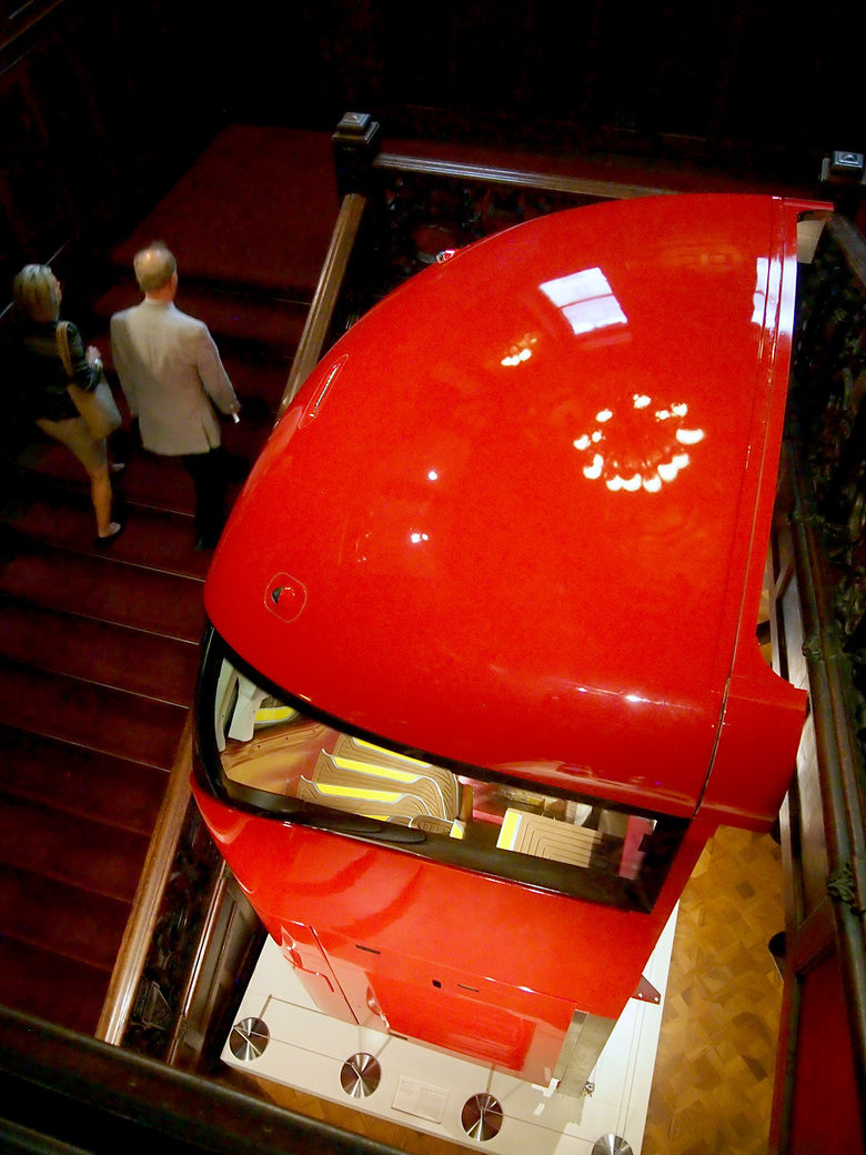
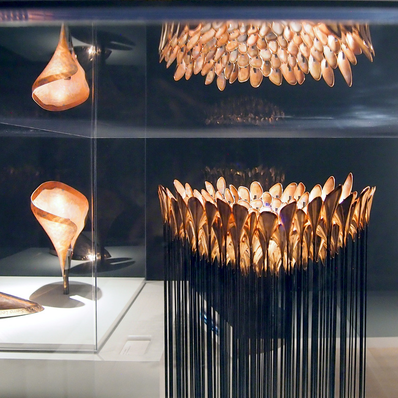
Provocations, which was organized in 2014 by the Nasher Sculpture Center in Dallas and traveled to the Hammer Museum in Los Angeles before arriving in New York, is billed as "the first museum exhibition to introduce the imaginative work of British designer and his London-based studio to an American audience." While this is a true statement, American audiences already knew the work of Heatherwick, if not by name, given that his design of the Olympic Cauldron was seen by millions during the broadcasts of the opening and closing ceremonies of the 2012 Olympic Games in London. But before visitors to the Cooper Hewitt are reminded of that petal-like construction, they are confronted with a full-scale section of a double-decker red bus in the museum's lobby.
Just as the Olympics gave Heatherwick the kind of exposure that most designers can only dream of, the London Bus will do the same; 600 buses are slated to hit the streets of London by 2016. In redesigning one of the city's icons Heatherwick asked, "Can a London bus be better and use 40 percent less fuel?" In response to this last concern the bus is a hybrid vehicle with lightweight frame. But given that the bus is longer, due to having two stairs instead of just one, Heatherwick rounded the ends, apparently decreasing the bus's apparent size and giving it its distinctive appearance.
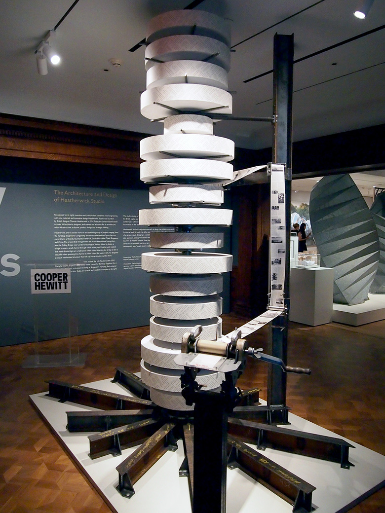
Questions like the one above about the London bus are common with Heatherwick Studio. They are found in both the updated Making monograph (its release is timed to the last leg of the traveling exhibition) and in the tear sheets that visitors can take with them. In regards to the latter Heatherwick again approached the design of something from another angle to come up with something different, unexpected. Most exhibition pamphlets or tear sheets are folded and found in a bin mounted to the wall, but for Provocations this memento is produced from rolls of paper stacked upon a large contraption at the entrance to the exhibition on the museum's third floor. Visitors turn the crank and tear off the sheet when prompted. Although this piece is visually striking and memorable, thanks to the necessary use of muscles, the sizable steel structure hardly seems the most efficient or appropriate solution.
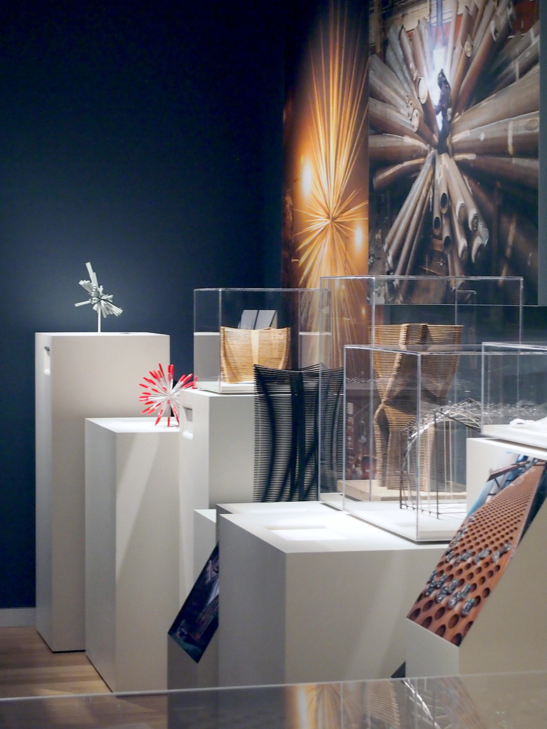
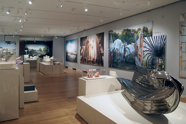
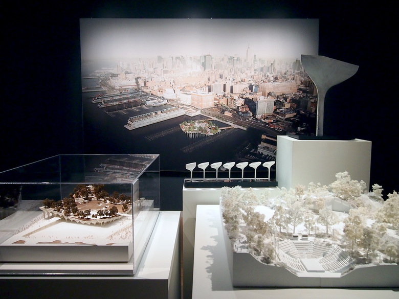
With meter-long paper in hand, visitors embark upon the exhibition proper, which is made up of three rooms – one large, one medium and one small – filled with models, photographs and renderings. The last two are hung on the walls, while most of the gallery space is filled with models placed atop boxy bases of different heights, with some of the models encased in plexiglass. These bases combine to create a topography of objects, many of them exhibiting similar formal traits, such as hairy buildings (Barnards Farm Sitooterie, UK Pavilion at Expo Shanghai), petals (Olympic Cauldron, Pier 55) and flowing surfaces (Longchamp, Bombay Sapphire). This last aspect is accentuated by the chronological order of the exhibition, which sees Heatherwick's preoccupation with these formal solutions happening coincidentally.
If positioning of projects within the gallery gives them importance, the two most important projects are the Olympic Cauldron and Pier 55. The first is given its own room, small and darkened to heighten the qualities of the bronze and the fire it encased during the 2012 Summer Olympics; the second is the last project in the show, a park proposed by Barry Diller for a site in the Hudson River near the High Line on Manhattan's west side. If the cauldron is a high point in Heatherwick's career, both for giving him exposure and for being a clever means of making an important part of the Olympics memorable, then Pier 55 is a sign of where he is heading: toward larger projects that are permanent rather than fleeting and have a significant impact on the public realm. Yet it's interesting to note that these two projects are formally the same, with similar petal-like forms grouped into aggregate: one brings bronze torches together to create a larger flame, while the other groups concrete piers together to support a park. Is architecture more than a sum of its parts? That's not a question that Heatherwick asks, but it's one that visitors will wonder after seeing two decades of the studio's output at the Cooper Hewitt.

