Interview with Stephen Van Dyck, Partner at LMN Architects
Serendipitous in Santa Barbara
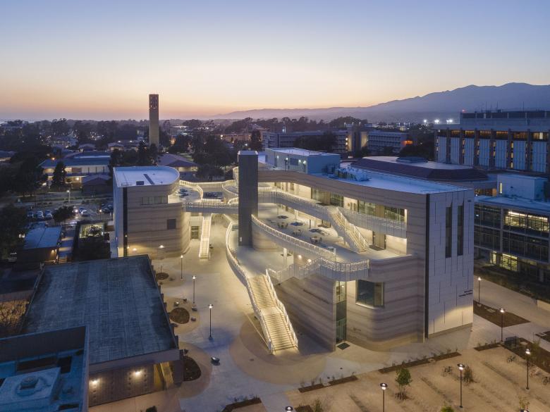
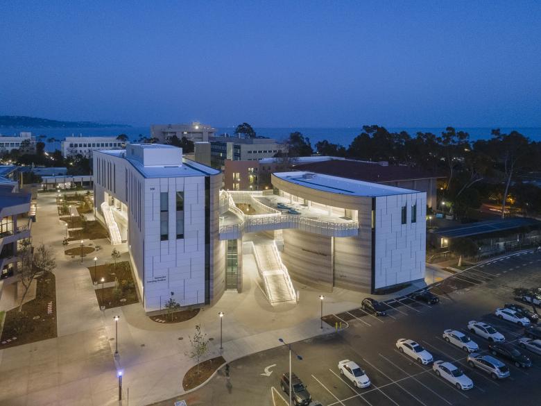
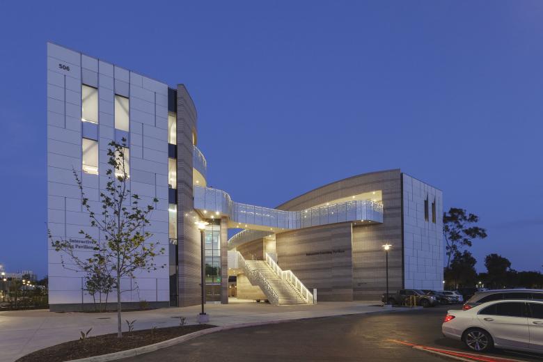
In January, we asked visitors to our American-Architects platform to vote for their favorite Building of the Week from 2023. In the end, the US Building of the Year winner was the Interactive Learning Pavilion, a dedicated classroom building that opened last spring at the University of California, Santa Barbara. Designed by Seattle’s LMN Architects, the building is organized about a canyon-like outdoor “street” with stairs, terraces, and bridges. To learn more about the winning project and how it fits into the firm’s wider portfolio, World-Architects spoke with LMN partner Stephen Van Dyck via Zoom. Our conversation, which took place in early May as pro-Palestinian protests spread across American universities, has been lightly edited for length and clarity.
John Hill (JH): In the Building of the Week feature on the Interactive Learning Pavilion (ILP) at UC Santa Barbara (UCSB), you said LMN gained the commission after the university asked you and others to interview and submit proposals. How did your first thoughts, your first proposal, compare to the finished building?
Stephen Van Dyck (SVD): They first published an open call to submit qualifications, and then we interviewed. In the interview we shared what we would call sketches, or early ideas. Thematically, what we wound up with in the building is completely in line with what we shared in that interview. We shared a bunch of different ideas, but they were basically all about opening up the building, making a building about its place, and making the experience of the building into an experience of the campus. The sketches were different ways of doing that, more or less, and there was one scheme that was very similar to what we wound up building. We didn’t say “this is the idea and we’re going to develop it” — we arrived at it through a process of learning more about what the site needed, what the programmatic relationships needed to be, what the constructability issues were going to be. So, it was a pretty iterative design process for us to get there.
The other thing worth noting is that at that point, before they procured the design work that we did, the university had just finished what they call a DPP (detailed project program), basically a concept or feasibility study that was done by another architect. That concept did two things that our ideas built upon and reacted to. First, the site was different; they had located the building farther east, not adjacent to the future extension of Library Mall. So, the first thing we proposed was moving the building to the west, to advance the vision for the extension of that pedestrian mall to the south. It is currently a parking lot, so the photographs aren’t indicative of the ultimate state, but the cascading stairs will ultimately empty and meet in the heart of that pedestrian mall.
The second thing the DPP did was define a building that had an inside: it literally had a couple doors that you would go in, be inside the building, and then go to the classrooms. That was the other thing we really tried to rethink; we didn't think the building needed a traditional front door. Given the climate, you could create a building where the outside was the inside. Navigating up and through the building could be an exterior experience, and the only time you would go into a room would be going into the program spaces, the classrooms; everything else would be outside. That unlocked a lot of potential for the project to really feel much more connected to the experience of campus.
SVD: Yes, we are. The preliminary program they had developed before we came on board was a lot more fleshed out than a lot of projects that we do. We will usually join the university in the programming phase and do that work in house; we also have a few specialist consultants that we'll bring on to help us through things like AV and IT, and some other key consultants that help us dial in the performance criteria of these program spaces. We actually did a bit of that in this project, too. Once we saw the full programming document and learned about their goals, we then evolved a few things — the classroom configurations in particular — to meet what we felt would be a better performing series of spaces than the program originally outlined. And that's usually the case, in that a preliminary programming phase really just helps establish the scope of the program and the budget. Once design begins, you better understand what those program spaces need to be. They don't necessarily grow or shrink a whole lot, but their form evolves a little bit, as does some of the technical criteria; but at that point you have a general budget and area scope that you can work with.
SVD: The evolution of these sorts of spaces for serendipitous interaction is happening right now in higher education, pretty broadly speaking. It has been recognized in the last 20 years in the thinking of how teaching and learning occur on campuses. A lot of learning happens in the classroom, but almost as much or sometimes more learning happens just outside the classroom, in those times before and after class, in the moments when you just happen to bump into somebody that's doing research similar to what you're doing. Campuses thrive on that. After Covid, people realized that being on campus matters, being together matters, being around each other creates something special. I would say it is a recognition of something that architects have always felt: shared spaces are at the core of great human experiences. Modern pedagogy has evolved to the point where that is now accepted and is an essential part of higher-education design. So, yes, almost all of our clients specifically ask for these types of spaces; they are essential to how we talk about our value as designers, and they are part of all the projects we deliver these days.
The street idea was building off the open-air paseos that occur throughout the UCSB campus. There are these moments of passage that occur through and around buildings on campus, where a kind of central open-air space feeds all of the rooms around it. So that theme felt very natural because that is the way the campus works and feels, and it also happened to be a great organizing element for the program components. As we started to put the program components on the site, we knew that we didn't want take the full breadth of the site east to west because we needed to reserve some of that space for bicycle parking. There is a huge population on campus that commutes by bicycle, so we have 1,800 spaces for bikes on that site.
We knew that the most efficient way to plan a classroom building is to put the biggest spaces lowest in the building. That is true from a structural point of view and from an ingress and egress point of view. There is a turnover time of between 10 to 20 minutes between classes, and in some of these rooms you have 350 people leaving and 350 people entering within a very short period of time. The closer to grade level for the big rooms the better, so we started planning the building around where these big rooms could fit. As you stack the smaller rooms on top of the bigger rooms, you wind up with this sort of natural terrace. The building kind of showed us what it wanted to become in that regard. It basically built for itself a series of outdoor spaces that were terraced naturally due to the way the geometries aligned. It doing so, it opened up this “canyon” that is narrow at the bottom and wide at the top, that helped bring light, air, and views into the space, and helped create a sense of welcoming.
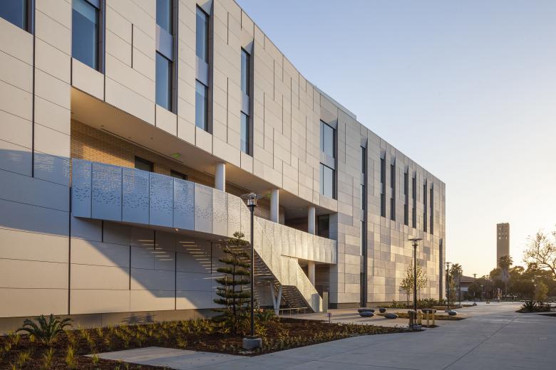
Meanwhile, we also pushed the program to its furthest limits on the north and south sides of the site, to build a vertical building on the outside. That was in response to the neighboring buildings: to establish clear bounding edges and help reinforce some of the other campus passageways nearby that really benefit from taut vertical facades. That left the inside with a more interesting gooey and soft, tiered and terraced quality of space. Then, of course, there was the issue of getting to each terrace, making sure there is appropriate egress and connections to all the rooms. We like to locate elevators as centrally as possible in buildings, so the elevator experience feels equal as a participant in the pedestrian environment of a building — a bit like a kebab skewer holding the building together! Here it is also a central element that is a bit like a bell tower in the middle of the space. And when you get to the top, the terraces do feel like an outside space on campus; they don’t feel like they’re part of a building, so to speak. You have these views around that you don’t get otherwise. It’s an interesting way for the center of campus and the public spaces on campus to really permeate the building. It lends itself to being a very public shared space.
SVD: Yes, for sure. We don't know what the university's plans are, but this building, which may need to be expanded in the future, has a planning concept that lends itself well to expansion. As far as how it is performing, we have heard some really wonderful things and feedback from the campus, some of it when our team was down there a couple weeks ago for the one-year warranty walk. (The building had been turned over to the owner about a year ago.) Generally, the building is doing really well, performing beyond our expectations. There was actually a great article recently published by the university's newspaper — one that was triggered by the Building of the Year — in which they quote the chancellor, a professor, and a student. The quotes are insightful and capture, in a really genuine way, how happy they are with the building.
And recently we worked with them on an award submission, and they talked about how the building has become a new standard for the university, in how they think about their buildings and about future expansions, renovations, and what classrooms should be like moving forward. The building has elevated the standards on how they think about their future. And everybody's fighting to get into that building and have a class there, so it is all very positive.
SVD: Many of the education buildings we design are for a specific area of study, but they almost always have teaching and learning spaces in them. So, this being a dedicated teaching and learning facility makes it a valuable laboratory for us, in developing our thinking and approach specifically to classroom spaces. From a program-expertise standpoint, it is an influential project. It gave us a chance to dig deep into classroom design and into what it means to build a space for the whole campus community to come together. The most fundamental theme of the building, beyond the function of teaching and learning, is really celebrating its place and trying to make the most of its spectacular setting. Each of our projects has a very unique setting, so finding a way to make the most of the place has been a pretty high-level goal that we have always been passionate about. And if we do it well, it leads to a completely different result every time.
As far as how it's influencing our work moving forward, we do a lot of higher-ed work, and for the reasons I mentioned it is very helpful. I'd also say that because so much of this building is outdoors, it is very unique in the way the architecture, the systems, and the spaces all work together. In a way, it is more like a piece of infrastructure than a traditional building. We do a lot of what we call urban infrastructure projects: train stations, bridges, highway lids, community spaces. The thinking about the outdoor public space in this project is parallel to the things we investigate on other projects. For instance, the ILP has two bridges — literally and technically bridges —through the open-air space, so we had to figure out how the detailing works, the materials work, the guardrail works, how all these elements come together to create a civic place.
I'm working on a project now that is part of the restoration of a whole estuary system here in Washington State, and we are at the part of that project in which we are designing a new bridge. There are parts of that bridge that are taking inspiration from how the public spaces, guardrails, edges, and landings work at UCSB. This is the first time I've thought about it, because these things sort of percolate in the back of your mind, and you don't really think about how you explicitly apply these things. But, in you asking that question, it made me realize there is a lot that we learned there, a lot that we are carrying forward in a completely different project typology.
SVD: I have not heard about anything happening on campus related to the ongoing protests, but I can tell you that when we interviewed for the project there was an exhibition on campus commemorating the anniversary of some important civil rights demonstrations that had taken place there in the late 1960s. We made a pretty clear point then that buildings like the Interactive Learning Pavilion will inevitably play a part in the campus’s civil discourse; they have to be able to accommodate and help facilitate it safely. As a centrally located, completely accessible series of spaces, I think it is a wonderful place to have people share their opinions, to bring people together to interact with each other in a civil way about the important issues of our time. That is one of the most important things our universities can offer: spaces that are safe and have equitable access for meaningful civil discourse. Hopefully this building is part of that tradition and can help the campus foster that discourse.


