Bolles+Wilson's Bibliothèque nationale de Luxembourg opens
Worth the Wait
The Bibliothèque nationale de Luxembourg (National Library of Luxembourg) opened the doors to its new building on the first day of October — 16 years after Bolles+Wilson won a competition to design it. Ulf Meyer delves into the library's design and what it means for the area of Luxembourg in which it resides.
The Kirchberg-Plateau in Luxembourg is one of the most curious urban districts in Europe. Disconnected from anything, the architectural autism of the solitary buildings have made it a symbolic failure of contemporary urban design but also of the pan-continental ambitions of one of Europe’s smallest yet wealthiest nations. In recent years, the long-dead Avenue John F. Kennedy has been upgraded both urbanistically and architecturally: The Mudam art museum by I.M.Pei and the Philharmonie by Christian de Portzamparc give the boulevard cultural weight, while the sprawling EU bureaucracy and booming financial center that popped up around it host architectural designs from all over Europe.
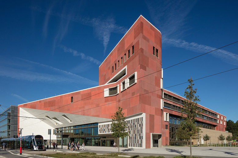
The Boulevard itself, once an out-of-place inner-city highway to nowhere, has been turned into an urbanized artery with lines of trees and a modern street car that is free to ride. Another cultural building has been added to the sprawling new cluster of financial buildings for the investment fund industry. Inaugurated in early October, the National Library of Luxembourg is thus a clear sign that city and state are serious about turning the Kirchberg area into a full-blown new urban district larger than the capital city’s downtown.
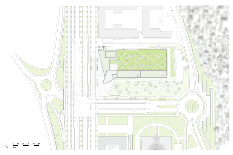
The National Library was designed by Bolles+Wilson from Münster, Germany. Shortly after Julia Bolles met Australian Peter Wilson in London and started their eponymous firm, their first claim to fame was a library building in Julia’s home town of Münster. In that sense, the successful office has come full circle. The commission in the European capital has proven to be lengthy, requiring a lot of patience on the architect’s side, but the result is great. When Bolles+Wilson won first prize in the international design competition in 2003, they had no way of knowing it would take 16 years for them to see the building completed — in another location altogether. The library was supposed to be housed in the Schuman building on the opposite side and far western end of Avenue Kennedy. A decade later, in 2014, the architects were asked to adopt some of their architectural design concepts for a new-build library on another site. And they did, with the 75 million Euro library standing proud along the north side of the boulevard.
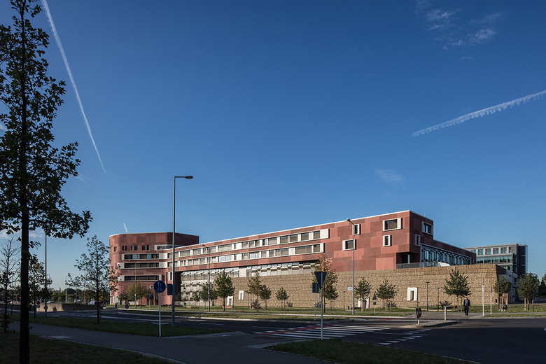
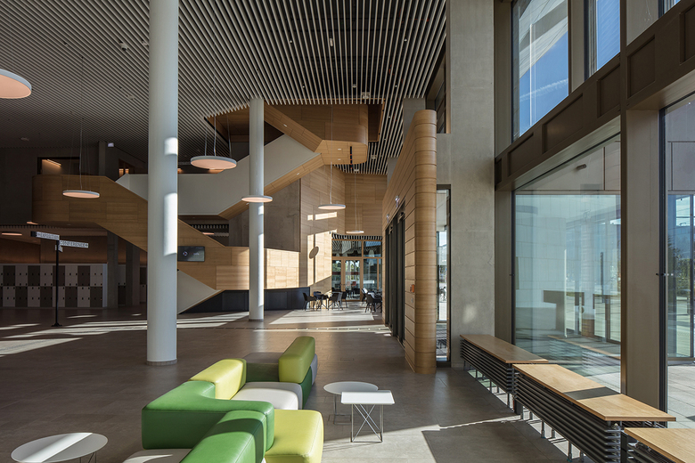
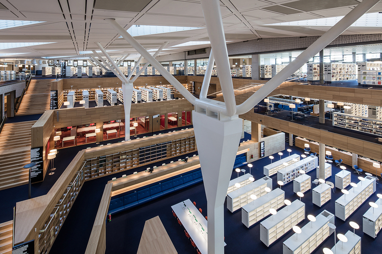
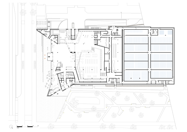
The building is arranged in a linear fashion, with an inviting entrance facade toward the south leading to a foyer, café, conference and seminar center, and a terraced reading hall. The architects call this last space “landscaped,” using Hans Scharoun’s phrase about the Staatsbibliothek in Berlin, arguably Germany’s most iconic post-war library. The main element of the National Library is a five-story magazine block, which forms a plateau for the large reading level.
The red precast concrete panels on the facades have surfaces that were treated differently to create what the architects describe as a “lively profile despite the homogeneity in color and material.” White precast concrete elements define the entrance facade and frame windows. Gabion walls — their filling coming from rock excavation — give the storage a fortress-like appearance. The architecture seems to imply that this is a shelter of culture and the written word.
Bolles Wilson are known to enjoy bright red materials and interesting, precise geometries, but they also show a serious interest in sustainable architecture. There are PV panels on the roof, there is controlled night-time cooling, and the surfaces and components of the interiors provide thermal mass for heat storage.
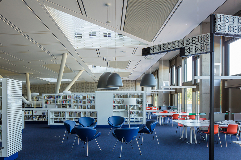
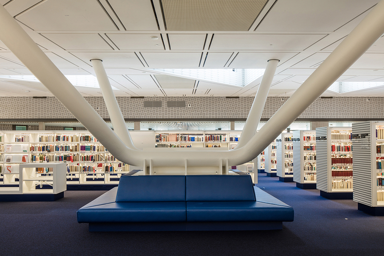
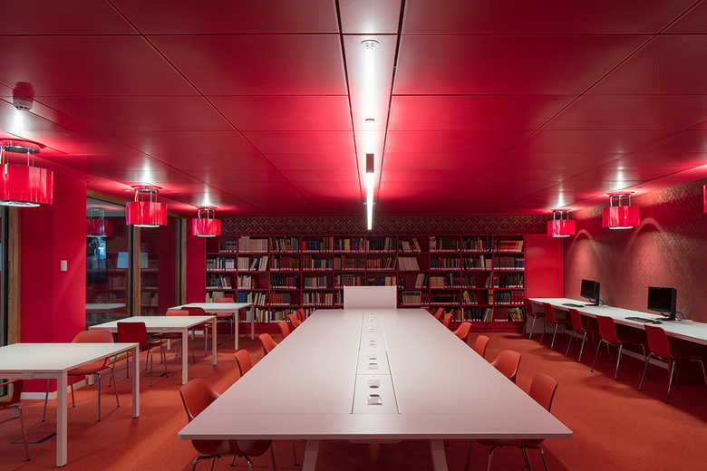
The large ceiling of the reading hall is made of wood and from its terraces visitors can see the whole space. Shelf rows make the 2.5 million pieces of media easily accessible to visitors, arranged with ease of orientation in mind. As in a city, there are broader and narrower "streets" and smaller or larger "piazzas" for reading and learning. While the magazines are not accessible to visitors, there is a special reading room on the middle of the terrace, where visitors can review books under supervision of a librarian. This space is the bright red heart of the library. At night it is illuminated and can be seen from the outside. Buffered by an encircling corridor system, the archives are sealed off climatically from the rest of the building. Here, constant levels of humidity and temperature guarantee the preservation of the books.
Since the large roof over the reading room is made of wood, no lighting or ventilation could be placed there due to fire considerations; all technical installations had to come from the raised floor below. The lighting of the metal shelves, the outrigger on the built-in shelves made of wood, the beautiful white glass lights on the shelves up to the reading table lights, all were specially developed and manufactured. Testament to the building’s long duration, during the course of planning, it was necessary to switch to LED.
With the exception of the reading room, the structure is made of reinforced concrete, often left visible as thermal mass in the offices, workshops, staircases, and corridors. White walls, wooden windows and doors, and bold colors in the flooring and furniture compensate for the "roughness" of the concrete. In some public areas, the concrete structure is visible, but sound-absorbtive surfaces make the rooms acoustically pleasant. Perforated, white bricks, also used for the night-cooling are placed in front of the concrete walls.
It is impressive how Luxembourg has turned its international district, once known as an “elephant cemetery” of post-war architecture, into a lively urban quarter. The Kirchberg Plateau of today offers a growing number of high-profile cultural buildings that add some great architectural touches to the surrounding seas of office buildings. The new National Library is the premier example of this welcome move.

