Chrome Hotel
Kolkata, India
Facing a busy arterial road of the city and flanked by commercial buildings on either side with a residential building at the rear, this small plot for a business hotel had a height limitation of 24 m.
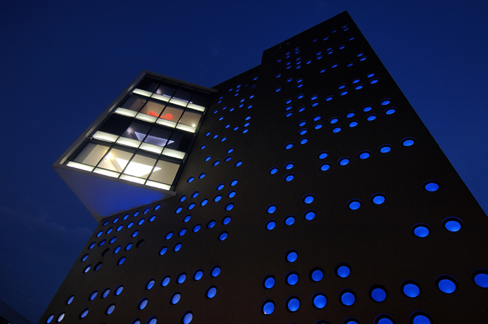
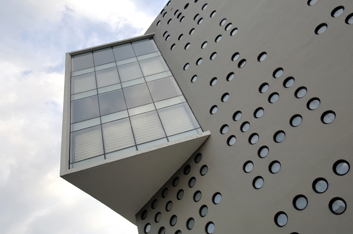
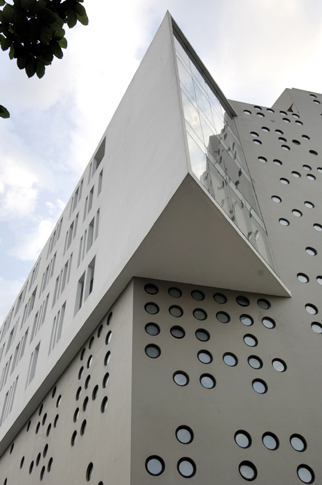
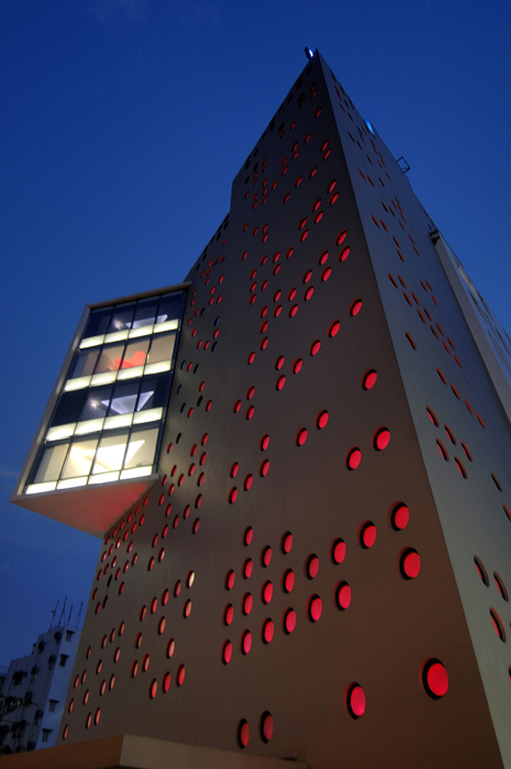
The hotel is planned in eight levels with public spaces occupying the first three levels and four levels of rooms above with a rooftop lounge bar on the topmost floor. Since there was nothing in the surroundings to look out to at the lower levels, the entire volume comprising of the public spaces and the vertical circulation is punctuated by small 45 cm diameter circular openings. These openings allow natural light into the public spaces at daytime and are made of frit glass so that the exterior is purposely not seen and the public spaces have an identity of their own once one enters and experiences them. Each opening is lit by LEDs during the evening hours that change colour as the night progresses, making the building dynamic as it glows in different hues like a large punctuated lantern.
The room levels are identified by a rectilinear white block that is punctuated by varying widths of vertical slit windows that cantilevers out over the level of the flyover, forming a wedge at the front corner that houses a suite at each level overlooking a school playground beyond the flyover across the road. The built form thus relates to its surroundings in terms of its planning and creates a distinct identity albeit its small size.
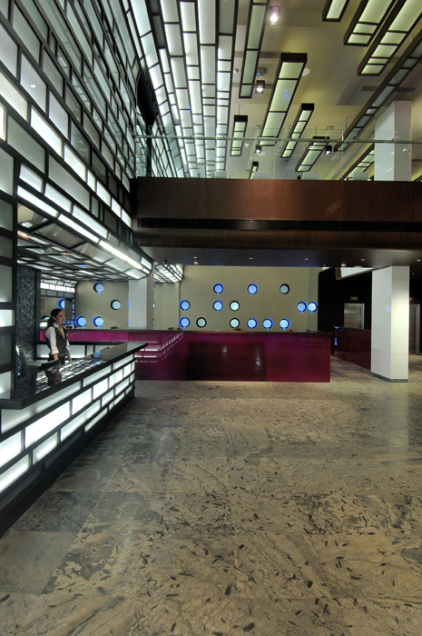
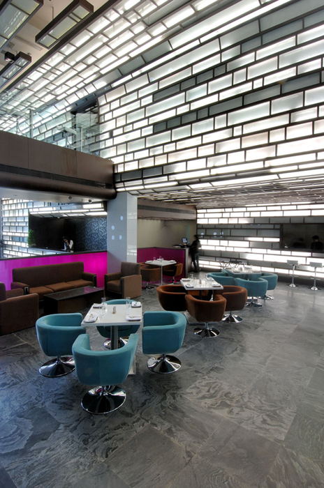
The hotel is entered through a 24' high lobby with a wall of varied rectilinear composition of wood and glass that curves into the ceiling, slowly fragmenting into individual suspended glass cuboids, creating a sculptural effect. The small lobby space is perceived with openness by virtue of its volume and its extension into an open coffee shop that is segregated by low pink glass partitions.
Suspended within this lobby volume, a wood wrapped corridor acts as an open bar overlooking the lobby while leading into a restaurant at the upper level. A glass punctuated floor with colour change lights echo the exterior wall composition in this open bar corridor with a linear glass bar counter.
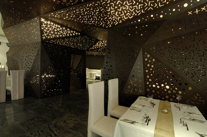
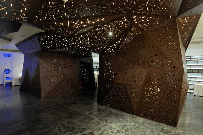
Angled trapezoidal planes, punctuated with varied compositions, fold down from the ceiling to create two private dining areas within the restaurant space and fragment the volume into smaller spaces that are lent more privacy. The restaurant design thus creates compositions of form that are varied depending upon which part they are being perceived from.
Four levels of rooms house the 63 rooms, with each floor having a judicial mix of twin bed and double bed configurations, along with a suite and a themed room. The rooms thus offer a wide range of experiences. The suites are cantilevered out at the front corner of the building with floor to ceiling glass, each one designed differently. The rear corner has themed rooms that include a sports room, a quirky music room, a love room and a wellness room.
The typical rooms are created with a graphic composition that flows across the ceiling diagonally coming down vertically in a wide panel behind the bed and sweeping down in a narrow panel at the opposite end, to turn into a study table. The graphical composition of each room differs so that no two rooms in this boutique hotel are identical. The rooms necessarily being smaller due to the constraints of the site are yet perceived with openness achieved by the continuity of design elements and the glass cornered toilets within them.
The corridors too have panels that visually connect doors to rooms diagonally interspersed with large graphical panels deviating from the staid repetitive corridors that most hotels incorporate.
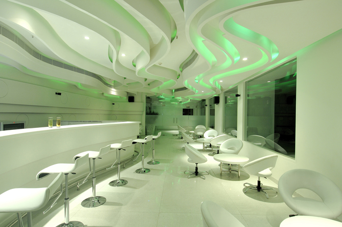
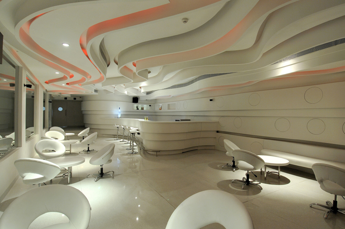
The topmost floor houses a lounge bar with an open terrace along its length. The bar being small in area is designed in a fluid manner that allows it to be perceived as a larger space while being rendered in a sculptural way. Undulating curved ribbon shaped panels are suspended from the ceiling with reflected colour change lighting between them across the length of the bar. The walls and the bar counter are merged fluidly with curvilinear panels of varying widths and projections. Complete white rendering of all the design elements allow the bar to be completely transformed by colour change lights at intervals, creating different moods.
This hotel is designed in a manner that allows a series of experiences to its visitors. The juxtaposition of angular punctuated volumes that form the building, the sculpted free flowing entrance lobby, the angular abstracted volumes of the restaurant, the variety of rooms and the fluid spaces of the bar each are created with their own distinct identity and experience.
Each space is a sculpted volume with forms, colours, textures, materials and lighting being brought together in a cohesive way to create its individual experience. These spaces create a hotel that is not just a place to stay in temporarily, but a series of spaces that are explorative in the experiences they evoke.
The building in lieu of its restricted surroundings, size and height limitations yet creates a strong presence within the area using every space within to advantage in a clearly functional manner, while creating the illusion of being a much larger series of spaces internally.
