House in Araiyakushi
Tokyo, Japan
Embrace aspects of the city directly
The surrounding of the site is a dense area of dwellings and commercial buildings. There are many land allotments before the war. The client’s request was a home office for a family consisting of 3 generations. The city has existed for a long time, and there is no clear urban axis. The existing houses crowded together with diversity in type of structure, scale, and use. Without planning, they developed in chaos but converge at characteristic and interesting balanced state, which seems to show us very Japanese aspects of cities.
Classically, monolithic ‘plus’ volume was usually built as a symbol of order to contrast a disorderly site background like this. However, it would just come down to one factor of dis-order, and discard the benefit of the city’s characteristics as well. Thus, we believed it is better to embrace dis-order as aspects of the cities positively and then convert it into a new quality of architecture.
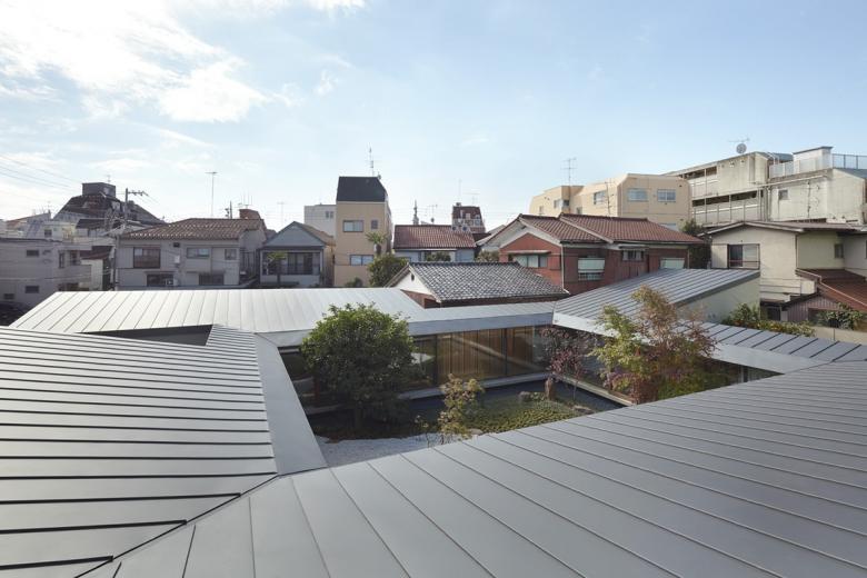
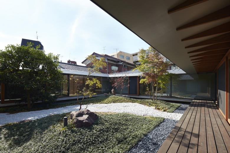
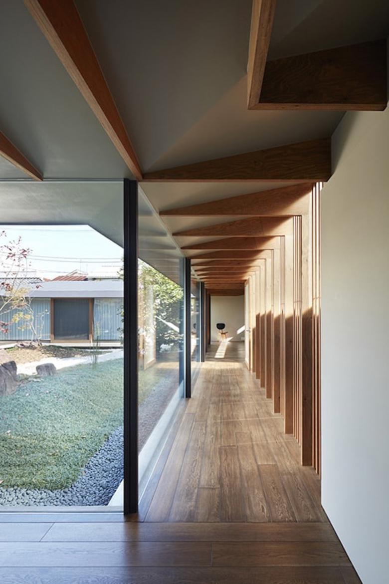
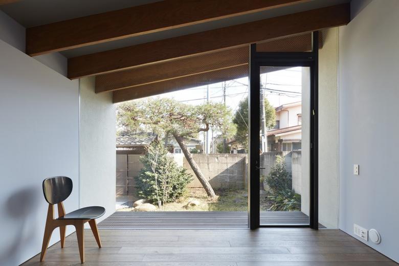
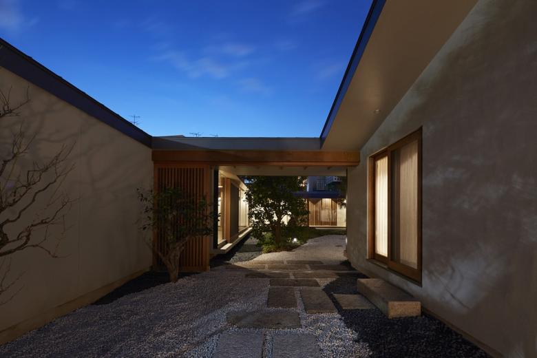
This housing, functioning as office and residence for 3 generations, indeed possessed a certain volume. But instead of squeezing it as a square volume into the existing city, we decided to rather ‘infiltrate’ it through urban elements such as neighborhood, streets, existing trees, garden-stones, old well, shrine, etc. As a result, the outline became a complicated ameba-shape having several folds, which remained the aspects of the city. For uneven ‘human lives’, it can be also read as preferable ‘topography’.
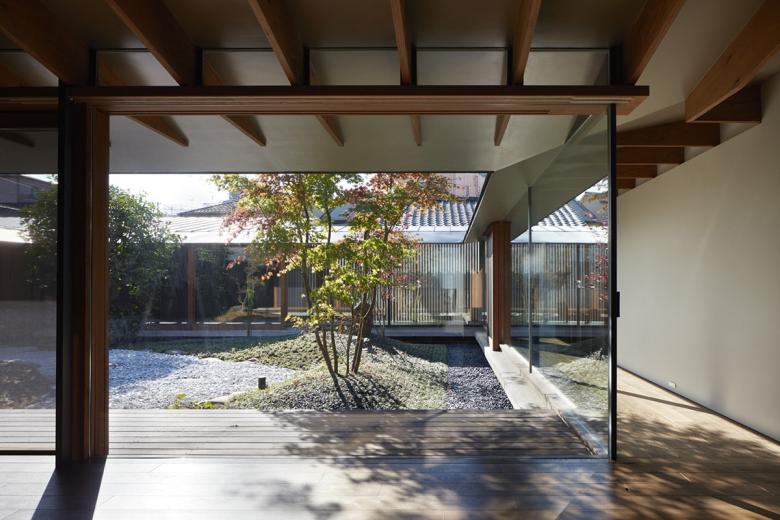
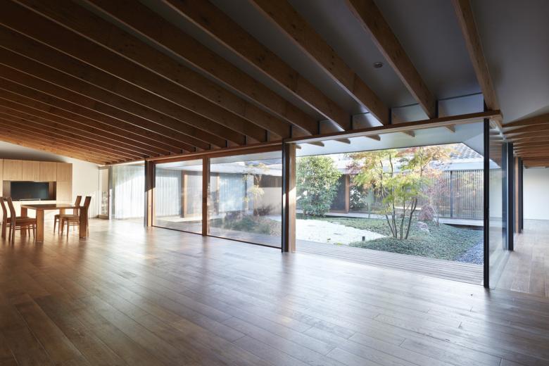
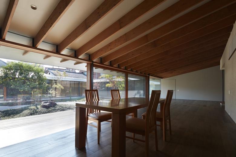
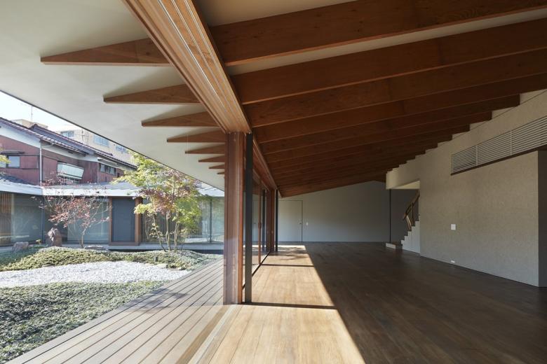
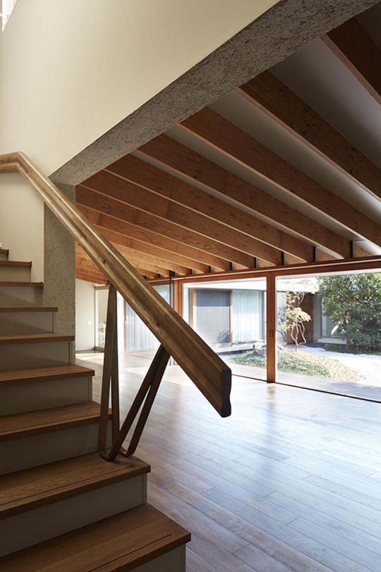
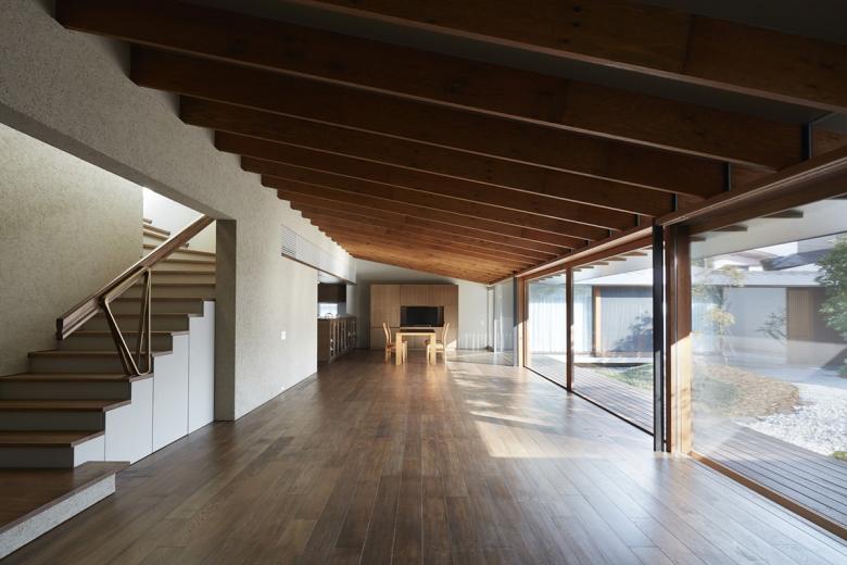
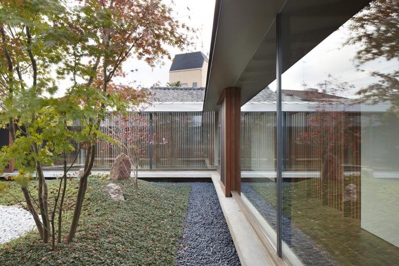
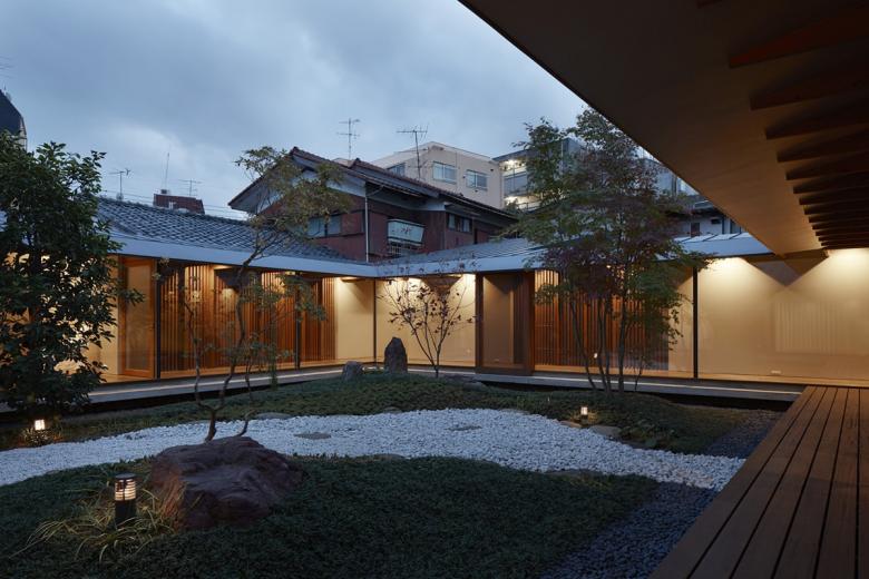
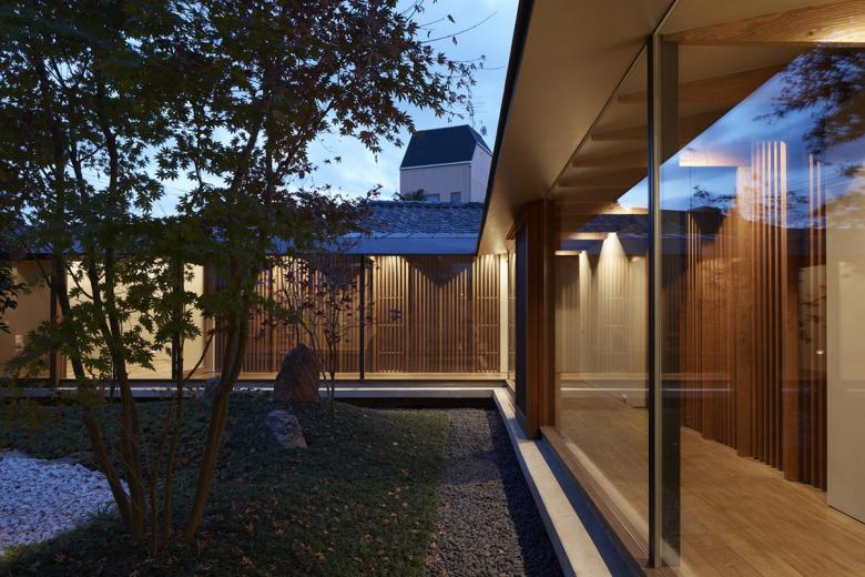
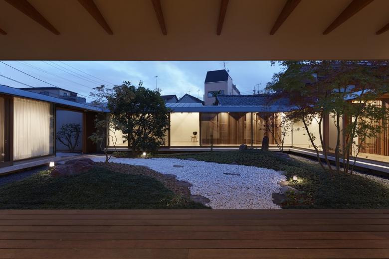
In order to convert such urban topography into ‘the place of human’, the only architectural process, if it’s appropriate to say, was ‘a rectangle courtyard’ that located as a ‘minus’ architecture volume in the center of the complicated plan. It of course allowed comfortable lighting and ventilation while several folds were used as characteristic rooms suitable for various lives. In addition, a decent distance and space were secured among each family. Although parents and children were independent households, they were also integrated by inner ‘order’, namely the rectangular courtyard as well as the climbing beams sloping towards that courtyard with the same gradient.
By looking back what we had done, we found that it might just simplify a normal and prolix process -- placing ‘a simple architecture’ in ‘a diverse city’ and then create ‘residential diversity‘ inside -- into directly grasping ‘a diverse city’ as ‘residential diversity’. It might also reverse the way of architecture, the unlimited ‘ordering’ of cities by connecting city and individual life through reversing the inside and outside of architecture imitating the inward outside, the courtyard.
In any case, I believe ‘the future’ of architecture, which starts from ‘the end’ of urbanization, is very interesting.
