2014 Venice Biennale: Elements of Architecture
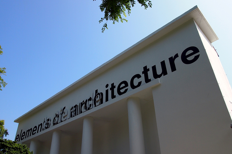
The Fundamentals theme for the 14th International Architecture Exhibition consists of three components: Absorbing Modernity 1914-2014, Elements of Architecture, and Monditalia. Here we look at Elements of Architecture in the Central Pavilion.
See also our coverage of Monditalia, and Absorbing Modernity 1914-2014, and some of the collateral events.
Before delving into the 15 elements of architecture (EOA), room by room, here is what Koolhaas says in a statement about this part of the Biennale, which is the result of a two-year research studio with the Harvard Graduate School of Design:
We heard from many architects who visited the EOA during the preview days, and while many were very critical of the show – saying it was too basic, felt like a product catalog, and was missing elements (column, real estate, etc.) – it is highly commendable for explaining the fundamentals of architecture to a general public. Focusing on the elements in a historical context, and tracing how they changed in the last 100 years, the show also hints at the changes happening now as digital technologies infiltrate normally "dumb" elements and imbue them with the "smart" ability to respond to the presence of people and their needs. It is a worthwhile component of the larger exhibition that just scratches the surface of the large amounts of research Koolhaas carried out with Harvard GSD and made into a series of 15 books, one for each element.
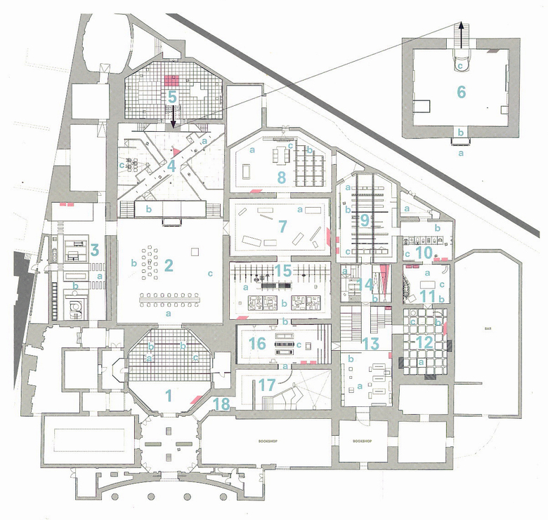
Each of the EOA is numbered and discussed briefly here in order of the above key plan, which loosely dictates a clockwise loop through the pavilion after entering through the porch at the bottom. Not discussed are 17 and 18, the “Books for Architects” room and “Digital Corridor,” respectively. It should be noted that Koolhaas collaborated with various schools, professors, architects, historians and other experts on each element – too numerous to mention here but included in the individual room descriptions when important. For the overall EOA, Koolhaas worked with the AMO arm of his Office for Metropolitan Architecture, architect/theoretician Stephen Trüby, the Harvard GSD and its Dean Mohsen Mostafavi.
1-Ceiling
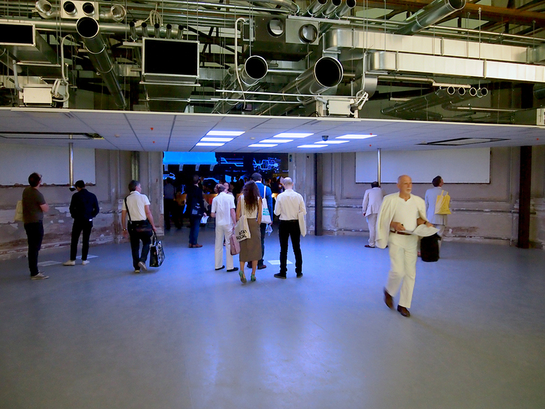
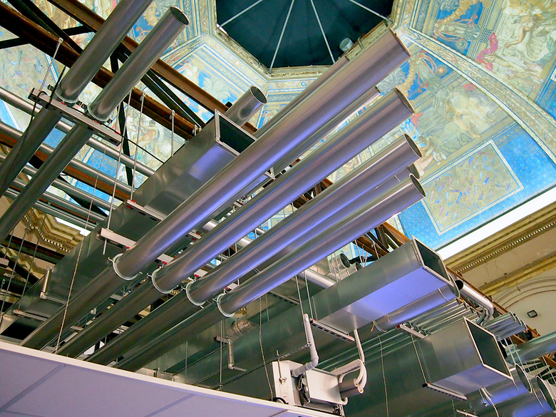
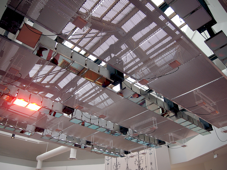
The first space beyond the front porch of the Central Pavilion is devoted to the ceiling, articulated in two types: solid and hollow. Solid is revealed in the recently restored ceiling by Galileo Chini from 1909 that vaults impressively over the space. Hollow is found in the drop ceiling and its normally hidden infrastructure of ductwork and other services. Symbolic meaning gives way to pure mechanics. This juxtaposition is especially jarring given the scale of the space created by the drop ceiling, a compression reminiscent of Koolhaas buildings like Lille Expo, where entry to the grand hall is via an extremely low foyer. This first space in the Central Pavilion sets up the dichotomy of the EOA show – historical versus modern – as well as the way the elements are surgically revealed and technically discussed.
2-Intro
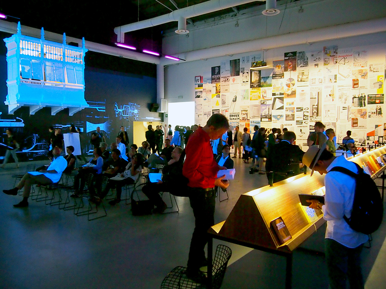
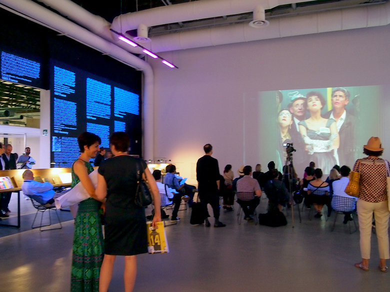
Past the octagonal room devoted to the ceiling is the Central Pavilion’s central space, which houses an introduction to the rest of the exhibition. The dimly lit space saturated with the glow of black lights contains four types of artifacts: a display stand with books where elements have been examined throughout history; advertisements for products culled from architecture magazines cover one wall; Charles Jencks-esque evolution diagrams of the elements across history sit on a wall next to a mashrabiya projecting into the room; and a film by Davide Rapp cuts together the EOA making “cameos” in movies on another wall. This film is fascinating in its depiction of the 15 EOA in cinema, reminiscent of Christian Marclay's The Clock, the hypnotic 24-hour artwork that splices scenes from films displaying clocks that are the same time as the viewer’s. Using popular film as an introduction to the 15 EOA is important, for it hints to the visitor that the exhibit is geared to non-architects as much as to professionals, without limiting the displays to things only graspable by architects.
3-Window
A small collection of the thousands of old windows in the vast Brooking National Collection covers one wall in the room to the left of the central space. The wood frames, pointed arches, and divided lights are in clear contrast to the rest of the room, which is an odd assortment of what goes into the making of modern windows. There is factory equipment (for testing a window's strength and a mechanical grinding machine for making the various small parts) from Belgian window fitting manufacturer Sobinco in the middle of the space. Along the wall opposite the old windows are bins of the normally invisible window parts whose display is more akin to a hardware store than a gallery.
4-Corridor
The previously open spaces of the Ceiling, Intro and Window give way to the divided room devoted to the corridor. This is appropriate, given how this EOA divides spaces, but it's also disconcerting, since the corridors cut diagonally across the square room in sometimes maze-like configurations. Given this layout, exit signs – five different kinds – are displayed throughout, some of them projected on the floor. At one of end of the main corridor are monitors displaying five “Building Exodus” evacuation simulations by One Simulations, one actually devoted to the Central Pavilion in its current layout.
5-Floor
At the ends of the diagonal corridors are stairs that wind up to a mezzanine that is covered with a unitized raised flooring; the system is often used in office buildings to allow power, data and other infrastructure to be flexibly routed. Some if the floor's squares are removed or glassed-in to reveal a robotic vacuum making its way throughout the otherwise hidden underworld of what Koolhaas calls the “floorspace.” Historic flooring – mosaics, prayer rugs, Uzbek tiling – is displayed sporadically throughout the rather bare space, but the energy-harnessing dance floor with its changing light displays stretching to infinity steals the show.
6-Balcony
Unlike the sparse and mute Floor room, the one devoted to the balcony is saturated with images and color; the orange stair connecting the two spaces hints at this before even entering. What can be considered the most superfluous of the 15 EOA (a balcony is not as necessary as a floor for standing on or a window for admitting light and air, for example), the balcony is presented in political element as well as an architectural one. The traditional mashrabiya projecting into the central space is now seen from the other side, giving only a screened view of the visitors below. This is counter to the modern Bauhaus balcony that, painted orange, reveals much behind its thin railings.
7-Façade
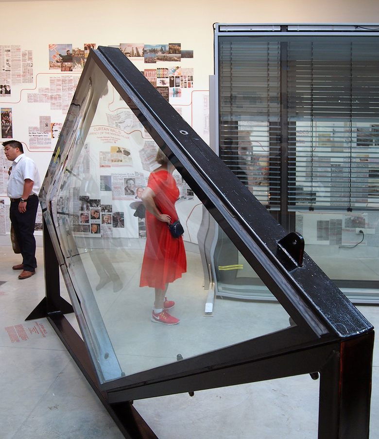
While Koolhaas’s mandate for the whole Biennale exhibtion emphasizes the historical and modern over the contemporary, this room is the most overtly contemporary of any of the EOA. Full-scale mockups of planted, precast, rainscreen and other façades sit in the middle of the room, while historical newspaper clippings with stories implicating historical façade development are mounted on the walls. The façade research is carried out with Princeton University’s Alejandro Zaera Polo, who describes the installation as aiming for “the understanding of dynamic ecologies of materials and technologies, their diffusion, application, and environmental adaptation.” Not surprisingly, Herzog & de Meuron is represented multiple times, shown here with their Prada store in Tokyo and the Museum der Kulturen in Basel, Switzerland.
8-Fireplace
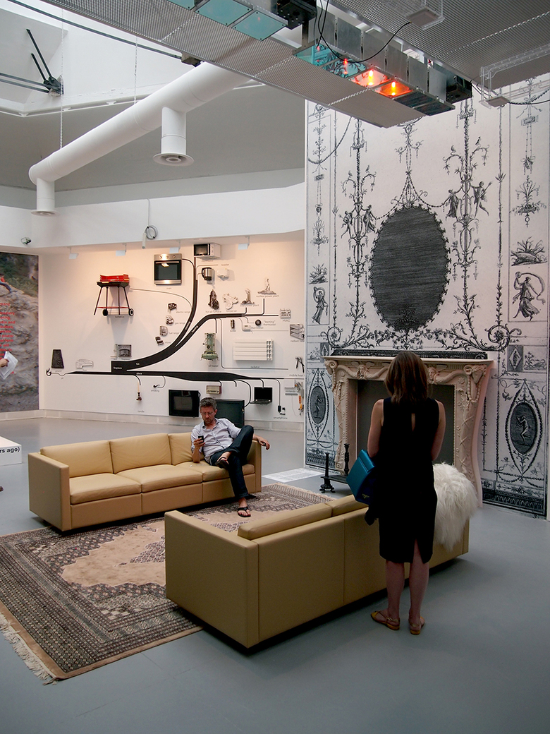
Koolhaas describes the fireplace as “one of the many elements competing for origin-of-architecture status,” but its erasure from most new buildings is undeniable. The prehistoric EOA is depicted as a “part real, part fake” hearth from 228,000 years ago; a 3D-printed version of a Piranesi design depicts the aristocratic fireplace of the 19th century; the last of the triumvirate points to the future in MIT SENSEable Cities Lab’s “Local Warming,” where sensors and ceiling panels provide targeted warmth to whomever walks below.
9-Wall
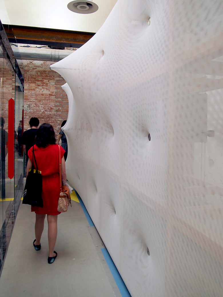
The vertical element that defines the extents of rooms is separated into two types: the bearing wall and the partition wall. The former’s combination of structure and enclosure is evident at one end of the space in the remnants of a 17th-century Dutch house that was destroyed by a plane crash. At the other end of the room is a kinetic skin wall designed by Germany’s Barkow Leibinger, where motors drive telescoping rods that push and pull the fabric surface and make walking by it a sometimes intimate experience. In between are parallel walls that gradually make the shift from bearing to partition, heavy to light, solid to transparent, static to kinetic.
10-Toilet
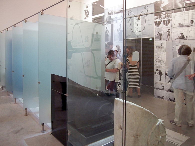
A row of stalls appropriately traces the history of “evacuation” in the Toilet room, where clear glass and frosted glass partitions express the shift from communal/social to private/personal through history. The toilets on display reach from a chariot latrine in the Roman baths at Caracalla to a smart toilet with its warming seat, sound effects, deodorizing features and even wifi capabilities. The wall opposite is wallpapered with Alexander Kira’s research on the science of evacuation, which looked at human anatomy as a means of determining the ideal toilet design. An adjacent room screens Peter Greenaway’s 26 Bathrooms from 1985 and William E. Jones’s Mansfield 1962.
11-Escalator
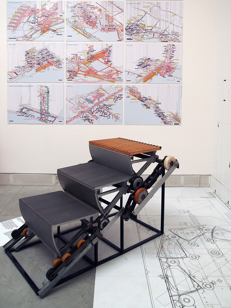
The escalator is “the single device that has transformed our cities most,” according to Koolhaas, who further says it has “transformed our architecture, our urbanism, our infrastructures, our movements, ultimately, our consciousness.” But the escalator’s design and mechanics have changed very little in its over 100-year history. Therefore this room respectively presents the axonometric maps of the walkways connected by escalators in Hong Kong from the great book Cities Without Ground, showing the escalator's urban implications, and highly detailed escalator sections at full-scale on the walls, revealing how its precise mechanics negates dramatic changes to the this EOA.
12-Elevator
The elevator plays an important role in Koolhaas’s classic manifesto Delirious New York, enabling the skyscraper and its diverse vertical layering of stacked floors. It's clear that Koolhaas laments its “lost” location in the core of buildings, where “a disconnected experience shuttling between floors” is the norm. The sparse room in the Central Pavilion is occupied by an Eindhoven University of Technology Robotics prototype of an elevator that can move horizontally as well as vertically; not surprisingly the atypical version of the elevator was undergoing repairs at the time of my visit. The capsule that rescued the trapped Chilean miners in 2010 anchors one corner of the room, recalling the elevator’s industrial origins.
13-Stair
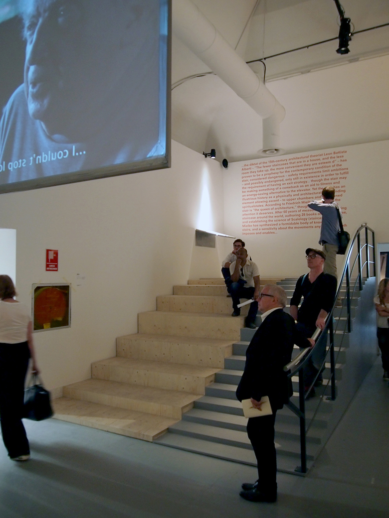
In a rather surprising statement, Koolhaas calls stairs “possibly endangered,” since they can be dangerous and only exist, in his mind, to fulfill exit strategies. Nevertheless he admits that stairs are making a comeback as an aid to fitness; numerous recent projects that encourage the use of stairs over elevators through their design and location come to mind, such as Morphosis’s Cooper Union building and OMA's own Casa Da Musica. The exhibition’s stair research, evidenced by drawings, scale models, full-size models, and a film, is derived primarily from Friedrich Mielke, who has devoted his life to what he calls “the queen of architecture” and authored nearly thirty books on the subject he refers to as “Scalology.” Fittingly, to watch the film visitors sit on or beside a stair he designed with artist Werner Bäumier where the tread heights rise and fall.
14-Ramp
Koolhaas the architect has made ramps significant parts of a number of projects, even designing the unbuilt Jussieu Library as a continuous ramped surface carried up and around the building. He calls the ramp “a speculative springboard, constantly pulled down by realities.” Those two aspects of the ramp – design ideas and code realities – are expressed via full-scale constructions on either side of the room. Claude Parent’s “living on inclined planes” occupies one side, inviting visitors to lounge on the soft surfaces, while Tim Nugent’s low-incline ramp he researched and lobbied for as an accessibility advocate decades ago sits opposite, a yin to Parent’s yang.
15-Roof
The most specific exploration of a particular EOA occurs with what is billed as “the first ever English translation of the 1103 Chinese architectural manual for Yingzao Fashi,” a standard Chinese roof. A continuation of Koolhaas’s efforts in last year’s Bi-City Biennale in Shenzhen, China, the attempted translation yields blue-foam models that are suspended in the room. In addition to the contemporary, cross-cultural translation of traditional forms, some parametric designs illustrate recent forms modeled, engineered and fabricated through the help of computers.
16-Door
The room devoted to doors involves moving through openings lined with “a short history of door handles by FSB and Rainer W. Leonhardt.” More portals await inside the room, but in the form of full-scale mockups of doors from architectural treatises erected out of foam. At the far end of the room is a working metal detector, emblematic of the door’s role as what Koolhaas calls “a dematerialized zone.” If setting off the detector’s beeps were not enough, one side of the room is devoted to an “airport security diorama,” again erected in parallel layers of foam. Unlike the physical heft of traditional fortifications, airport security is the 21st-century equivalent of the “city gate.” Like the other EOA, the juxtaposition of old portals and new security detection asks us to reconsider what exactly a door is.
See also our coverage of Monditalia, and Absorbing Modernity 1914-2014, and some of the collateral events.
相关文章
-
AlMusalla at the Islamic Arts Biennale 2025
EAST Architecture Studio | 03.02.2025 -
