New LACMA Renderings Revealed
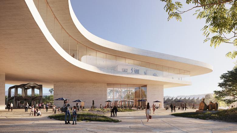
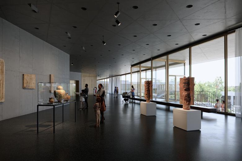
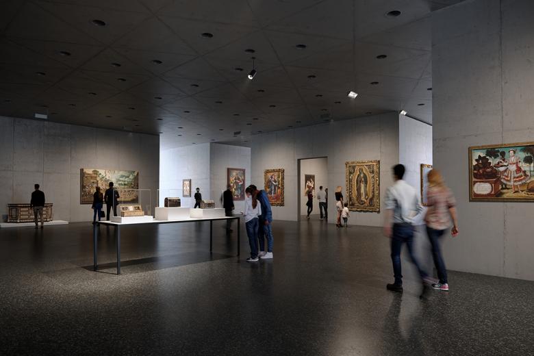
The hyperrealistic renderings of Peter Zumthor's design for the Los Angeles County Museum of Art (LACMA) that were recently made public focus on the gallery spaces that sit behind the glass walls of the curving plan.
Compared to March 2019, the last time renderings were updated and released to the public, the new exterior renderings are quite similar, with one notable exception: the addition of signage reading "David Geffen Galleries." The name comes courtesy of the $150 million that Geffen pledged in October 2017, a major chunk of the building's $650 budget. ($125 million is coming from the County of Los Angeles, with the rest courtesy of private donations.)
The new exterior renderings do take us closer to the building, though, revealing concrete finishes that are lighter than before and free of noticeable joints. Considering that the 100,000-square-foot exhibition level is raised above the ground — and Wilshire Boulevard, which it spans — the finishes of the concrete ceilings are of the utmost importance. In turn, the new renderings hone in on the qualities of light that are being explored in the design of the galleries.
Back in 2017, when some of the galleries were designed to extend above the main roof, the spaces received natural light from tall windows as well as the curving perimeter. Now, with all galleries below the large roof, the only natural light is courtesy of the glass walls at the perimeter, which are shielded from direct sunlight at certain times of the day by deep overhangs but otherwise open up much of the interior to the hazy Los Angeles light. This combination of a bright perimeter and dark interior results in some renderings depicting high degrees of contrast and potential eye strain.
If accurate to the final building (due 2024), what would these light levels mean for how people experience the building? Would visitors first walk the perimeter, for instance, before heading to the semi-enclosed galleries that float within the amoeba-like plan, in order to minimize how often their eyes need to adjust to the different light levels? Or will the lighting designer, in the meantime, develop a plan that allows artificial lights to balance the levels of natural light? Whatever the case, the new renderings raise questions that Zumthor and his team will no doubt be grappling with between now and when the first glass and concrete mockups are erected on site — below the Los Angeles sky.


