'LACMA Not LackMA'
The Citizens’ Brigade to Save LACMA has unveiled designs by six finalists in an ideas competition aimed at providing alternatives to, and correcting the perceived deficiencies of, Peter Zumthor's new building for the Los Angeles County Museum of Art.
Although it's far too late to #SaveLACMA, given that the demolition of four of the institution's buildings is now underway, there is still vocal opposition to the new building design by Peter Zumthor and the process that led to its approval. It's a fairly long process, starting in 2013 with the design's unveiling and culminating last year in LA County's approval of the latest Wilshire Boulevard-spanning design. In the process, the budget for the evolving design increased to reportedly $750 million — all for a building that supposedly reduces the total square footage relative to the buildings being demolished.
That reduction in gallery space is one of nine bullet points that the Citizens' Brigade — a "group of unpaid design professionals, art experts and citizens at large, concerned about the catastrophic impact of the proposed design on LACMA and Los Angeles culture" — has highlighted as inherent problems in the Zumthor design. They contend that all the finalists in the LACMA Not LackMA competition:
- enlarge, rather than reduce, the exhibition square footage;
- build only on the current site, rather than bridge across Wilshire Boulevard;
- save money per square foot, as compared to the Zumthor plan, thereby allowing County funds to be used to better serve its citizens (especially during the COVID-19 crisis);
- place curatorial concerns ahead of making a dictatorial architectural statement;
- provide flexible gallery interiors, not permanent concrete gallery walls;
- retain back-of-house services, including curatorial offices and library, rather than placing them off site;
- tie the Resnick Pavilion and BCAM into the new museum and embrace the La Brea Tar Pits Park and Museum;
- use conventional construction methods rather than expensive high-finish concrete;
- maintain the formal continuity of LA’s memorable Miracle Mile district along Wilshire Boulevard
A jury of "noted architecture and museum professionals" (Aaron Betsky, Barton Phelps, Greg Goldin, Joseph Giovannini, J. Patrice Marandel, William Pedersen, and Winka Dubbeldam) selected the six finalists from nearly thirty designs submitted. They are: Barkow Leibinger, Berlin; Coop Himmelb(l)au, Vienna; Kaya Design, London; Paul Murdoch Architects, Los Angeles; Reiser + Umemoto, New York City; and TheeAe (The Evolved Architectural Eclectic), Hong Kong.
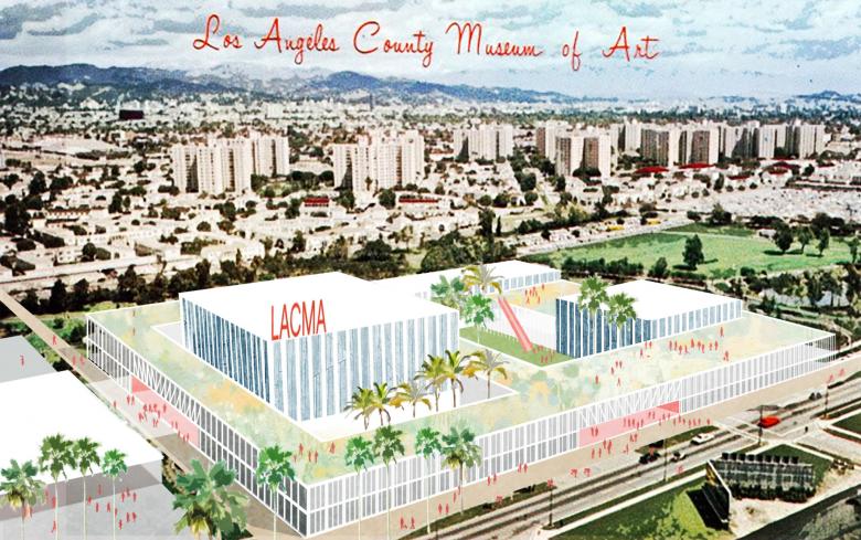
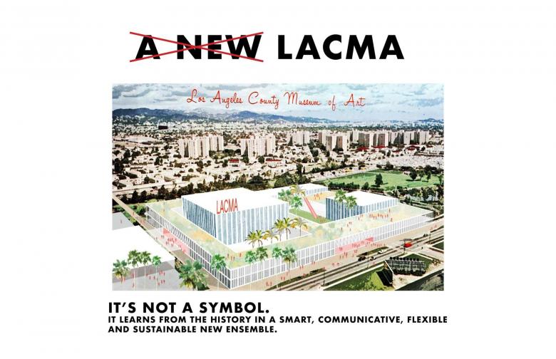
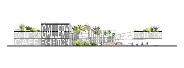
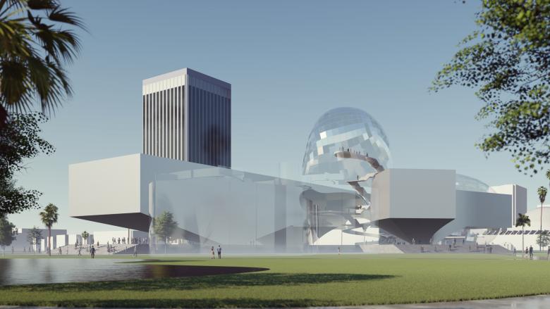
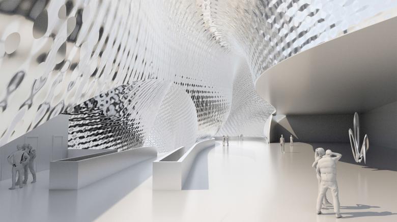
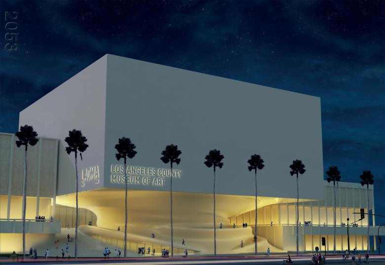
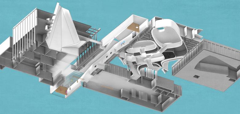
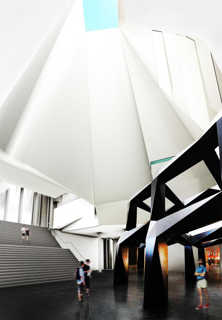
The six designs are split into two groups of three on the competition website: ground-up buildings that assumed demolition would occur; and designs that worked with the existing buildings in the hope they'd be saved. Their designs are briefly described below through images, comments by the jury, and links to their proposals on savelacma.us.
Barkow Leibinger
"The jury thought this flexible, spacious design addressed the changing role of museums by including a good amount of shopping, cafés, and event venues that urbanize the spaces and engender a lively environment. 'There’s a powerful idea of using the area around the pavilions to create a whole new programmed space,' according to the jurors. They enjoyed the rediscovery of the inner plaza and could 'imagine these would be great spaces to be in, as well as fun to discover.'"
Coop Himmelb(l)au
"The jury appreciated the curatorial flexibility of generous gallery spaces, with 22-foot floor-to-ceiling heights, the possibility of mezzanines and intimate galleries, and open floor plates. 'This entry combines issues of great efficiency with moments of drama,' noted the jury. 'The "bubbles" offer exciting spaces that celebrate the public realm while connecting to straightforward, practical, functional galleries in the wings.'"
Kaya Design
"Replacing the 1986 building, Kaya Design proposes 'to preserve the best elements of the past while creating a more contemporary, multi-use alternative space.' ... 'This design achieves a considerable service to the campus, making the east campus more coherent than it’s ever been,' said the jury. 'The biological form of the spiral—as ancient as seashells and hurricanes—gives value to the floors it connects.'"
Paul Murdoch Architects
"The design, according to the architects, is 'expressive of LA in its openness, multiplicity of urban, natural, and cultural connections, and abundant use of controlled natural light.' The jury noted how this horizontal skyscraper—an on-axis version of the neighboring tower across Wilshire—corresponds to the urbanism of the area. 'It restores the continuity of the Wilshire Boulevard street front with a respectful attitude by placing the narrow part of the building facing the street and the broad side framing the park.'"
Reiser + Umemoto
"Reiser + Umemoto’s aim was 'to create a coherent, retroactive masterplan that builds off the campus’ prior successes and seeks to engage and reinvigorate the full breadth of LACMA’s collection.' ... 'The architects found a way to make the plaza into a connective tissue and strategically make the existing buildings work as an ensemble,' said the jury, which also commended the clear circulation that employed new interstitial spaces to move people through the building’s interior spaces."
TheeAe (The Evolved Architectural Eclectic)
"The jury remarked that the dramatic hybrid design would make it a 'destination building' cleverly designed to sustain the urbanity of Wilshire on one side while extending the bucolic nature of the park on the other. 'The Wilshire façade becomes a kinetic wall, imparting a strong urban experience that changes as you drive by, which is how most Angelenos experience the city,' noted the jury. 'The back façade, a built hillside, is a landscape event that adds a surprising new participatory dimension to Hancock Park. This will be a hill you want to climb.'"
