Erie Art Museum
Erie Art Museum
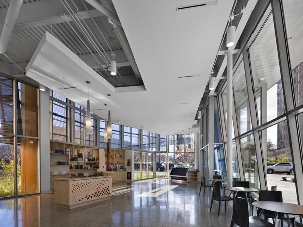
As green building becomes the norm rather than the exception, green features in a design can read like a laundry list of the same components and systems: low-e glazing, lo-flow toilets, recycled materials, etc. These features are certainly good, but they have become relatively easy to accomplish within even tight budgets. But sustainable thinking that goes beyond these standards to questions a building’s use is both innovative and rare. Such is the case with EDGE studio’s addition to the Erie Art Museum, where the wastefulness of exhibition design is addressed in the design of the new galleries. The architects answered some questions about their design, which is marked by a dynamic new entrance.
What were the circumstances of receiving the commission for this project?
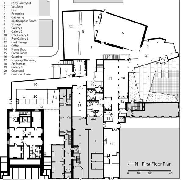
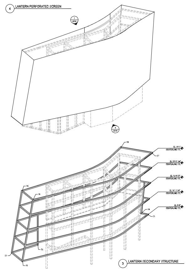
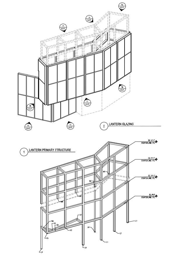
EDGE studio received the commission for this project with our response to a short list RFP (Request for Proposals) that included architecture firms from across the country. Our design team resisted the temptation to recommend design solutions within our proposal, realizing that the project and site considerations were incredibly complex. The addition connects three discontinuous buildings on an urban block and the site of the addition is an irregularly shaped parcel that is very narrow along one end. Additionally, one of the existing buildings is a Historic Landmark and so the project was required to meet standards set by the US Department of the Interior. Consequently, coming to any conclusions during the proposal phase would have been extremely premature so our proposal focused upon elucidating the assets of the existing spaces and how these could be enhanced by an addition. We also clearly illustrated an understanding of the design issues and criteria specific to this project, along with the technical considerations critical to museums. Sometimes the proposal of a design solution can win the job, in this case, it would have been detrimental.
Can you describe your design process for the building?
This project was constructed on a highly restrictive budget averaging under $185/ sf for new and renovated space. This is a very low cost-per-square-foot for the museum building type which has a large percentage of finished public space and costly technical requirements, including specialty HVAC and lighting. During the design process, a number of cost estimates were produced, all of which resulted in design changes. Nearly every element of the project was challenged, from the volume of new space to the materials of the exterior envelope and midway through the design, scope was added to the project. A team approach, involving the collaboration of the design team, the Owner and the Construction Manager ensured that decisions were made with the input of all involved. Physical models and computer models were created as the design evolved to inform both the design and the construction. Despite this, the projects primary goals remained constant. These included creating a new entrance that would differentiate itself from its context and provide a recognizable identity, creating a public gathering space with an associated free gallery space, and providing a variety of exhibition spaces along with a multipurpose performance, education and event space.
Because of the complexities of the site- integrating 3 existing buildings with one addition, a strategy was developed around the visitor experience and “tour” through the complex that is enhanced by the inevitable transitions through different structures and spatial scales. From the exterior entrance plaza and lobby through the new galleries to the historic gallery spaces, the multiplicity of spaces and the varied artistic media that they support are all celebrated as a part of the experience.
How does the building compare to other projects in your office, be it the same or other building types?
At EDGE studio, we have not had the luxury of working with clients with substantial budgets relative to their aspirations. We have, however, had the good fortune to work with clients who understand the value of architecture and space as elements that support social well being. Across a number of building types, from museums and libraries to higher education and transportation spaces, we have found creative ways to give shape to space and to advance the importance of the built environment within their contexts.
How does the building relate to contemporary architectural trends, be it sustainability, technology, etc.?
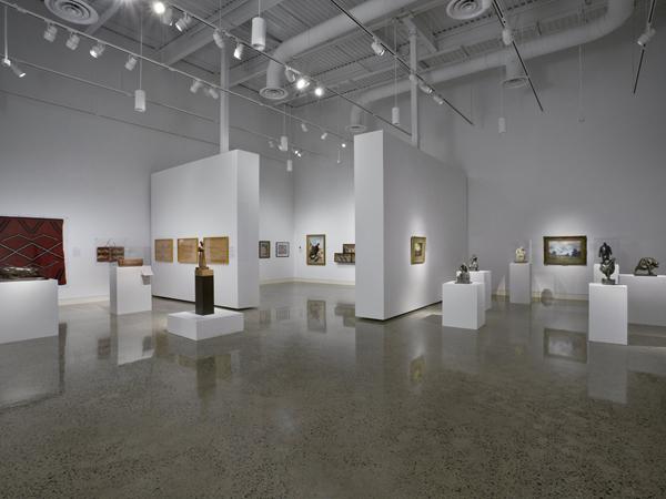
An enormous factor in both operations and materials expenditure within the museum type is the need to constantly recreate the exhibit space as exhibitions change. The creation and installation of temporary partitions to hang artwork and to define the viewing experience utilizes tremendous resources, both materially and operationally. From a survey presented at the International Exhibition Organizers Conference in April 2008 that included an international spread of 85 organizations, 31% of those who use temporary display partitions do not recycle their materials. This is in large part due to the lack of storage space for this material, a limitation that EAM also recognizes.
The new addition, which incorporates a high bay, 1700 sf gallery along with smaller galleries, is designed with three large, pivoting panels in the main gallery. These panels, the largest of which is 26’W x 16’H x 2’D, permit a variety of gallery configurations, including 64 right angle arrangements without the need to rebuild for each unique changing exhibition. Valuable staff time can be utilized for exhibit planning and management, instead of building panels. Additionally, the panels remain in place, allowing valuable storage space to be retained for artwork. Critical to the operations of the museum, this idea was generated during the initial planning phases of the project.
During construction, another system of movable panels was developed to support a second floor gallery. With this system, panels can be ‘parked’ in the space and become perimeter exhibit walls when not utilized to reconfigure the space. Green roofs, low water use plumbing fixtures, permeable paving, a permeable stormwater removal system, a tight, insulated envelope, and an energy efficient mechanical system that performs to the high standards set for display of art by the American Association of Museums all contribute to a building designed to reduce operational expense and to limit environmental effect. The project is in the review process to receive LEED Gold Certification.
E-Mail Interview conducted by John Hill
Erie Art Museum
2010
Erie, Pennsylvania
Client
Erie Art Museum
John Vanco, Director
Architect
EDGE studio
Pittsburgh
Design Principal
Anne Chen, AIA, LEED AP
Project Manager
Jonathan Golli
Project Team
Matt Fineout AIA
Stephen Mrdjenovich
Matthew Manzo
Swee Hong Ng
Adam Beaulieu
Structural Engineer
DeSimone Consulting Engineers
MEP/FP Engineer
Firsching Marstiller Rusbarsky & Wolf
Landscape Architect
Dahlkemper Landscape Architects
Lighting Designer
LAM Partners, Inc.
Interior Designer
EDGE studio
Construction Manager
Spaulding Banks Project Management
LEED Consultants
evolveEA
Insulated Metal Panel
Centria Architectural Systems
Glazing
Kawneer
Retroplate Concrete
Hoehl and Associates
Sound Control
AVT/ Kinetics Noise Control
Synthetic Concrete Reinforcement
FORTA Corporation
Building Area
57,000 sf
Photos
David Joseph

