Merkur – Hoher Markt Premium Store
Hoher Markt 12, Vienna, Austria
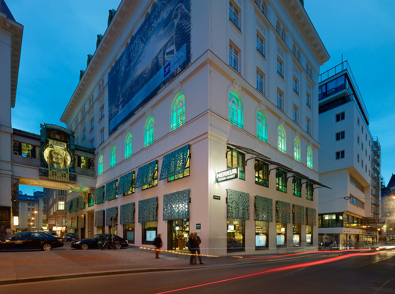
At Hoher Markt, one of the oldest and historically most important places of Vienna, Rewe Group´s new flagship store Merkur Hoher Markt opened in the heart of the first district. The place which has always been a crucial marketplace and central meeting point in Vienna still represents a popular and much-frequented spot and tourist destination, particularly because of the well-known „Anker“ Clock.
Due to strict regulations from the city and our own awareness of the importance and peculiarity of the location, it was clear that a plain supermarket with the usual, loud and bold corporate identity was not to be built. On the one hand, the new facade should integrate itself smoothly in its environment. A clear, long-distance and close-up effect without breaking out from the surrounding area should be provided. Simultaneously, it should be clearly visible that the supermarket represents modern Merkur delicacies.
The building contractors/clients asked for a modern and pioneering/visionary supermarket. Visionary does not mean to create a fully automated and technoid supermarket, but to be responsive to the location and its environment. Our task was to re-interpret ornamentation and materials (copper, brass, hand-painted tiles, wood etc.). We installed sun protection panels for the facade which are broken by a leaf pattern and create a play of light and shadow on the pavement and the interior. The panels consist of pre-weathered copper which has a coating of verdigris. The colour green does not only adjust itself perfectly to the surrounding, but may be related to the shade of green of Merkur´s corporate identity.
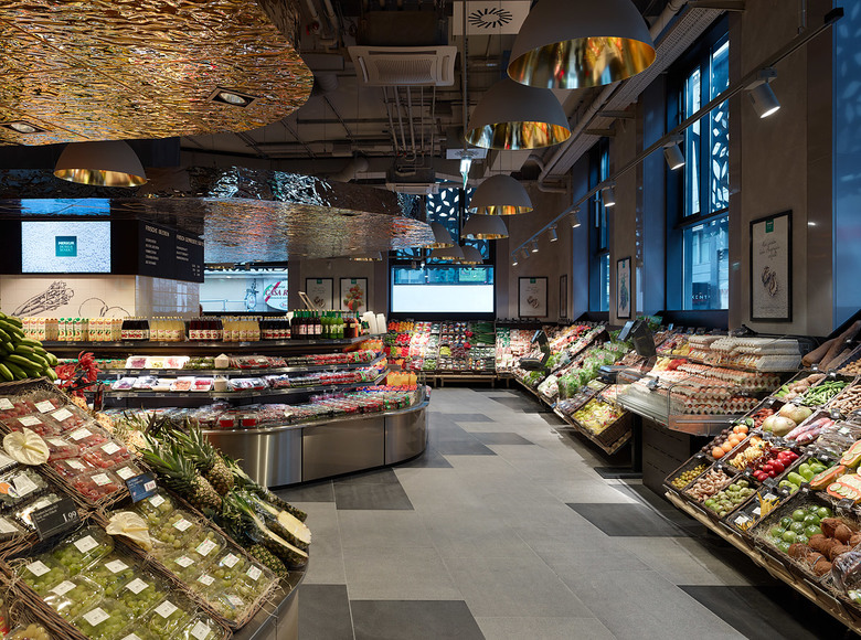
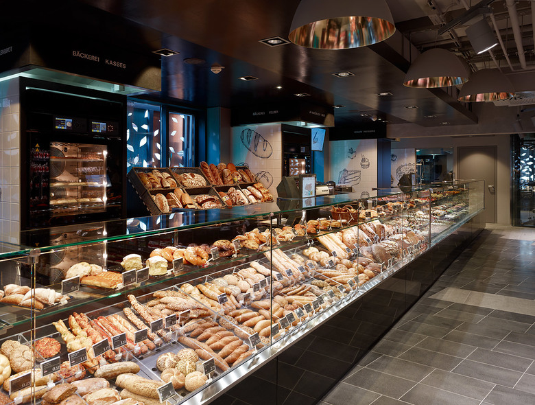
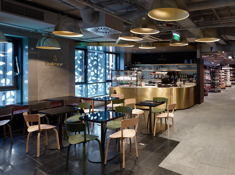
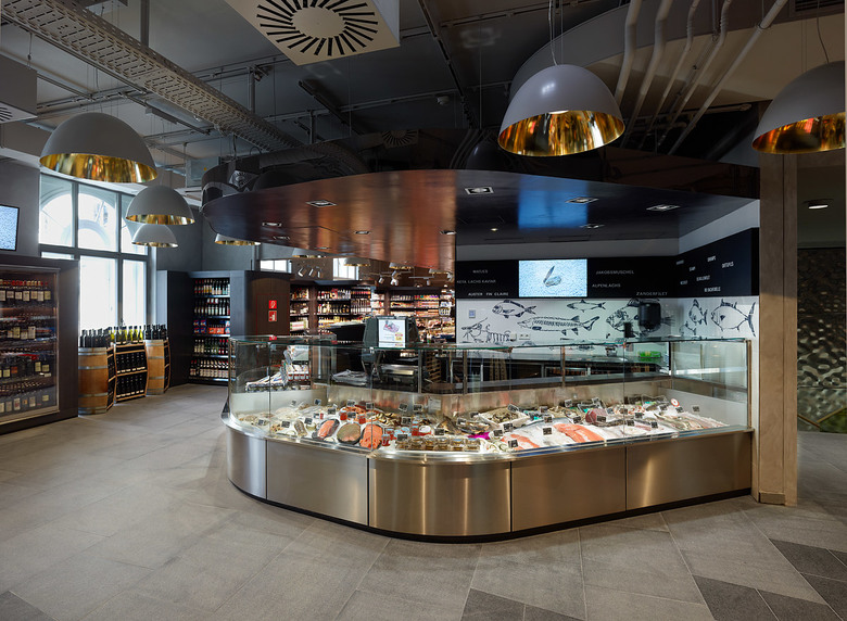
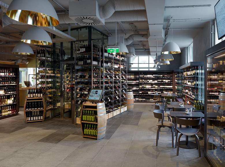
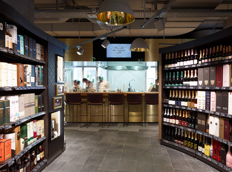
We also made use of classic materials for the interior and re-interpreted them in new trying different surface structures. Flooring, walls, ceiling and furniture are primarily held in shades of grey which are selectively complemented by brass, polished steel, stone and wood. The goal was to establish an environment which highlights the value of products and goods.
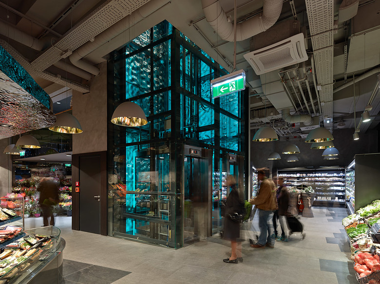
In contrast to conventional Merkur supermarkets, the subsidiary at Hoher Markt offers only food assortment, partly exclusive products. The whole salesroom is divided into three levels. The idea behind the zoning is that attractive products should encourage the customer to visit the other zones. The first floor provides a Dallmayr Cafe with special tea and coffee sorts, while the second floor houses the restaurant “Kim kocht” and a broad wine section. The levels can be accessed via staircase and three panoramic elevators which make space and goods vertically experienceable.
- Architects
- BEHF Architects
- Year
- 2012
- Project Status
- Built
- Client
- Merkur Warenhandels AG
- Team
- Planning: BEHF Architects, Design Architect: Armin Ebner, Project Management: Anja Merz, Head of Design: Hugo Feisthamel, Planning: Ellen Gehrke and Katharina Koschitz, Construction Supervision: Erich Grassler, Construction Supervision: Fanny Stöcker, Construction Supervision: Gerald Hecht
