Dental Surgery
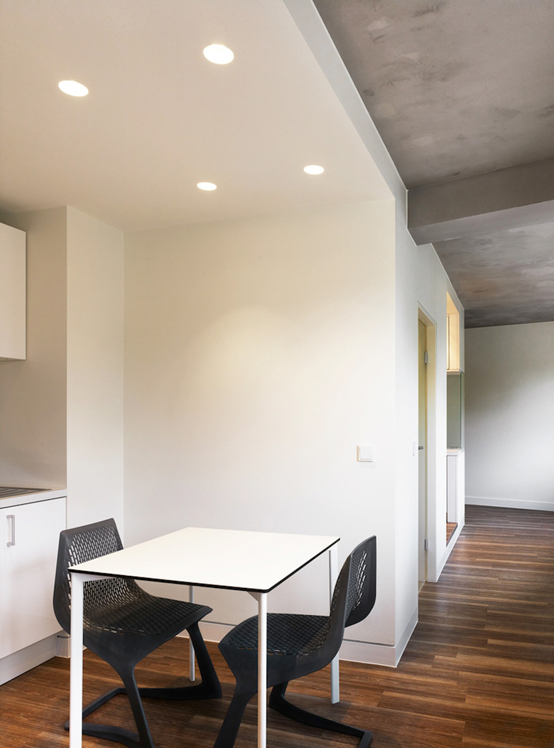
Düren, Germany
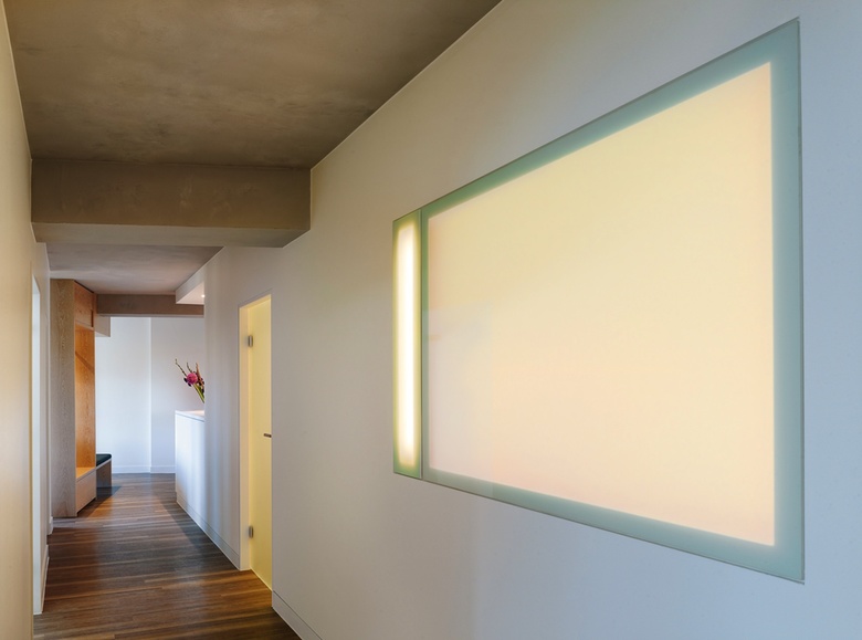
The 150 m² existing dental practice corresponded in both space and material technology no longer meet today's requirements. Within three weeks (holiday practice) should the conversion be implemented. Due to the time restriction, the project was divided into two steps. First of all the reception area, the anteroom, the sanitary fittings, the teakitchen and the room for sterilization were rebuilt. In a further step, the treatment rooms, a laboratory and the X-ray room adapted to today's requirements. The reinforced concrete structure of the building allows a high flexibility of the Floor plan design to. This freedom was elevated to the concept and all non-load bearing walls terminated. In discussions with the physician and the practice team, the desire for a large crystallized out whilst transparency, intimacy possible. Such a center was established, which was placed in the free blocky, loft-like space and is surrounded by the traffic areas. This block takes the reception rooms, back office, staff changing, personal toilet, kitchenette, room for sterilization and the patient-wc on. The corridor rooms, reception, Personnel flow into each other, there is no massive set limit. The anteroom is left at the same place certainly closed by a massive wall. A floor to ceiling glass wall with integrated wardrobe furniture allows a high degree of transparency and provides a sound protection. The color scheme corresponds to the reduced form of language. The reinforced concrete ceiling has been restored and refined to a concrete point of view. All the walls are smooth and primed and painted pure white, thus forming an exciting contrast. The floor is a vinyl flooring, decorated in wood optics (limed oak). This floor exists in all of the rooms and froms a "warm" basis. All furniture is made individually. The cabinets are the core with white laminated boards and furniture in the waiting room with whitewashed oak occupied. In the toilet rooms, the patients found in the wall tiles, the red of the practice logo as a subtle "anchor" again. The light follows the design concept in a consistent manner. Thus, waives any light in the traffic areas. The selected block is used as a lamp shade and light up the gears from atmospheric.


