Das Gerber Shoppingmall
Württembergische Lebensversicherung AG owns a 14,000 m² plot of land at the south-western end of Stuttgart’s city centre. Its former company headquarters were demolished in 2011 and replaced by an ambitious new urban development, comprising of retail, office and residential space. The competition for the building and external design was won by architectural firm Bernd Albers Berlin, while we were commissioned to design the interior for all public spaces and to develop a guidance and orientation system.
The interior was designed to position the GERBER as a key location and leading city address. Its main axes successfully negotiate the terrain topography and connect the city centre with its neighbouring quarters. The GERBER itself is more of an urban boulevard than a mall. A high-end design throughout makes it viable in the long term, while remaining a low-threshold location for those less interested in luxury. Trademarks of the mall include its high quality environment, easy orientation and spatial elements with a strong recognition value.
Access to the public areas of the GERBER is provided via entrances set at three of the four corners of the building. Thanks to its strategic position at several crossroads, shoppers are guided straight into the mall from the surrounding streets. The two entrances on Tübinger Straße lie at ground level whereas the Marienstraße entrance is one level higher. This height difference coupled with the non-linear layout of the main shopping trajectories within the mall make a clear and precise guidance system indispensable.
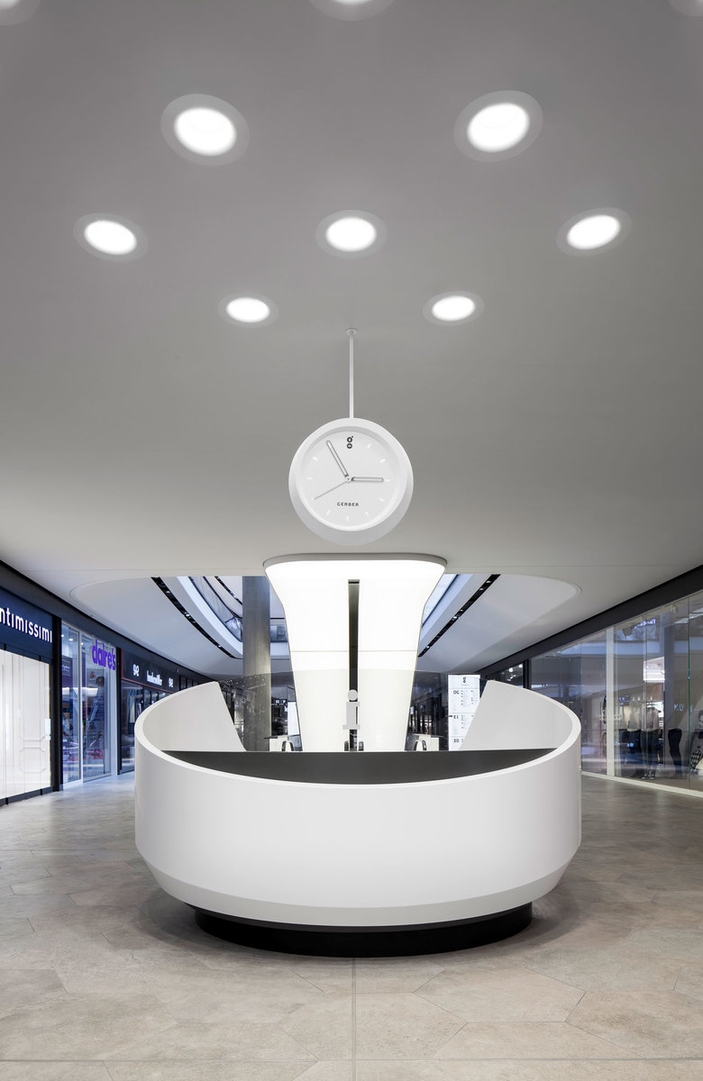
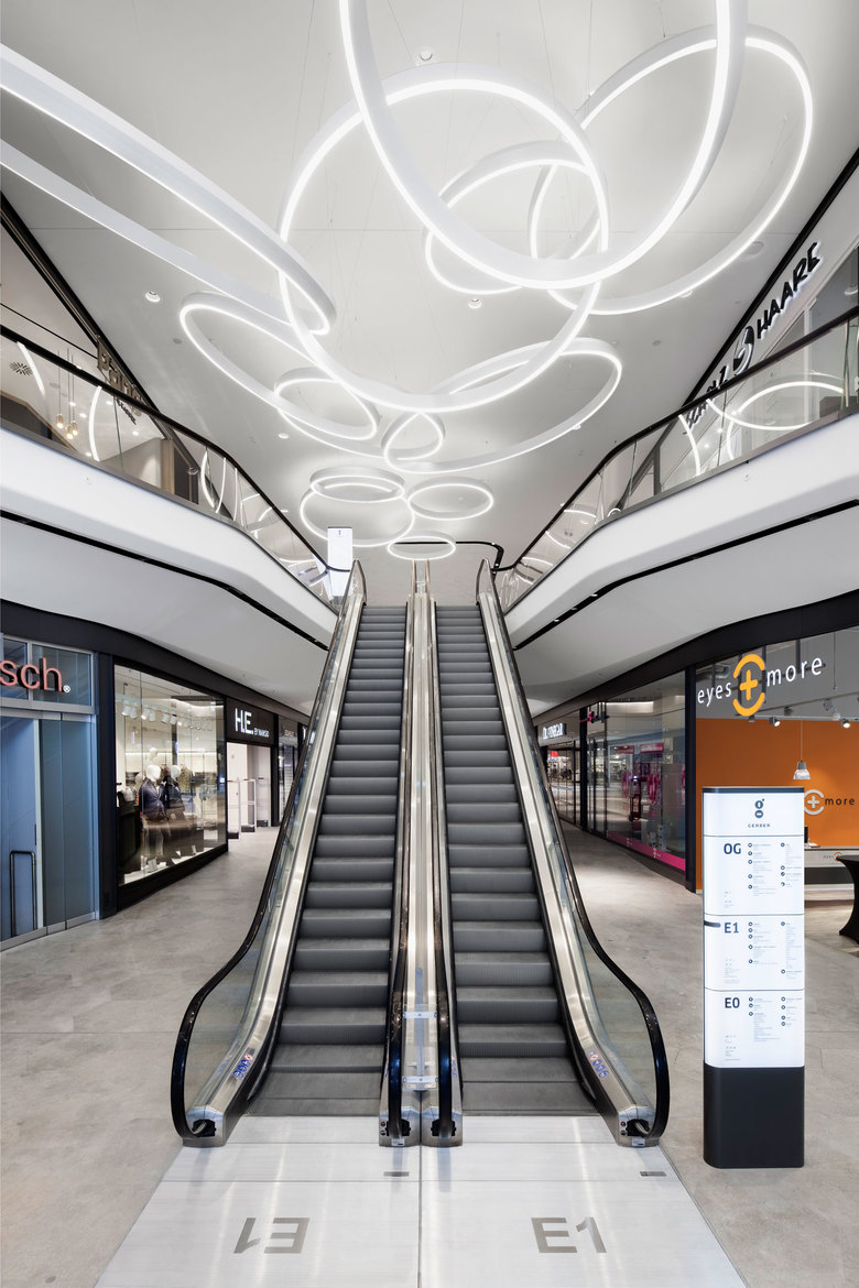
The entrance areas already introduce key themes of the interior design. A central element of the interior identity are light rings whose shape echo the GERBER logo – a letter ‘g’ constructed from two circles. The positioning of these rings responds to the respective entrance situation. At the narrow, steeper entrance at the eastern corner, an interlocking, linear chain of rings accompanies the visitor upwards. While at the wider northern entrance, they explode across the ceiling in a wide arc. At the third, single-storey entrance, curved bands of light integrated into the ceiling adapt the theme while tracing the route that forks here. The theme of intertwining rings thus creates a signature address for each entrance. The light rings reach their pinnacle at the very heart of the mall where they entwine a column and extend upwards to form a tree of light piercing all three storeys.
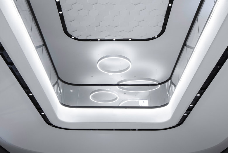
Incised airspaces create visual links between the different levels of the mall. Rounded ceilings and balustrades give the space a flowing appearance and emphasise its verticality. Glass sides make the ceiling layers appear less weighty, revealing shop façades on other levels and attracting shoppers to continue their shopping spree there. The monochrome colouring of all public areas adds a note of elegance. The lack of colour also deliberately avoids visual competition with individual shop façades.
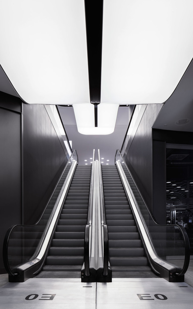
The flowing movement is continued in the curved edges of the shop façades. A handbook for store façade design was developed to ensure a cohesive look throughout the mall’s interior. The spatial feel and high-quality materials used for the façades underscore the its positioning in a more high-class retail segment. The shop façades are additionally brought into line by a continuous, warm dark grey façade screen. Its horizontal line traces the exterior borders of the public areas and serves as a means of orientation. Black light channels set into the ceiling and dark wooden hand rails support this effect by circumscribing the spatial apertures. The play of black lines is completed in a dark strip running down the back of the back-lit escalators. Each escalator serves as a striking light object and an important horizontal orientation point.
A stoneware floor is laid in all public areas, including those leading to the toilets, elevators and stairs. An hexagonal tile has been used to reflect the pavements in the surrounding urban environment, which thus appears to be continued in the interior of the mall. The hexagonal shape does not impose a particular direction on the shopper, instead inviting one to tarry and browse, while still clearly denoting the route. The GERBER is designed to unite the shopping experience outside and inside the mall, making it not just a shopping mall, but a fixed point in the urban scene. The shape of the floor tiles recurs in the ceiling design, where they are tilted and offset to form relief accents.
The GERBER introduces a new retail boulevard and highly desirable location for the modern shopping experience. Flowing movements guide the consumer down a bend into the mall and create a light atmosphere with soft transitions and generous visual connections between the three retail levels. The design of the interior space effectively entices the city indoors.
Client
Phoenix Real Estate GmbH
Size
5500 sqm
Team
Gunter Fleitz, Peter Ippolito, Michael Bertram, Katja Heinemann, Tilla Goldberg, Axel Knapp, Tim Lessmann, Frank Peisert, Hatice Bilal, Jonas Hertwig, Lara Scholl, Magdalena Bauernfeind, Leonie Beck, Monther Abuhmeidan
Lighting Design
pfarré lighting design, München
- Year
- 2014
- Project Status
- Built


