More Design Office (MDO)
Jian Li Ju Theatre
The Jianliju theatre company, in an interesting examination of typology, offers a unique spectator experience where the audience plays an integral part of the performances and productions. As such the brief for their new premises in Shanghai demands a careful architectural approach to the relationships between space, event and movement.
MDO, the architects selected to take on this mantle, have addressed these conditions with a deliberate and exaggerated exploration of form, lighting and circulation.
Project: Jian Li Ju Theatre, 2017
Location: East Hongsong Road, Minhang District, Shanghai, China
Client: Jianliju Theatre Company
Architect: More Design Office (MDO)
Signage: Evelyn Chiu
Size: 930m2
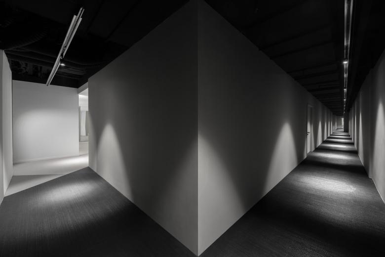
The practice has taken the cinematic expression of film noir and applied its heightened sense of drama to the atmosphere within to create a sequence of contrasting spaces that read as a montage of screenshots from a film reel.
With work of this nature, the architectural theory of Tschumi, especially the 1976 Screenplays project, is never far away and many of the formal strategies employed by MDO directly reference the parallels with screen editing and the time-space nature of architecture. Tools such as distortion, repetition and superimposition often used by the great directors of the film noir scene have all been applied as a method to soak the interior with all the atmosphere of a 50s Hollywood melodrama.
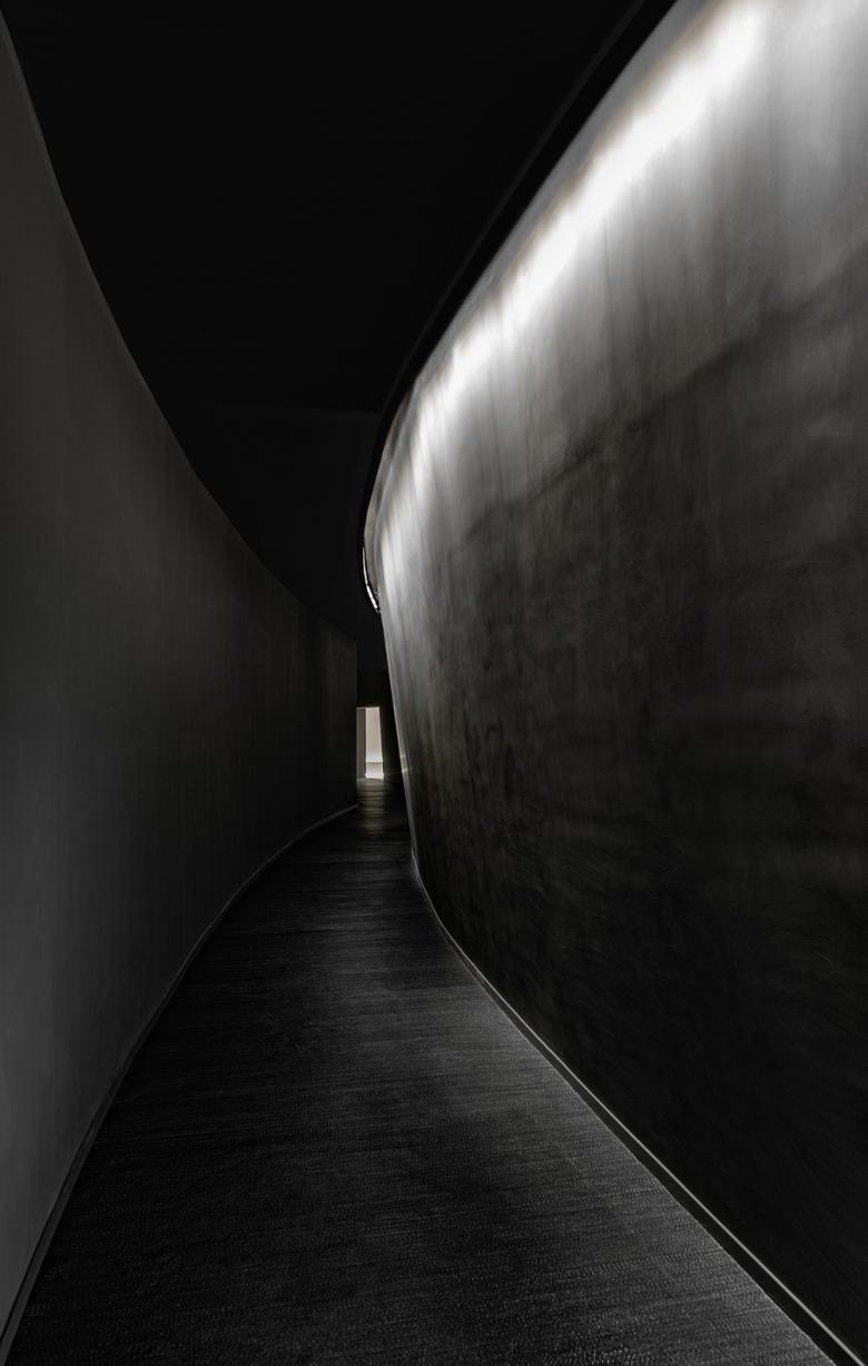
The theatre is accessed off a nondescript side-street in central Shanghai, the entrance door hidden at the back of an antique furniture emporium. Visitors only arrive with a time, location and number. From the door, a stair leads down into the darkness and from there the circulation seeks to create a sense of departure from the world outside, a deliberate act of disorientation initiated by a dark curved corridor that emphasizes low-key lighting andleads to the spaces inside.
The functions are organized into a linear arrangement of spaces, where the visitor is prevented from going backwards, as if following an unknown figure through the street at night.
The palette is simple throughout, monotone, minimal with a hint at texture through the treatment of the plaster to give a lustre and depth to the spaces.
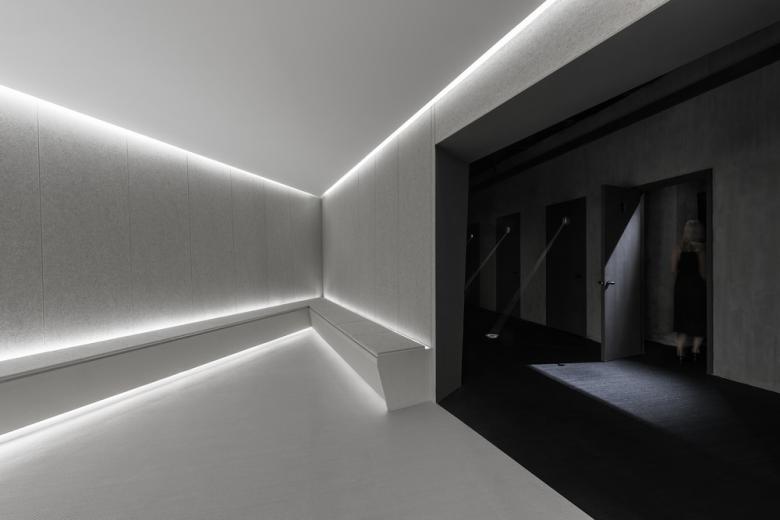
In contrast to the threshold sequence, the lobby is bright and lined with acoustic paneling on the walls and benches creating a closed and soft environment—a moment of respite before the performance begins and the drama is further heightened.
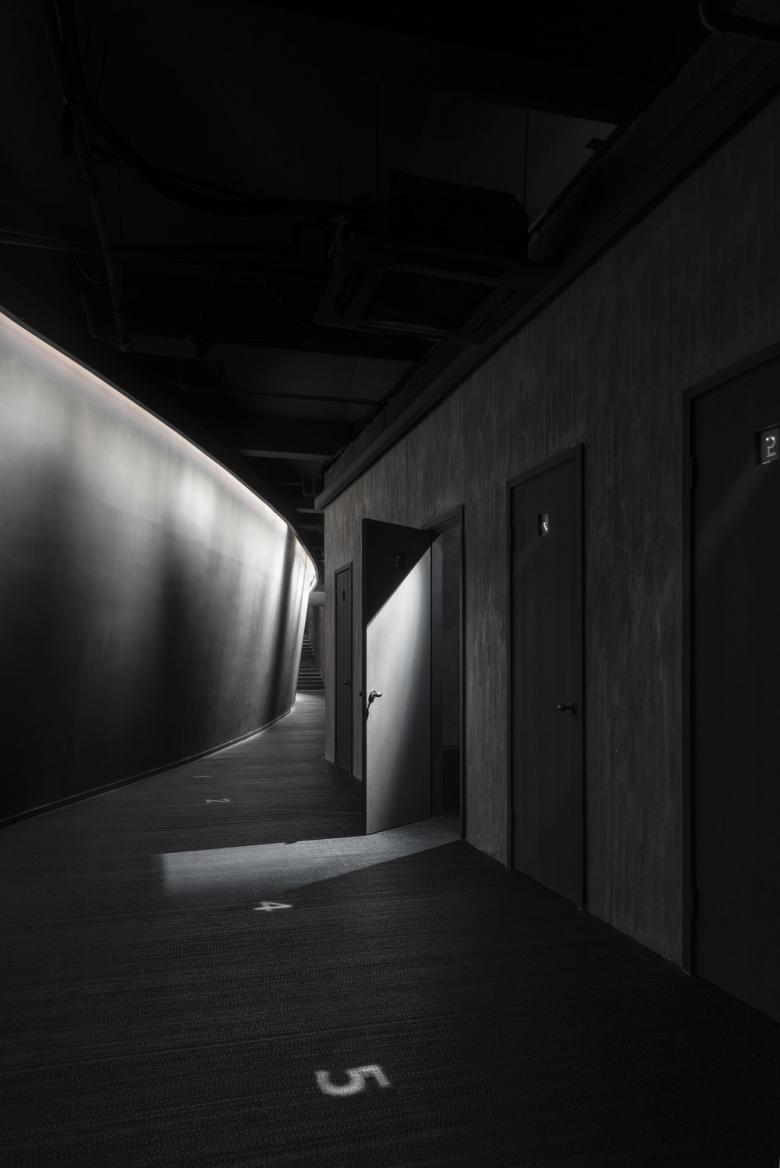
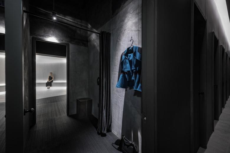
When it is time, each participant in the production enters a small changing space, highlighted by an eerie number projected from a pinhole aperture on to the dark corridor floor. In this space, reminiscent of a Lynch production set complete with heavy velvet curtains, they are provided with a script and transform into character.
They emerge from a costume change into a small anti-chamber where the four enclosing walls are asymmetrical, an unsettling space where the main focus is on a number displayed through a magnifying glass giving stage directions to the participating actors waiting in anticipation.
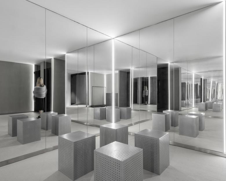
After the show concludes the sequence finishes with a hall of mirrors, one final nod to the film reel and the cinematic traditions that their design engages with. Given this final space is predominantly used for photographs and selfies, their last note is intentionally witty, a critical reflection on the ambiguous relationship between actor and audience that their architecture has curated throughout.
Related articles
-
The Three-Body Problem: Trapped in a Wave Sandwich
Eduard Kögel, Scenic Architecture Office | 13.04.2026 -
-
-
A Loop for the Arts: The Xiao Feng Art Museum in Hangzhou
Eduard Kögel, ZAO / Zhang Ke Architecture Office | 15.12.2025


