An Archipelago of Projects
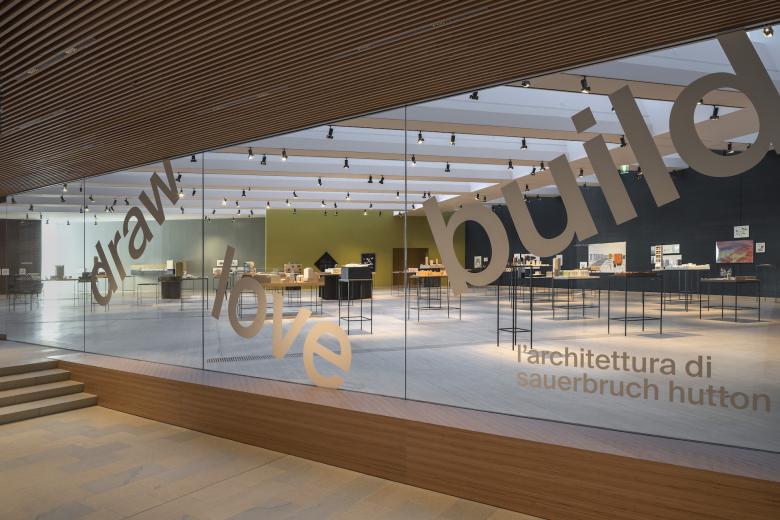
The M9 Museum of the 20th Century in Venice-Mestre is hosting draw love build, a large exhibition on thirty years of the work of Sauerbruch Hutton, the architectural practice that can boast of M9 as one of its flagship designs. Ulf Meyer visited the exhibition after its September 3rd opening and filed this report.
Mestre is to Venice what New Jersey is to New York — it ain’t pretty, but it is (all too) real. In this twin city to one of the world’s greatest tourist magnets, Sauerbruch Hutton, arguably one of Berlin’s best architectural practices, designed the shiny new M9 Museum. Completed in 2018, the building tries very hard to stitch together a cultural center for this city using broad urban(istic) gestures. The unique red ceramic facades make M9 indicative of Louisa Hutton’s taste for “families of colors,” apparent in museums designed by the firm since the inauguration of the Museum Brandhorst in Munich in 2000.
The (overly?) ambitious museum in Mestre seems like an appropriate place to host draw love build, a retrospective of this successful architecture firm. Matthias Sauerbruch and Louisa Hutton founded their eponymous practice in London in 1989 and four years later moved it to Berlin. In the early 1990s they established a British understanding of sustainability in architecture in Germany, combined it with sensual colors and soft edges. The exhibition in Mestre documents their work from this beginning until today, highlighting two main themes: working in the post-industrial city and finding new ways for a more environmentally friendly architecture.
The architects themselves do not mention an extensive use of color and organic shapes as their credo, but this has long been their trademark, at least since their first big success, the GSW Building in Berlin, near Checkpoint Charlie. Sauerbruch Hutton’s design abilities reached a crescendo in the design for the Federal Environmental Agency in Dessau, where they took the chance to learn from the failed experiments (e.g., the chimney effect in the double facade never met the intended results) that GSW ended up representing.
Now, the British-German couple (personally and professionally) states that “sensual and surprising spaces and materials and a curiosity for innovation” are the fil rouge of their oeuvre, although the general public would probably argue otherwise. Surprisingly little has changed in their design approach over the last three decades since their first buildings were completed. The only major change is their disillusionment with technology as a way to help save energy in buildings. In German, their design attitude is described by the phrase rund und bunt (round and colorful), but this wonderful play with words unfortunately does not rhyme in English. Still, references to the shapes of the (supposedly) innocent 1950s are omni-present in Sauerbruch Hutton’s work.
The title of the exhibition, draw love build, is terrible, because it gives the show an infantile touch that is not deserved. The exhibition is beautiful and well crafted, with projects presented in models and drawings like anywhere else, plus a 2013 documentary film by Harun Farocki, but there is no text anywhere. Only an app for tablets and smartphones enables visitors to access photographs, drawings, texts, and videos about the exhibited projects. Sauerbruch Hutton used this technology before, when Sauerbruch curated architecture exhibitions at the Academy of Arts in Berlin, and although it is meant to be modern it is no fun to look at a screen and scan QR codes when surrounded by beautiful artifacts.
Every single one of the 60 models and 100 drawings is attractive. The exhibition resembles an archipelago of projects, shuffling times and locations but still narrating a journey and presenting connections between buildings. Visitors have to find their own key as they wander around freely. There are no captions; the archipelago-like setting ignores chronology and location. The polychromatic treatment of the walls in the large gallery gets to point: the awareness of the kinetic perception of architecture that Sauerbruch and Hutton developed has brought about a fragmentation of their color palettes.
But what makes the exhibition at M9 special is, of course, that the museum was designed by the Sauerbruch Hutton. The conversion of the Convento delle Grazie, in which it is situated, is a great example of their design ethos for urban regeneration, and here it represents a rare chance to exhibit architecture by the same architects responsible for the exhibition's container. Their M9 scheme opened up an inaccessible part of the city used previously by the military, extending the small-scale urban tissue with pedestrian connections that allow this part of the city to provide new attractions at ground floor within a fragmented and patchy urban fabric. Since the exhibition is on the third floor of the museum (a new exhibition on the first floor, about architectural changes to Venice in the 20th and 21st centuries, is also worth seeing), a view of the center of Mestre, presented to visitors from a terrace, marks the culmination of the experience.
相关文章
-
The Three-Body Problem: Trapped in a Wave Sandwich
Eduard Kögel, Scenic Architecture Office | 13.04.2026 -
-


