Vertical Garden Apartments
Mexico City, Mexico
The lack of green areas, noise contamination and air pollution force people out of the city, or in the best case, oblige them to live in the suburbs and work in the city. But when you live in Mexico City, living in the suburbs means driving for at least two hours to get to your daily job, meaning this is not a viable option.
The young Le Corbusier was deeply troubled by the cramped and dirty conditions and the poor quality of life cities had to offer to their inhabitants so in the early 1920s he conceived the “Plan Voisin”: sixty-story cruciform towers placed in an orthogonal street grid and park-like green space. With this he hoped to transform contemporary cities into huge mega parks where the whole population could enjoy the open space and the natural elements as they were meant to be.
What if you didn’t have to choose between living in an apartment in the city or in a house with a garden in the suburbs? What if you could have both?
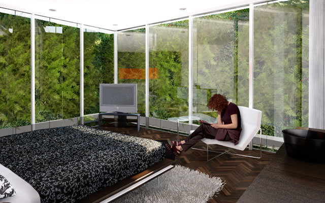
When an apartment building in Polanco was commissioned, the ambition to merge the urban and the suburban into a single expression led us to design a project that could enjoy a large garden in a relatively small plot: a 700 m2 garden in a 450 m2 plot. How? By turning the garden on its side, folding it and wrapping it around three sides of the plot. By then separating the building from the plot boundaries and cladding the facades with glass, all the living spaces could have a full experience of the vertical garden.
To spice up what appeared to be a very simple idea, we decided on exploring John Hejduk’s Wall House Studies. The Wall House Studies examined the wall as an architectural element both as barrier and connector, a plane that dictates the architecture of the houses and the lives of the inhabitants. In Wall House 2 the rooms are cantilevered from the wall and the only course of movement between them is a spiral stair on the other side of the wall.
Here Hejduk experimented with space and time, shunning contemporary house design which placed an emphasis on spaces flowing together without definitive boundaries.
In order to take the Hejduk studies a step further we created a wall that was absolute: it served as structure, contained the elevator as well as all the staircases and enclosed the vertical shafts, water and drainage pipes and electrical conduits. It also housed the service quarters, storage and visitors restrooms.
Complexity comes into the equation by mixing the distribution of the living spaces within the apartments and turning them into interlocking shapes that assemble like a 3D Tetris. On one side of the wall an apartment’s public areas can be on one level while on the other side of the wall the private areas can be on another level. This way the wall distributes, divides and connects the apartments, creating a richer mixture and experience of space.
Vertical Circulation System:
Like this Escher litograph, the apartment building has a lot of stairs for only 4 apartments. In the picture the stairs lead to nowhere since it’s only meant as an illusion to trick the viewer, but in the building each apartment has its own private staircase starting from the parking level. This is achieved through scissor-like intercrossing staircases contained within the wall.
The vertical garden gives absolute privacy to the interior spaces and achieves the oxymoron “private openness”, apparently a contradiction in terms, but an ingenious solution that allows the inhabitants to have a full experience of the exterior and its natural elements without having to worry about privacy issues: nosy neighbors and prying eyes from the street.
It will also function as a lattice wall aiding in lighting, acoustic and temperature control issues. The need for curtains is eliminated but obviously not prohibited!
With the mixture of simple elements in a complex formula we created added value and achieved a much more interesting experience of space that completely differentiates itself from the repetitive and typical “Loft” branded apartments selling in the area. In short, we achieved SIMPLEXITY.
- Arquitectos
- BNKR Arquitectura
- Ano
- 2009
- Status do projeto
- Under Construction


