New Zen-sations
Two of Paris's most iconic buildings have been transformed by two of Japan's most famous architects: Tadao Ando has redesigned the Bourse de Commerce and SANAA has reworked the La Samaritaine department store. The projects, both commissioned by French billionaires, were nearing completion but have seen their public openings delayed due to the coronavirus pandemic.
In Paris, both Tadao Ando and SANAA have redesigned existing buildings that are of high historic value and in prime locations, were originally designed for trade, and now serve display purposes. However, the design approaches of the two Japanese stars are world's apart: Ando creates heavy monolithic architecture in concrete while SANAA's style is as ephemeral and light as can be. Both architects are nearing the ends of their careers, although Ando is much older. Still, his architecture feels fresh.
Ando: a dialogue with history
The architect from Osaka has designed remarkable buildings all over the world, but it was his European projects for fashion houses that first exposed him to working with architectural history. It started with the “Fabrica” building for the Benetton family in Treviso, Italy in the 1990s. Soon after this Ando started to collaborate with François Pinault on several projects in Venice. First were the renovations of Palazzo Grassi and the Teatrino, where Ando adopted a self-confident attitude towards valuable historical buildings. Later, Ando converted the former customs office of Venice into the “Punta della Dogana” museum of contemporary art, also for Pinault, one of the richest men in France. In Paris, Ando was hired to convert the Bourse de Commerce in Paris into a magnificent gallery for the private “Collection Pinault.”
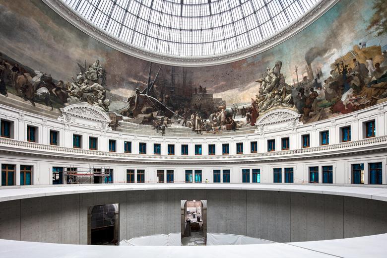
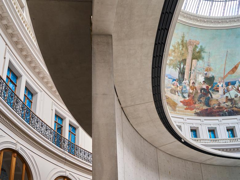
Ando’s intervention echoes the Bourse’s circular plan. A concrete cylinder, pierced with only four openings, is inserted into the building and surmounted by a great “oculus” that allows natural light to filter into the building’s core. This center, used to store wheat before acting as Paris’ stock market, has become a space in which to experience art. The existing grand glass dome controls the light, bathing visitors in it and turning them into “actors in a scenography intended to remove them from their daily lives,” according to the architect. The pure geometry of the nine-meter-tall concrete cylinder should prove strong enough a shape in accommodating the various media contemporary artists use.
Nicolas Le Camus de Mézières, the building’s original architect, wrote in his essay “The Genius of Architecture” that “it is not enough for an architecture to please the eyes, it must also touch the soul.” Ando, too, tries to turn the former Bourse into “an emotional space” for surprising encounters between a rich past and the modern presentation of art. Ando’s trust in pure geometries is usually justified; it gives his designs a lot of power. Here, a double-spiral in the central rotunda with its long ramps will create a perpetual movement of visitors, animating the space. The bare exposed concrete walls have precise details, sharp corners and smooth surfaces that are Ando’s signature. His work in Paris resembles the central cylinder of the Benesse Art Museum, an unforgettable space on the Naoshima Art Island in Japan’s Inland Sea.
In the Paris museum, too, visitors are led in a centrifugal movement to the gallery spaces. A winding walkway, curled around the central cylinder along its internal façade, constantly offers new vantage points on the way up in the drum as well as down to the new underground auditorium. On the first floor, exhibition spaces are inserted between the historic plaster and the new concrete walls. Visitors can access the second floor from one of two points. On the third floor, the visit ends with a great panorama of the city one side and of the interior and its giant frescos on the other. A gourmet restaurant awaits wealthy connoisseurs at the top.
The self-taught Ando is Japan's most successful contemporary architect. Over the span of his career, Ando expanded his formal repertoire but never fundamentally questioned it. The stages of his career — from boxer to Pritzker laureate — began with his close examination of Le Corbusier's béton brut architecture and Louis Kahn's basic geometries. But there also is a distinct East-Asian touch in his work. Empty spaces, called “Yohaku” in Japanese, were first used in Chinese landscape painting a thousand years ago. Ando translated Yohaku into the third, architectural dimension. The simplicity and the "nothingness" of his empty spaces have a Zen-like atmosphere. The powerful duality of light and dark, open and closed, mass and space in Ando’s oeuvre creates exciting dramaturgies, often unfolding a sophisticated promenade architecturale.
For the Pinault collection he interweaves spaces and paths, creating rich spatial experiences. His “sensitivity towards the raw” depends on the fineness of his exposed concrete surfaces, always carefully cast in situ with accuracy and sophistication in detail. The concrete surfaces are so smooth they reflect their environment. Only the play of light and shadow on the bare concrete “canvases” enlivens Ando’s minimalist spaces, creating memorable meditative places for the contemplation and the enjoyment of art. Only light and the movement of visitors bring the grey matter of his buildings to life. Ando's often very introverted architecture need not be anti-urban or ahistorical, as the Bourse de Commerce in Paris proves.
SANAA: in praise of shadows
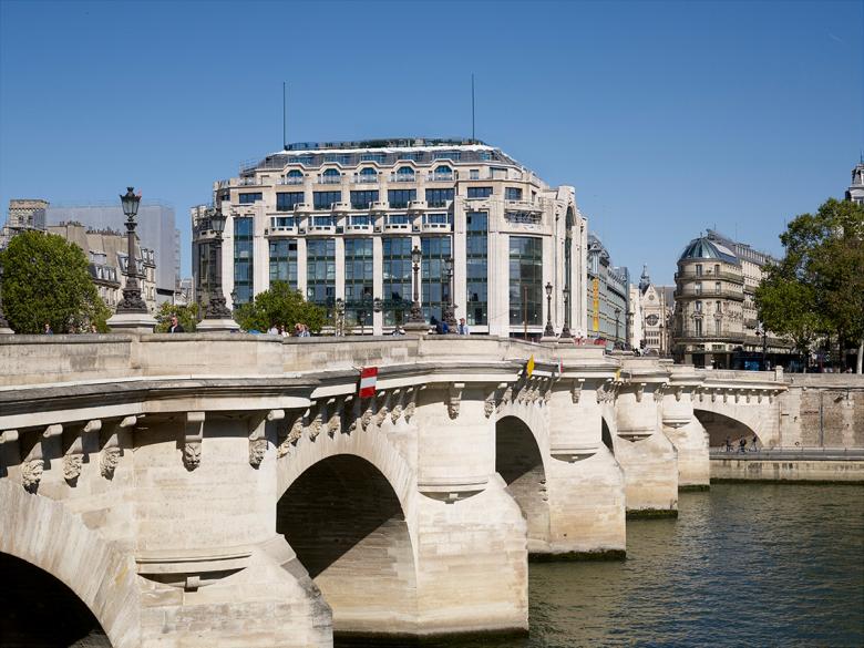
Not too far away from the Bourse, near the famous Pont Neuf, another Pritzker-Prize-winning Japanese architecture team works on another Paris icon, albeit with a completely different set of design tools. The historic department store La Samaritaine, once the capital’s largest, is being turned into a mixed-use ensemble with retail shops, apartments and a luxury hotel. The grand magasin was originally designed by Art Deco architect Henri Sauvage on the Quai du Louvre; it is part of a block with three other buildings designed by Frantz Jourdain. Of the department store’s four buildings, SANAA wrapped one in a new façade. While Ando works just inside a building, SANAA’s design for La Samaritaine is very visible in the Rue de Rivoli, a street that tourists typically walk. Just like with Ando, the client for Sejima and Nishizawa (the “S” and “N” of SANAA) is also a famous fashion empire: LVMH, the world's largest manufacturer of luxury goods. LVMH bought the department store complex in 2001 and soon thereafter closed it down — despite local protests. The LVMH company is run by Bernard Arnault who, like Pinault, is one of France’s most famous Billionaires and shares his enthusiasm for the contemporary architecture of Japan.
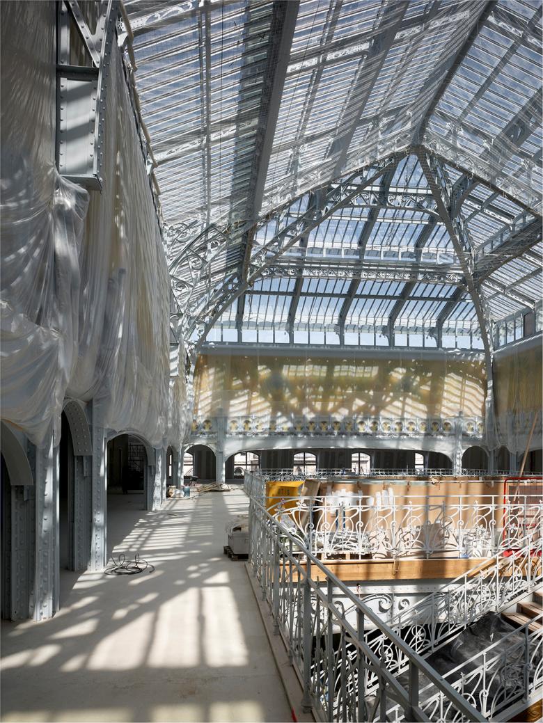
Sejima and Nishizawa’s design for Paris has its predecessor in Japan: the flagship store for Christian Dior on Tokyo’s famous Omotesando shopping street. There, in 2003, SANAA first developed a façade that appears to be wrapped in layers of fine paper. The milky facades in Tokyo and also in Paris display the interiors behind them only dimly. The Paris façade consists of curved glass panels resembling stylized curtains. This shoji-like, semi-transparent façade is used to high aesthetic effect. It continues inside to merge with the great art nouveau glass hall that Jourdain designed for the store in 1907. The new façade features the entrance to the block, which spans the lower levels of three of the site’s four buildings. These retail areas culminate in the grand glass-roofed atrium with its carefully restored monumental staircase.
SANAA’s new façade seems like Junichiro Tanizaki’s famous book In Praise Of Shadows turned into architecture: It resembles traditional Japanese architecture’s translucent sheets of paper used in facades, transmitting only diffuse light. Shojis do not set a sharp barrier between the interior and the exterior; outside influences such as shadows and silhouettes can still be appreciated from inside. SANAA’s elegant new façade in Paris is a convincing interpretation and translation of the Shoji into contemporary architecture. The office’s kirei-architecture (the word "kirei" means both "clean" and "beautiful" in Japanese) shaped Japan for the last twenty years.
In Paris, Japan's most famous architects are demonstrating that their minimalist architecture can shine internationally and in direct dialogue with history. Now all these two fabulous additions to the French capital need is an end of the lockdown and a stream of patrons to enjoy the art and architecture on display.


