Nursery
Zsámbék, Hungary
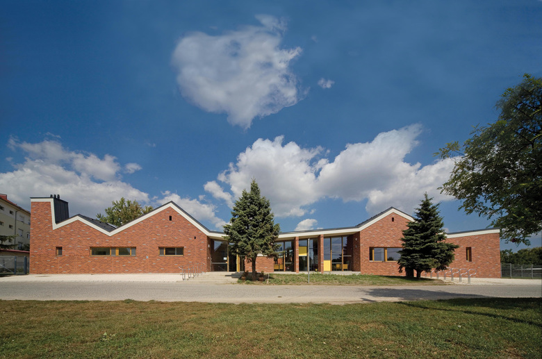
We meant this day care, designed for the small town of Zsámbék near to the capital, to be a building which can add value to this small-town and featureless residential built environment.
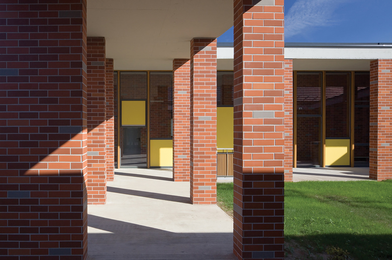
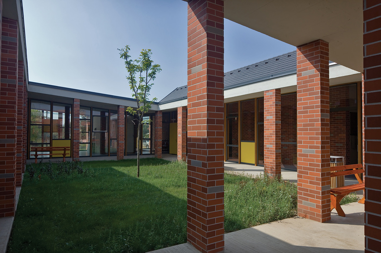
We mixed the functionally strict floor plan of the créche with a traditional and community building space form – the cloister. We’ve placed the group rooms and the central multifunctional space around the cloister. This way the créche became appropriate for developing relationship between parents and organizing baby-parent events as well.
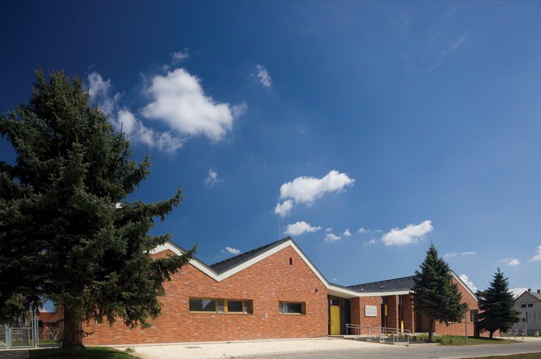
The building displays the form of the traditional manor-houses which is adapted to the world of the little inhabitants by the playful facades. The garden, the size of which meets the standards, is divided into three parts. The more peaceful sessions and the recreation would be at the cloister while the more active and noisy games will take place in the two side gardens.
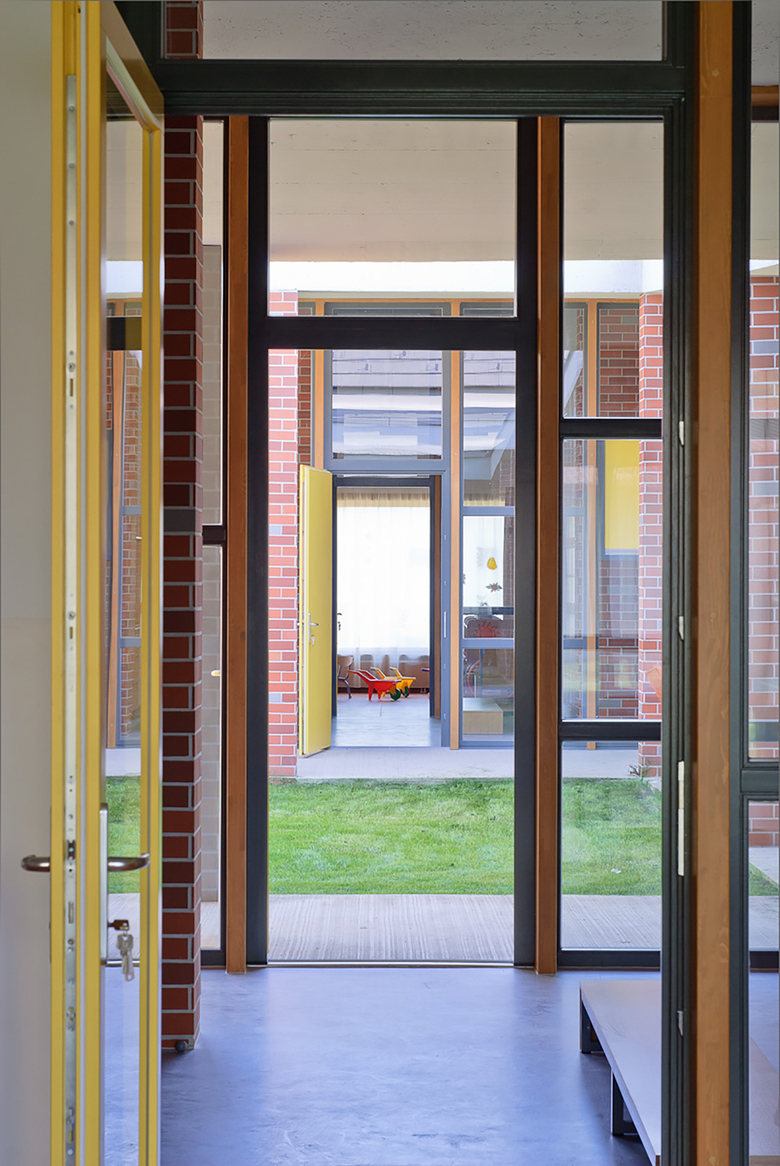
In the center, around the cloister, we’ve formed a communal zone as a unified line of spaces. The outside and the inside are formed equal, the open air roofed space and the interior are only separated by a transparent glass wall. The courtyard (with the tree in the center) provides comfortable micro climate in the summer heat making the installation of expensive building system unnecessary.
We were intent on using natural, warm materials in the design.
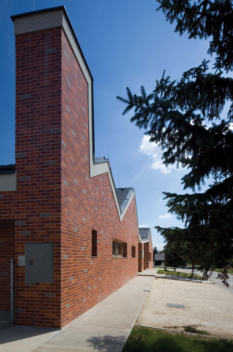
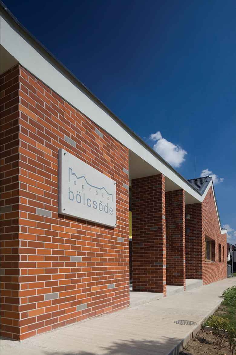
We were looking for a lasting and meanwhile people friendly material for the facades so we decided to use bricks which appears in more colours, placed freckled, showing as a mix of joyful burning red and grey. Brick appears consequently in the community places too this way strengthening the unity of the exterior and the interior places.
As a contrast to the clay we designed concrete-tile roofing on the roof waving as a single sheet, which becomes a worthy counterpart of it by its simplicity and lasting.
This sheet covering the whole building appears in the interior too by the weaving of the off-line reinforced concrete slab roof. The exciting vertical movement resolves the scarcity feeling of the communal places, this way making the relatively small spaces seem more far-flung and spacious.
We intended to use clear shaping and some fresh-coloured tones to provide clear-out background for the whirl of colourful toys, drawings and clothes in the children’s group rooms where they spend their whole day. The furnitures unfortunately visualize a more colourful, more vivid world compared to our intentions. The finishes are made of PVC everywhere, on the floor, on the walls and in the lavatory as well, using grey colour on the floor and white on the walls.
We applied low-parapet windows between certain spaces, this way the small snugs and intimate spaces - for the children essentially - are combined into a community-building whole.
- 年
- 2011
- プロジェクトステータス
- 竣工済
