Two Sheds
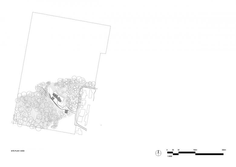
Two Sheds is located on 25 acres of bush in the hills immediately to the west of the Lorne township, Victoria, Australia. It is a retreat allowing the clients to disconnect from the world of city, noise, and work as they come together to reconnect and begin a 30-year project to rejuvenate the surrounding bushland.
The project uses a minimal material palette and a simple design language drawing from local cottages, agricultural buildings and Australian vernacular. It provides a backdrop for cherished family experiences as the inhabitants slow down, notice and engage with the simple joys of living.
Location: Lorne, Victoria, Australia
Architect: DREAMER with Roger Nelson
- Project Lead: Ben Shields
- Project Team: Ben Shields, Malisa Benjamins, Mitchell Sack, Roger Nelson
Landscape Designer: Scott Leung (Eckersley )
Structural Design: David Doolan, Brett Stewart (4D Workshop)
Civil Engineering: John Guise (Tompkinson Group)
Planning: Phil Rosevear (Rosevear Planning Associates), Andrew Rodda (Contour)
Vegetation: Ecology and Heritage
Bushfire assessment BMO: Ecotide
Builder: George Dragovitch, GD Construction
Lead carpenters: Nathan Lewis & Mark Jolley from Birregurra
Joinery: Mawson Joinery
Brasswork: Elias Katsouranis, Made Retail
Lighting: Inlite
Appliances: E&S
Site Area: 101,100 m2
Building Area: 220 m2
The site was purchased by Roger and Jane Nelson in 2010. Roger is Managing Director of NH Architecture and over the course of the next 7 years he and Jane designed a house and obtained a planning permit for the site. This process was time consuming and difficult as the site had a bush fire management overlay and required an assessment and management plan to establish the required BAL rating and consequent defendable space.
DREAMER was engaged to contribute an interior design scheme for the project in 2017. We undertook a number of meetings and design workshops at the client’s Melbourne home, hearing about the project and slowly understanding how they liked to live. A number of times we walked around their home, discussed and observed the design of various elements from sliding doors, to light switches to fans.
We spoke at length about other buildings they had visited that contributed meaningfully to their lives, particularly important was Louisiana gallery in Denmark. We observed their current lifestyle and love of art. We discussed family life, being active, connecting outdoors. Jane in particular spoke of her desire to rejuvenate the land around the future house in Lorne and re-establish native plants.
Through these workshops and discussions, we heard stories about escapism, about working outdoors, about a cottage or shed on a rural property. We asked ourselves and the client what it meant to leave the city on the weekend. This was to be a bush retreat, but more a house to challenge the inhabitants, a house that defines a certain way of living. Physical escapism through being in a different place/experience and but escapism of identity through the different actions and activities not present during day to day life.
Through this process DREAMER was ultimately engaged to build on what the Nelsons had started and develop a new concept for the complete house. We began by working with the client to narrow down the key things that the house had to do well and started to jettison what was non-essential.
The crystal-clear zoning between the private sleeping areas and public social spaces was to be retained from the original design and importantly, this house needed to work as well for 2 as for 7 people (and have room to grow with additional grandchildren).
Requirements included places for social interaction and places of quiet reflection, spaces for connecting outdoors, as well as a house that would provide a base from which to work in the bush. The clients Dreamt of walking out onto grassed glades from any room in the house.
We workshopped 3 iterations of the plan, each reducing the footprint in size and helping us to put ourselves and the client in the space. The client contributed a beautiful axonometric sketch that helped to solidify the form of the project. The original design had been a larger home of 500+sqm with the new concept more compact 220sqm.
Views to the hills and beach, privacy and constructability had all been carefully balanced in siting of the previous design. In addition, the clients and design team wanted to avoid any further time spent in town-planning and the original location was kept.
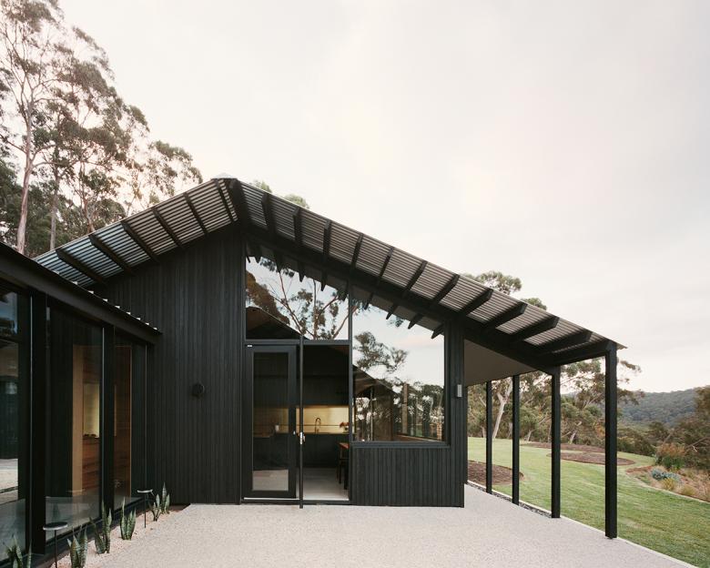
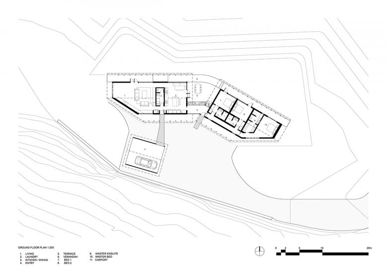
Two almost identical but mirrored gable-roofed timber lined sheds compose the public and private zones of the house, with the timber externally charred and raw within. The forms are separate but remain connected internally via a glazed gallery and externally via a terrace and path. They align with existing contours and are consequently cranked to face away from each other, increasing privacy to sleeping shed and bedrooms.
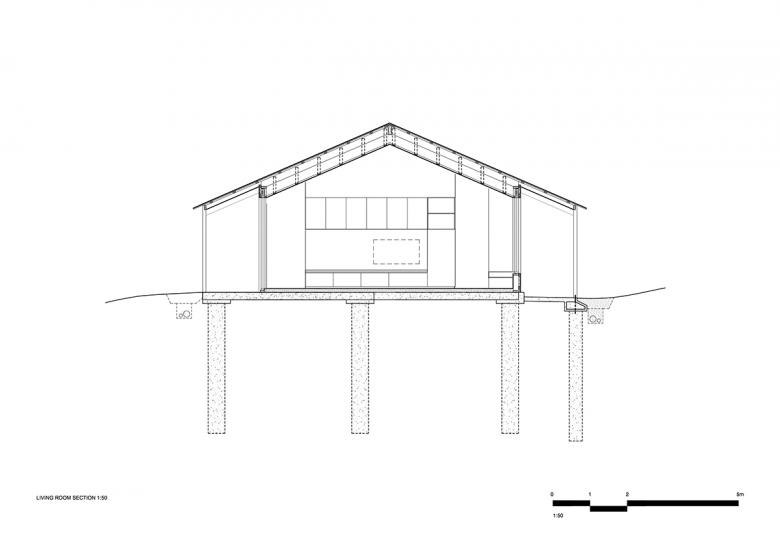
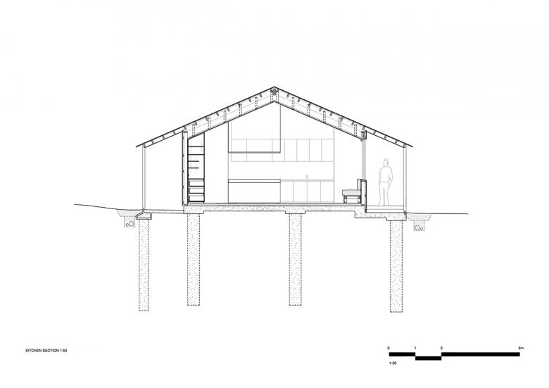
Verandas line the hill and ocean sides of the buildings, mediating the sun and providing a deep threshold, from inside to out. Importantly these have also become great informal social spaces for a drink and chat. The verandas, expressed rafters and roof eaves are reminiscent of Australian typologies such as the cottage and shed and similar elements are can be found on buildings nearby.
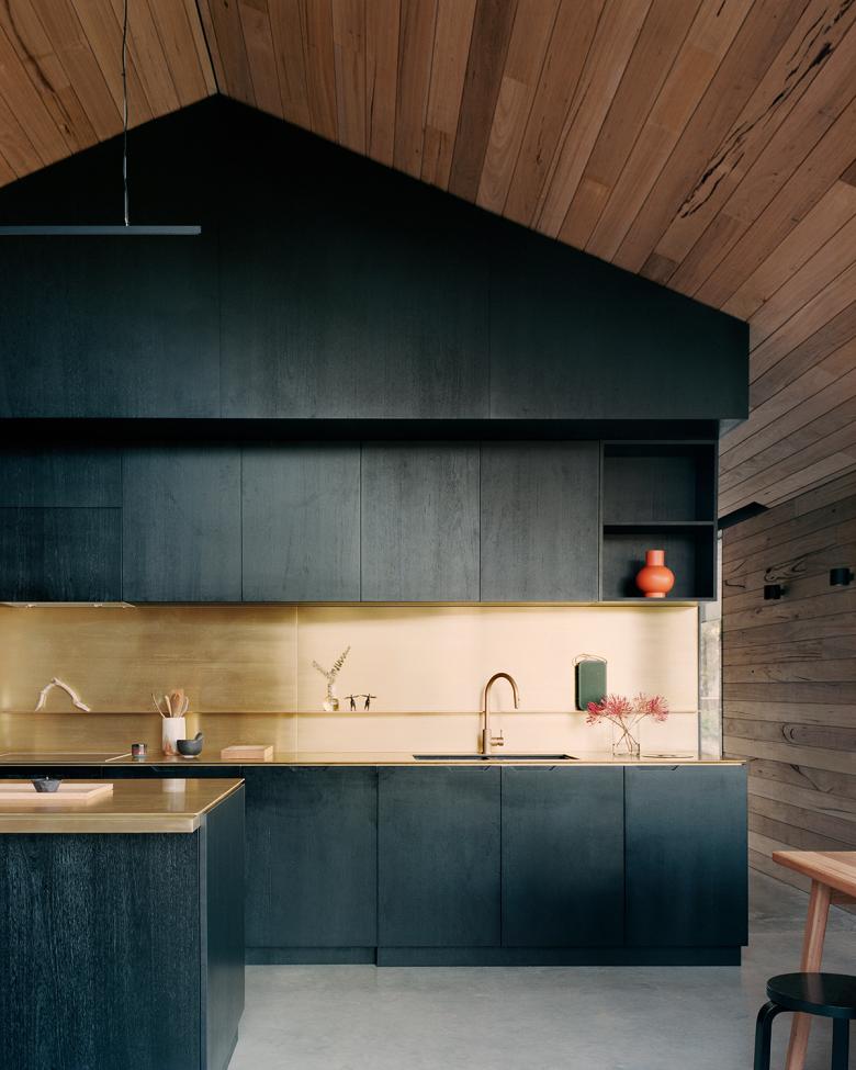
The social/living shed to the west is an open space occupied by a dark central box housing the kitchen, laundry, WC and living joinery. This box creates two volumes at either end of the shed forming the kitchen/meals areas and living/lounge. These are distinct spaces but still connected. Conversely the sleeping shed is divided repeatedly, creating compact bedroom and bathroom spaces, connected via a corridor to the south. A concrete wall in the living space necessary for bracing became an opportunity for a long shelf/seat and spot for a wood heater.
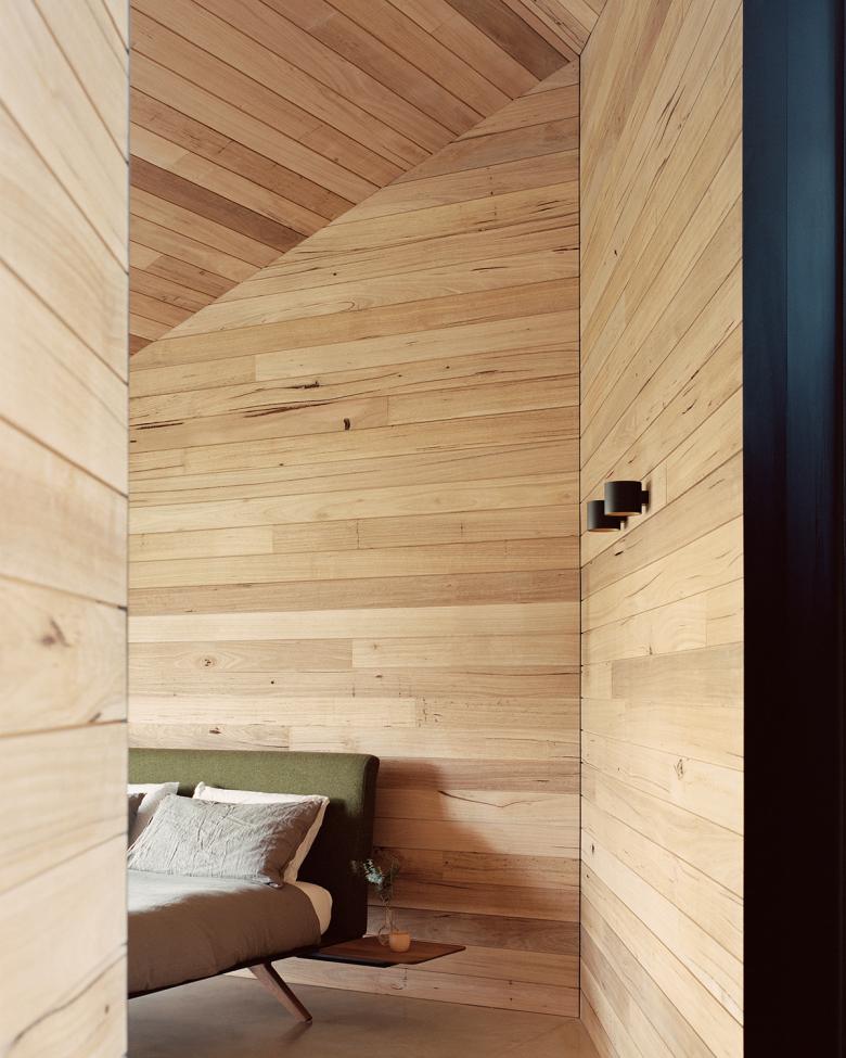
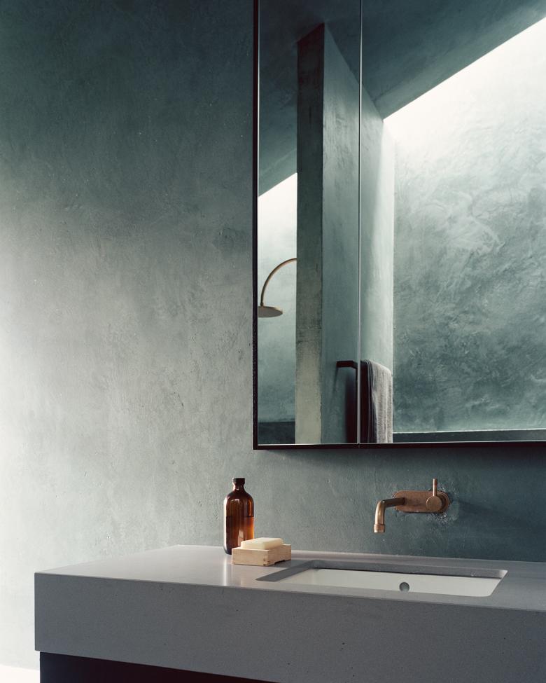
In the sleeping quarters the zoning, seamless sliding and pivot doors and increased acoustic control through timber-clad blockwork walls all work hard to create intimate, quiet spaces, secluded but still connected to bush and ocean. The bathrooms are intentionally located within the building, with low ceilings that release into full height shower spaces, lit by skylights. They are experientially different to the rest of the house as the soft light and cementitious render highlight the timber materiality present elsewhere.
A loose court is present on the hill side of the house, created by the retaining wall, main house and carport/future bungalow. This space has been left open to change as the family’s needs grow in the future.


