Mexican Pavillion Expo Shanghai 2010
Shangai, China
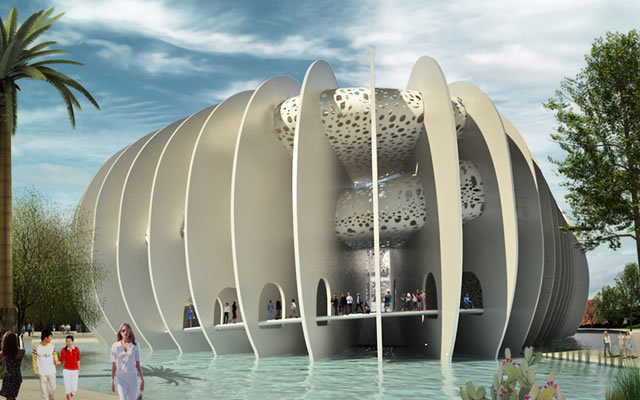
World Expositions have become redundant and their pavilions have lost the capacity to communicate purpose to the point that they appear as empty architectural masterpieces. With this premise, our mission in this competition was crystal clear: to create a Pavilion charged with meaning that portrays and criticizes Mexico’s situation in a globalized world in crisis.
Mexico, like many third world countries, has seen its economy overturned by the new superpower China has become. Not being able to compete with its ridiculously low manufacturing costs, many small and large companies have gone out of business. It’s almost cynical for China to host the 2010 World Exposition after it has wrecked the economies of most of the countries that will take part in it.
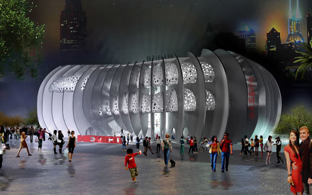
Our pavilion is a caricature of the historical moment Mexico is battling to overcome.
To accomplish this, we made a parody of the national symbol, a serpent curled up inside a cactus waiting to be devoured by the new eagle of capitalism: China.
Better City! Better Life!
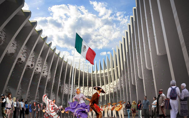
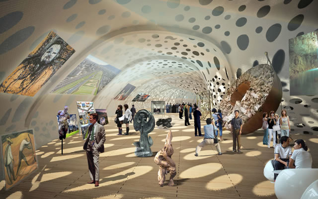
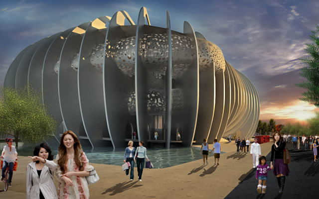
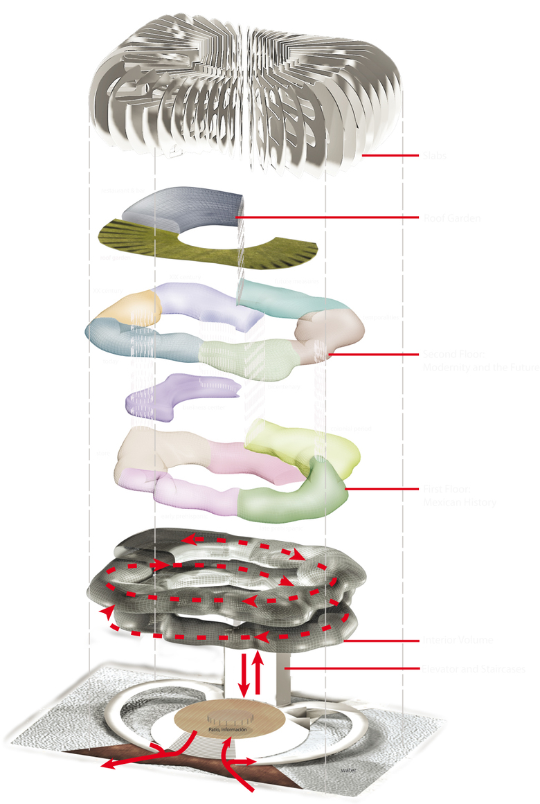
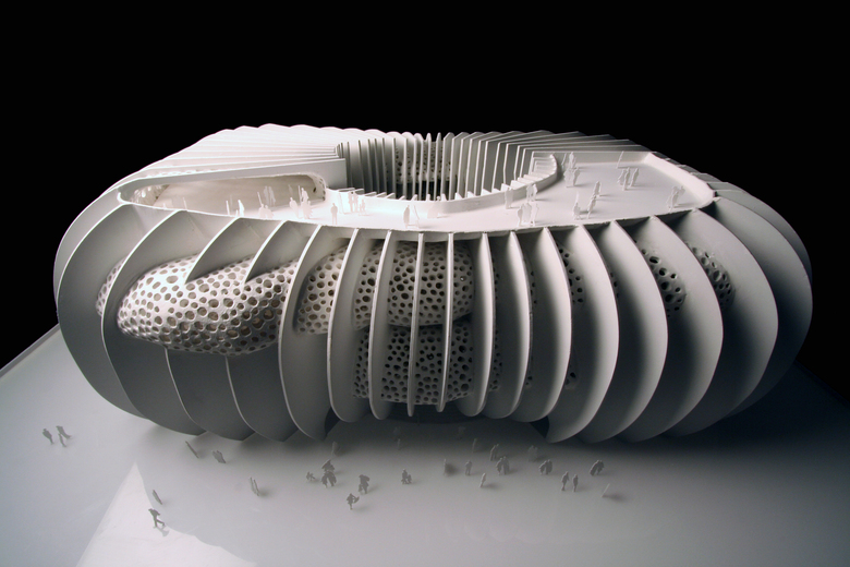
The Expo’s theme aspires to expand and celebrate the progress of cities in the 21st century. The voracious expansion of the urban sprawl has fractured the relationship of the city with its natural environment. Global warming and recent natural catastrophes are nature’s way of condemning civilization to disappear if it doesn’t halt its progress, take a step back and redirect its course.The preservation of the natural environment should be the city’s ultimate goal. By establishing our pavilion as a giant cactus, an endemic species in Mexico, we seek to penetrate the imagination of the Expo’s visitors and question the role nature plays in the contemporary city. The program was divided into two parts: one contains the service areas and offices and the second one the exhibition areas, restaurant and business center. The first of these is contained in a windowless cone-shaped plinth surrounded by 52 twenty-meter-high slabs that create an access patio. At the other end of this patio an elevator communicates to the third level where the exhibition space starts in a descending spiral ramp that perforates the slabs in an organic free form according to the demands of the program and the exhibition design. This structural system of continuous inter-spaced walls allows the creation of space from the inside out, as a worm or termite would dig out the tunnels of its nest.
TIMELINE The exhibition was conceived as a journey from the future into the past. This way, we can show visitors who we want to be, in order to then show them who we are, and who we were. The spiral descends clockwise and places emphasis on the transitory aspect of the exhibition in a continuous, organic and fluid procession. The store is located at the end of the exhibition and through here you enter again to the patio and consequently the exit ramp.
The patio is deeply rooted in Mexican history and culture. From the first pre-Hispanic houses to contemporary buildings, the virtues a patio contributes to a project are undeniable: natural light, ventilation and distribution. As well as being an access vestibule, the patio becomes the heart of the pavilion’s social life and a performance space.
The restaurant and roof garden are located at the beginning of this exhibition intestine and the business center derives from it at the second level as an appendix.The number of slabs was not chosen randomly: 52 is the number of years the Aztec calendar needs to complete a cycle. These slabs function as a latticework that allows the maximum amount of light without direct sunlight. They also allow the free circulation of air to reduce the temperature on hot days.The original budget the government assigned for the pavilion was extremely limited. As the competition evolved, the financial crisis of 2008 struck the world, so the budget was cut in half. Sometimes in the process of developing a project, it becomes more important than the competition itself, so we decided to go along with it anyways.
We figured the jury would select the cheapest project and disregard anything that at first glance looked “expensive”. And that is exactly what happened.
The Two Libraries for Jussieu University and the National Library of France are some of Rem Koolhaas’s unbuilt projects and lost competitions. These projects became cornerstones in his architectural career. His unique vision has paved the road for the succeeding generations the press loves to call “The Rem Children”.
Triumph Motorcycles, the largest surviving British motorcycle manufacturer, were very popular in Mexico in the first half of the 20th century although they never had a proper retail shop. In the 1960s Triumph motorcycles became scarce until eventually by 1967 distribution in Mexico and America had stopped and they became unavailable.
By the early 2000s, Triumph decided to recover lost ground and return to Mexico now with its own retail shop in Polanco. Since no empty plots were available for a new motorcycle agency, they had to settle for a 1930s California Colonial-style mansion that was previously used as offices and before that as the Spanish Embassy. The house had a mixed use permit but federal law forbids alteration of the original floor plans and façade.
So the question was how to transform this old building into a motorcycle agency in a non-invasive and respectful manner? How to minimize the confrontation of the old and the new?
Two steel and glass showcase boxes for the motorcycles frame the ornamented windows and flank the main entrance to the agency.
The height of the new volumes was defined by the desire to fully clear and respect the carved stone window moldings. A wooden deck raised the entrance level and with a subtle ramp, the use of stairs was avoided. This platform ties the boxes together and stresses the floating quality of the project. Inside the house the intervention was reduced to painting walls, restoring original wooden floors and new lighting issues.
When the UK Central Branch CEOs visited the agency, they agreed that of all the Triumph Stores around the world this was the one they found the most original and liked best. Our local clients were more than happy with this praise.
Two years after the opening of the store the landlords concluded the Triumph business was doing too well so they doubled the rent. This unfortunately forced our clients to relocate and our intervention to be dismantled. Today the house stands exactly as it was and the only trace of our architecture is to be found in photographs. The “ephemeral” acquired a new meaning in our office after this project.

