Aadyam
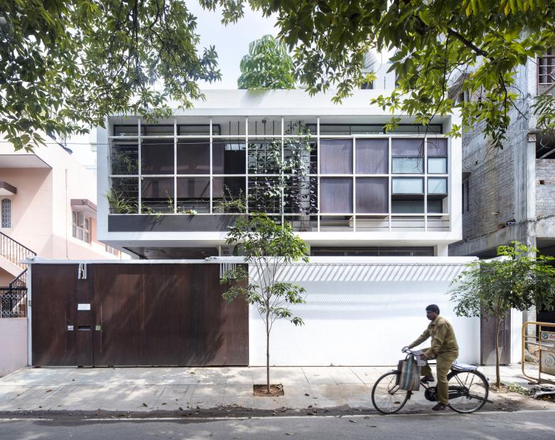
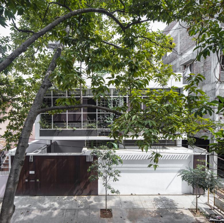
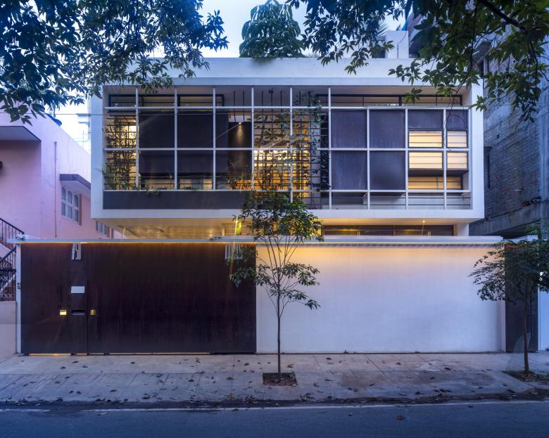
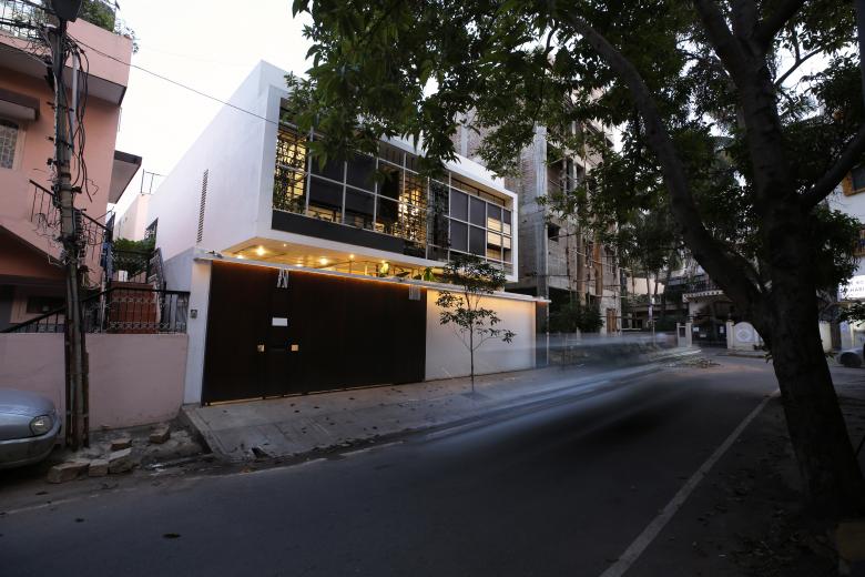
We were called in to visit the site in an well established central neighbourhood of Bangalore, after some construction had already progressed. The plinth was already in place with the columns raised till the lintel level of the ground floor. The site measured 40 feet in the west towards the Road, and was 60 feet in depth.
The previous design did not meet the Client’s requirement, and we were invited to step in.
The Client, a young couple, needed their house to do two things; be dynamic, energetic and hybrid to suit their lifestyles, whilst remaining comfortable, familiar and traditional for the husband's elderly parents living with them.
These two separate and somewhat disparate ideas also needed to merge intrinsically, ensuring a spatial integrity as a home.
We began work using the existing structure and following the Client’s strict brief for Vaastu principles which dictated the positions of most of the spaces in the plan. We also wanted to make this house self- sufficient in terms of light and ventilation, since the neighbourhood was already starting to see restructuring, where the old houses were giving way to high-rise apartments, leading to an increasing dearth of privacy, light and ventilation.
Since we had to rely heavily on top light, rather than the sides, we used the technique of levels to bring the light into all the spaces of the house. The levels were also used to unify and, in the same breath, divide the house.
THE LAYOUT
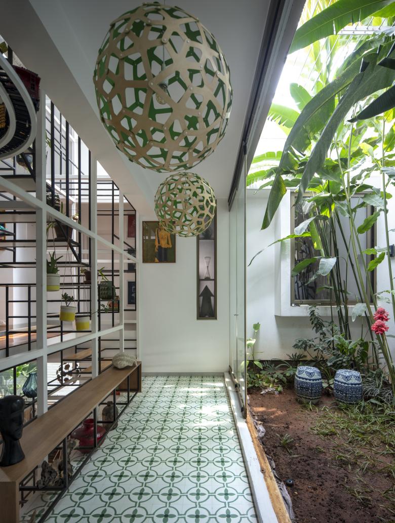
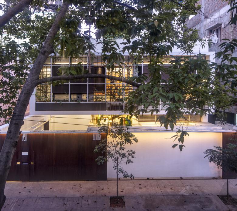
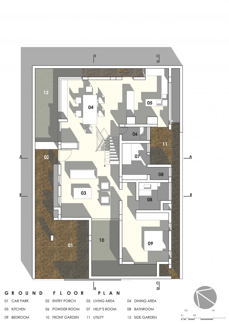
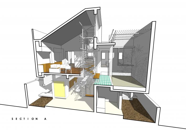
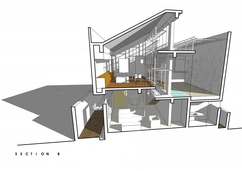
The ground floor becomes the traditional space of the house, being easier for the parents to access. The Bedroom on this floor comes in towards the front, in the south west corner, opening onto a narrow Front Garden. The Living Room also opens up towards this Front Garden, before combining with the Dining Room to occupy the northern length on this floor. Glass ventilators bringing in the soft north light, illuminate this length.
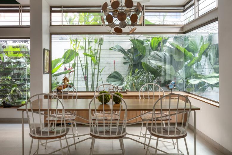
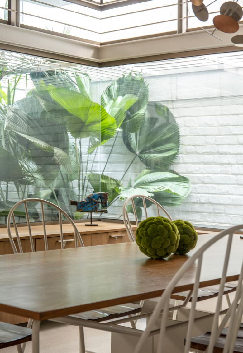
The Entry is positioned in the centre of this length, with the Temple volume guiding the visitor in. The Temple floats within this large length while creating a nook for itself combining with the Side Garden. The Dining Room has the benefit of the north-east corner, as it engages with the Side Garden through large glass windows.
In the south east corner, the Kitchen opens towards the Dining Room. It is serviced by a Utility towards the center of the house.
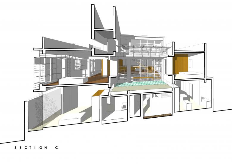
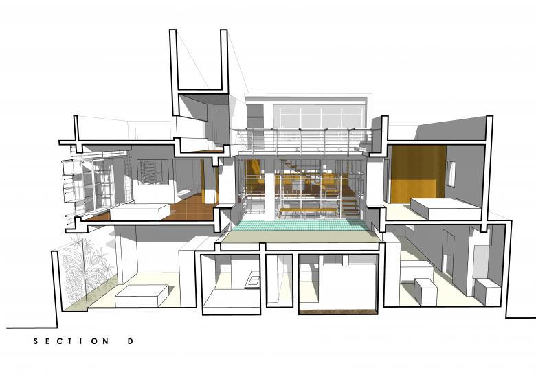
The Utility area, the Powder Room, the Help's Room and the Parents’ Bathroom are bundled into a low height block above which sits the Mezzanine and the Elevated Garden.
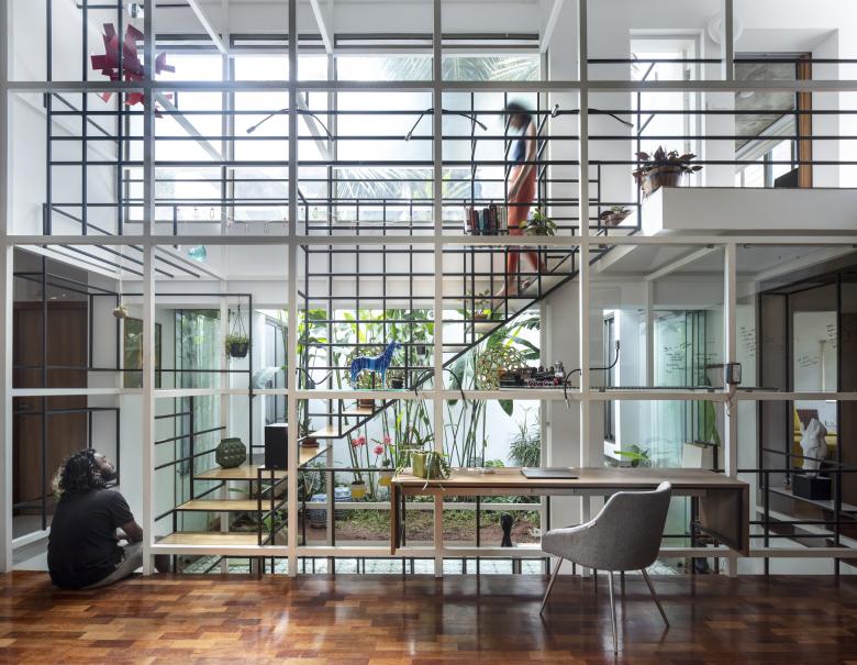
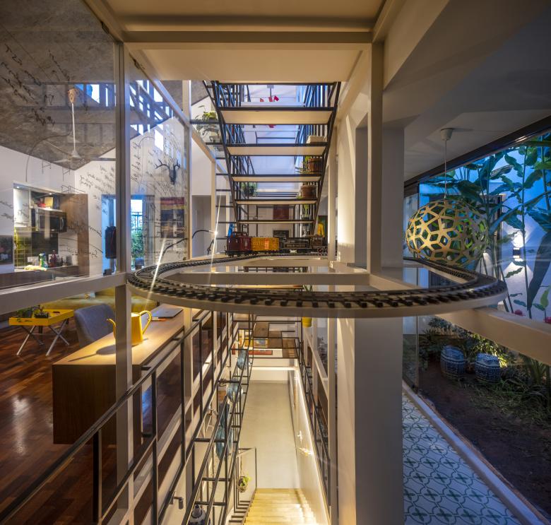
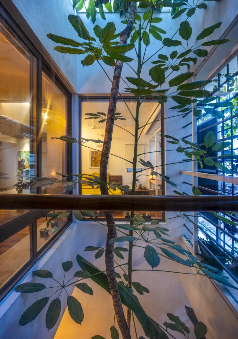
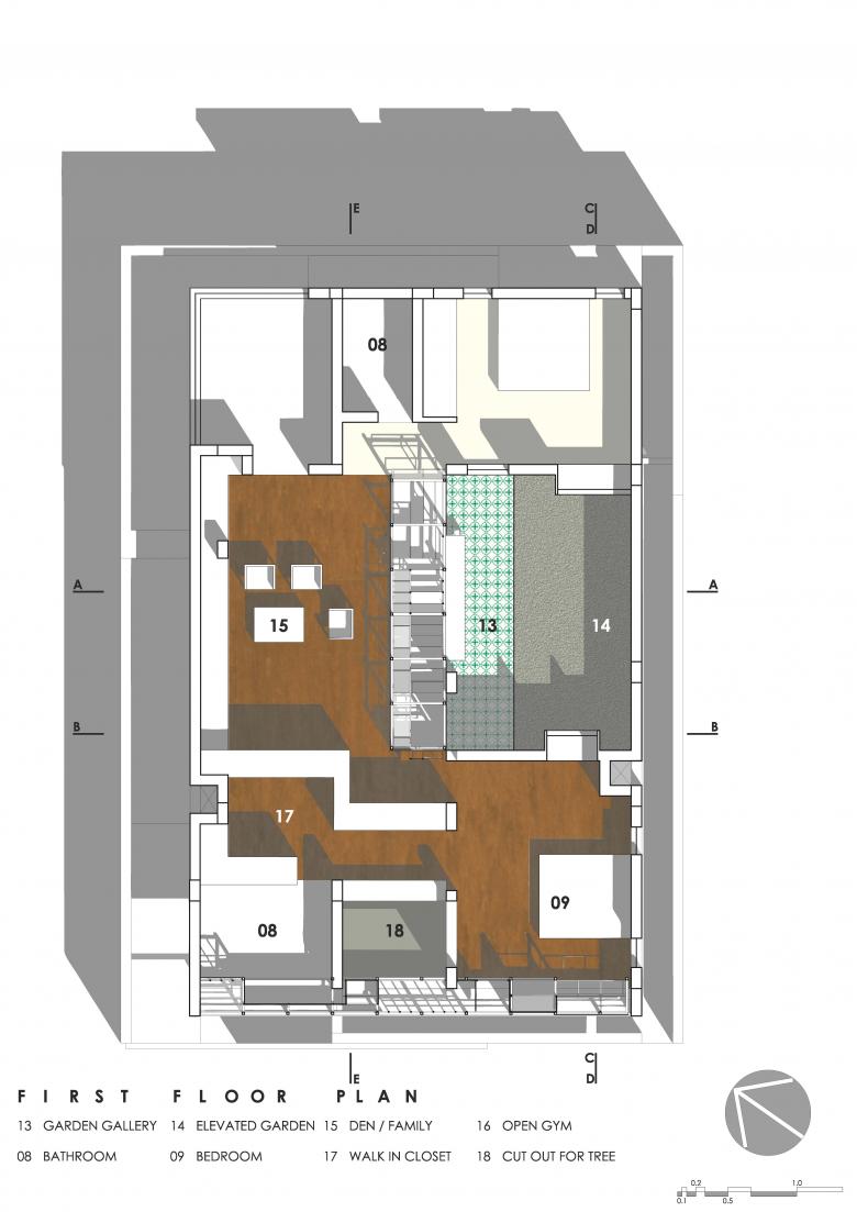
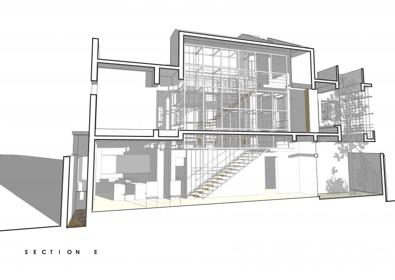
This Elevated Garden becomes the heart of the house, commanding views from both the ground floor and the first floor. It is also the central source of light and ventilation for the house, as it opens up to the sky and the weather. A Gallery runs alongside the Elevated Garden with fully collapsible high glass doors.
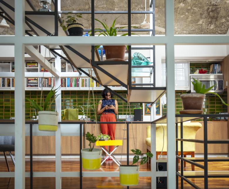
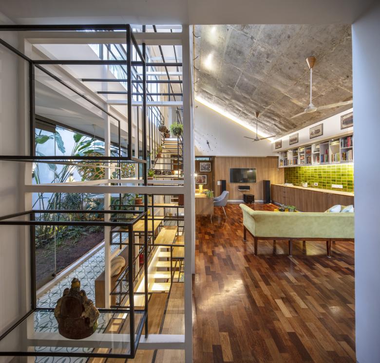
The first floor revolves in a 'C' shape around the Mezzanine and the Elevated Garden, and houses a bedroom on either side with a large hybrid space in the middle. This Hybrid Space lines up with the Elevated Garden in length, and has a sloping roof expanding its volume and the light filtering into it. The Hybrid Space engages face-to-face with the Mezzanine and the Elevated Garden, creating a space that serves as a den, a library, a lounge area, an AV room and a second living room for the couple.
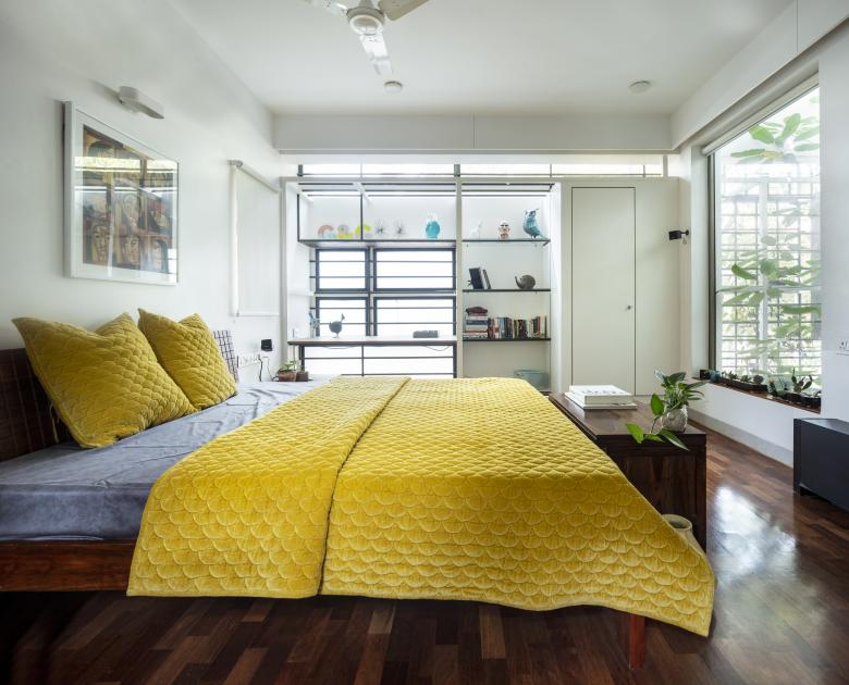
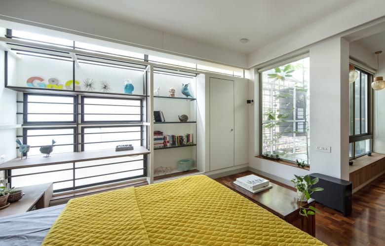
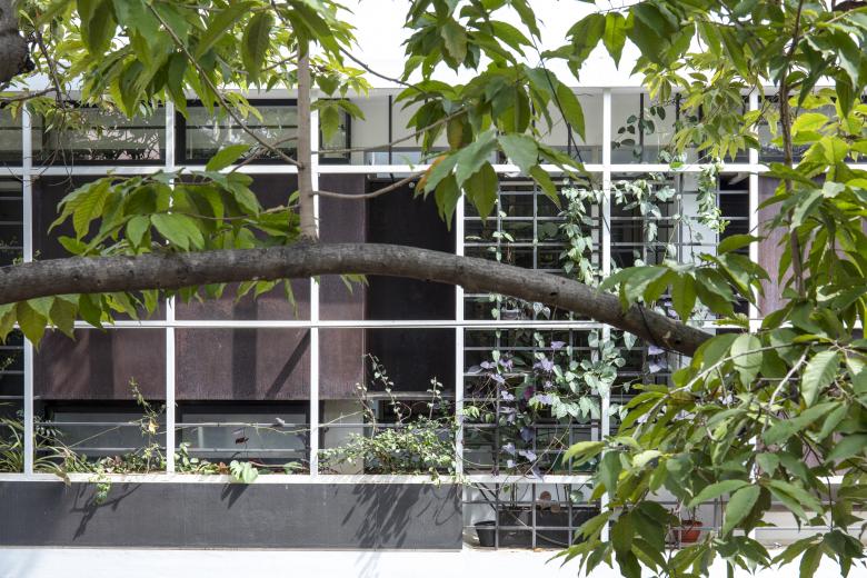
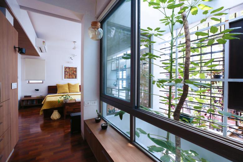
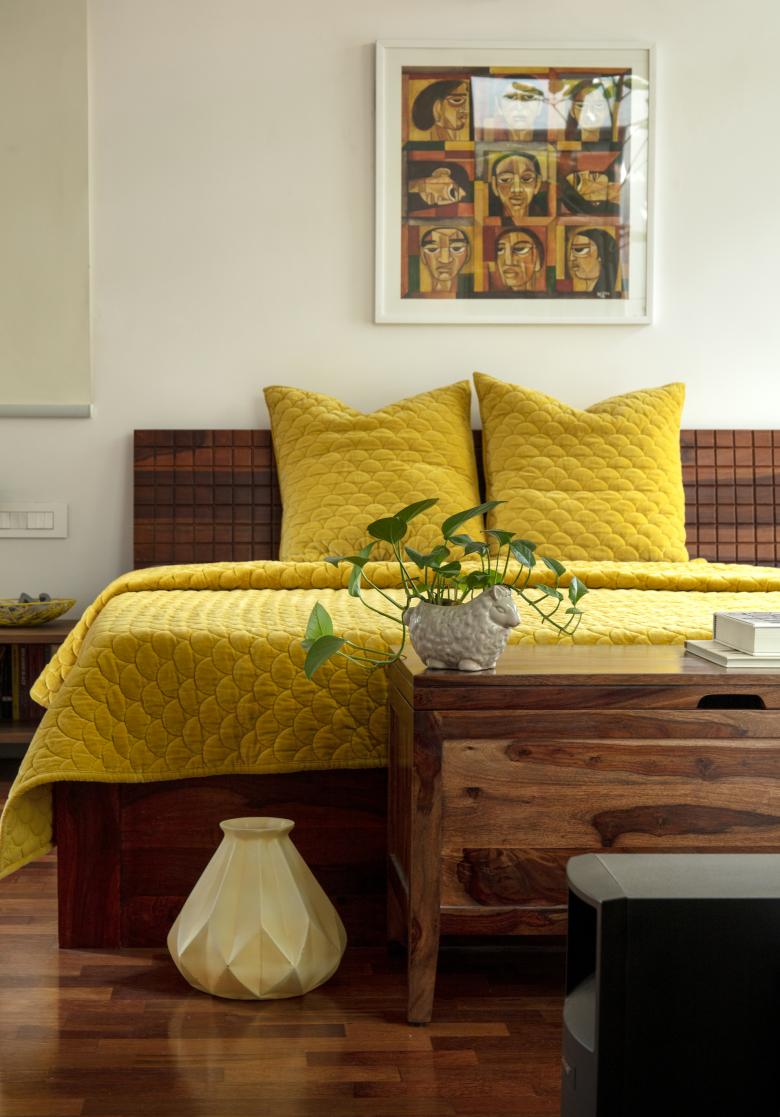
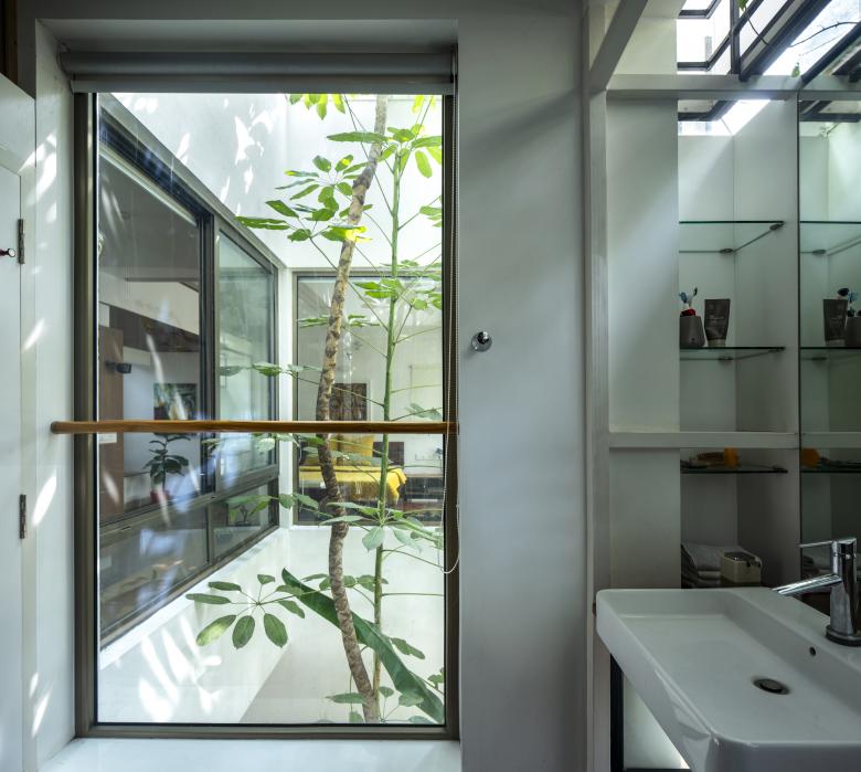
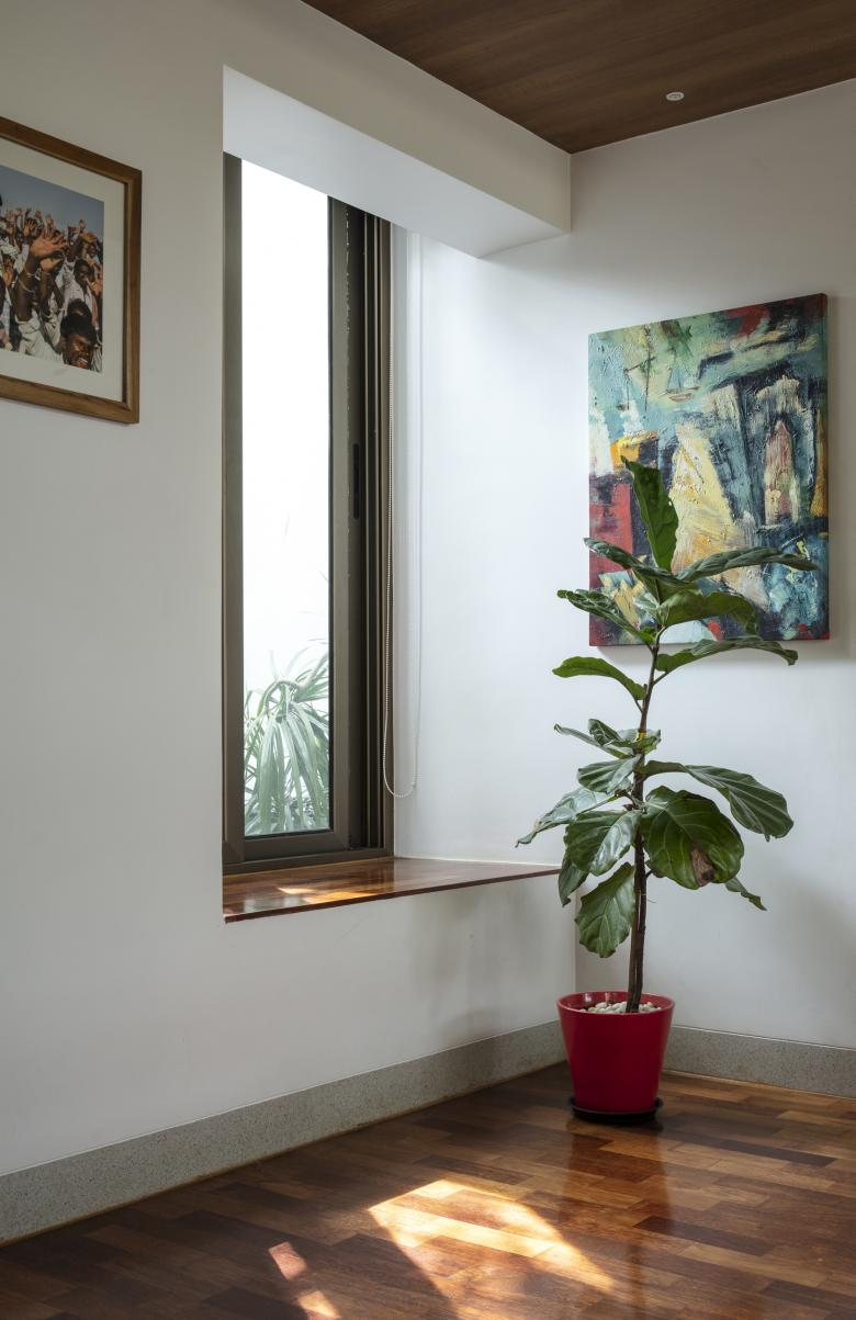
The Master Bedroom towards the front west side, turns into a suite with a cut-out separating the bathroom and sleeping areas. A tree (from the front garden in the ground floor) grows through this cut-out, simulating an internal courtyard. The Guest Bedroom in the south-east corner, opens into the Elevated Garden with a bay window, similar to the Master Bedroom.
The north-east corner of the first floor is left open, with green planters shielding it from neighbouring houses. This area is used as a Gym and a sit-out.
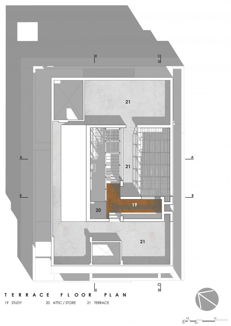
The roof houses the Study, a calm secluded space overlooking the Elevated Garden through large windows, from above.
MOVEMENTS
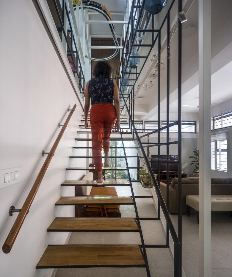
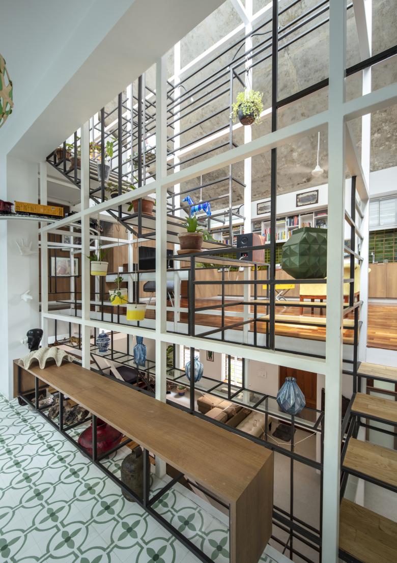
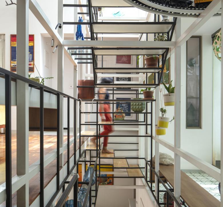
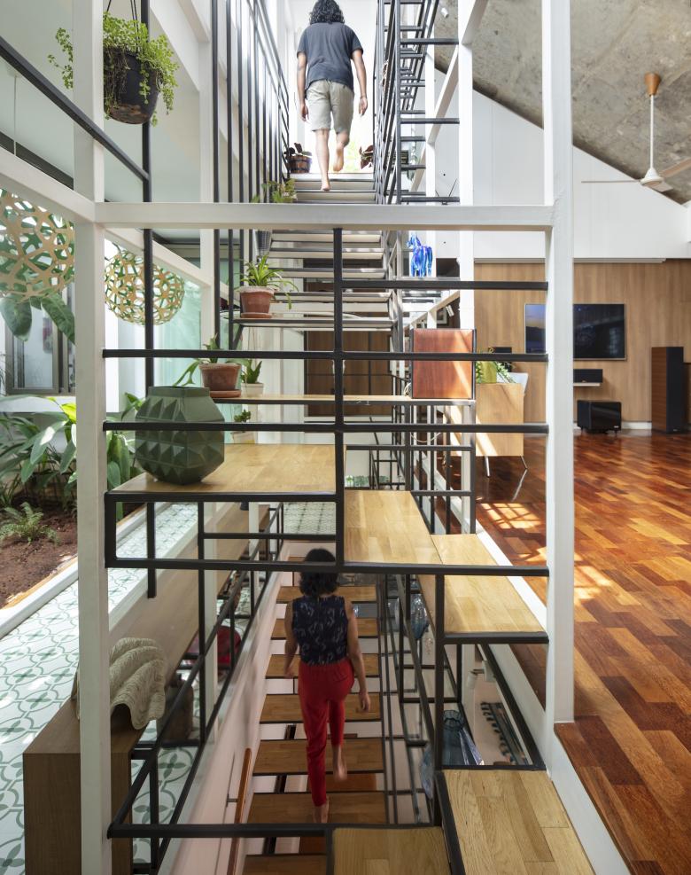
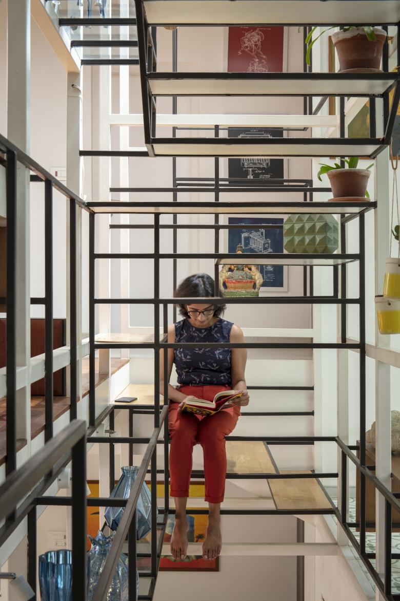
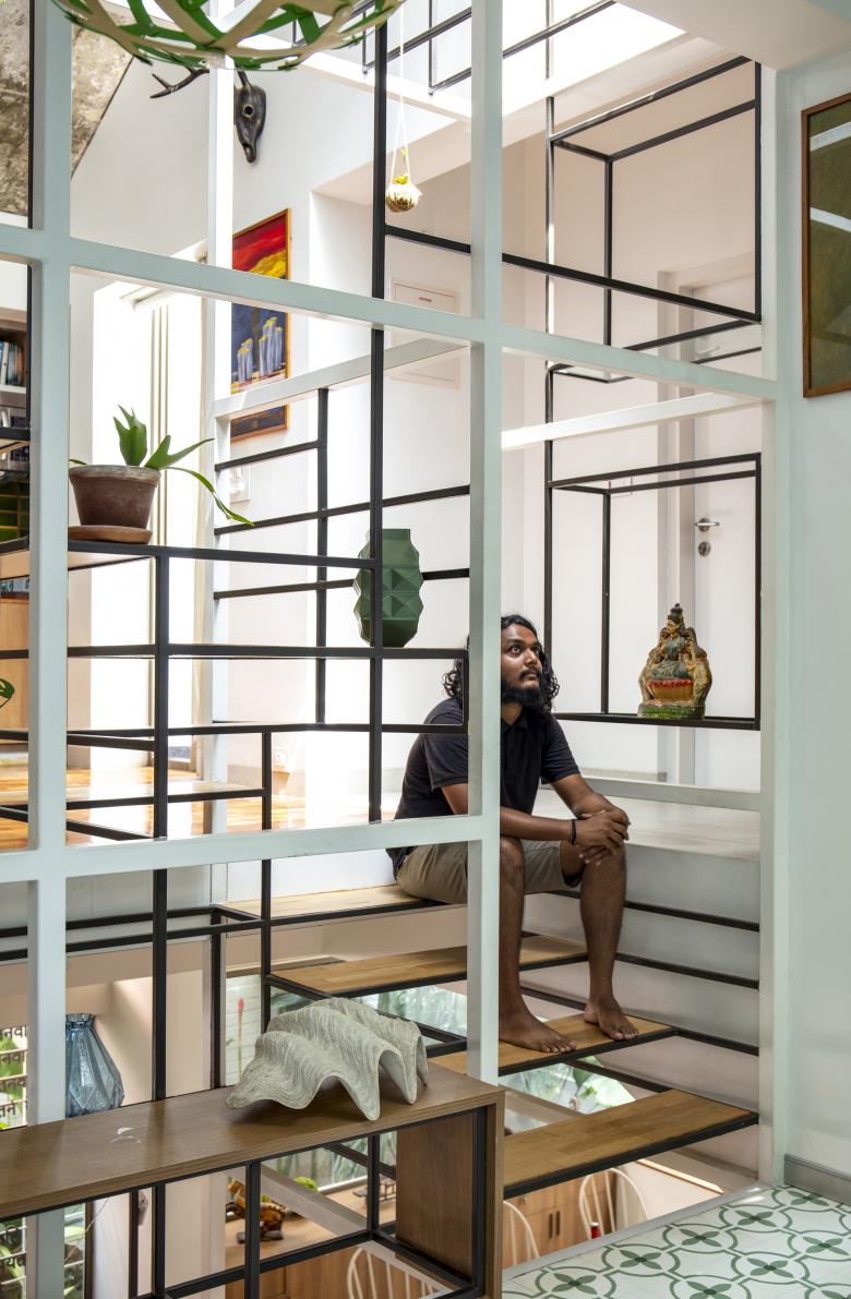
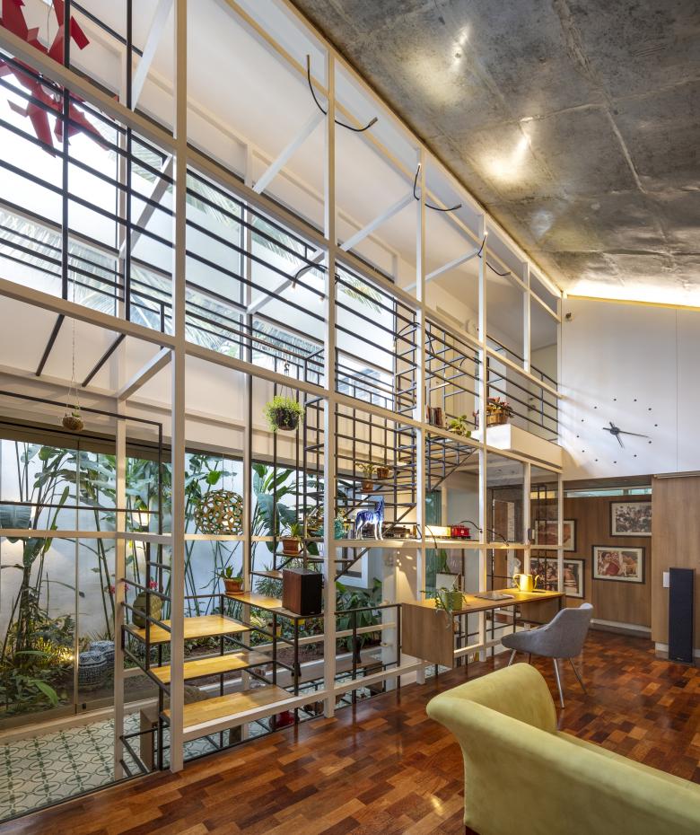
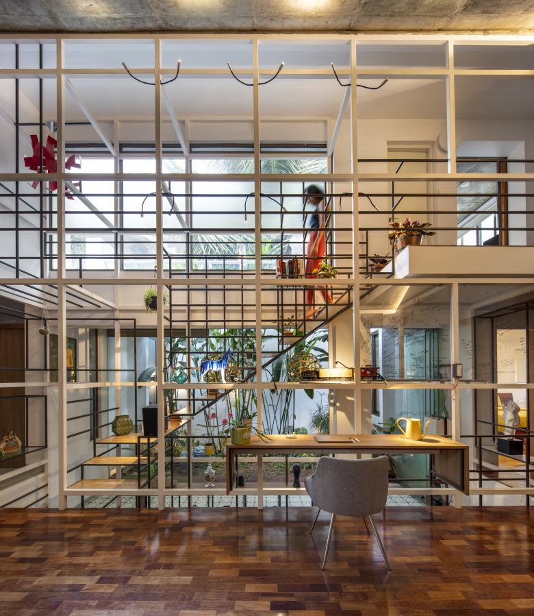
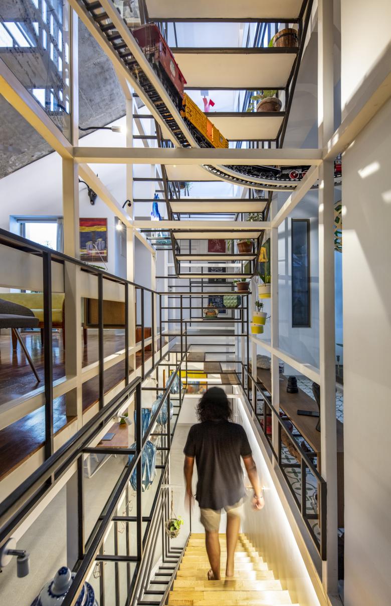
The staircases of the house run through a central vertical shaft connecting all the spaces together. This is the Steel Space frame; a language derived from the internal geometry; widths and the heights of the house.
This Space Frame hangs from upper levels with two sets of geometries: the large box sections which set the larger parametric rhythm of the house, and the smaller box sections which meander and run the fluid notes of movement, scale and local function (steps, shelves, benches, tables etc.). These two sets of geometries combine together to create a spatial realm as one moves from the traditional ground floor to the buzzy energy of the levels above.
Just like the garden and the light, this silhouetted foreground becomes the language through which each space perceives the other. Almost like a lens with its own colouration.
This same lens is taken from the inside core of the house to the outside edge of the Master Bedroom, courtyard and bathroom, to craft the views and the connect of the house to the outside. Layers are moved in and out as the house expands and contracts, opens up and closes, as plants move from spaces within, in rhythms reminiscent of the core of the house; like music, almost familiar and discernable coming from far away.
The silhouette inside becomes an object outside, and a silhouette outside becomes an object inside. These shifts through day and night makes Aadyam revel in its own character from deep subjectivity to stoic objectivity: as it lets in the sky, the light and its shadows, through the day and through itself.
Aadyam's spaces are self-involved and yet thoughtful, selfish and yet generous, duplicitous and yet honest all at once.
- Año
- 2018
- Estado del proyecto
- Construido
