Studio Archohm
Yogananda Library
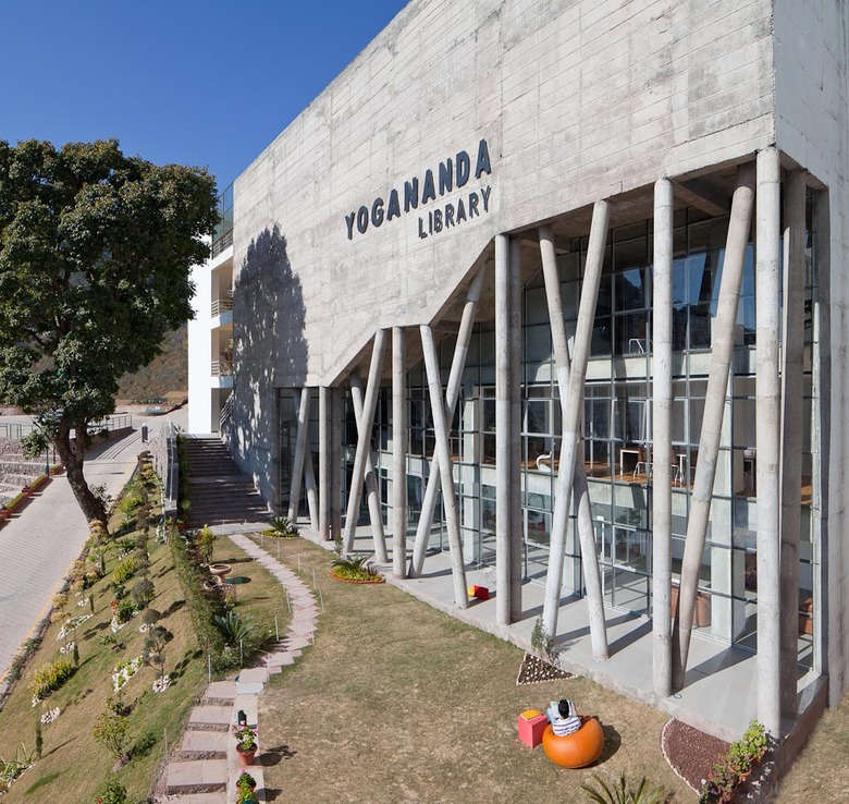
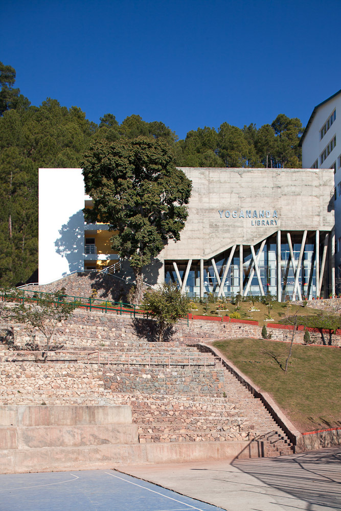
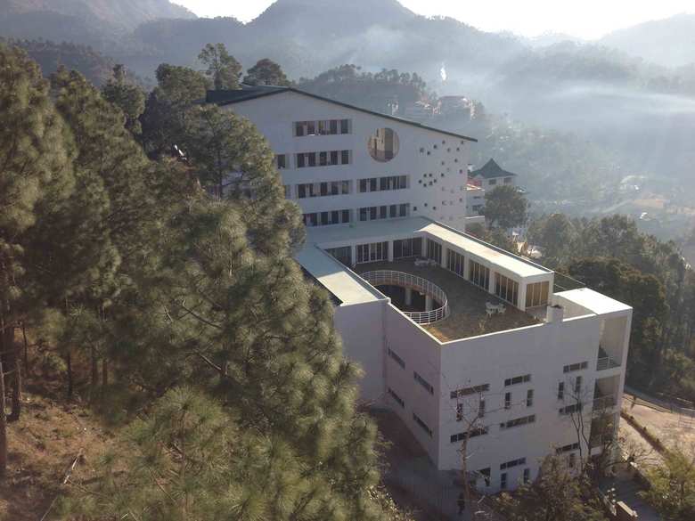
To rebel with a cause: The big blank concrete central library of the Shoolini University in Solan, overlooks a beautiful green valley.
Sitting in the landscape as an impassive built piece, peacefully positioned, the building stands out reflecting the nature of its function and physically manifests the philosophy of this biotechnology campus.
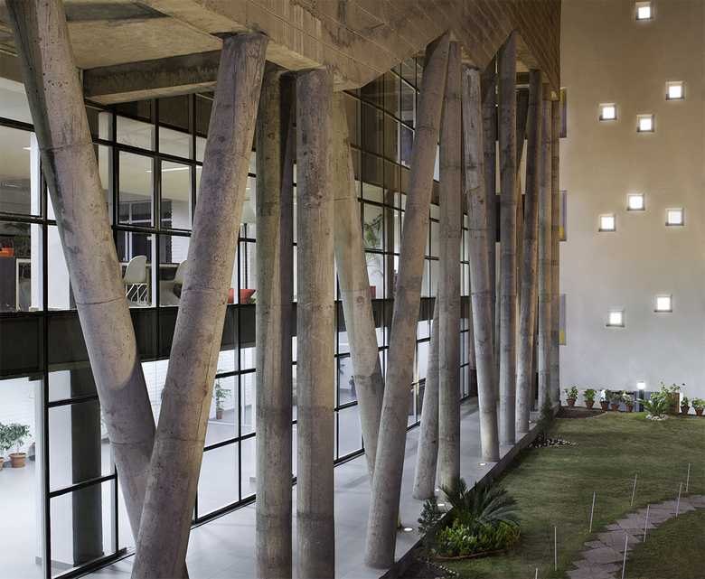
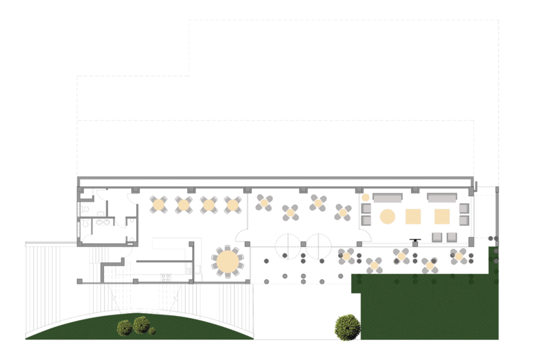
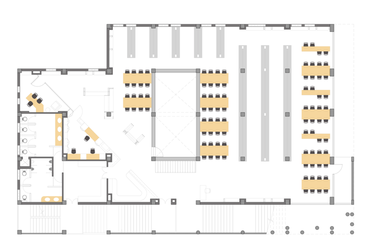
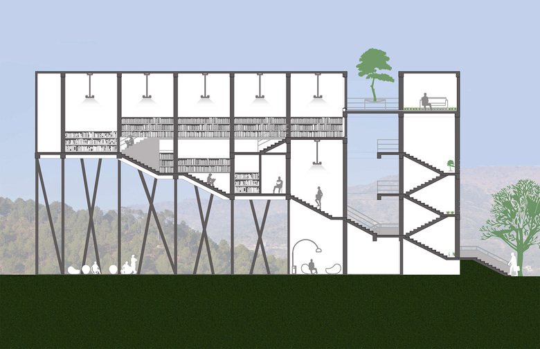
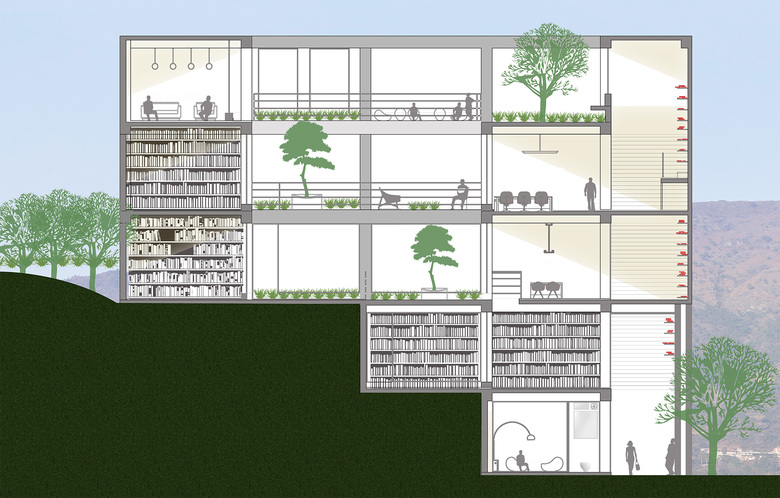
Conceptually, this four-story structure is an intense interconnected volume of voids and solids, connecting the entire building as a large functional plate. It starts as a narrow strip of an extroverted, yet shaded space on the lower two floors. These are research cells and discussion areas for senior students and faculty. The upper two floors are made deeper as the contours recede and the front remains aligned. This allows a large central courtyard that pours uniform indirect light into all the parts of the built floors. The courtyards connect playfully in voids and volumes as they broaden up to the terrace to become a natural container of light. This unrestricted light withcontrolled temperature and views bring the required climatic control within the building.
Functionally, the library books stack up on the periphery, with a row of reading bays forming an inner ring with a center, being a bright green inspiring space. This physical introversion and philosophical introspection in a study environment brings in a sense of silence, creating a sacred space for knowledge and learning in an educational campus.
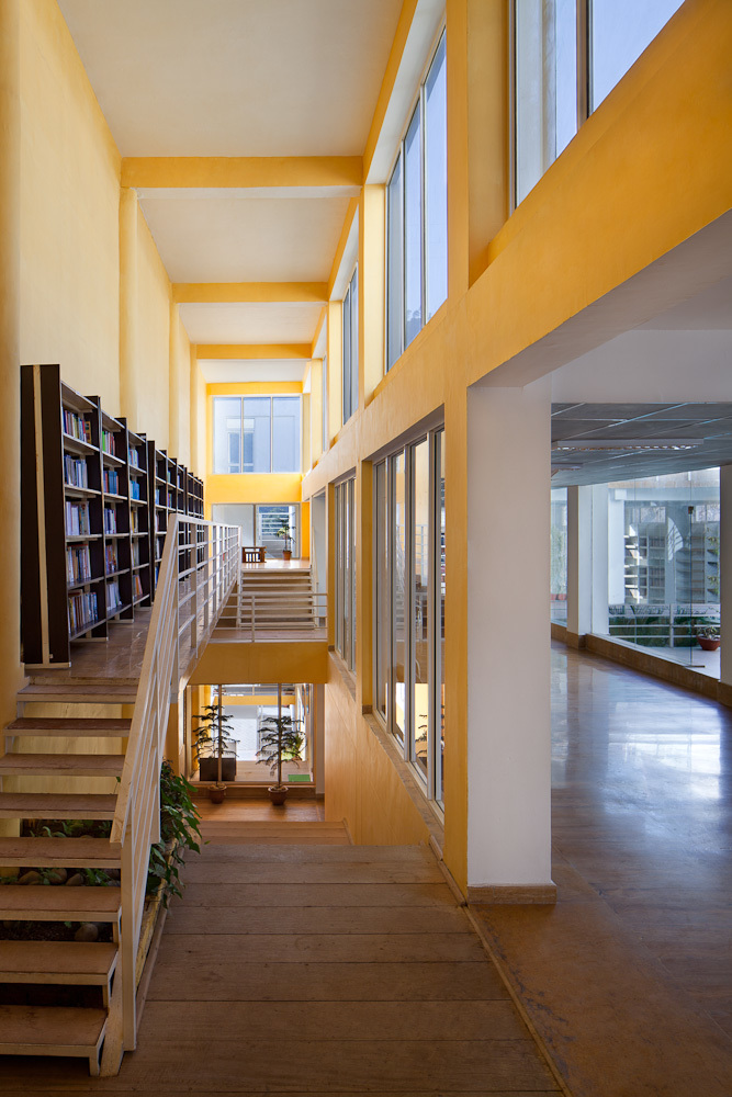
The terrace is a lush green extension of the central courtyard. One could bring books away from the confines of a traditional library stack and read on the refreshing grass, sun bathing on these winter foothills. The greens keep the latent temperatures of the structure in check to add to comfort within. The green roofs bring in a level of drama, as one ascends through these large steps. One could casually climb the spacious stairs and use the steps to surf for books. Seating on steps, lighting from top onto the books and the strong directional volume thus created aids in pulling people and uplifts them, literally. The circulation space is thus reinterpreted as a bright yellow, clean white and raw grey contrast. They work well against each other to give this reinvented route, a refreshing look and feel.
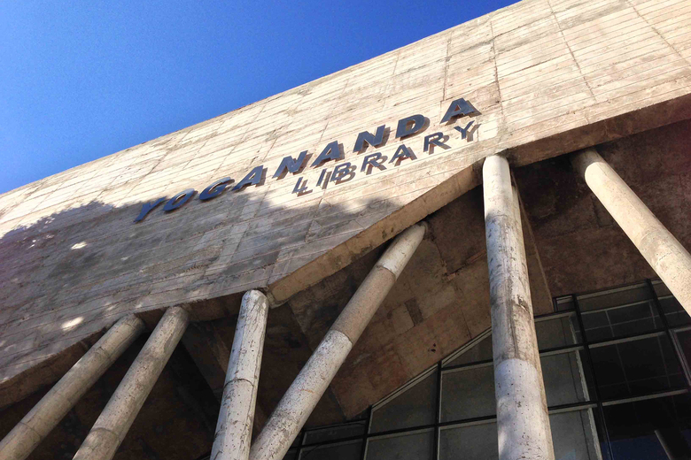
Last, but not least, the fair faced concrete facade is a two-face phenomenon. The inner face of concrete bears the load of the entire shelving system of the library and it's books. The concrete wall is supported by seemingly intersecting concrete columns, an interpretation of the most fundamental element of biotechnology and reflection of the university's logo. The clean facade of concrete and recessed glass brings out the fundamental function of the building.
The spatial superstructure and the exclusivity of the elevation elevates the role of the library on the campus and evaluates the campus for it’s international sensibility. It gives the university an apt image, an ideal icon.
PROJECT CREDITS
Client: Foundation for Life Science and Business Management, Mr. Vishal Anand & Mr. Atul Khosla
Architect: Studio Archohm
Principal Architect: Mr. Sourabh Gupta
Design Team: Sanjay Rawat, Bhoomika Singhal, Sanjay Bisht
Site Area: 4,257 sqm
Built-Up Area: 2,476.88 sqm
Start Date: 12.12.2009
Completion Date: 01.10.2013
Structural: Roark Engineers Consulting
Electrical: Archohm Consults
Plumbing: Techno Engineering Consultants
