BUD
tissellistudioarchitetti presents the renovation of a single family '50s villa in Cesena, Italy.
The client inherited a villa from a beloved aunt and wanted to keep alive the associated memories and affections in the renovation designed to inject it with new life and adapt it to the needs of their family.
This forms the basis for the project, risking an obvious reconstruction of childhood memories and aims at expressing the full potential of this aged, faded beauty from the 1950s.
The three-floor villa is surrounded by a large garden and stands in the Cesena foothills, just outside the city walls. This advantageous position gives it great views over the old town that is only a few metres away and because it stands on a small rise at a crossroad, it is visible to anyone coming out of the historical centre.
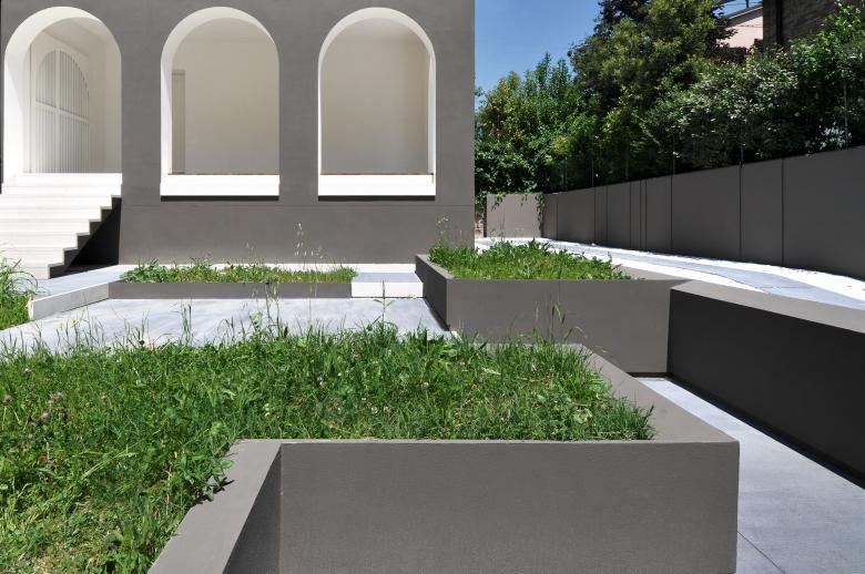
This visibility is one of the many issues addressed in the project, which pursues a harmonious balance between preserving the past that is important to the client and giving the house a radical style and function makeover. This search for balance is also reflected in the choice of colour - a rich, warm grey that stands out from the other buildings around it and contrasts with the white bays of the arch inners and the window ledges, which drop smoothly down the wall, streamlining the proportions of the complex original volume to give it a sleek look. The proportions of the original volume have also been modified by the elegant design of the parapet on the small corner balcony, repeated in the railings of the rear windows.
A system of white milled wood gates forms the main entrance into the property and references the design of the original, now restored pedestrian gateway. The gates and the gateway constitute the two ends of a pedestrian path that is structured around a sequence of steps, exploiting the particular morphology of the block.The path winds around the garden instead of taking the traditional, straight gate-to-front door approach, so different perspectives of the house open up as you gradually come closer. At the same time, you can take in the colours and scents released from the plants in the raised-bed planter boxes of different heights and sizes that flank the path. The driveway is, of course, straighter and runs between the house and the retaining wall separating the lot from the neighbouring property, softened by small, strategically positioned, vertical milling and trims. The wall and the planter boxes are painted the same grey as the house to bring everything together.
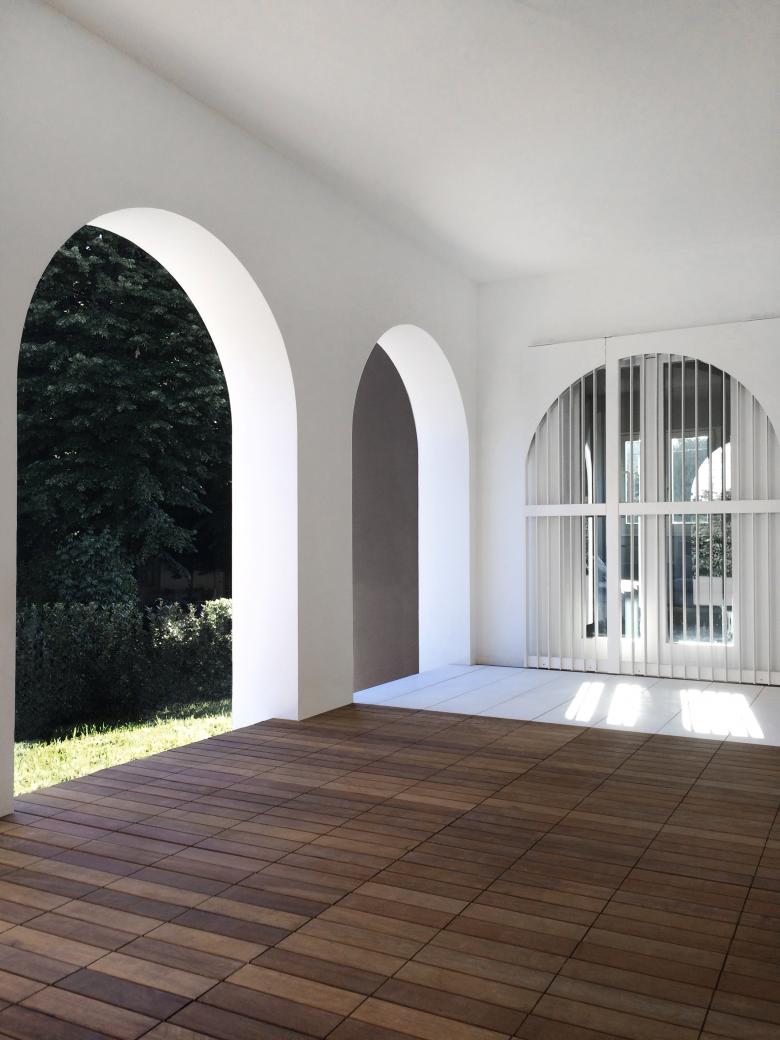
The stairs leading up to the main entry on the raised ground floor are clad in a beige limestone, the same as the bays of the arch inners. A large veranda acts as a filter between interior and exterior, and its timber and stone floor and elegant, white-painted railings give you a foretaste of the combined modernist and contemporary style that runs through the whole project.
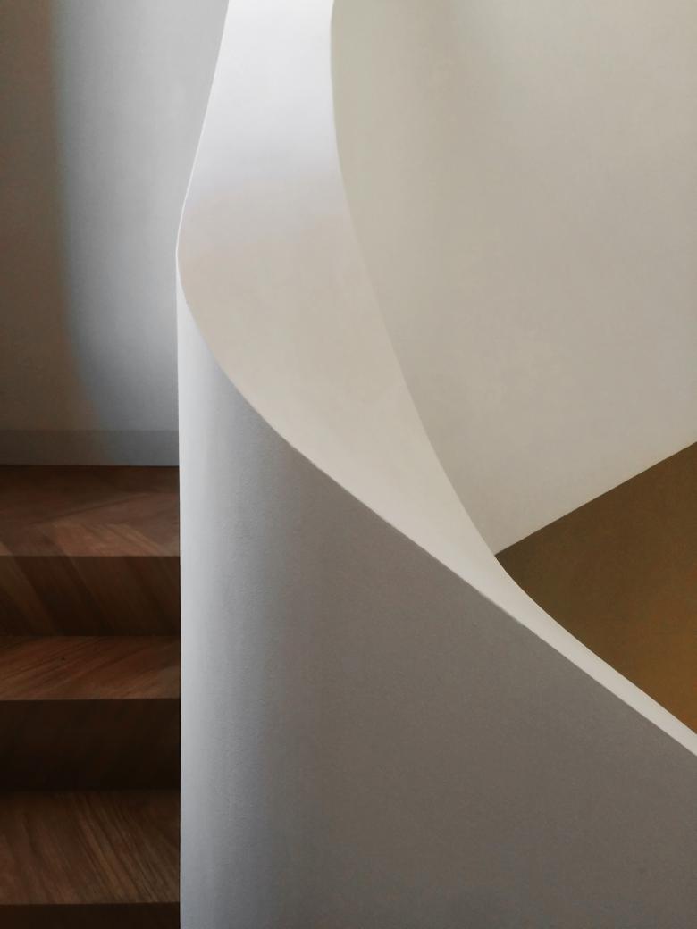
This foretaste gives way to facts when you step through the door into the full-height entrance hall. The stand-out features are the wide staircase connecting the ground floor to the first floor, and the herringbone pattern of the teak floor, which runs seamlessly through the whole house, continuing up the stairs leading to the first floor. The contrast between the flavour of the past and the makeover is immediately showcased in the serpentine, plaster handrail, replacing what would be the traditional iron and wood parapet: its continuous line protects and follows your eyes, framing and bringing out the texture of the wooden stairs.
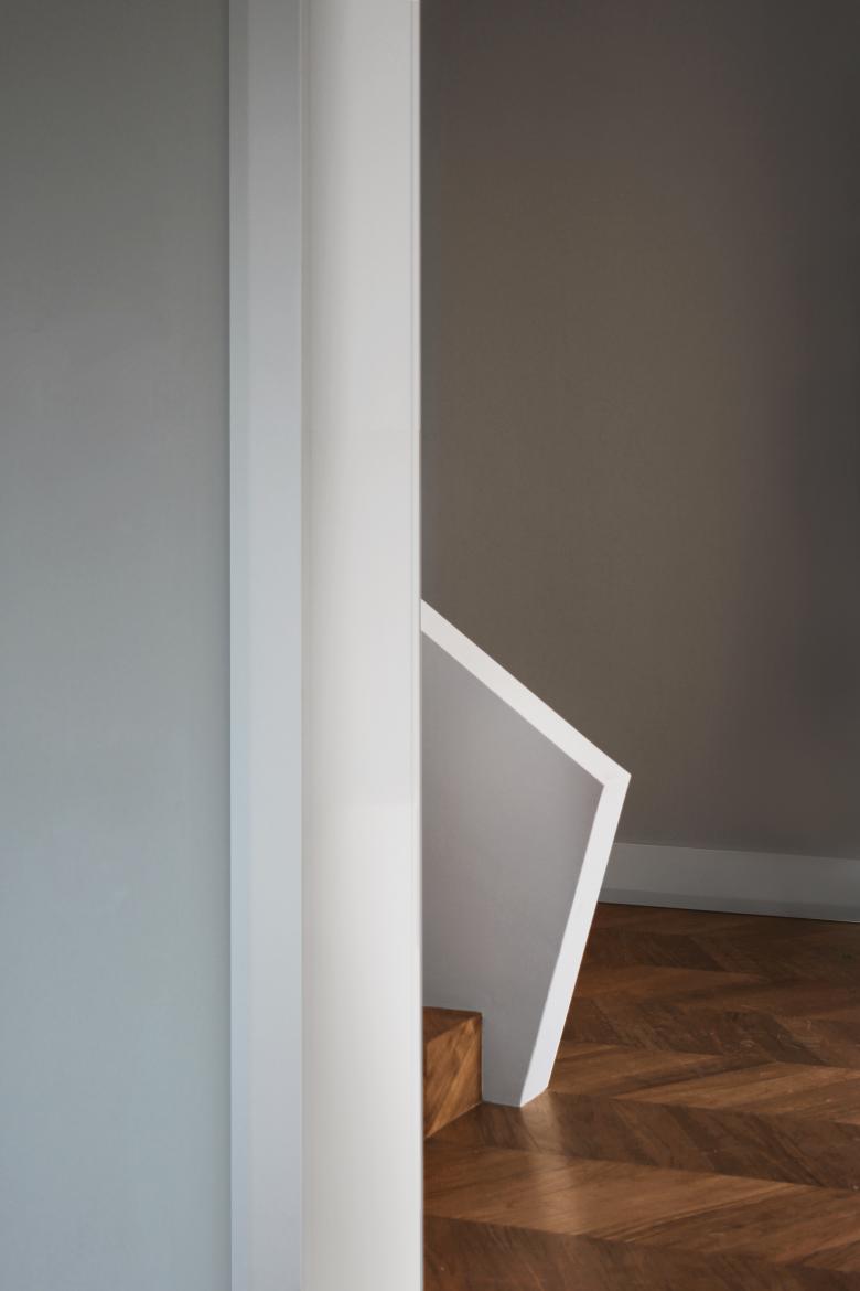
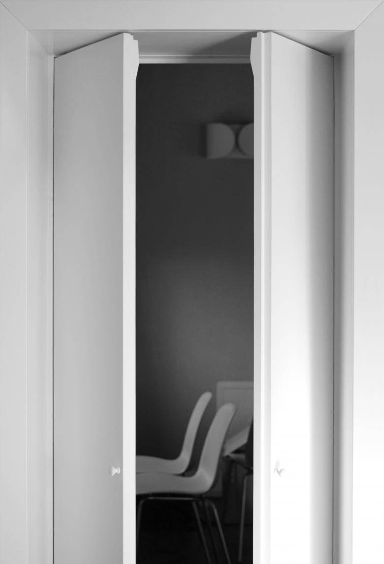
The rooms all hint of continuous references to 1950s design reinterpreted with a contemporary take. Doors and skirting boards discreetly play the game of references with bespoke edging, present throughout the house and recreating the lines of that period.
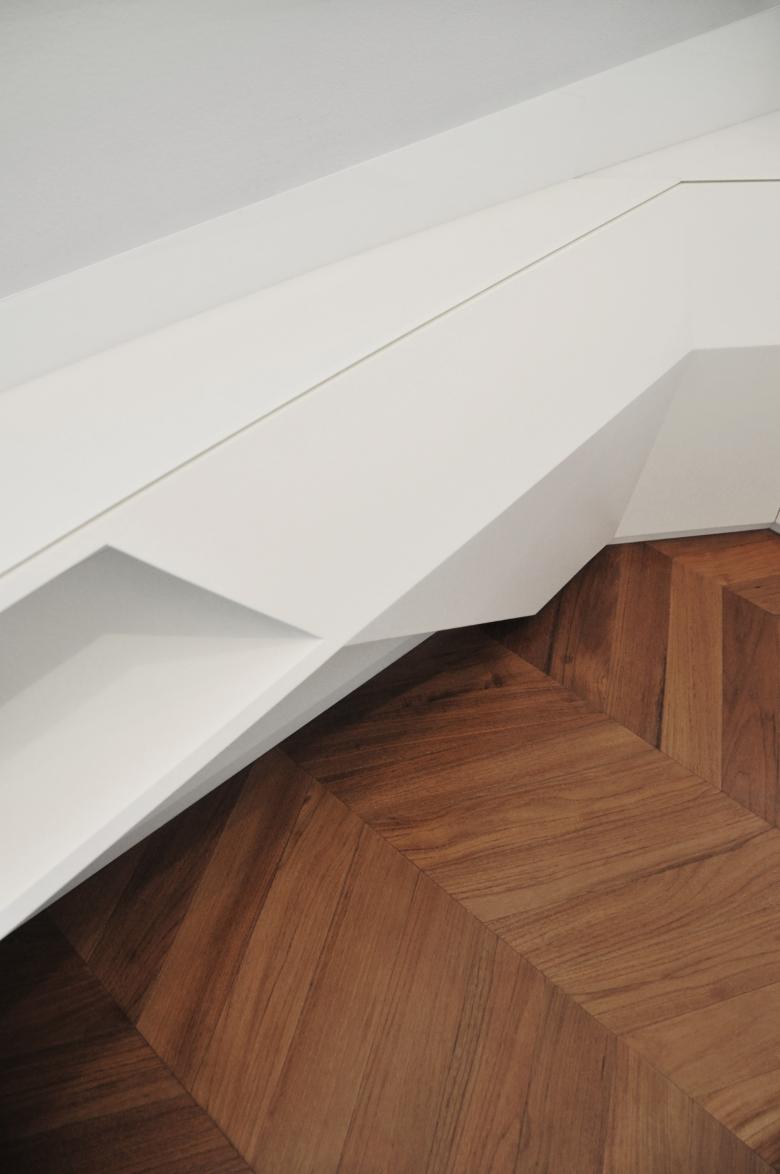
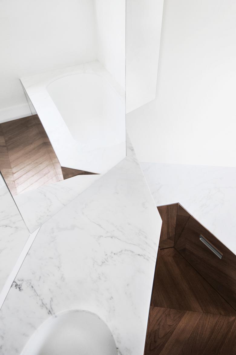
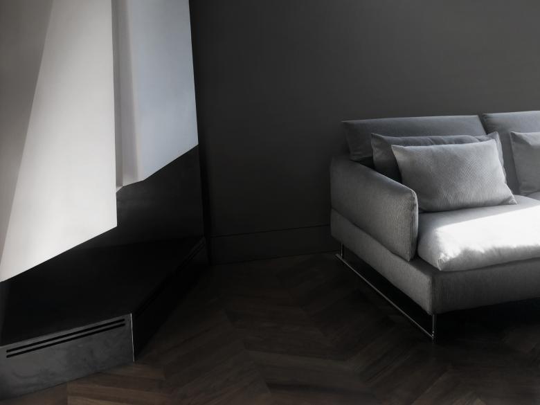
These reassuring accents, like the strictly preserved splayed windows or the mild, familiar feel of the new kitchen design stand alongside bolder, more biting details. The new fireplace in the living room has been positioned in the corner rather than straight-on, acting as a sculpture as well as a fireplace, and the furniture arrangement in the two upstairs bathrooms has been designed with broken lines and split surfaces. Together they pronounce and mark the arrival of a new generation.
- Year
- 2017
- Project Status
- Built
- Team
- Filippo Tisselli, Cinzia Mondello, Marcin Dworzyński


