Yotsubako
Yokohama, Kanagawa, Japan
Turn the steering "commerce" to "urban space"
The site is near Centre-Kita station, in the centre of the emerging suburban district where the number of young families keeps growing.
Here several large commercial facilities scatter forming a unique suburban cityscape. There is also positive urban planning and many energetic young people. However it is still hard to argue that it is being attractive enough as a town or urban space.
Because the commercial facilities are too self-contained to communicate with other plazas and pedestrian spaces offered by the city plan. It seems to become a conventional routine for the commercial designs to enclose their customers and shopping activities, by which surrounding urban environment loses the vigor it deserves.
On the contrary, many other commercial areas of domestic or foreign historic cities are not only open but also strongly related to the urban space in order to promote the business. A positive “circulation” takes shape here as they share a mutually beneficial relation that commerce becomes one of the charms of an urban space while it is booming because of the urban space.
As design intentions, we focused on this “circulation” and “urban space” itself.
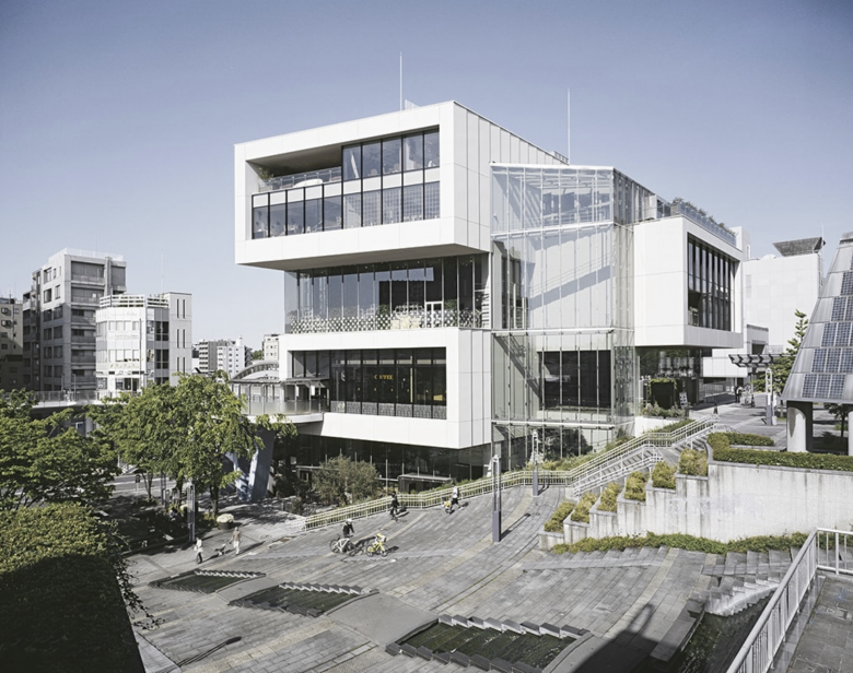
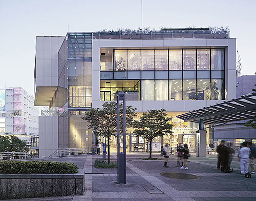
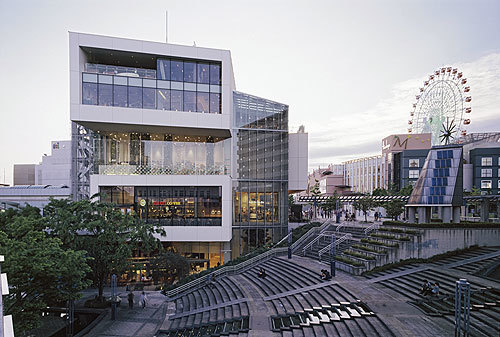
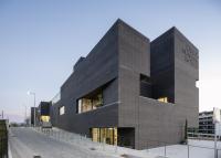
The resolution is the simple composition of four boxes alternatively stacked, which are roughly wrapped by transparent glass skin. The composition further subdivides the contrary relationship between “exterior/interior” into “outside hako · exterior”, “outside hako · interior”, “inside hako · exterior”, “inside hako · interior” and therefore creates a smooth connection between city and architecture.
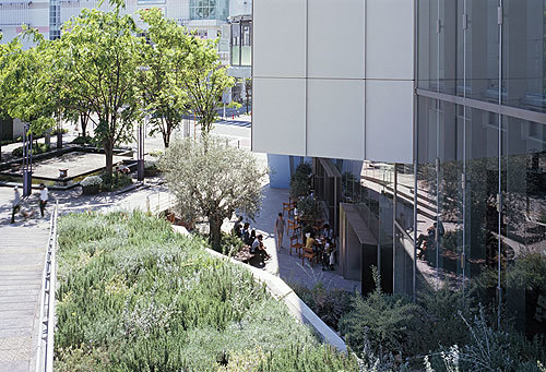
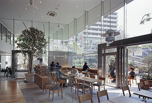
For instance, two existing public spaces on the different levels, saying “symbol plaza” and “fountain plaza”, are closely connected with commercial spaces by the intermediate territory under the box resembling eaves. A couple sits down on the step of the plaza eating pies they bought at the tenant; at the same time some people relaxing in the café have a look at them. A great number of such interrelationships happen and each space is synergistically activated and utilized.
The two ground levels ascend through the full height atrium to the upper floor where urban and commercial spaces are strongly connected, thanks to the panoramic scenery enabled by the glass skin and terraces on the box.
Moreover, a “public pedestrian corridor” that joins the station nearby and large commercial facilities behind it is taken into the design on the 3rd floor, by which its unity with the city is further enhanced.
In addition to self enrichment inside, the success of commercial facilities in the future largely depends on sustainable, attractive planning of urban space as well. It may be necessary to consider architecture as a part of the “urban space” and “continuity of time”. To achieve that, just conventionally dealing with “surface” is not sufficient. For this time, we were able to go beyond that and get further into the composition including the urban space. But it would be closer to persistent value of city if appropriate construction was applied.
We believe this is the first step of journey towards there.
