Skyline Self-Study Room
Shanghai, China
Landscape is always in the distance, but we cannot encompass the horizon within our grasp; Landscape always involves light and shadow, but we cannot chase clouds and sun indoors; Landscape is always concrete, but we cannot move mountains to create scenery; Landscape always brings many beautiful feelings to people.
It is both a natural occurrence and a cultural rebirth. It emits a power that makes hearts expansive and joyful, warm and resolute, as if striving to elevate our spirits. Most study spaces require individuals to be within a directed functional goal. Each person has their own specific activities, and all material presence in the space needs to serve the individual's objectives. If this artificial space is handled carelessly, it can become a constraint on human conscious activities. When we realize that everything we construct in space, with landscape-like attributes, can inversely affect everyone in that space, we reference the landscape. Therefore, we aim to inject a scenic experience into the study space under the objective requirements of direction, a subtle uplifting force.
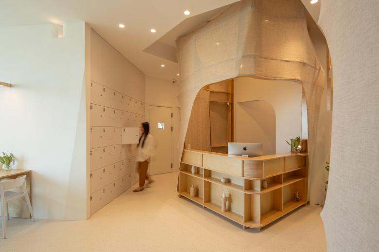
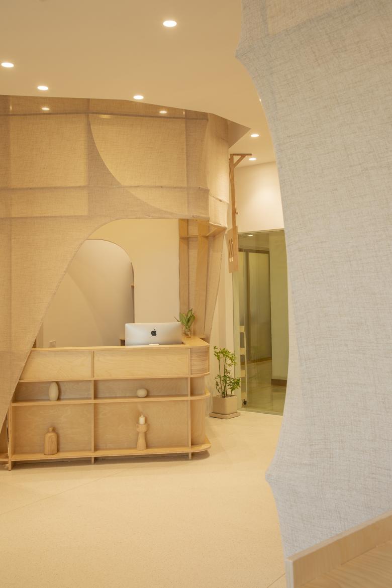
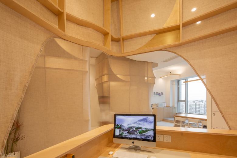
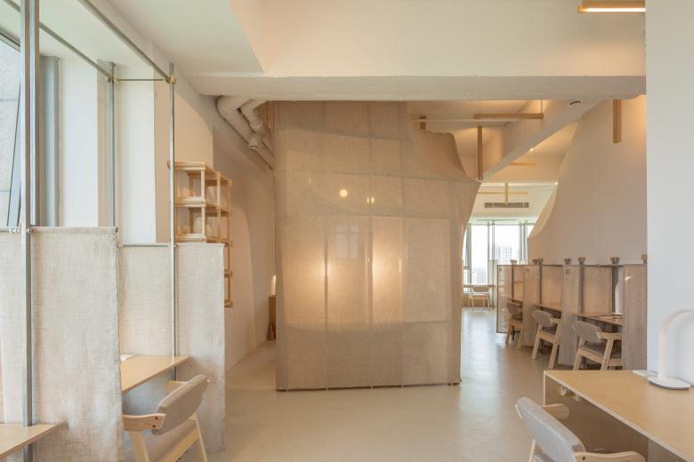
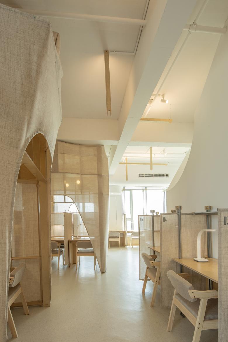
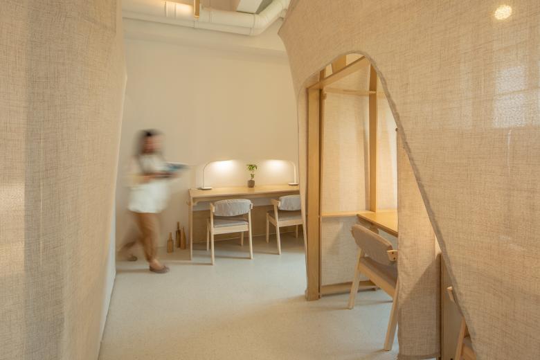
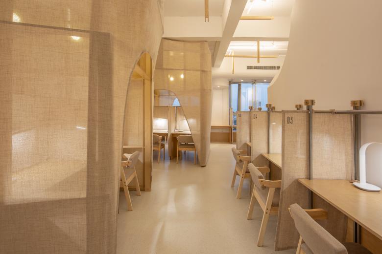
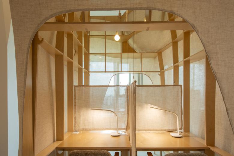
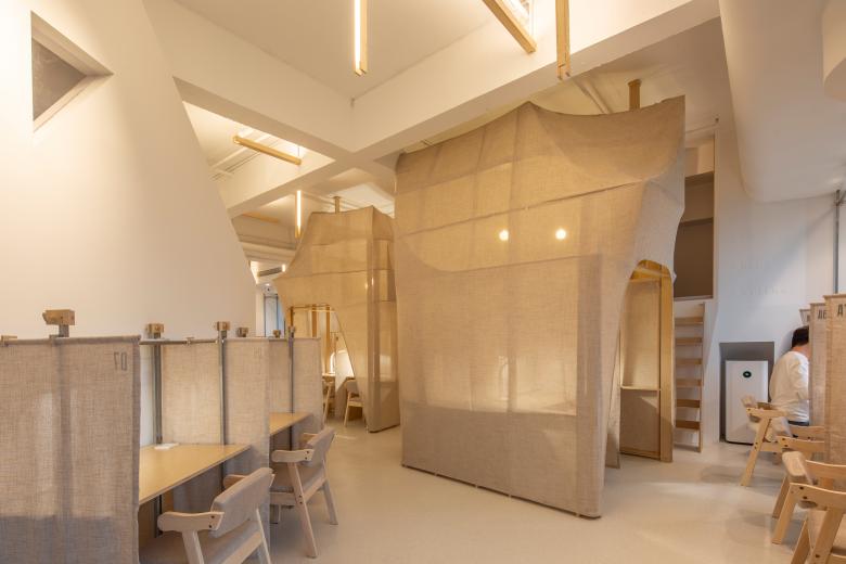
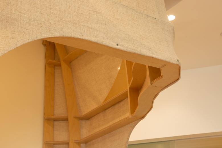
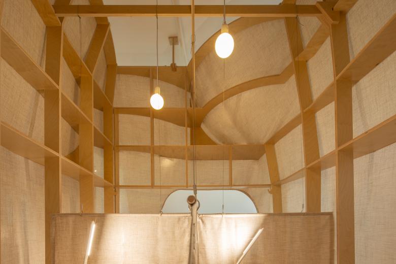
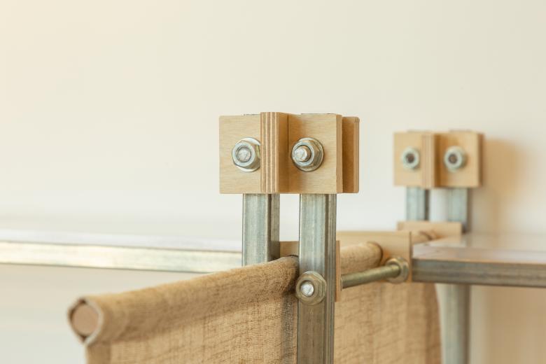
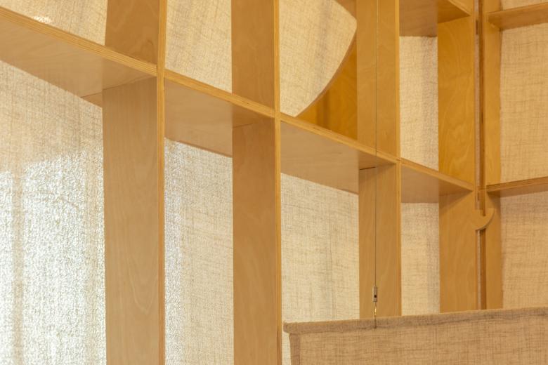
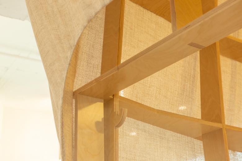
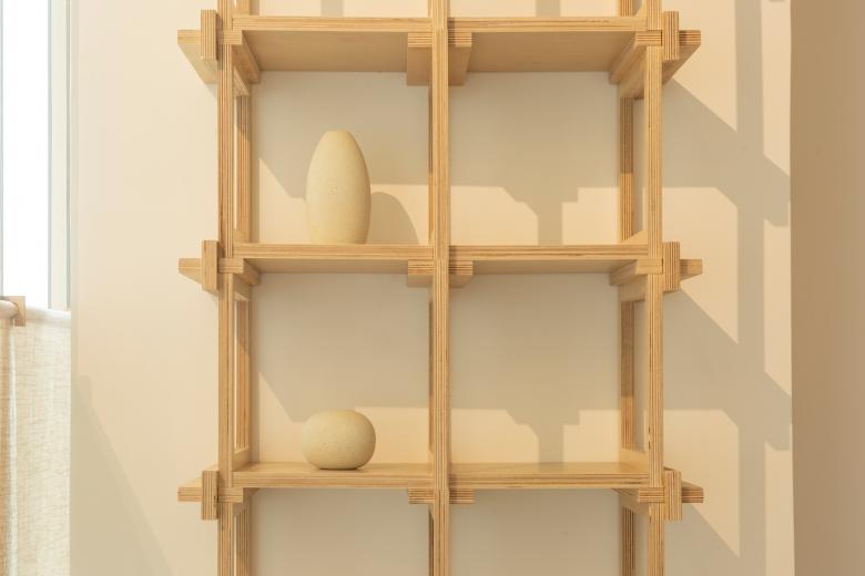
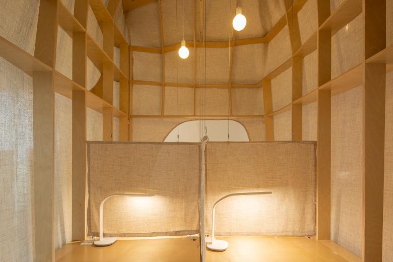
Here, the landscape is not rigidly manipulated in form, nor is it an imitation of scenery. The horizon here is destined to be nearby, easily reachable with a raise of the hand; the light and shadow here are inherently cultural, interwoven with dots and lines; the scenery here is inherently abstract, with sharp angles. We have embedded five mutually reflective blocks in the overall space, distributed in public and study areas, linking the functional flow of the space—reception, double study, and group study. We intentionally elevated the blocks, and the seemingly grand volumes created a visual effect similar to "scenery." However, tall forms often create a sense of distance, especially in functional spaces that emphasize efficiency. This sense of distance can lead to a confined space, intensifying relationships between people. Through continuous refinement of form, we discovered that in the upward extension process, the volume slightly expands outward, creating a sense of shelter. This resembles the intention of canyons and large trees. To ensure the block's form is soft and to maximize the reduction of pressure from the form on people, we avoided traditional hard construction materials and chose fabric with an affinity texture as the block's outer garment. We designed a specific contour language, assembling prefabricated wood components into a support frame, covering it with fabric to shape and tighten, intentionally revealing the frame's contour lines to create a soft tension. Under this soft outer garment, it seems like a solid body—when we walk through the space, occasionally stopping to meet, it feels like entering a massive shelter.
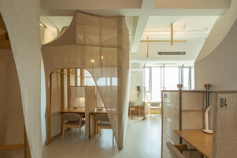
And so, the landscape is also hazy, with a blend of reality and illusion, lightness and weight. Two blocks located in the open study area stand tall on the east-west main corridor of the study area. At dawn, the sun rises from the horizon. Light crosses over the desks and chairs along the window, penetrates the seams and openings in the fabric coat, lightly dispelling the heavy shadows under the blocks—awakening these two massive bodies, as if eagerly awaiting the earliest visitors. With the passage of time, sunlight retreats outside the window, and the interior is bathed in homogeneous natural light, revealing the full and varied contours of the blocks.
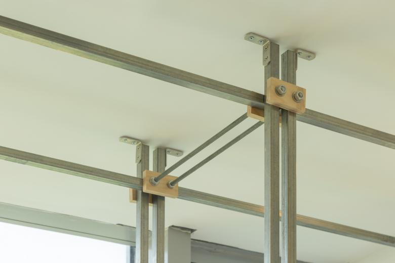
The seminar room requires higher sound insulation and privacy. To meet users' psychological need for a sense of volume thickness, we applied more solid walls to the enclosed space. When the blocks are dressed in fabric coats, we use the space formed between the fabric and solid walls as a lighting position. When light emerges from the cavity, clear crescent-shaped contours and blurred longitudinal and transverse shadows of ribs intertwine, projecting on the fabric's surface, creating a lightness under lighting conditions that complements the heavy nature of the tower space inside the seminar room. In the lighting design of the open study area, we designed modular linear fixtures, large-span cantilever structures, and used steel wire ropes. The glowing openings are positioned to avoid people's line of sight, minimizing the presence of light sources. The fixtures in high-altitude spaces are reduced to individual intersecting wooden components, diluting the visual significance of the light source and maximizing the creation of luminous surface areas on the ceiling. Suspended wooden structures, diffused light, create a light and tranquil atmosphere in the study area.
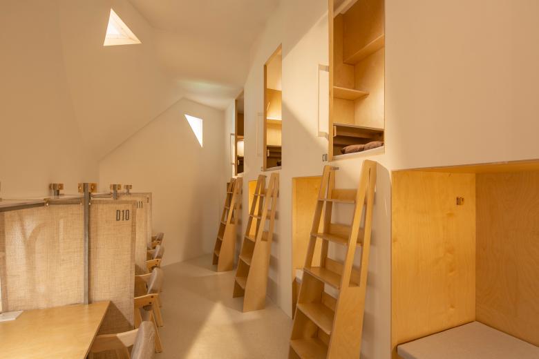
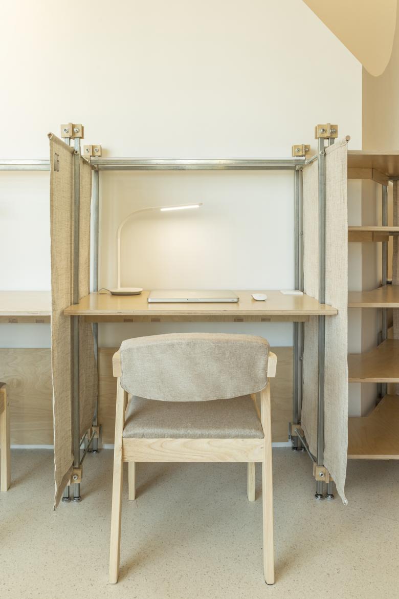
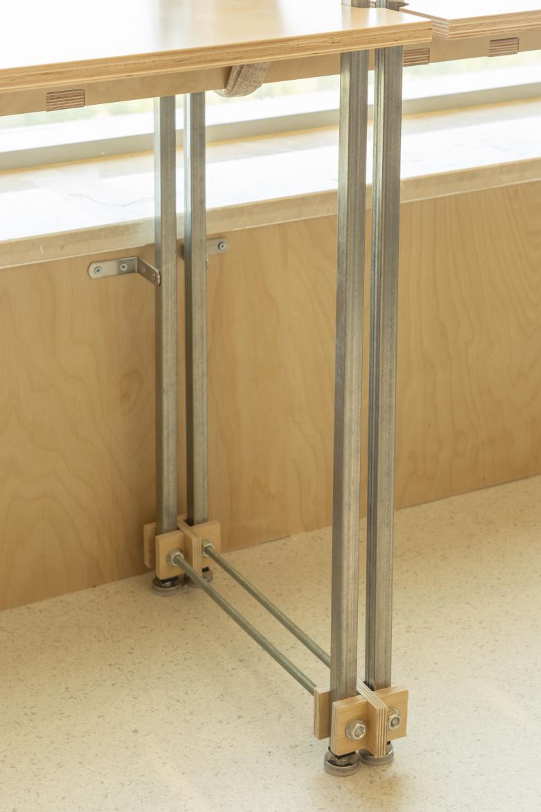
In the landscape, there are colors, originating from the nurturing earth. White reveals the pure appearance of the sky and horizon here; undyed linen makes the material itself more natural and friendly; exposed galvanized steel pipes and details of multi-layer board assembly locks highlight the organic feel of material connections in the contrast of warmth and cold; and in the low-light area, bright yellow artificial light passes through triangular portholes on the sculptural wall, projecting onto the interior walls, freezing the moment in the afternoon.
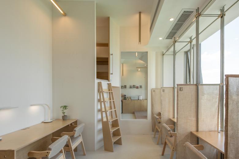
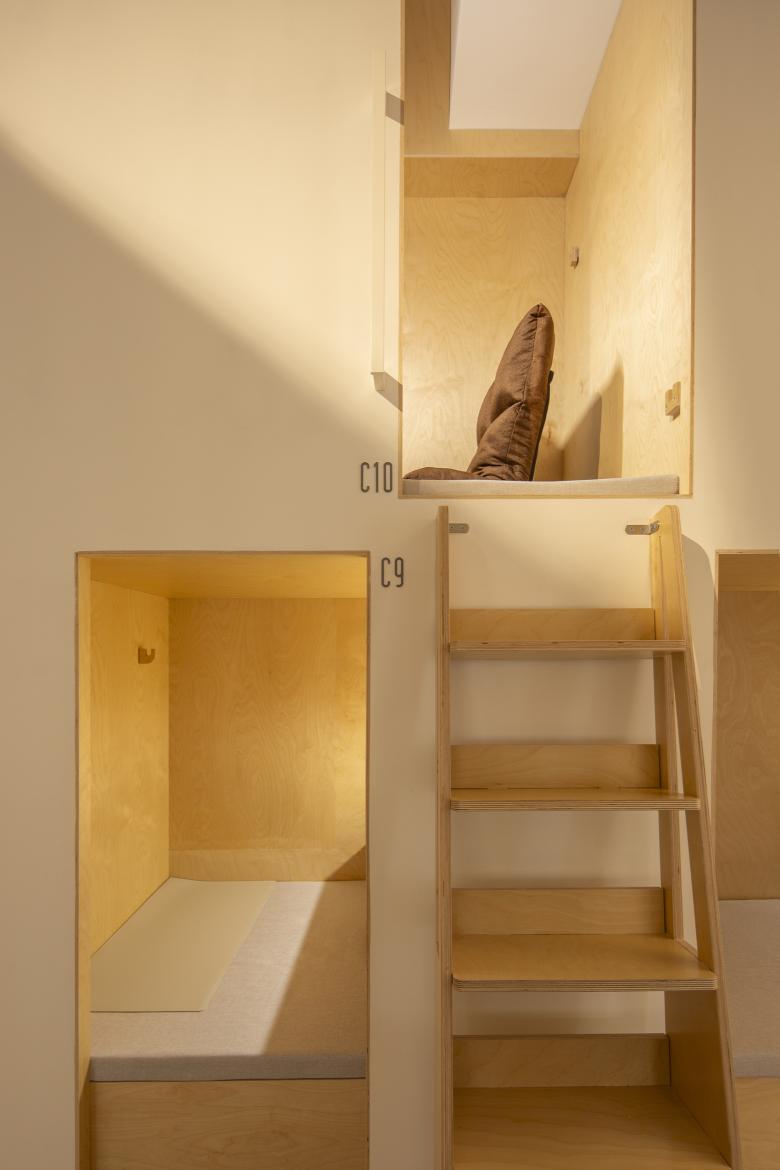
The privacy of the study area has always been a demand of study space. We want to find a balance between individual privacy and the overall space. To ensure the private use of individual seats, we designed retractable fabric curtains between single desks, with a height critical to the line of sight, allowing natural light and the viewer's vision to extend to the distance. In the open area and the study area's partition walls, we reserved a full-height glass surface. Meanwhile, in the low-light area's wall corner, we created a unique triangular opening, and in the corner of the bright study area, we erected a second-floor tower space. This complements the different orientations of the openings of the two fabric-covered blocks in the study area, diverting people's lines of sight to various corners of the space during breaks, allowing thoughts to wander from the desk.
The landscape, when remembered, is gentle, and when approached, it is lifted slightly, arriving at the heart.
As night falls and the lights come on, it is as if delicate lanterns are about to rise. When approached, you will feel a subtle upward force, leading you to the high.

