Skin and Laser Center Altmühltal
Eichstätt, Germany
The Skin and Laser Center Altmühltal is located in Germany close to Munich and was opened in February 2016. On an area of 380 square meters, the center consists of a dermatology practice including an operating theatre and an individually accessible cosmetics department. The core business of the practice is classical and aesthetical dermatology (e.g. body fat reduction via Cryolipolysis). Additionally the Skin and Laser Center Altmühltal offers beauty treatments (e.g. skin rejuvenation, Botox treatments, permanent hair removal) and laser surgery using the latest laser technologies.
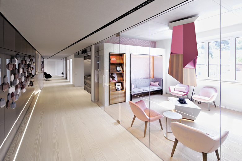
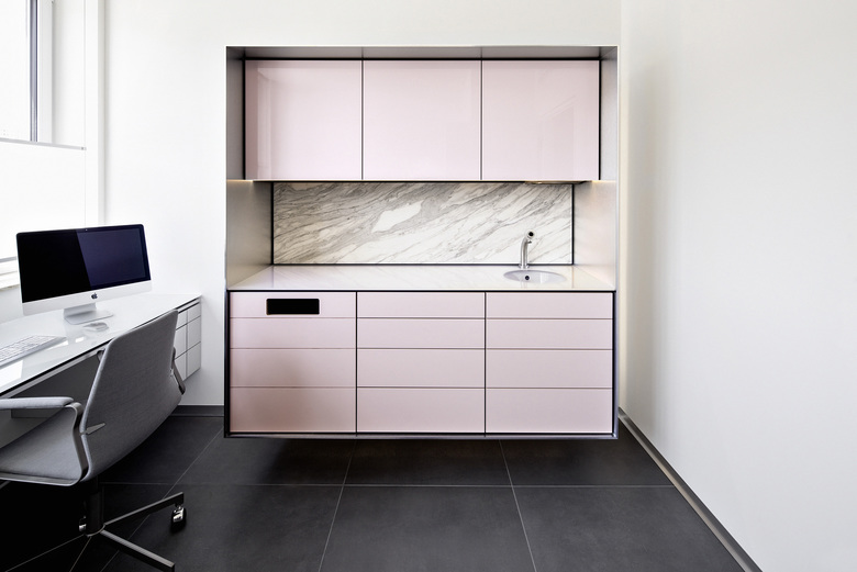
Key design features in the practice are clear visual axes, discreet coloring and an exceptional quality of the interior. The main theme of the design concept is the texture of skin in different variations, for example polygonal structures. Other features of the concept are pastel shades, mirrored surfaces, elegant shades of grey and the architectural lighting.
The client’s main objective was to meet all hygienic requirements of a dermatology practice including an operating theatre. Furthermore it was important to develop an authentic corporate design of the interior, which expresses the identity of the Skin and Laser Center Altmühltal. The main goal was to create an independent brand with high recognition value in all the aspects of corporate communication (corporate design incl. office equipment, print products and online presence). In order to fulfill those requirements, we chose to establish a three-dimensional marketing, which focuses on the brand message as well as on functional aspects. The client’s wish was to create a visual connection between the special field of dermatology and the interior concept. Therefore we decided to focus on the concept “skin”. In the design state we gathered ideas of various interpretations of skin - haptically as well as optically. Afterwards we presented the draft of our design concept with its central theme “skin” to the clients.
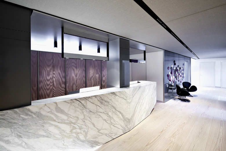
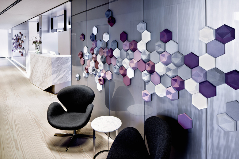
In the following some of the elements of the design are described: The hexagonal shape of skin cells can be found in the wall design - for example the custom-made concrete cubes in different colors in the corridor or embossments in the waiting rooms. The rosy tone of skin is the main color concept of the whole practice. Different shades and tones of the color family are used. Real natural materials, reflecting the naturalness of human skin, are also part of the design concept. Examples are the reception desk made of Calacatta Statuario marble or the 8 meters long, rosy colored boards made of Douglas fir.
- Interior Designers
- Reimann Architecture
- Year
- 2016
- Project Status
- Built
- Client
- Meier Kosmetik GmbH
- Team
- Herr Sergius Kowalski, Herr Julius Reimann
Related Projects
Magazine
-
-
Building of the Week
The Three-Body Problem: Trapped in a Wave Sandwich
Eduard Kögel, Scenic Architecture Office | 13.04.2026 -

