MORPH
Hisense Southern Building, Nanshan District, Shenzhen, China
Located in Nanshan District, Shenzhen, China and occupying a corner of a building, MORPH is a mixed-use space with a total construction area of 1,000 sqm. With an urban park and Houhai business circle nearby, it's a rare tranquil place amidst the hustle and bustle of the downtown area. "MORPH" means transformation and evolution in Chinese. The client hopes to build a vigorous and brand new social space, to introduce and hold various cultural, artistic and musical events, with a view to bringing new vitality to the city.
The project was approached by Various Associates, a local-based design studio. According to the project designers' understanding, evolution indicates progress and variation. Taking account into the context of Shenzhen — a new city, they wanted to utilize some traditional and local materials to collide withthe modern interior structural forms, and fuse gradually-forgotten Chinese old elements with international modern designs and aesthetics in an innovative manner, thereby presenting the "evolution" of design. The designers' idea is to realize collisions within the space through a diversified material palette, contrasting interior scenes as well as division of multiple functional areas.
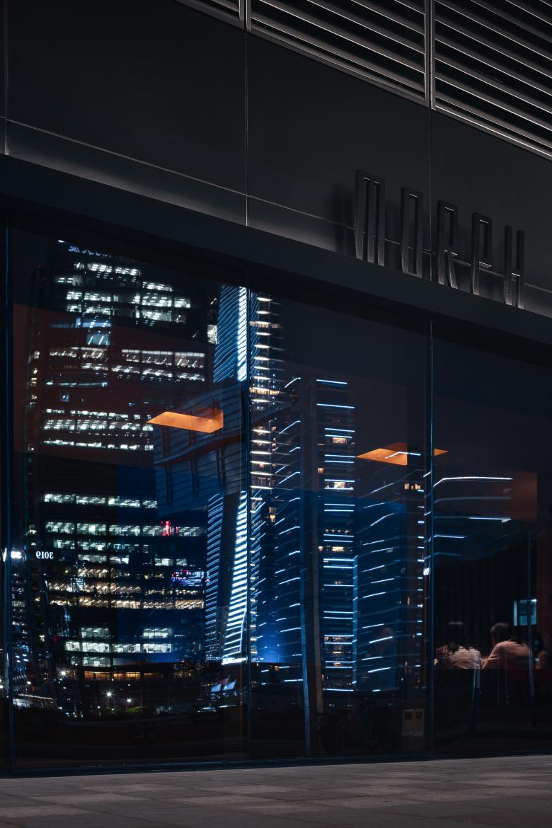
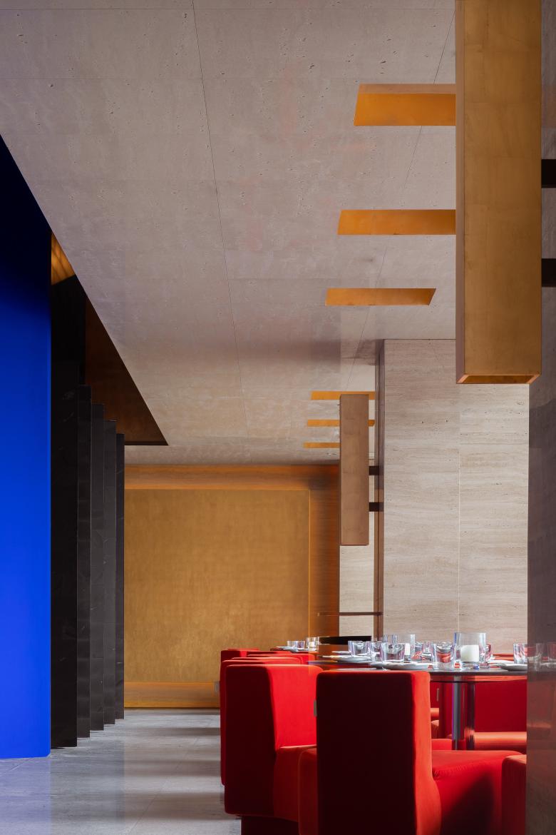
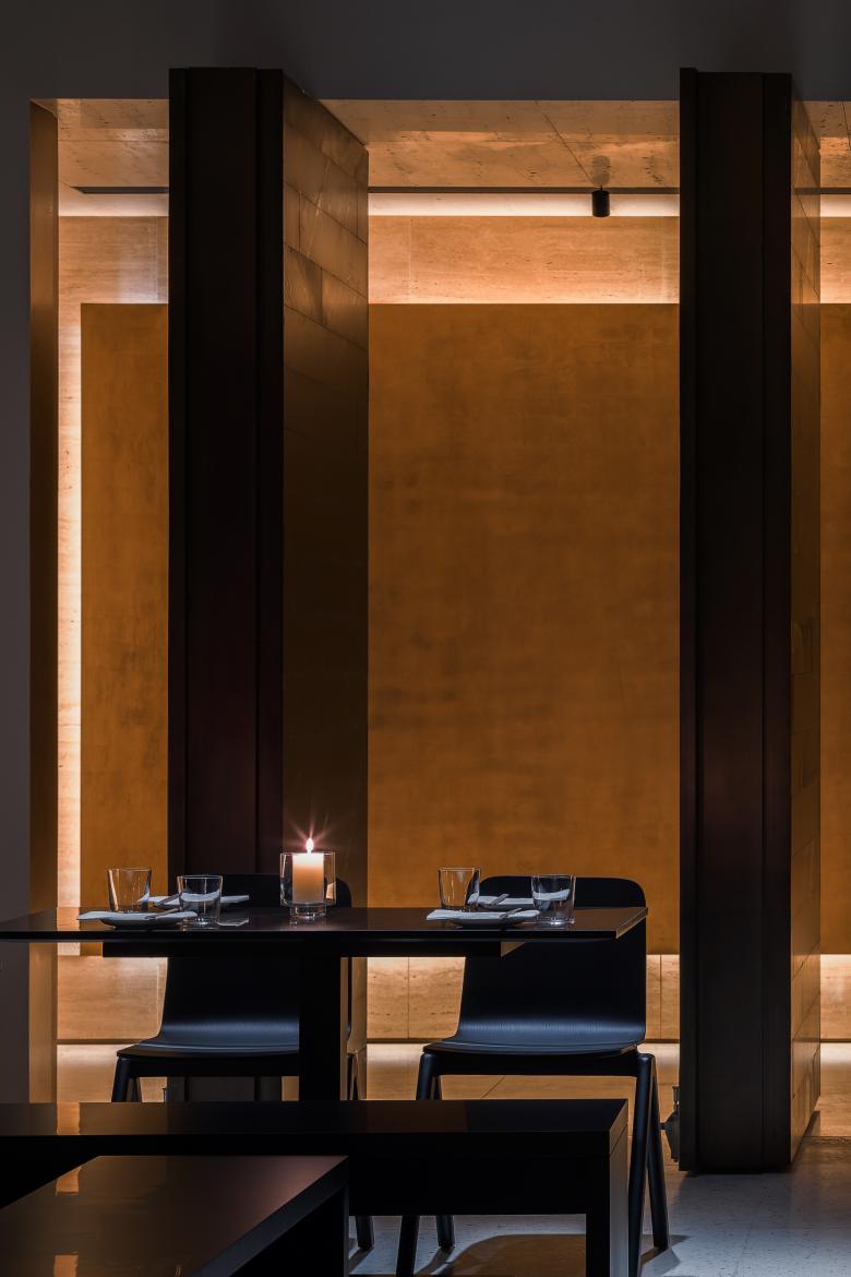
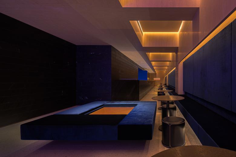
Walls and ceilings are mainly clad in sand-color natural travertine, which adds a subtle texture to the simple and warm volume as well as presents a visual impression of modernity and eternity in combination with brass connections and holes finished with gold foil, forming striking contrast with surrounding buildings visually. Lightweight yet massive, composed yet prudent, transparent yet closed, the space is awash with contrasting elements.
The color palette is inspired by the Forbidden City, consisting of red, blue, black, yellow and gold, which feature extremely high saturation and are consistent with the colors of Wu Xing (Wu Xing is also named as the Five Elements,which includes metal, wood, water, fire and earth. In traditional Chinese philosophy, Wu Xing is the foundation of everything in the universe and natural phenomena). The five hues with Chinese characteristics are reorganized, interpreted and transformed in a modern approach within the space, which well integrate with the interior structures, together producing visual highlights.
The designers combined diversified modern materials with traditional materials exclusive in China.
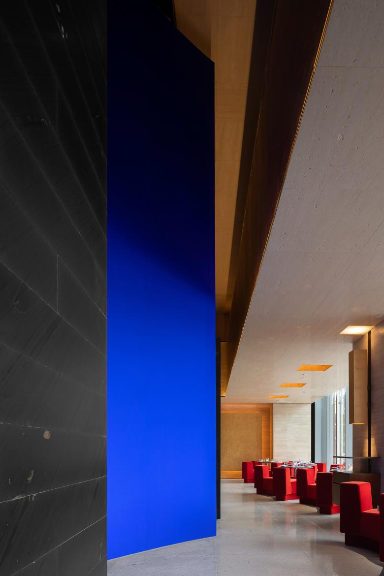
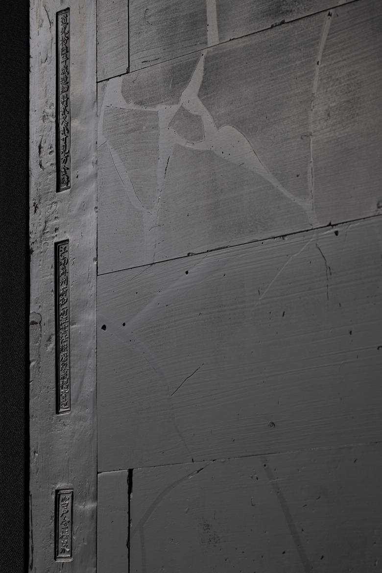
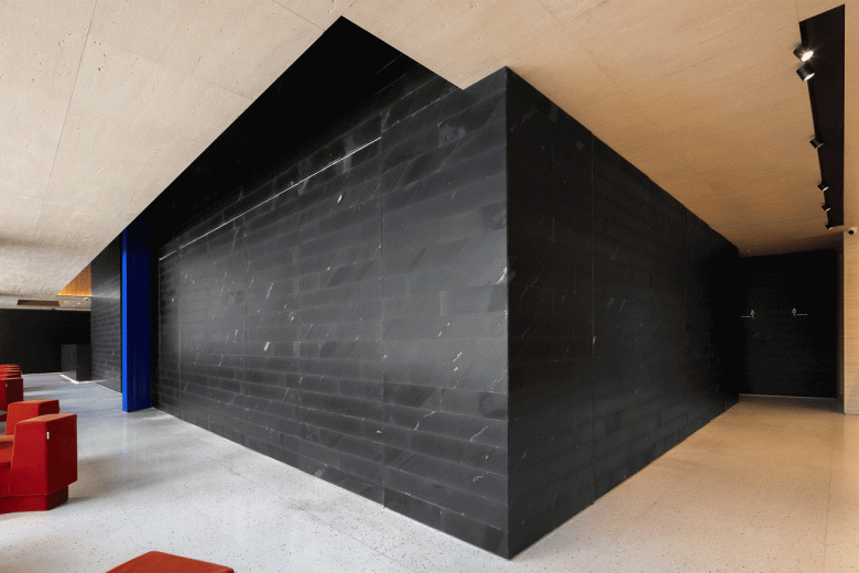
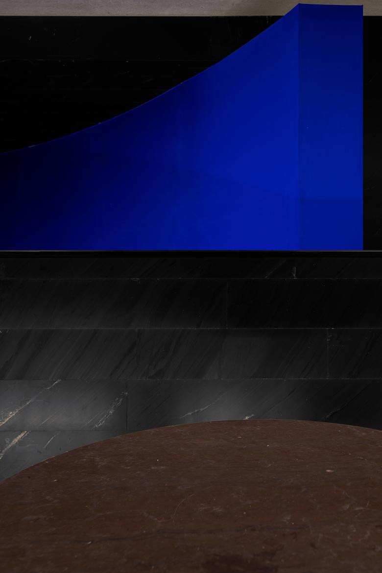
The matte black wallsare covered with a new environmentally-friendly material. It’s made from a kind of traditional black tiles which can be seen on the floor of Forbidden City’s palaces (Interior flooring tiles of the Forbidden City are also named as “gold tiles”, because they are as precious as gold.), via modern technology and a reorganization process. This new cladding not only maintains the texture and properties of “gold tiles”, but also greatly reduced the cost. According to researches, the traditional “gold tiles”, which crystallize ancient Chinese craftsmen’s wisdom, will disappear 20 decades later due to the lack of raw materials.
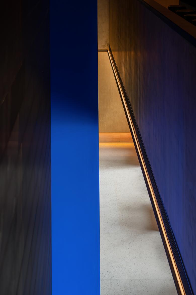
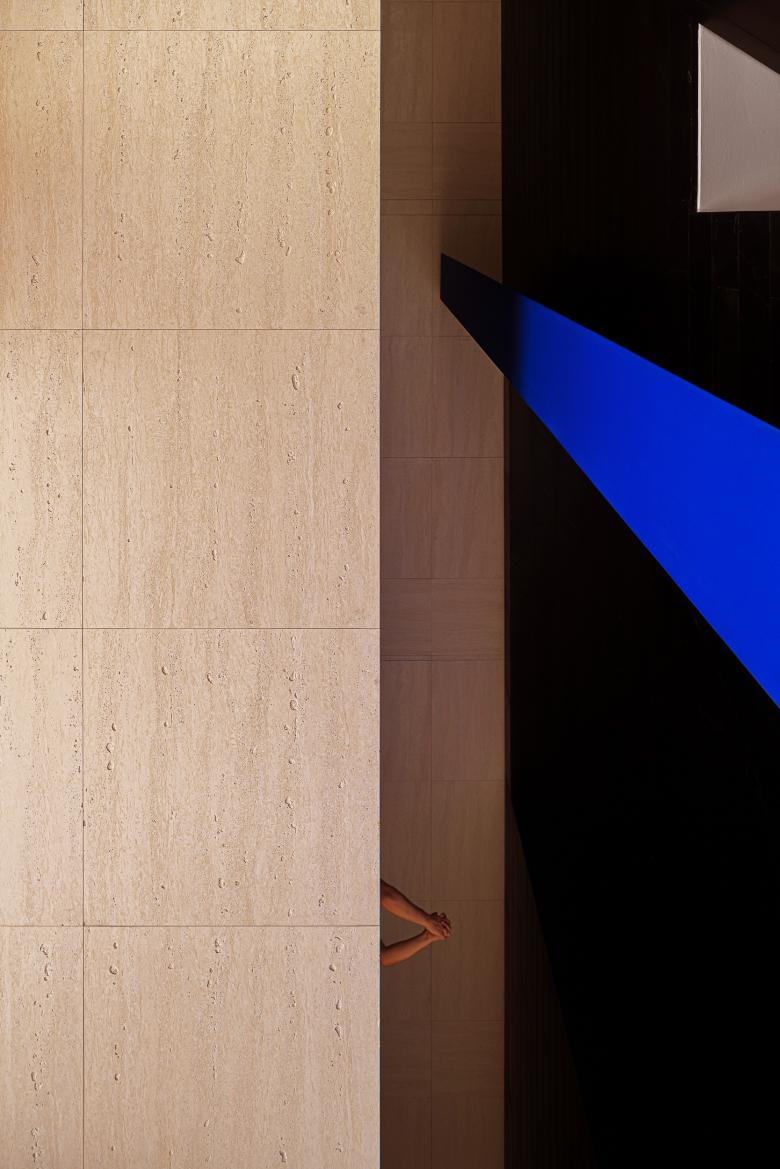
The blue curved doors are wrapped in a kind of traditional Chinese fabric hand-dyed by experienced craftsmen, which is characterized by high chroma. Hand-dyeing is a traditional craft, and different batches of cloth dyed manually have different shades. At the center of the space erects a high wall, which features an "orthodox" blue color, seeming to declare the fabric covering’s unadulterated quality in an uncompromising way.
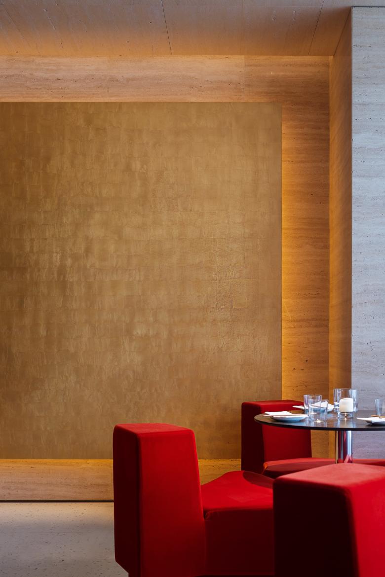
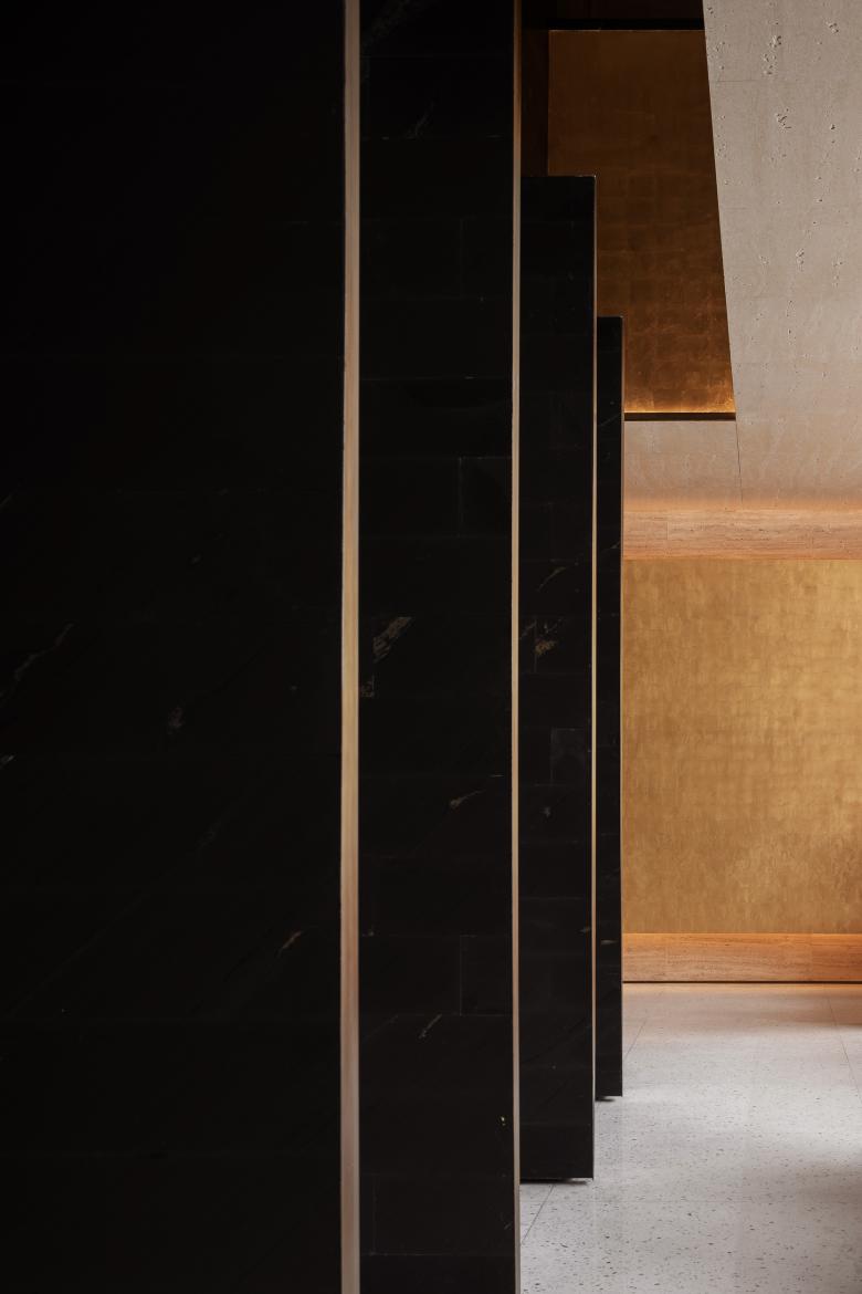
Gold is dotted throughout the space, which is rendered by gold foil, with a warm and natural texture. Each piece of foil was stuckby hand, similar to the way of how gold buddha statues in temples are clad. Layer upon layer, the gauze-resembling gold foil showcases unique grains and textures, and becomes more shiny through the reflection of light.
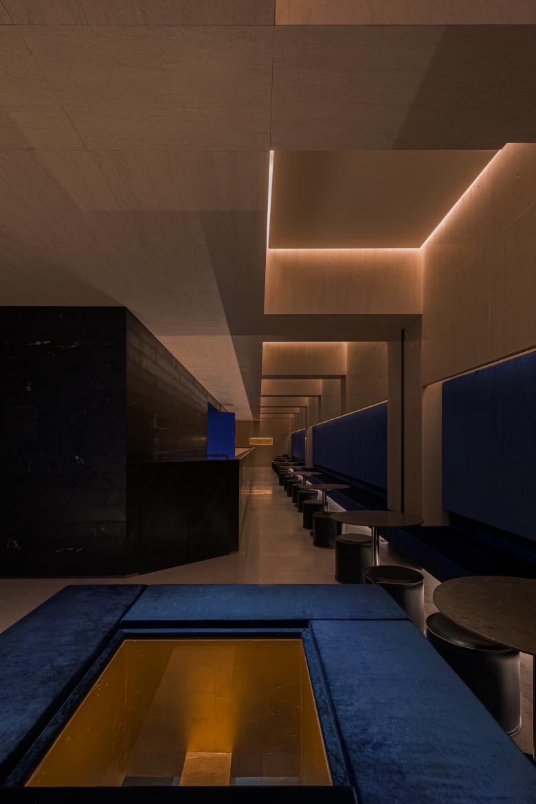
Gold openings on 1F's ceiling subtly connect the two storeys. Gleaming light shines onto the gold foil and then generates reflection, endowing the interior with a Zen ambience and a sense of ritual.
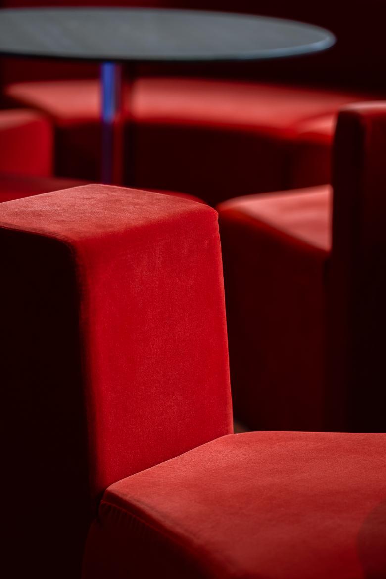
Red velvet sofas feature special shapes, which add a sense of modernity and playfulness to the solemn space. The bright red collides with the strong blue of the curved walls, forming interesting contrast. It's the first sofa series that Various Associates created in collaboration with Fresh, an excellent domestic furniture brand.
With a warm hue and natural textures, the earth-toned Italian travertine generates appealing contrast with the matte black walls and walls finished with gold foil.
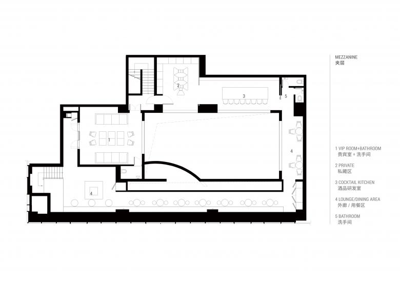
The key design intervention of the project is the creation of a mezzanine. Through precise structural calculation, the designers added a mezzanine to the original 7-metre-high space, which is regarded as 2F. A circular and flexible circulation connects all functional areas, and structural languages well match with materials featuring strong hues, hence maintaining balance and unity in an expanded space.
Another bold intervention is to insert a slightly oblique and curved double-height structure into the geometric space, which can not only link, partition and define the space, but also highlight spatial identity and increase brightness. The structure is set between the lounge and the activity area with black walls in a unique manner, perfectly presenting a geometric aesthetic via the collision between materials and structures. Looking up from 1F, it enhances spatial transparency, establishes a visual connection between two floors, and breaks the limitation of 1F's storey height as well as eliminates its oppressive feeling.
MORPH is a bar, an event venue and a transformable space, available for facilitating “interaction between human and city” in cultural context. Functional areas are set around a 7-meter-high activity space at the center. With capacity for 100 people, theatre acoustics, and spatial installations which can be replaced irregularly, it's adaptive to various types of activities and provides local people with a fantastic place to socialize.
Flexible rotating doors on both sides of the activity space can meet the needs of different events and exhibitions. When doors close, a separate inner activity space is created, while it connects the lounge as doors open, which enriches the interaction and sense of layering within the overall space. People including performers can go through the doors casually, thereby resulting in interesting interactions and scenes.
Viewing from the lounge, continuous spaces and revolving doors bring the space more possibilities and flexibility to have different activities. Like a beating heart that expands, those doors endow the space with different layers and variations, just echoing its name — MORPH.
Functional areas such as bar counter, lounge, VIP room and cocktail kitchen are arranged around the activity space, forming an interesting ring-like circulation that can be segmented and reorganized flexibly for various events.
Special windows were designed at the functional areas on the mezzanine for guests to enjoy activities and performances held at the activity space downstairs, which provides another view to varying scenes.
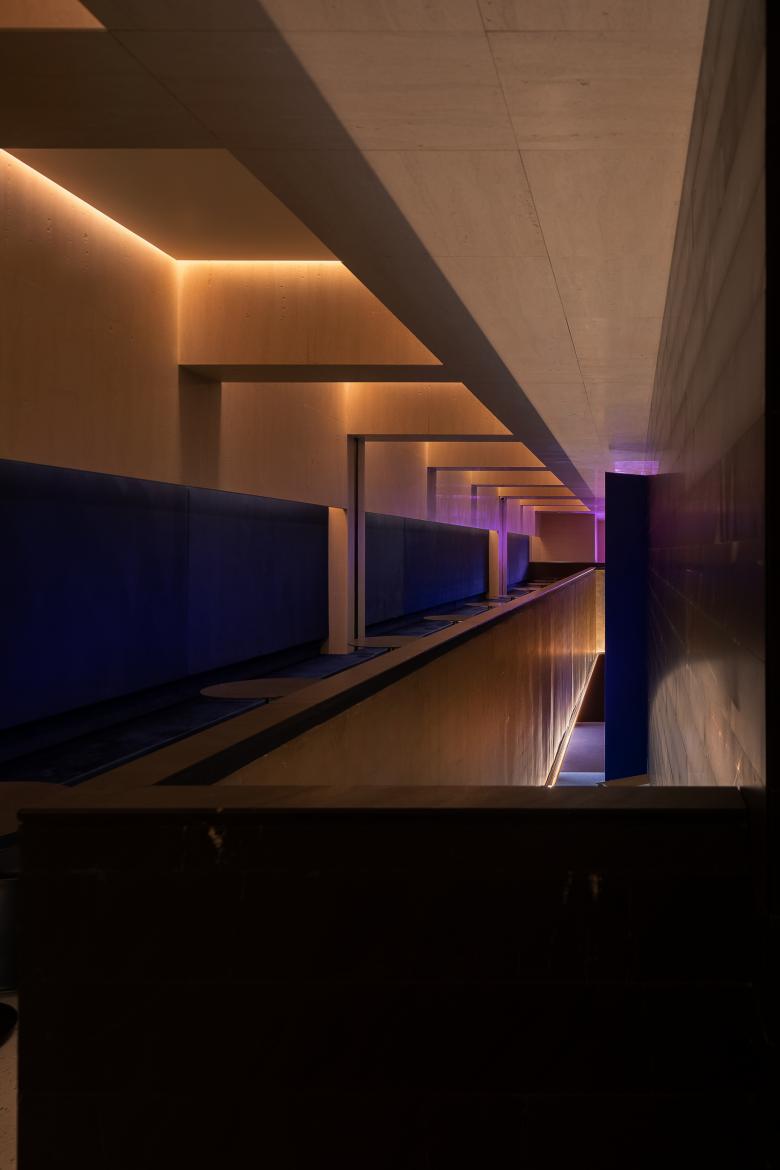
At the deep and tranquil lounge area on the mezzanine, indigo velvet booths are perfectly combined with repetitive ceiling structures, which fills the space with a sense of architecture and a geometric aesthetic.
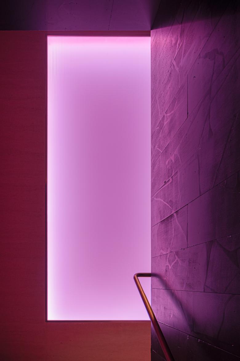
The geometric installation in the stairwell glows pink, adding liveliness and vividness to the calm and structure-predominant space.
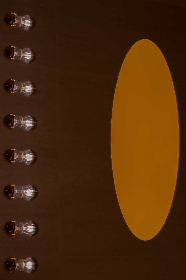
The designers created a scene of “mirror in mirror” in the bathroom. It redefines the way of displaying mirrors by taking advantage of the space, and highlights subtle interactions between people and mirrors with interpenetrating visual effects.
Through this project, Various Associates explored and worked out a solution to tackle with the oblivion and disappearing of traditional Chinese materials: on the one hand, adopting unique design approaches to innovate the way of using traditional materials and redefine them in modern designs; on the other hand, integrating China-specific materials with modern technologies, materials and designs, so as to break through the limits of traditional materials utilization and realize “re-design with old material”.
Amidst the prosperous and charming urban night view, MORPH shows its expectation and hope for the city with a unique posture. Just as its name indicates, it keeps evolving and transforming to face different challenges and bring infinite possibilities.
- Architects
- Various Associates
- Year
- 2019
- Project Status
- Built
- Client
- MORPH
- Status
- Completed in July 2019
- Design team
- Various Associates
- Project leader
- Qianyi Lin
- Chief designer
- Dongzi Yang
- Designers
- Dongzi Yang, Jingjing Tang
- Area
- 1000 sqm
- Photographs
- Shao Feng

