Louis Hotel
Viktualienmarkt, München, Germany
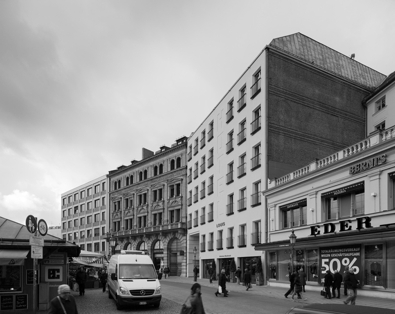
On 9th September, the Louis Hotel opens. Who is Louis? According to the hotel managers Kull & Weinzierl, he is a world traveller, who values loving detail and high-quality materials. It is no coincidence that his name resembles that of the Bavarian fairytale King Ludwig: his adopted home lies in the centre of Munich, at the Viktualienmarkt. The Kustermann company commissioned Hild und K Architekten to convert existing buildings into a boutique hotel with shopping arcade. The latter is publicly accessible and connects the Viktualienmarkt with the Rindermarkt square, where it opens into the foyer of an existing medical centre, whose facade was also refurbished during the reconstruction. The old cladding was removed and both buildings now shine in a light grey tone.
In this project, Andreas Hild and Dionys Ottl were faced with the task of finding a relation to the old town without neglecting the demands of modern building. They decided on a reinterpretation of different Munich building traditions: Baroque and the architecture of reconstruction in the fifties, strikingly represented by the immediately neighbouring buildings at the Rindermarkt square: the Peterskirchen parish house belonging to Munich’s oldest community and the Kustermann store. The architectural concept interlaces both styles, probably most obviously at the head end of the hotel. The view from the Viktualienmarkt of the neatly arranged room-high windows with French balconies gives the facade a modern feel, while the stucco profiles around the window openings create Baroque movement. This side of the building also carries huge letters in plaster relief which cross the facade vertically from the third to the fifth floor. They form the word “Hotel” thus informing from afar on the usage of the building.
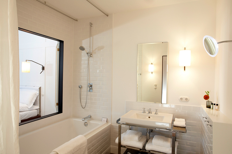
The aesthetics of the interior, co-designed by the architects during the project, also narrate a story. Importance was attached to individuality: none of the seventy-two different sized rooms matches the other, neither in shape nor in furnishing. A number of especially designed pieces of furniture and accessories recount tales of travelling and arriving. The wardrobes for example, which stand in the rooms in the shape of large travel cases. Or the tiles inspired by those in the Paris Metro. Although pervaded by the spirit of the wide world, the rooms give comfort at the same time: local woods, materials in colours inspired by nature and natural stone from the region create a cosy atmosphere and strengthen the ties to the location, as does the facade. The world traveller Louis, at any rate, feels completely at home at the Viktualienmarkt.
- Architects
- Hild und K
- Year
- 2009
- Project Status
- Built
- Client
- Grundbesitz- und Verwaltungsgesellschaft Viktualienmarkt 6 mbH
- Team
- Andreas Hild, Dionys Ottl, Nina Großhauser, Christian Huber, Katarzyna Kielkucka, Andrea Sommer, Stefanie Tröger


