Living and Working at Tucherpark
Munich, Germany
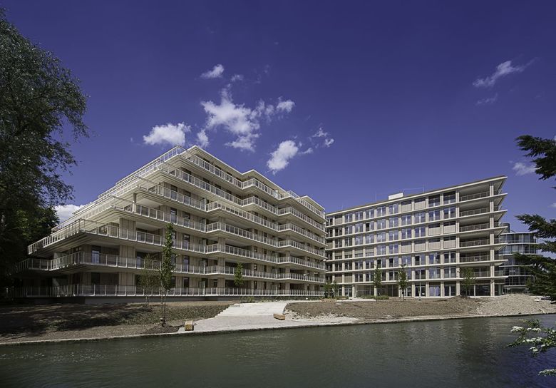
Respect and Character – On behalf of HOCHTIEF Project Development, Hild und K Architekten designed this small ensemble of 7-storey residential and office buildings. Their shapes and terraced facades blend beautifully into the surrounding structures at Munich’s Tucherpark. This administrative district idyllically situated between the Eisbach, a gushing channel branching off the Isar River and the English Gardens was designed in the 1960ties by Sep Ruf on initiative of the Bayerische Vereinsbank and is today protected as a historic ensemble.
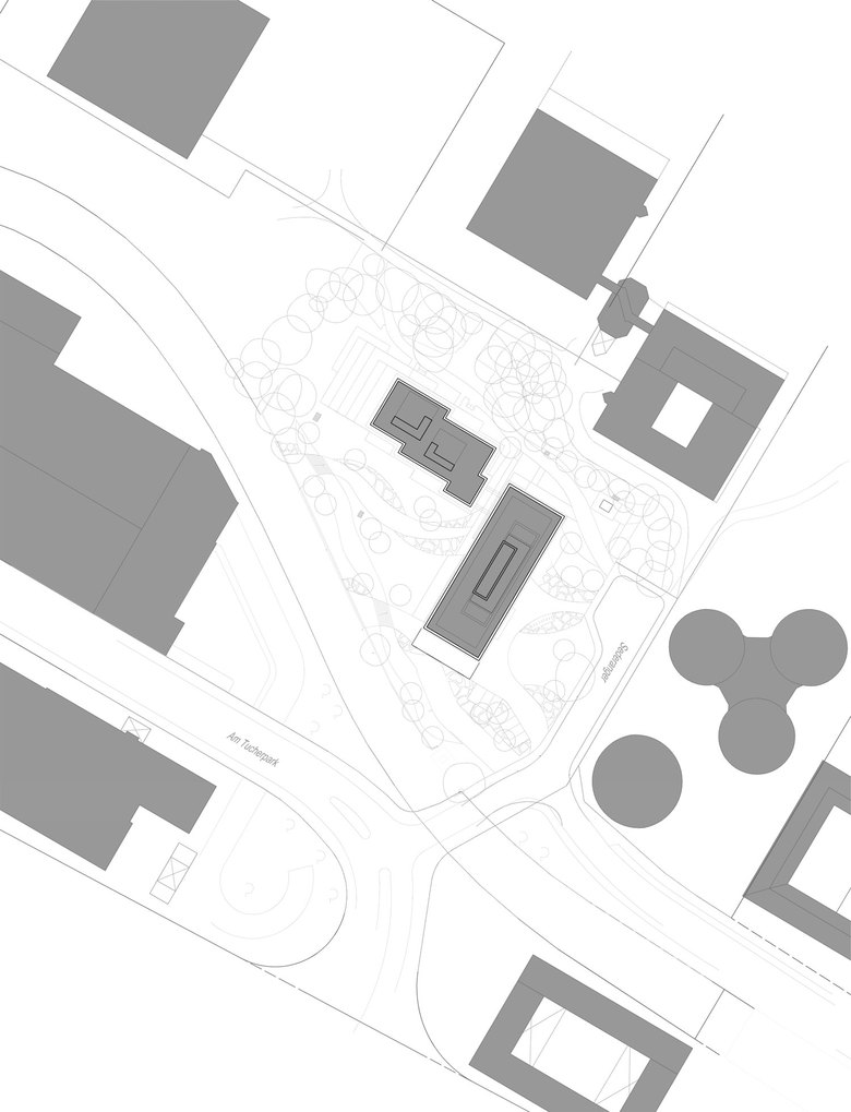
Yet, unlike the neighbouring buildings, Ruf himself did not design the pagoda-style terraced house originally on this site. It was built in 1973 as an IT centre for the Central State Bank (Landeszentralbank), the extremely large room depths made any plan of conversion much too complicated. The Monument Protection Authority finally gave permission for it to be demolished and space to be made for these now completed new buildings. The representative main entrance to the office building is at the address “Sederanger 1”. To the back a pagoda-style residential building stands at a ninety-degree angle and is connected via two rooftop gardens.
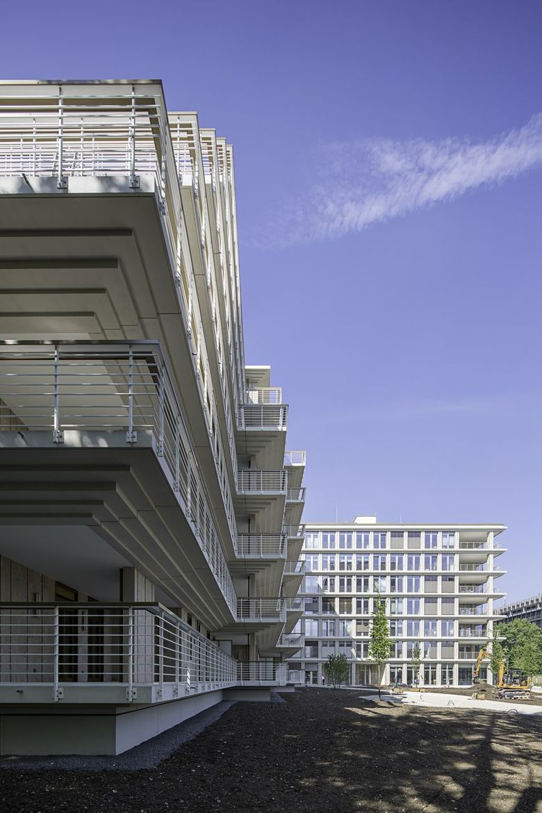
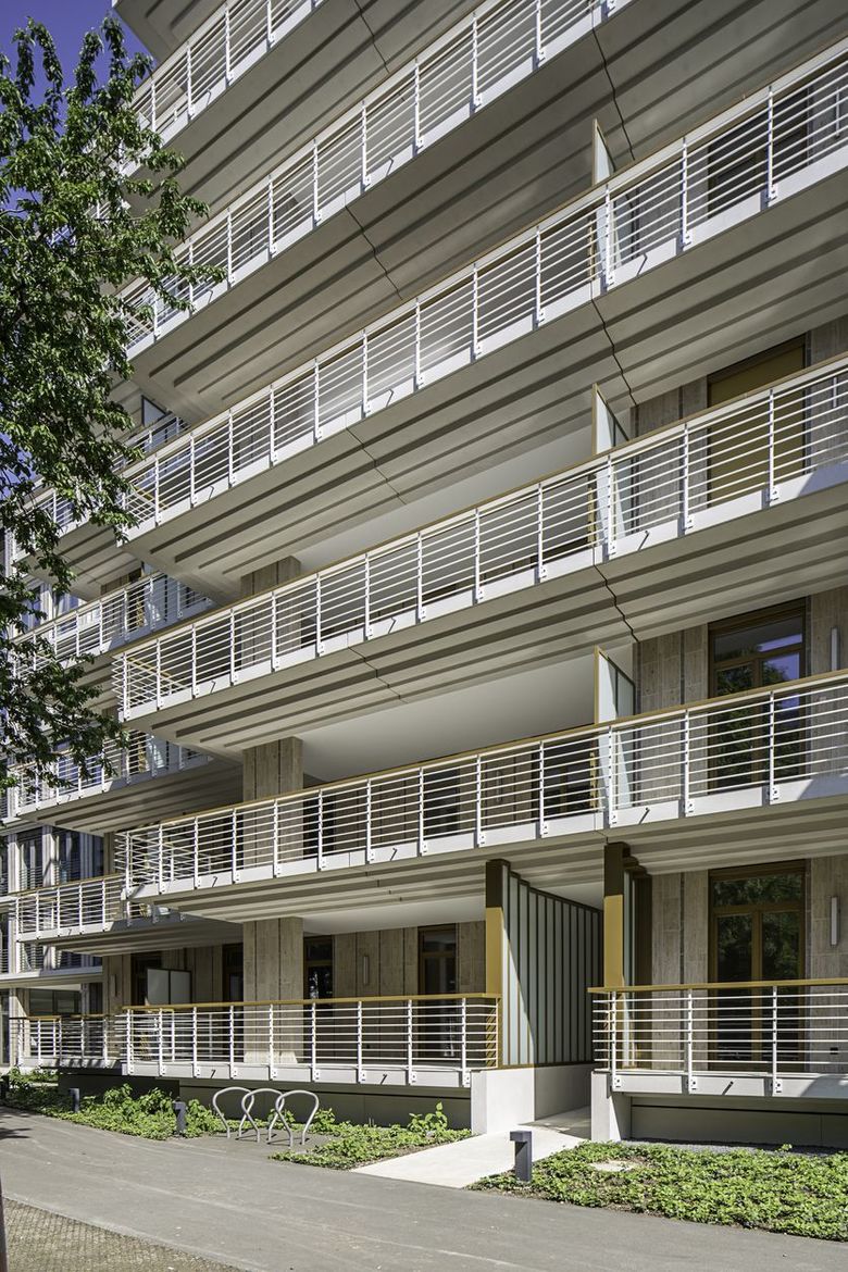
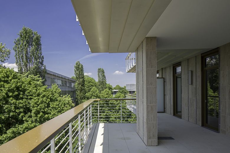
Andreas Hild, Dionys Ottl and Matthias Haber would like to see their design as homage to the site itself. The new buildings’ precast concrete skeleton construction follows the design of the surrounding structures, seen for example in the staggered terraces of the residential building. Generous balconies skirt the edifice, and together with the terraces of the office building create attractive open spaces. The balconies of the residential building are made of profiled prefabricated elements of artificial stone and correspond to the ceiling disks of the office building. The slim metal guardrails underline once again the arrangement of the buildings and the transparent appearance created through the architectural context.
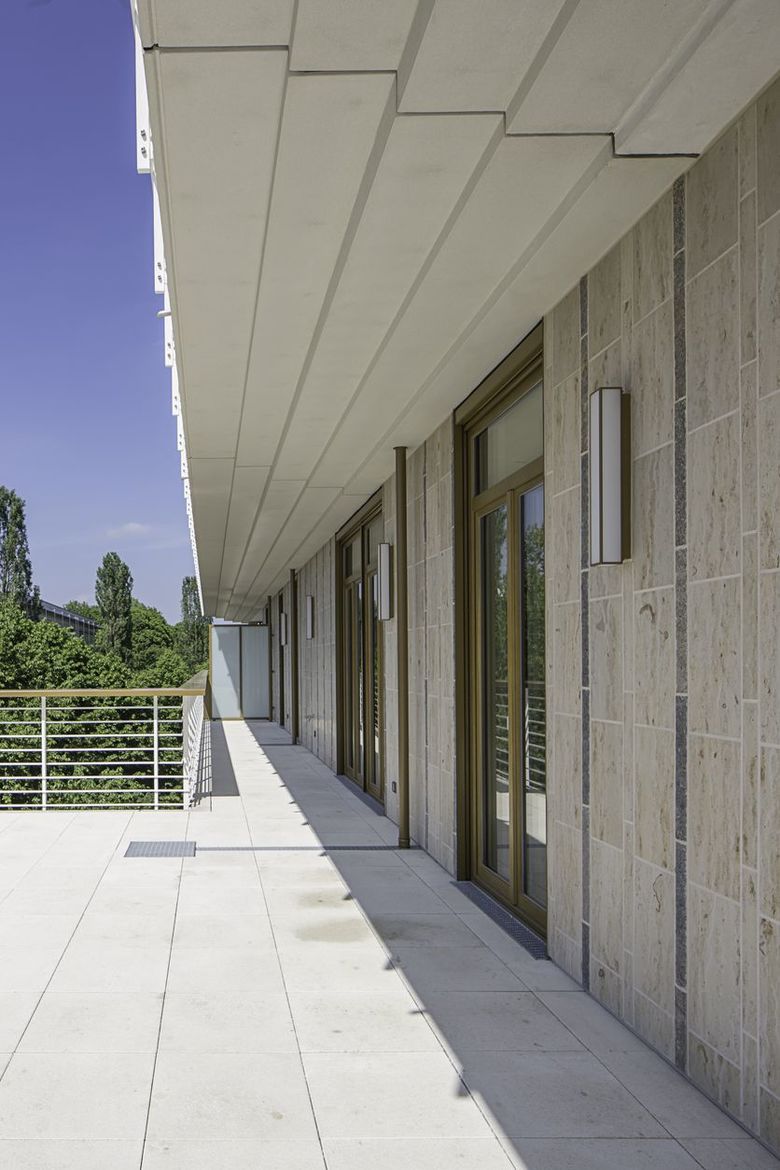
The facades enter relationship to the surrounding buildings, in a regular rhythm of light coloured columns and contrasting windows. Instead of using metal and glass as used on the other edifices on the site, we chose natural stone. This material on the one hand takes account of the particularity of having a modern office and residential building in this area characterised by administrative buildings from the sixties. At the same time the stone used and the particularities of the technique used to lay it are reminiscent of Sep Ruf, and the reconstruction period of Munich. Around the columns, dark shell limestone and light travertine create an attractive pattern, which in its small-scale fragmented arrangement purposely avoids any association to massive stone. As a continuation of the slabs on the columns, the walls behind the balconies and those at ground floor level are similarly veneered with natural stone. The remaining wall areas have a smooth render, which matches the natural stone slabs.
The interiors of the residential building take up the theme of dark and light, the bathrooms have flooring made of lime shell and wall tiles of yellow or grey Jura limestone. The arrangement of the apartments is open plan: they are divided into light open spaces, with separate private rooms. Together with the generously spacious balconies and floor to ceiling windows, the interiors extend out into the surrounding nature reserve.
A one-storey underground garage was also built, the exterior walls of the existing garage were kept as pit lining. Parking spaces for the office buildings and private parking spaces are separated by a barrier and can be accessed from Sederanger.
- Architects
- Hild und K
- Year
- 2015
- Project Status
- Built
- Client
- HOCHTIEF Projektentwicklung
- Team
- Andreas Hild, Dionys Ottl, Matthias Haber, Matthias Haber, Sabrina Thoma, Irina Kaiser
