Fengxian Qixian Jesus Church
In June 2023, the Fengxian Qixian Jesus Church designed by Wutopia Lab was finally completed after eight years. It took me a little while to recall because I had changed a bit, and the reasons for the design at that time had become a little fuzzy. But I remember at the time, I was fascinated by the use of translucency as a contemporary expression of what I understood to be the restrained beauty of Jiangnan and the struggling forces behind it.
Uniqueness with a bit of moderation
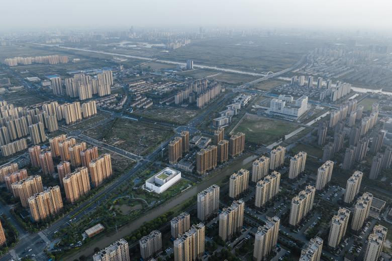
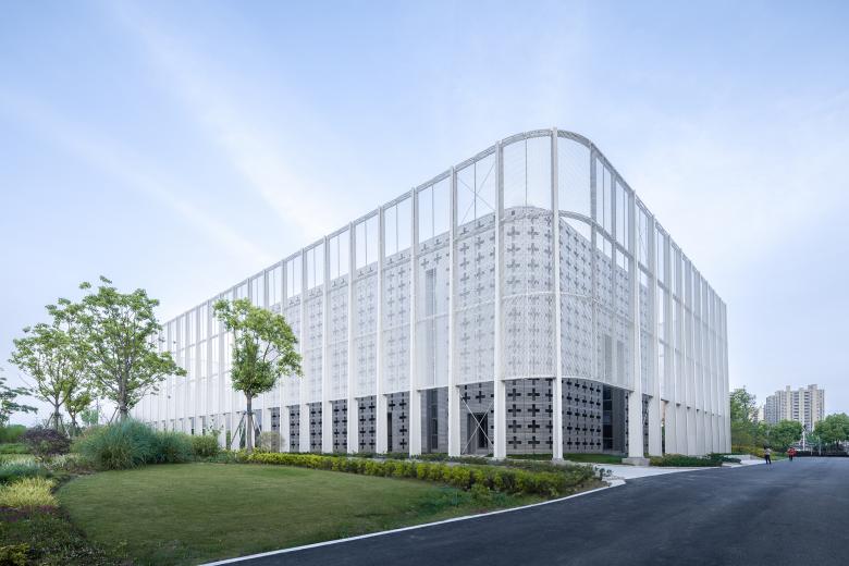
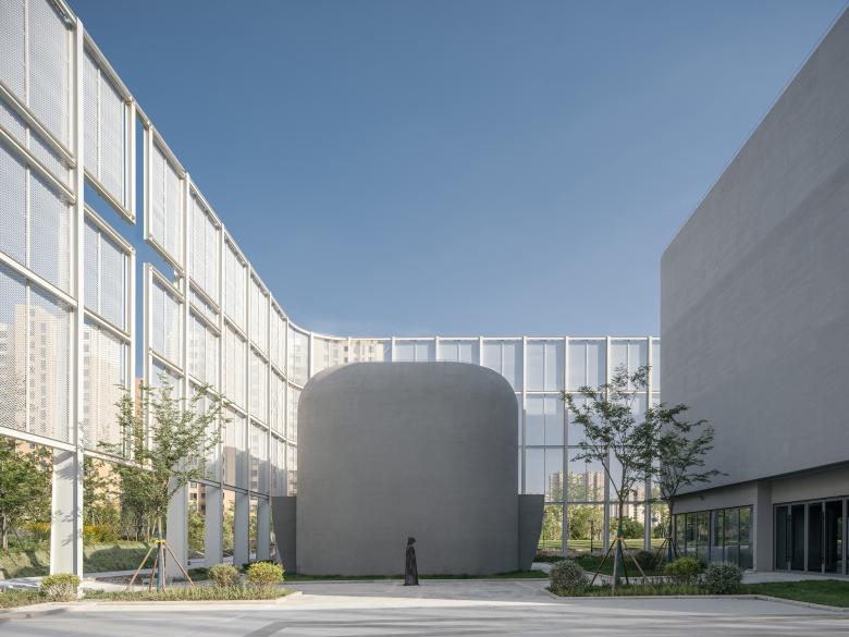
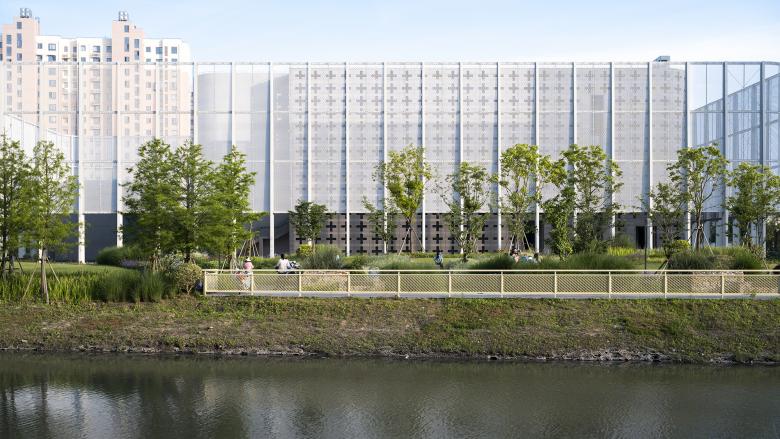
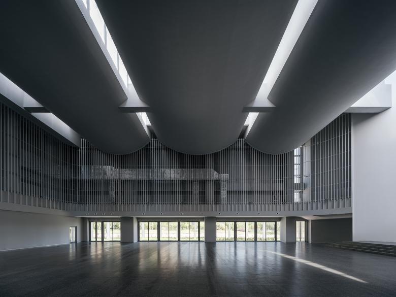
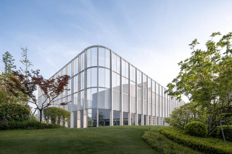
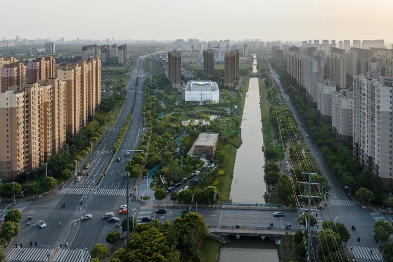
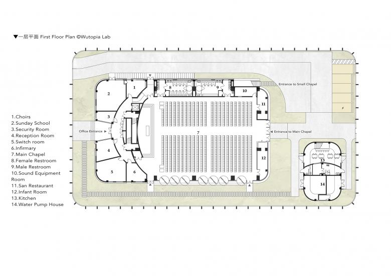
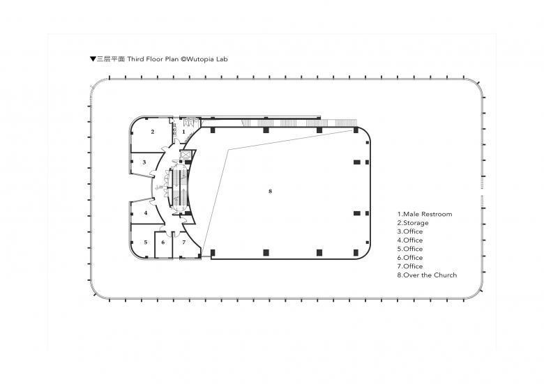
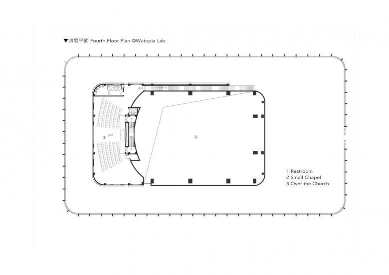
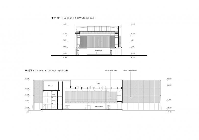
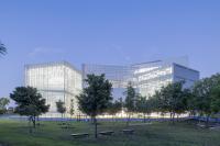
The brief called for the main and ancillary buildings to be separated. I decided to use the 16.7m high main hall as the core of the main building, inserting offices and other facilities on its west and north sides while placing the small auditorium on the highest level of the office area to create a vertical community. And the ancillary building is the canteen. Treating the entire site as a building called a place is my most significant strategy. I have erected a translucent enclosing "veil" as a visual boundary around the architectural control line, while the main and ancillary buildings are buildings within this field defined by this "veil". Together, with the visual boundary of the "veil", they form a complete architectural expression, a complete place.
Then I wanted to maintain the sense of symmetry within the building. However in the site plan, firstly, I adjusted the center lines of the main building so that they are parallel but not on the center line of the base; and secondly, I made the center lines of the auditorium parallel to each other but not according to the center line of the main building. This new layout not only avoids the rigidity of conventional symmetrism but also opens up possibilities for some lively vitality while maintaining the sanctity of symmetry in areas in need. Another advantage of this adjustment is that the first floor of the auditorium can face directly south. When the weather is nice, the main hall can be opened up completely southward so that the outdoor field can be used as an extension of the auditorium site. This is also a result of my attempt to bring the outside into the auditorium.
The obscure light of Jiangnan
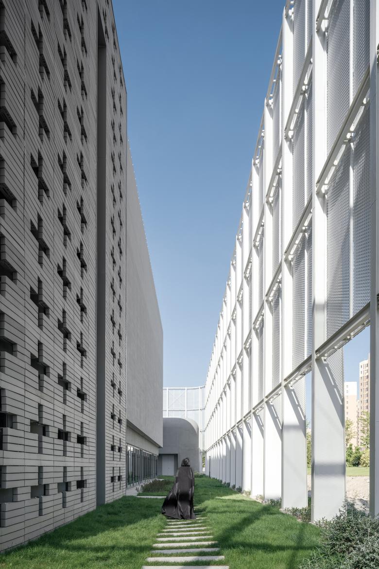
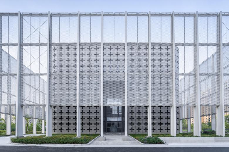
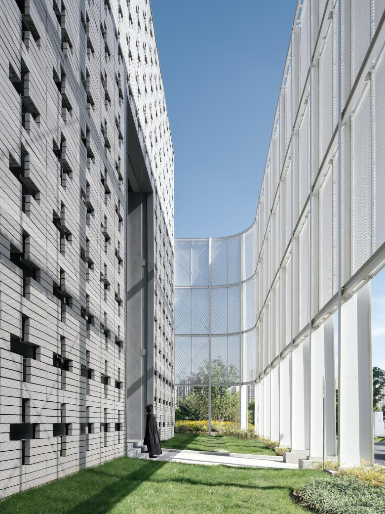
The translucent "veil" is one of the means by which I try to express the obscure light of Jiangnan through architecture. It can express shadows on the visual interface which change with daylight and the shadows can either be projections or transmissions of natural or man-made elements. It can also create filtered sunlight in this field enclosed by the visual interface, not so hot, but somewhat uncertain just like the weather in Jiangnan, in which you are. More importantly, it signifies the field within the interface as a complete place, going inside is entering a new territory.
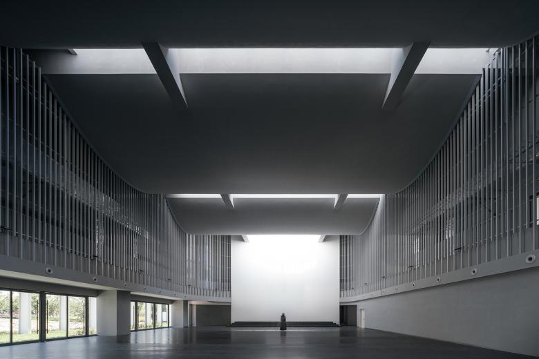
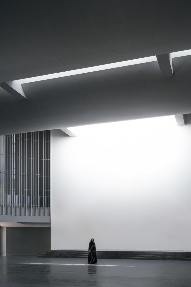
I used a dense grille in the auditorium to form an internal visual barrier in conjunction with the north-south skylights. If it were not for consideration of the cost, I would have twisted the grille a bit to create an indeterminate reflection. The current design works too as the vertical continuous reflections of the aluminum grille and the skylight together form a curtain of light that feels like a rain screen; the crowd is within this not so intense but encompassing curtain of light where their heart belongs.
Finally, I used different shades of grey to paint different parts of the main building. The ink is divided into five colors, peacefully diffused in the light fog above Jiangnan water.
A small change in eight years
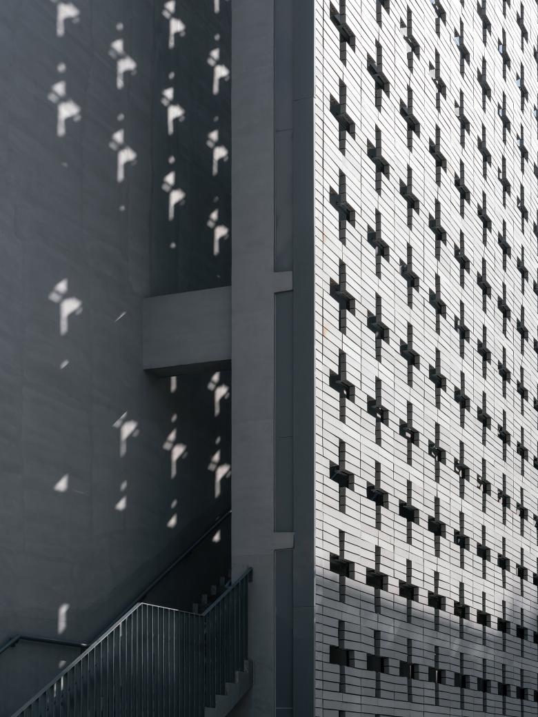
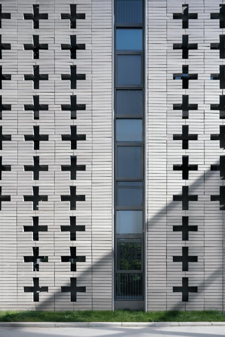
I used expanded mesh instead of perforated aluminum or solar panels for the "veil", because it is cheaper and reduces wind resistance better. To ensure the strength and safety of the "veil", I also agreed to enlarge the cross-section of the supporting columns of the "veil" while adding diagonal struts to the columns at intervals. In order to avoid additional plan approvals and cost increases due to overruns, I also agreed to adding columns on both sides of the main auditorium to avoid a large single-span space and the addition of two large beams across the curved ceiling which would interrupt the transverse skylight. Still for cost control, I replaced the rose wall with a floral brick wall. Some adjustments, however, were rejected by me. I disagreed with an architectural system that would have supports sticking out from the main structure to help support the veil because I like clear boundary definitions.
The biggest change came from myself
I agreed to many of these minor adjustments. When I was younger I would have called it a "compromise". During the eight long years, I understood the keyword "relax" in traditional Chinese architecture as Mr. Zhuang Shen mentioned. This means to adjust the details flexibly in a fault-tolerant way to ensure visual integrity when the details cannot be precise. The details were adjusted based on the integrity of the design without destroying the whole design in the end. Its completion is almost unchanged compared to the renderings that won the bid eight years ago. I have become more capable of facing challenges over the eight years. You stand in the middle of the main auditorium, the interior floor extends to the further earth outside, the light of the sky is as soft as a drizzle hitting your head, and you feel that the world, ebbs and flows like the sea.
"And that belief is that one person can contribute to restoring order to this world by even the smallest gesture.” -Amor Towles
Project Information
Project Name: Fengxian Qixian Jesus Church
Architectural Firm: Wutopia Lab
Website: http://www.wutopialab.com/
Chief Architect: Yu Ting
Project Manager&Project Architect: Dai Xinyang
Design Team:
Third Stage(2022-2023): Mu Zhilin,Song Qining(Intern),Zhang Yucheng(Intern)
Second Stage(2015-2017): Yu Jing,Song Mengjiao (Intern),Cai Chengze (Intern)
First Stage(2015): Xia Murong,Wang Yubin(Intern)
Structural Consultant: Miao Binhai
Lighting Consultant: Zhang Chenlu
Construction drawing: Shanghai Zhijing Municipal Construction Planning and Design Co.
Project Manager: Cao Kewu
Architectural Design: Wang Ye, Le Junwei
Structural design: Gu Jianping, Wang Gaoting, Yang Chao
Mechanical and electrical equipments: Gong Yedan, Lu Jidong, Liu Yuhong
Interior Design: Chen Zhengyuan
Cilent: Shanghai Fengxian new city construction and Development Co., Ltd
Client Architect: Li Na,Gu Hao
Construction: Shanghai Construction No.2(Group) Co.,Ltd
Project Location: North of Fengpu Avenue, south of Huili Road within the river landscape of the triangle
Gross Floor Area: 2598㎡
Design Period: July 2015- August 2017
Construction Period: Nov, 2021 – Jun,2023
Structure form: Steel structure (curtain) concrete structure (building mass)
Photo Credits: CreatAR Images
Model: Sendy
