Restaurant Akeno
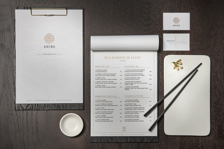
The popular district of Stuttgart-West has just added an exciting new gastronomy concept to its range of attractions. Right from the beginning, the brightly lit “Akeno” logo invites both locals and guests to take a step into the Asian restaurant for sushi and grilled food. DIA – Dittel Architekten developed a comprehensive branding and design concept for the restaurant – from choosing an appropriate name all the way to taking care of interior design – that utilizes key symbols of Japanese aesthetics and integrates them into new contexts to create a truly spectacular ambience.
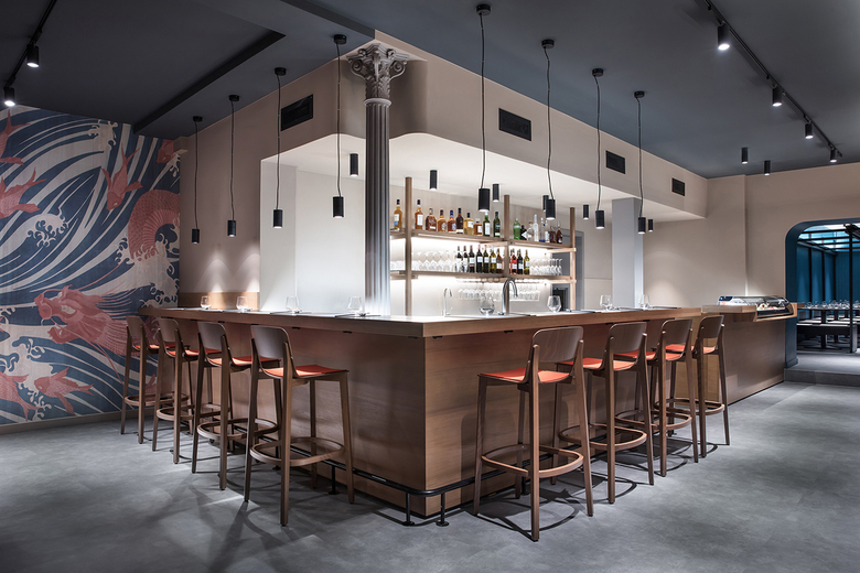
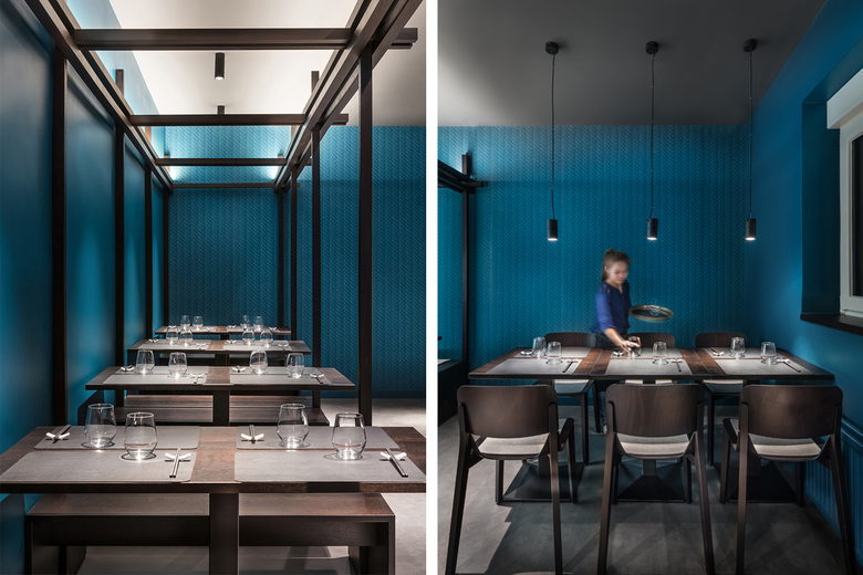
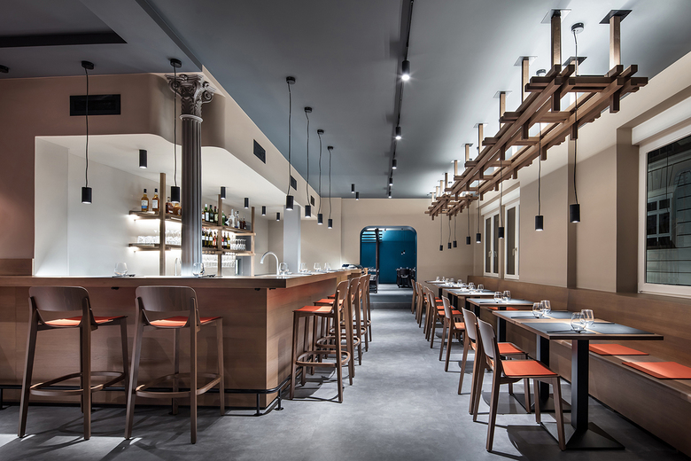
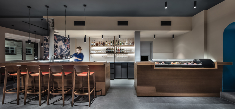
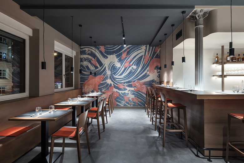
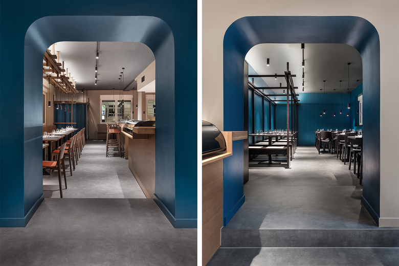
Light and shadow – eternal duality or a perfect match? This fascinating interaction, as depicted in the seminal essay “In Praise of Shadows”, has already established itself as a key idea in Japanese aesthetics. Even the restaurant’s name – “Akeno” (“brightly lit” in Japanese) – is a reference to that idea, which permeates the entire room design concept. The 100 square meter restaurant was divided into two sections – a light section and a dark section. In the front, the setting is marked by beige-colored walls and light oak furniture, creating a striking contrast to the petrol-black colors and dark-stained furniture in the rear area. Depending on how they feel, guests can opt for dining in more jovial and informal or more intimate surroundings, while the controlled activation and deactivation of individual lighting channels enhances the unique atmosphere of each room. An arched doorway connects the two sections. When a visitor enters the restaurant, this opening gives them a glimpse into the back room, awakening their curiosity and once more accentuating the contrast between light and darkness.
The koi carp can be found everywhere in Japanese art and pop culture. It symbolizes values such as strength and endurance, yet is also associated with luck and success. In Akeno, the koi motif was vividly implemented in the design of the wallpapers and serves to focus the attention of observers in both rooms. In the front section, the koi motif introduces a further signature color, a bright orange. In the rear section, the graphic scale pattern stands out discreetly against the uniform wall color.
Traditional Japanese modular design was a source of inspiration for a recurring decorative element. This structure, which resembles a wooden knot, can be found in the vestibule, on the bar shelves, in the ceiling installation along the edge of the room, and in the berth element of the rear section. Integrated LED rods and suspended luminaires set the perfect stage for these knot-like objects. Here, again, the interaction between light and shadow is visualized in an impactful manner.
- Year
- 2018
