High Park Residence
In the chaos of life today a home needs to be a place of refuge, a solitude for the homeowners to retreat to. Built for an Italian couple, the design pays homage both to the clients' Italian heritage and that of the Toronto residential building fabric, while ensuring a sensitivity towards well-being, mobility, and convenience.
Location: Toronto, Ontario, Canada
Architect: Batay-Csorba Architects
Area: 3,500 sf
The design of the project is born from the homeowners’ values and traditions where the comforts of their past are now viscerally felt within their present-day lives. The vault, in its many permutations, is one of the most common archetypes of ancient Roman architecture, characterized by its powerful modulation of light and its sense of lightness.
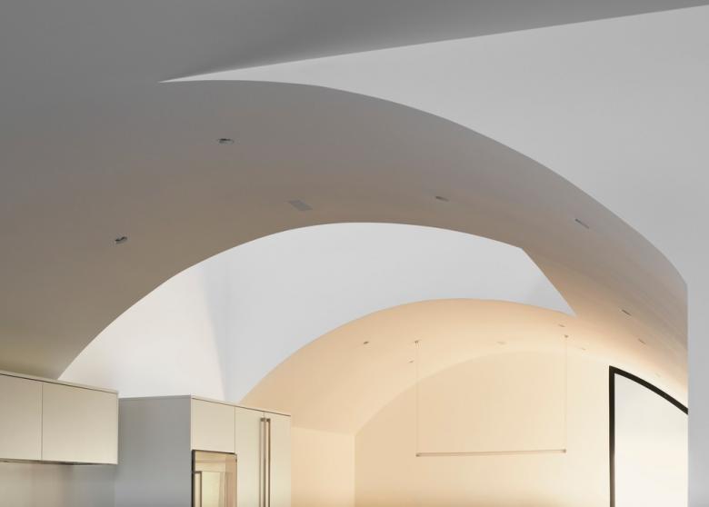
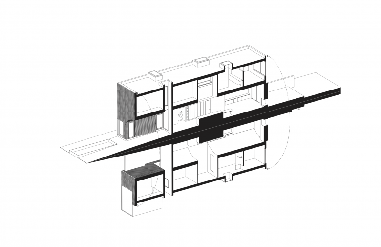
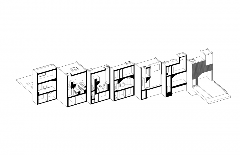
In adopting this typology into a domestic space, the architects evolved the vault from its primary form: puncturing, cutting, and peeling it into new geometries that help to distribute light and air into key locations, respond to program organization, demarcate each with a different atmosphere, and create a sectional continuity throughout the house. In carrying sacred content from the homeowners’ past into the present they are transported into another time and place, full of stories, meaning, and memories that become their refuge.
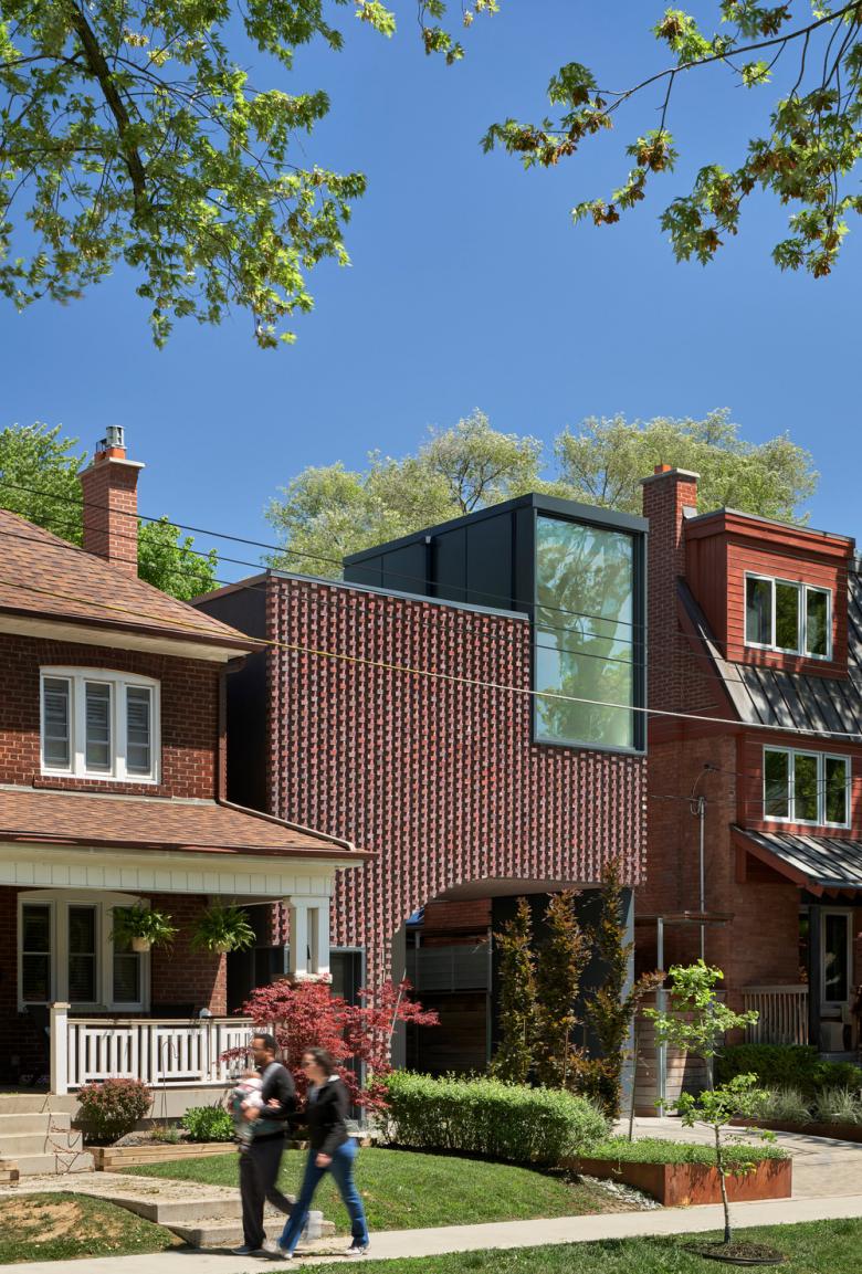
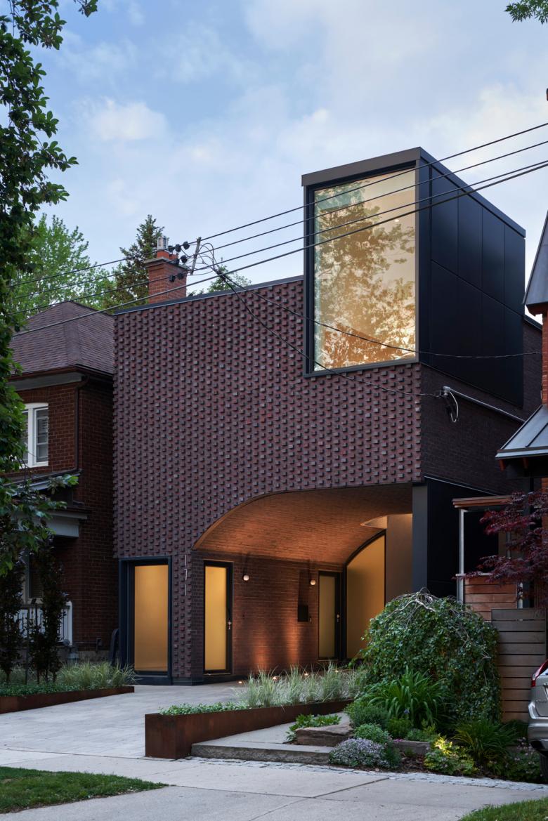
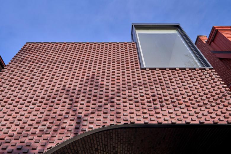
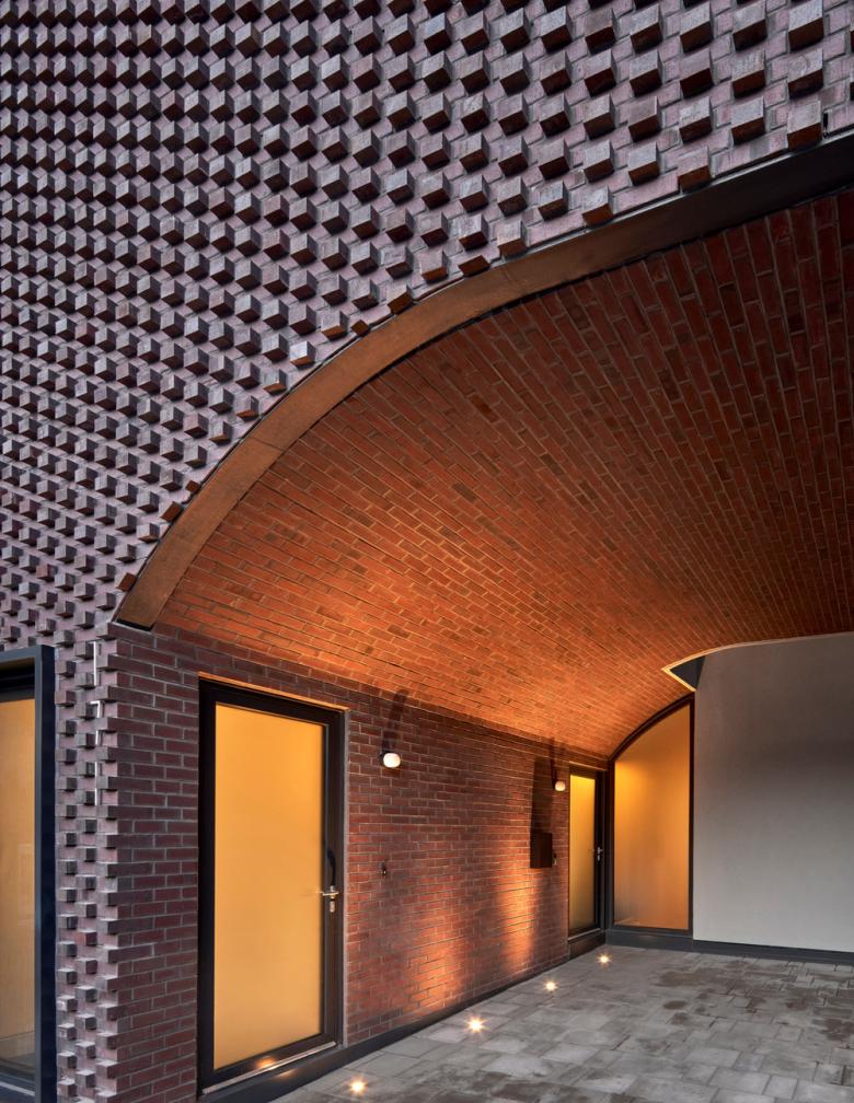
The vault geometry extends the length of the lot, informing a relationship between the facade and the interior. From the exterior, the brick vault is a subtraction from the otherwise monolithic brick frontage. This monolithic facade is created through a focus on the rich materiality of the brick coursing, and the isolated dormer which mirrors the proportions of the neighboring house. The brickwork that covers the facade and wraps the ceiling and walls of the carport plays into Toronto’s history of masonry detailing. The tradition of brick in Toronto’s residential fabric dates back to the 19th century when Toronto’s stock of Victorian houses was built. In these houses, ornamental detail presents itself in single isolated moments of brick coursing located above apertures, along with corners, and at cornices.
The architects took this singular moment of ornamentation and blew it up. The front of the home is reduced to a monolithic facade – where single repetitive material ornamentation, an adaptation of the Flemish-bond, becomes an even but textured brick field placing emphasis on the vaulted profile. This field of patterning emphasizes a play of light and shadow and picks up on seasonal changes. In the summer, the protrusions texture the façade with stark shadows, and in the winter the texture transforms through bricks creating shelves for the snow to fall on.
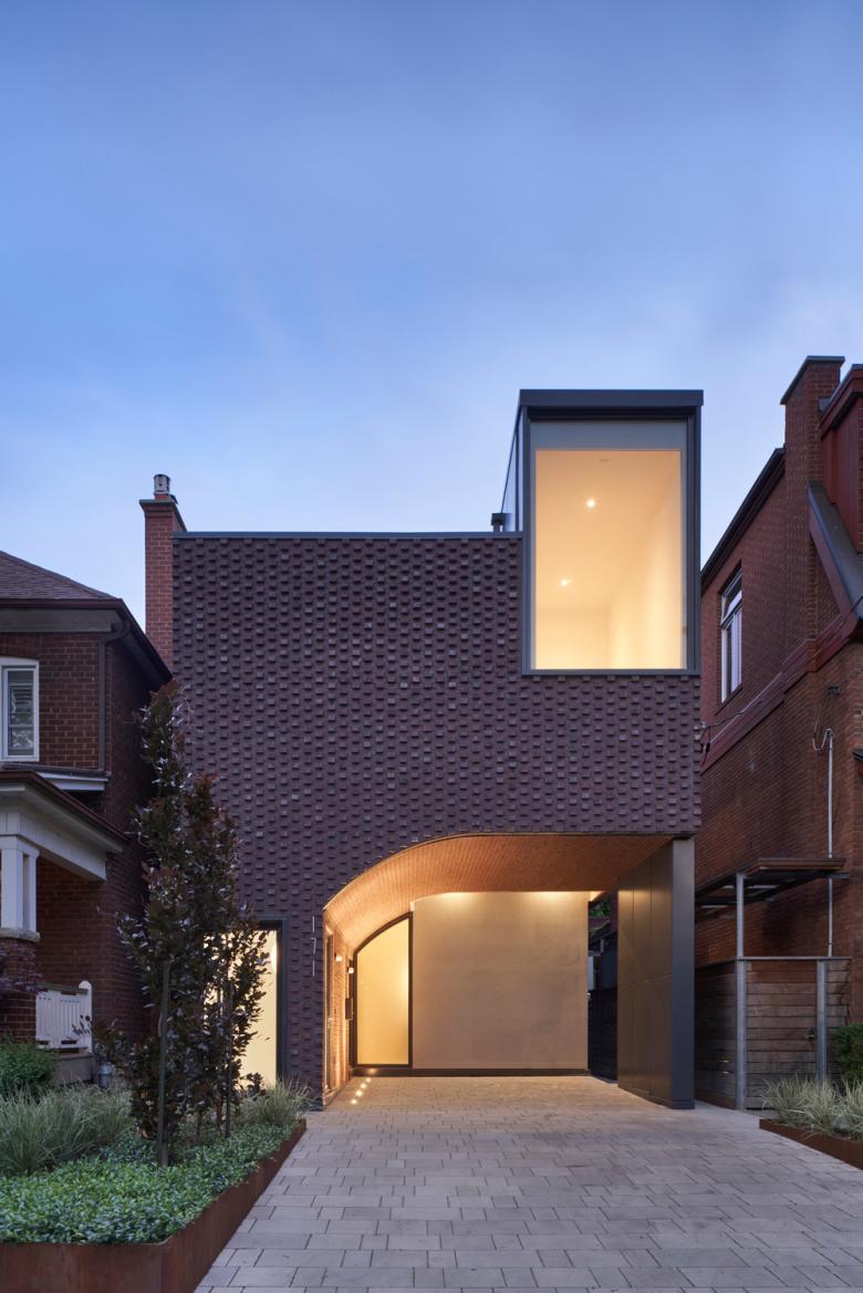
As a retired couple intending to age in place, it was essential that the homeowners had access to parking on site. Wanting to refrain from the suburban folly of a garage-fronted street, the decision to create a carport shaped the formal organization of the entire project. The integrated carport carves the front façade, creating a processional entryway reminiscent of the portico, an architectural feature found in roman architecture which covers and extends from the entrance often as a vault or colonnade.
Vaulted porches are also a prevalent form in Toronto’s Victorian housing stock. Toronto’s residential streets are often punctuated by front porches (rather than garages) to create a transitional space between the street and the home. In the case of Pacific Residence, the carved carport creates an inverted porch, which creates an introverted presence on the street. A lightwell that cuts through the height of the building is placed at the depth of the carport, washing the deep space with light, pulling visitors towards the entry. This armored space is turned inward and perceived as private, creating an intimate entry procession.
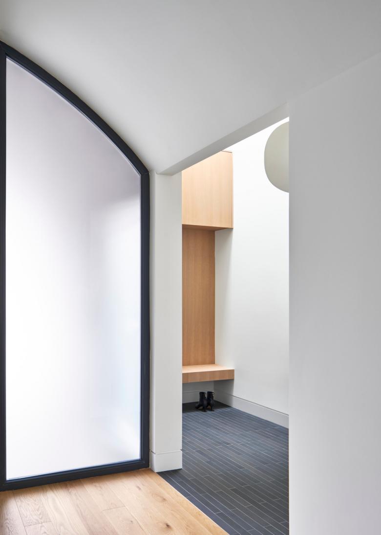
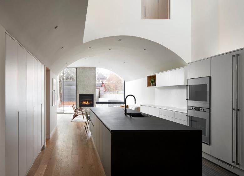
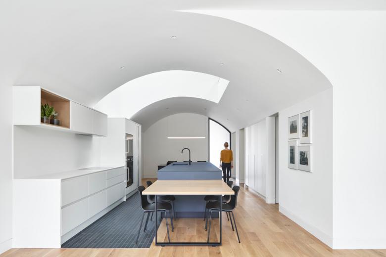
To emphasize the project’s geometric simplicity, all circulation, services, and entry conditions are tucked into a linear bar that runs adjacent to the vault. Upon entering the house, visitors begin in a compressed service ‘bar,’ which then opens into the ground floor’s expansive and airy living spaces. Throughout the length of the ground floor, the barrel vault’s persistent geometry connects these living spaces, accentuating the client’s desire for connectivity in food preparation, eating, and socializing.
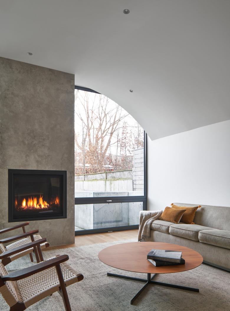
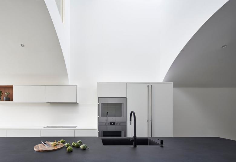
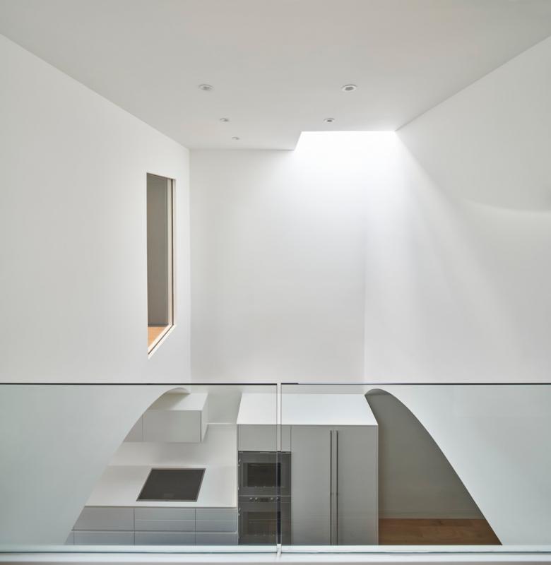
While the barrel vault brings these spaces together, moments of articulation and relief are found through tangential peels and cuts in the vaulted ceiling. The vault remains intact in the dining room, is cut at the length of the kitchen, becomes intact again in the living room, and then unfolds and peels into the backyard. This spatially delineates connected spaces, while also providing natural light to flood into the deep and narrow lot. Situated in the middle of a long floor plan, the kitchen opens and is flooded with natural light from a skylight above.
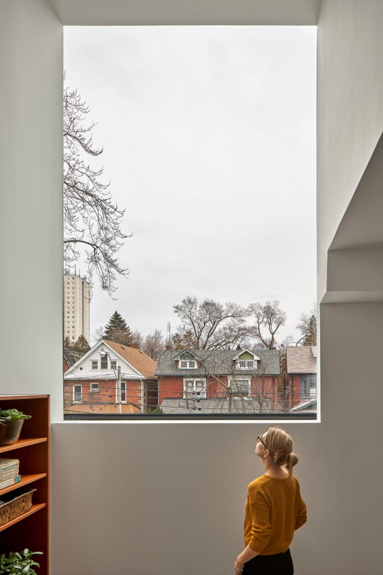
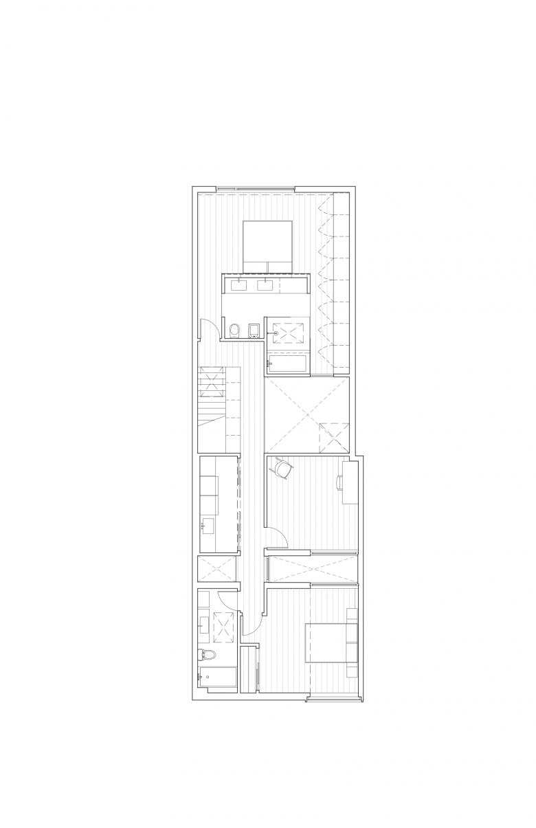
While the ground floor remains unimpeded and connected, the second floor is sliced into rooms connected by bridges. This allows for rooms to be stacked in a narrow lot with natural daylight reaching each room and the ground floor below. On this floor, the services of the laundry room, bathroom, and stairs are also tucked into the ‘bar,’ while the bedroom, study, and master suite are stacked from the front to the back of the house. The slice between the bedroom and study allows both rooms to share natural daylight brought in from the lightwell and the façade’s dormer window. The master suite is lit from both the house’s rear facade and the skylight above the kitchen.
Related articles
-
-
-
-
Allied Music Centre/Massey Hall Renovation and Expansion
KPMB Architects | 01.12.2025 -

