The New Whitney in 12 Photos
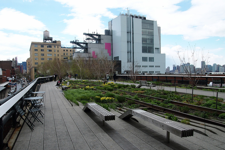
The Whitney Museum of American Art seen from the High Line (All photographs by John Hill/World-Architects)
On 1 May 2015 the new home of the Whitney Museum of American Art in New York, designed by the Renzo Piano Building Workshop in collaboration with Cooper Robertson, opens its doors to the public right next to the southern tip of the High Line.
As is evident in the photo above, the design of the $422 million, 220,000-sf (20,500 m2) building lacks the grace of other Renzo Piano museums, both in the United States and elsewhere. It is a building designed from the inside-out, interacting with the city physically and in terms of zoning and other codes that dictated some of its form. The resulting building may appear messy or even arbitrary at first glance, but it is anything but. So here we present 12 photos from a press preview yesterday that should lend a greater understanding of why the new Whitney looks the way it does.
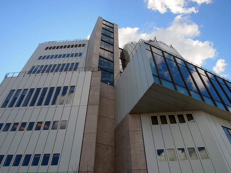
1 - One key to the building is expressed on the west side: the concrete structural "spine" that runs through the whole building, bottom to top, west to east. Stairs, elevators, bathrooms, mechanical and other services are within, while galleries are placed to the south (right) and offices, labs, and other non-public areas are placed to the north (left).
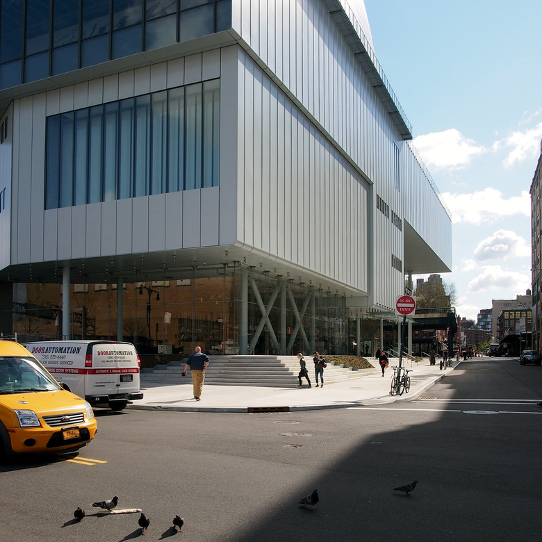
2 - The concrete spine is the building's main structure, taking care of all of the lateral forces, enabling the ground floor to be primarily open with glass walls and slender columns. Nevertheless, some X-bracing is found in the southwest corner near the bookstore for added stability.
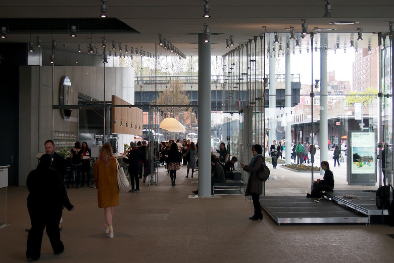
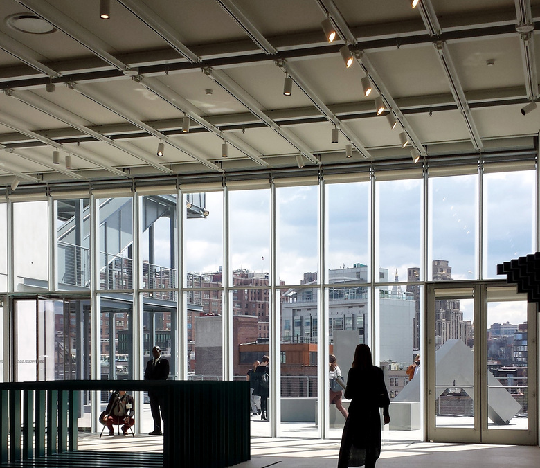
3 - The ground floor's transparency increases as the ceiling over the lobby and cafe ascends toward the cantilevered east end. The expansive glass frames the southern tip of the elevated High Line park.
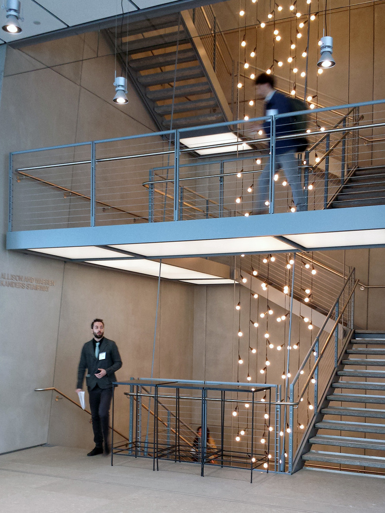
4 - At nine stories (eight above, one below), the Whitney is a vertical museum. Although the building has four elevators (one a huge freight elevator), an open stair with a light installation encourages museumgoers to walk up to the fifth floor gallery. As we'll see soon, exterior stairs encourage people to walk up to the other galleries on floors six, seven and eight.
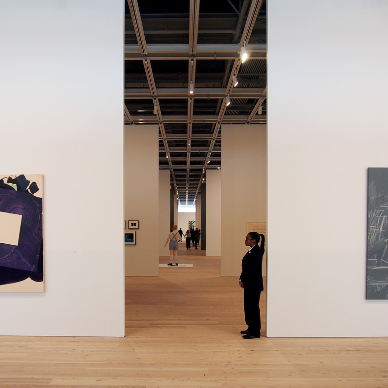
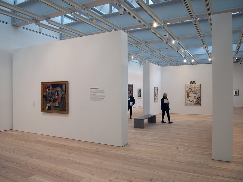
5 - At 18,000 square feet (1,675 m2), the fifth floor gallery is the largest column-free museum gallery in New York City. Walls have been erected for "America Is Hard to See," the inaugural exhibition in the new building, thereby cutting up the space. An enfilade running down the center of the space gives an idea of the floor's scale.
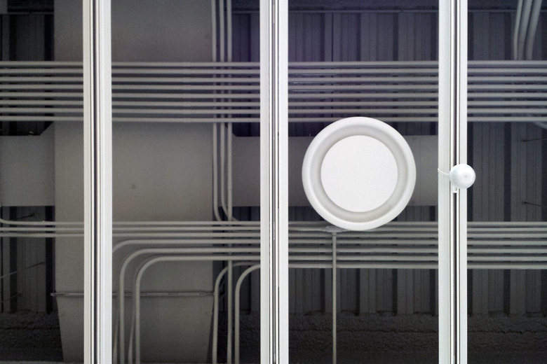
6 - Each of the museum's four gallery floors features a grid for fixing lighting and walls so curators can easily carve up the large spaces for exhibitions (the floors' reclaimed pine echoes this sentiment). On the fifth floor, services are tucked above the grid and left exposed, although they are painted gray to recede slightly.
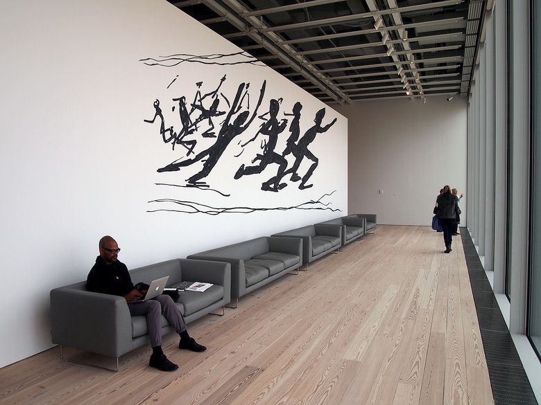
7 - The east and west ends of the fifth floor gallery feature artworks, but also seating areas for taking advantage of views of the Hudson River on the west and parts of Manhattan on the east.
8 - River and city views can be found on the other gallery floors on six, seven and eight. These floors have terraces on the east side that entice people to step outside and look at more art.
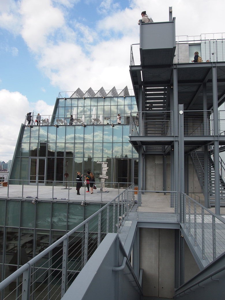
9 - The terraces on floors six, seven and eight are connected by exterior stairs that recall the ubiquitous fire escapes on old buildings in New York City. The progressively smaller floor plates on the upper floors create outdoor space for art, but they mainly serve to ensure natural light hits the adjacent High Line park.
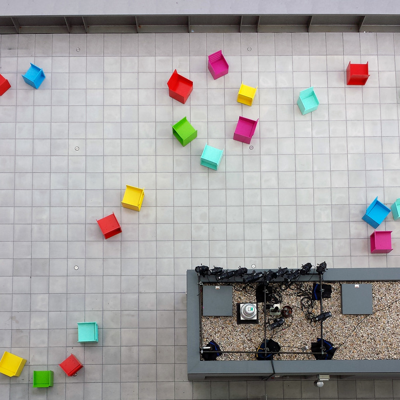
10 - The largest outdoor terrace is found on the fifth floor, sitting atop the adjacent High Line Maintenance & Operations Facility designed by Renzo Piano with Beyer Blinder Belle. At opening it is site of a project by artist Mary Heilmann that consists of wall art, a video and forty sculptural chairs that visitors can actually sit in.
11 - The smallest gallery floor is at the top, the eighth floor. This is the only floor that features skylights, what are usually a Renzo Piano signature in his museums (the Menil, the Nasher, the Art Instititue of Chicago, and the High Museum of Art addition are a few of his American designs where skylights dominate). Here the skylights are subtle sawtooths facing north, hidden above the steel structure and the grid for walls and lights.
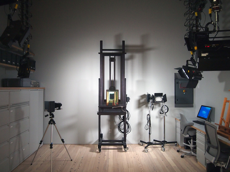
12 - The new Whitney's 50,000 sf (4,600 m2) of gallery space is only about 1/3 larger than its previous home in the 1966 Marcel Breuer building on the Upper East Side, but the new building more than doubles the overall size to allow for an education center, theater and study center, all firsts for the Whitney. Pictured here is the photo lab that is part of the conservation center on the building's north side.
