The Fulbright Building
217 E. Dickson St., Fayetteville, USA
The Fulbright Building was built in 1962 to house the Fayetteville Public Library and remained the Library’s home until the Library moved to a new facility in 2004. The 25,00 square foot building was originally designed by Fayetteville native and noted architect, Warren Seagraves. An addition to accommodate ADA requirements was built in the early 1990’s by Hailey Amirmoez Associates Architects. The building has now been converted into professional office space by Marlon Blackwell Architect.
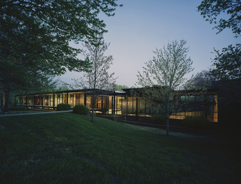
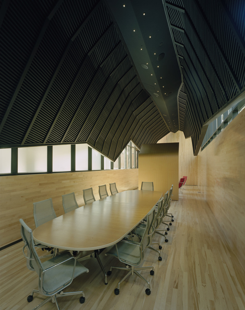
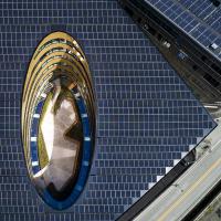
Respecting the quality of the original design of the building, as well as concerns from the community, the structure has remained relatively untouched. The generating idea or theme for the design of the remodel is “Ship in a Bottle”, defining the juxtaposition and materiality of the new interior spaces in relation to the existing steel structural grid and a new custom glass infill storefront system that wraps the upper floor of the building. The 1990s addition - a double height space with a stair and handicap ramp - was converted into a large conference room, with a lounge area, wrapped in continuous maple plank on the floor and lower walls and serving the building tenants as well as community groups. An acoustical ‘shroud’ clad in black zinc panels is suspended above the conference and lounge area, and fills most of its upper volume – it is a figure encased in a mostly glass room. The shadow-like zoomorphic figure of the ‘shroud’ acts as an art piece with a public presence seen through the glass from Dickson Street. Lighting on and in the ‘shroud’ at night further enhances its sculptural effect.
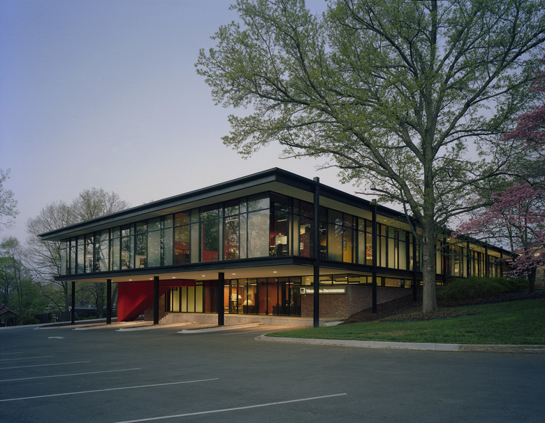
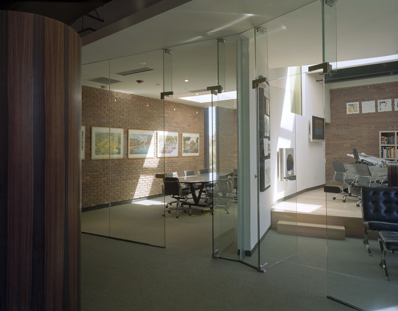
The new storefront wrapping the building has been subtly manipulated to play with the reading of the building. It has a seemingly random pattern of translucent and transparent glass that allows views into and from the office spaces while still providing the interior occupants controlled privacy from the street. The glass skin was used as a way to frame and present from within strategically placed accent colors on the interior office walls. These, then, register as blocks of color from the street without actually providing colored exterior building materials, and can be changed as easily as painting an interior wall. The final manipulation of the storefront is in the actual location of the glass, glazing at both front and back locations in the frame. This is a delicate articulation that provides a depth to the system which becomes apparent as you get closer to the building, adding another, more intimate dimension, in the reading of the entire building.
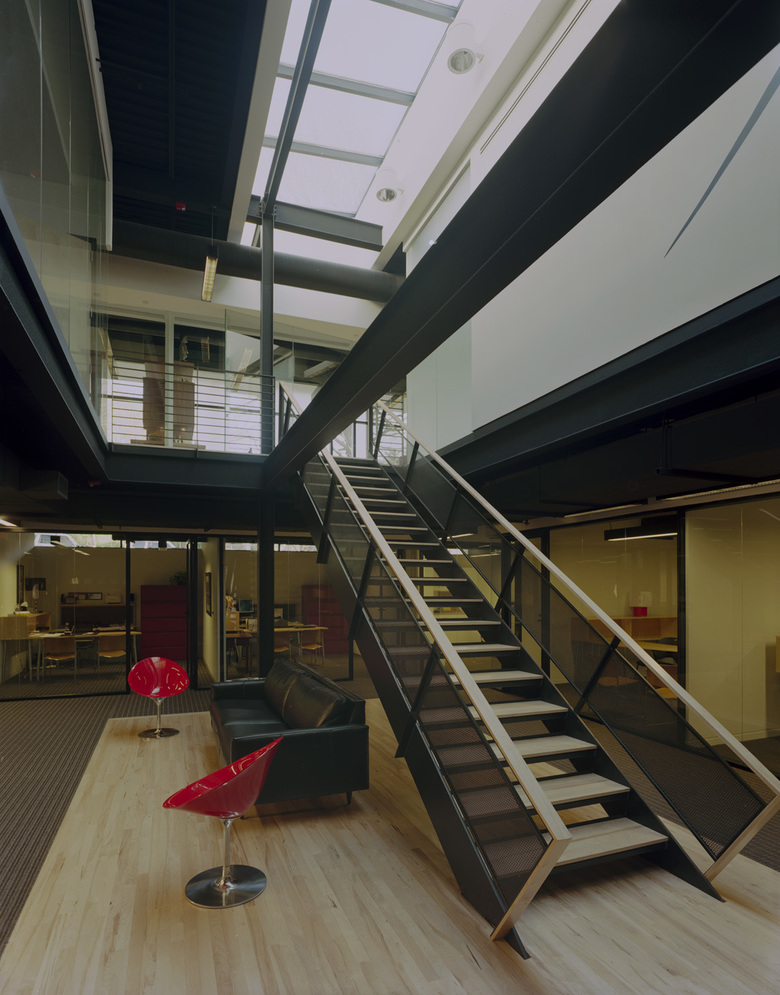
The upper floor of the building is full of light from the exterior glass windows and from skylights that were cut into the existing roof. The original lower floor was more basement-like, with little exterior glass due to the north and part of the east walls being retaining walls. To make the lower floor more marketable to tenants, as well as more enjoyable, holes were cut in the upper floor slab below each of the skylights and staircases dropped into them. These staircases become light wells that open up the lower floor with double height space enhancing the spatial quality of the leaseable areas. The tenant spaces are essentially organized in a vertical stacked layout, with each tenant having two levels of office space.
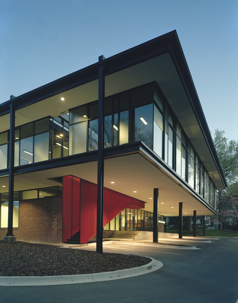
Two additions were added to the building during the remodel, bringing the square footage to almost 29,000 square feet. The first is a 2,040 square foot extension of the upper floor to the east. The elevated nature of this addition allows for covered parking areas below. It also created the opportunity for an exterior grand entry stair from the covered parking area and lower sidewalk to the upper floor, which acts as a spatial joint between the existing building and the new. The stair is illuminated from above by a continuous slot in the roof that allows sunlight to pour down through the steel bar grate that wraps the steel stair. The bar grate is painted a vibrant orange which enhances the intensity of the light and shadow play that occurs at the stair throughout the day.
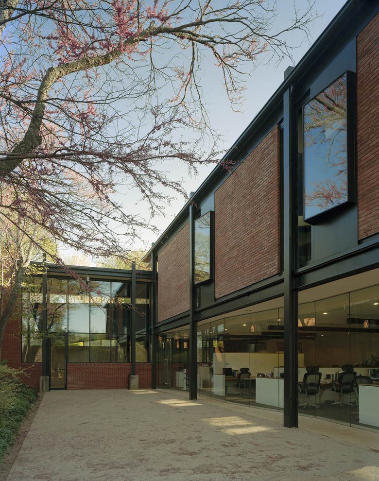
The second addition of 1,500 square feet, known as the ‘fishbowl’, is a formerly exterior space that was once used as a drop off area by the library. It is under an existing upper floor office space. A slab was poured below and butt- glazed glass walls were installed to wrap the space on three sides to create a seemingly barrier free transition between the interior and exterior space. Adjacent to this new interior space is an exterior brick-paved courtyard which will, when completed, have a fountain and landscaping.
This project was intended to revitalize and preserve the civic quality of a historically and architecturally significant Fayetteville building, while inserting a modern and dynamic office atmosphere; extending the fundamental dignity of the building and providing its past with a future.
- Architekten
- Marlon Blackwell Architects
- Jahr
- 2007
- Projektstatus
- Gebaut
