US Building of the Week
Martin Luther King Jr. Memorial Library
The renovated Martin Luther King Jr. Memorial Library in Washington, DC, originally designed by Mies van der Rohe, had a virtual opening ceremony in September 2020. Open since with limited services, the library, rejuvenated by Mecanoo and OTJ Architects, is sure to get lots of fanfare once the pandemic subsides and the building's new public spaces are used to their fullest. Mecanoo answered some questions about the project.
Location: Washington DC, USA
Client: District of Columbia Public Library
Architects: Mecanoo and OTJ Architects
Building Area: 39,600 m2 (426,000 sf)
In 2013, DCPL launched an international architectural competition, inviting teams to rethink Ludwig Mies van der Rohe’s only library. In February 2014, Mecanoo and Martinez+Johnson (which subsequently merged with OTJ) were selected as the winners. The winning entry had a new addition running from opposites corners of the original volume, this volume was designed to be residential (as requested on the original competition brief). The residential element was later removed due to preservation, pragmatic and financial considerations. In its place a new rooftop park has been realized, creating an elevated oasis in the heart of the city.
After a three-year transformation by Mecanoo, working in collaboration with OTJ Architects, the Martin Luther King Jr. Memorial Library (MLKL) has re-opened in Washington, DC. The library, which opened in 1972, is reborn as a contemporary lifelong-learning hub which reaches out to all communities. It was the only library designed by Ludwig Mies van der Rohe, one of the twentieth century’s greatest architects, and was subsequently named after Dr. King, the towering civil rights leader who was assassinated in 1968. Francine Houben, principal, founding partner and creative director of Mecanoo, says: “We have been guided by Martin Luther King’s timeless values and implemented them in this, the most important library for the people of America’s capital.”
The transformation of MLKL brings a new, humanistic environment at all levels, designed and programmed for the future, and it adds facilities including a public roof garden, a theater, signature staircases and a suite of community studios and workshops. A central objective of the new design, as Houben explains, is “to highlight the library’s social gathering purpose and its strong presence as a social landmark in the city.” The design approach balances the very different legacies of Mies van der Rohe and Dr King.
Mecanoo’s extensive research included dialogue with Jack Bowman, an architect who worked on the original building, and Charles Cassell, who led the campaign to name the library after Dr. King. If design decisions could favor either Mies’s legacy or Dr. King’s values, but not both, Houben would choose to go with Dr. King: “We must honor him by the programming, and by opening the building to everyone.”
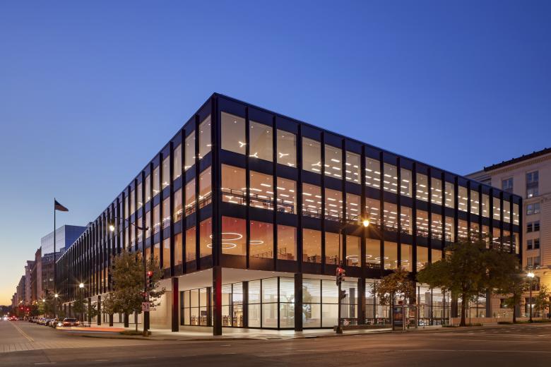
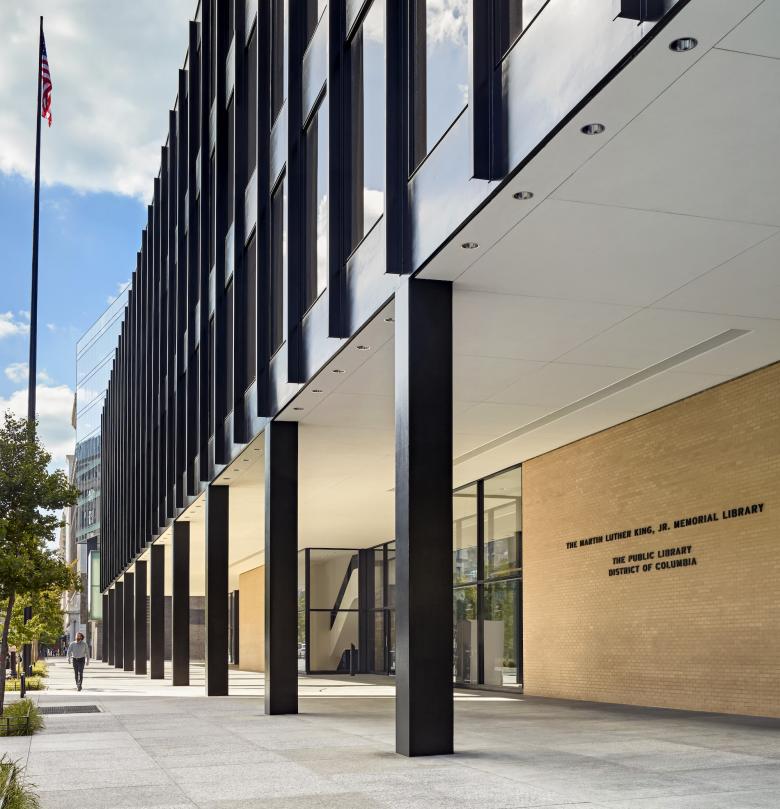
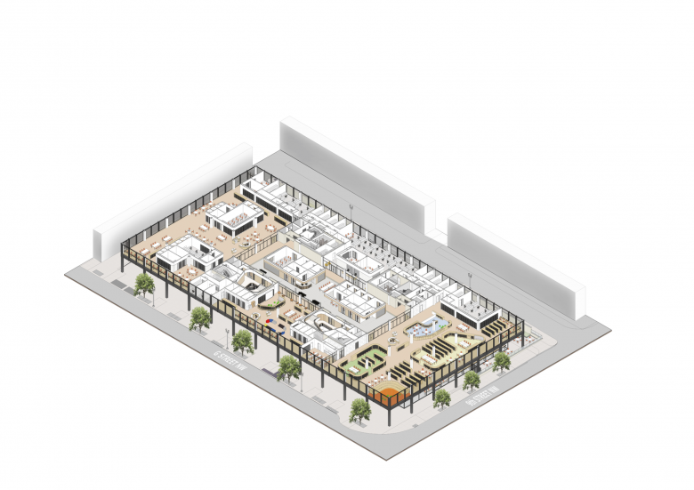
The 426,000-square-foot rejuvenation project respects the powerful simplicity of the original building. It is an example of Mies van der Rohe’s distinctive rectilinear black glass-and-steel aesthetic, which characterizes his iconic skyscrapers in New York and Chicago. The MLKL’s rectangular form has three glazed floors which float above a first (ground) floor recessed behind a colonnade of black steel columns.
When Houben first visited the old MLKL, she found that it “was not a good building technically and it was not a good library… all the books got daylight and all the people didn’t get any at all.” These and other fundamental shortcomings are eliminated in the new design.
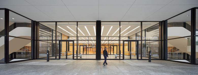
The main G Street entrance leads into the Great Hall, the lobby. Original features are restored. Below a magnificent mural from 1986 by Don Miller, which celebrates Dr King’s life, Mecanoo has recessed the wall and lined it with vertical wooden slats. Bench steps rise from floor level, drawing people to sit, chat, read and watch. The intervention brings warmth and better acoustics to the lobby, and boosts the library’s social dimension from the moment you enter.
As with all the library’s features, it is clear what was Mies’s original design, and what is new and designed by Mecanoo. The lobby also hosts new murals by Nekisha Durrett. Mecanoo has opened the lower ground floor to library users for the first time. It hosts a wide range of facilities that offer resources and skills training.
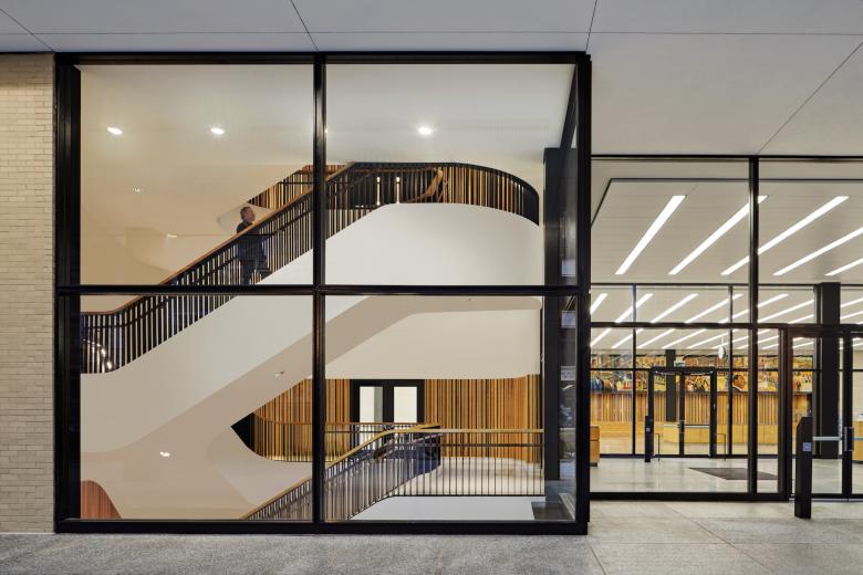
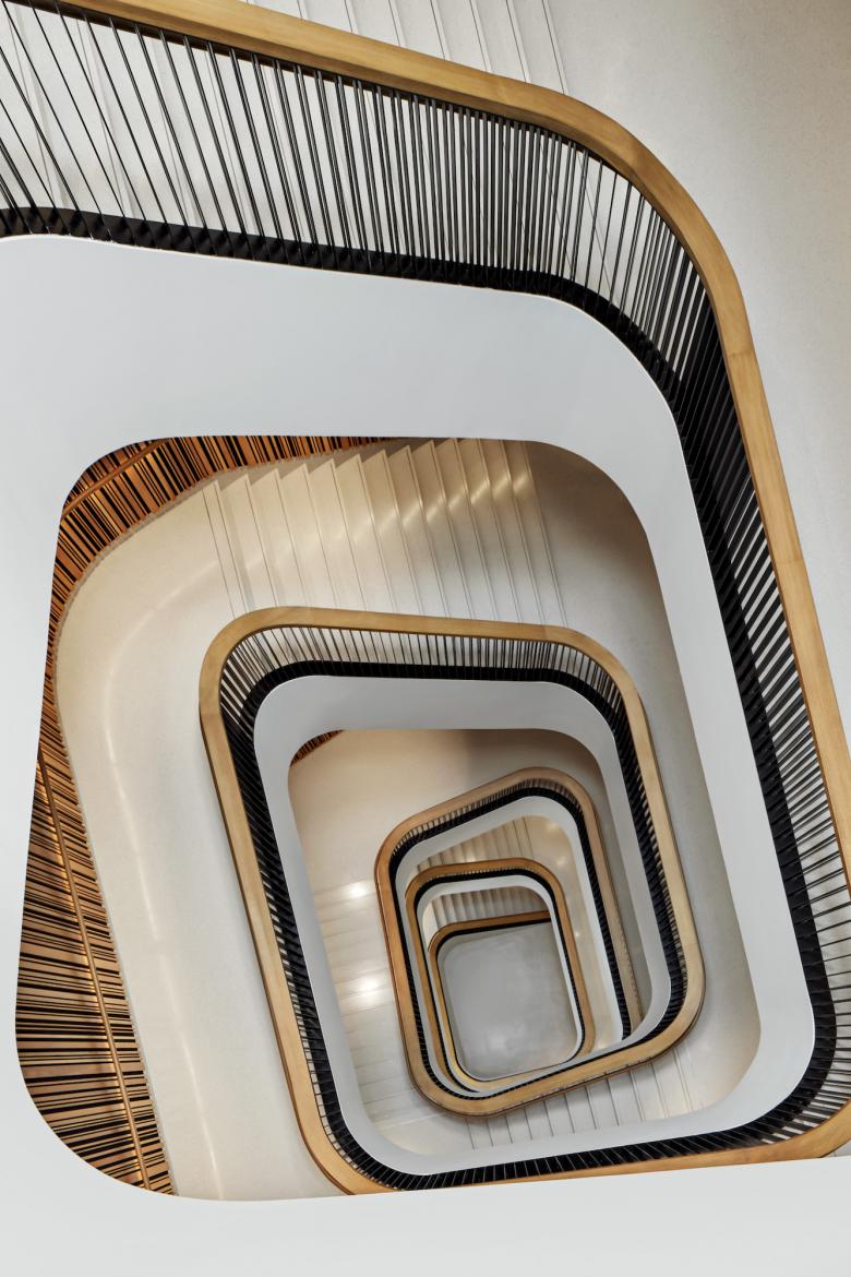
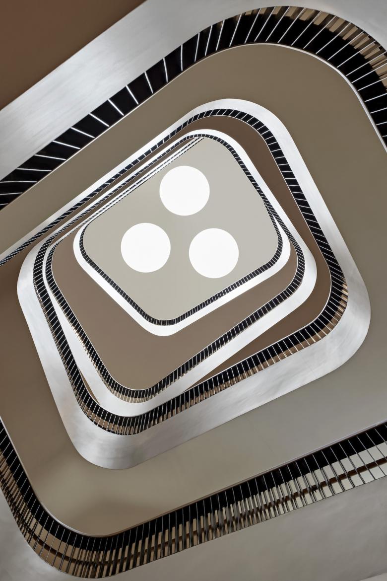
Mecanoo introduced two new wood-lined staircases characterized by their sculptural fluidity. Stairs are wide, terrazzo surfaced and curve up around a middle void from the lower ground floor to a new fifth floor, where natural light falls through circular skylights. The staircases exemplify Mecanoo’s organic styling, bring a soft, sweeping rhythm to vertical circulation, and they act as social connectors.
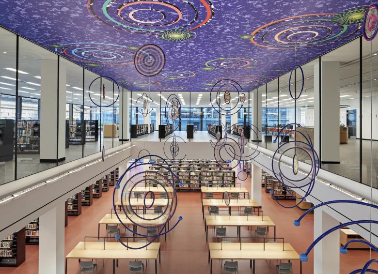
On the third floor, the highlight is the Grand Reading Room. Previously just one floor high, removal of a ceiling now gives it double height, visually connecting into the fourth floor reading room above it. A new installation by Xenobia Bailey hangs from the new two-story ceiling, an artist known for her strong traditional African and contemporary urban aesthetics.
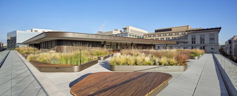
The fourth floor now features a major 291-capacity auditorium. This double-height event space has warm wood-lined walls which curve around the corners, and banked seating which rises into an entirely new fifth floor. There, the auditorium lobby is bordered by conference rooms and an Events Center, which opens into a new sky-garden. The new floor is contained within a trapezoid, glazed pavilion, sheltered by a roof cantilevering out around it. Set back from the edges, the pavilion is not visible from the street, from where the building’s profile and geometry look exactly as Mies designed it.
Surrounding the pavilion is new roof garden. Paths crisscrossed between angular planters which bring biodiversity into the heart of Washington. This hidden yet public oasis offers everyone tranquillity, proximity to nature and an open sky. “The rooftop was a desert,” comments Houben, “now it becomes a park for the city.”
Mies had designed a passive library to sit and read in, but the reborn library is designed to be active, a place for doing and meeting. It now embodies the spirit of advancement, inclusivity and hope that Dr. King brought to the nation. The introduction of organic surfaces and softer lines is a strong contrast to Mies’s strict hard-surfaced rectilinearity, but it creates synergy — not opposition — with the original building.
