Moroni Gomma
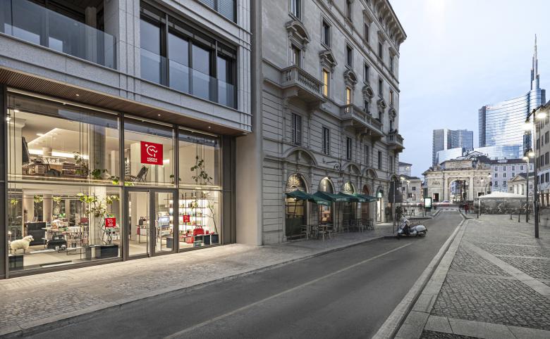
The new store Moronigomma in Milan, Corso Garibaldi 123, arose in a privileged urban area, in between 19th century buildings and the most contemporary part of the city, the ever-changing area of the skyscrapers of Porta Nuova. An area of the city in constant activity throughout the whole day, due to the presence of offices, shops and restaurants. The retail space where the shop is located is in the heart of this context and through the large double-height window on Corso Garibaldi it is able to absorb all its vitality.
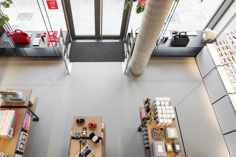
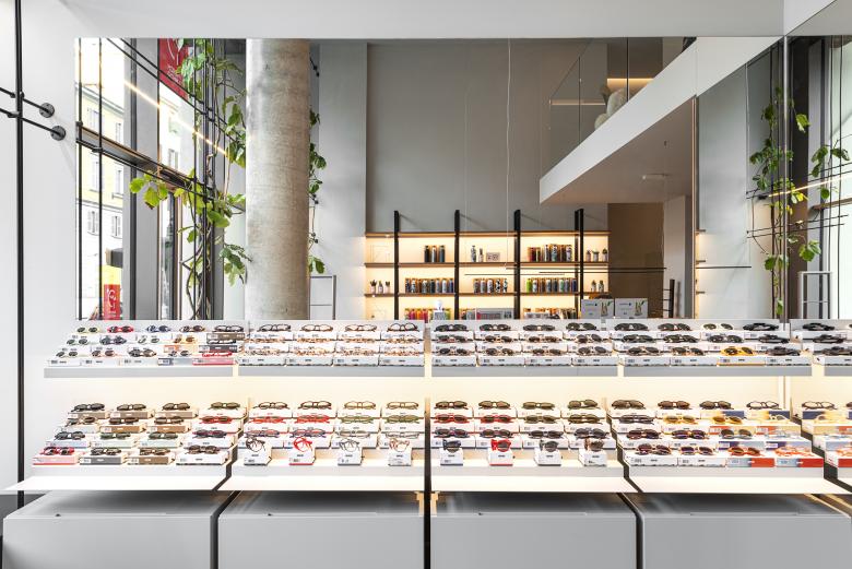
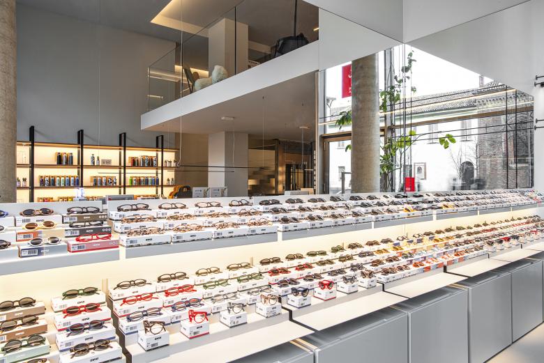
The main objective of the project necessarily becomes to ensure full visual permeability between the inside and the outside. The glass surfaces are left clear in all their transparency. The only diaphragm designed in parallel to them is a light system of vertical and horizontal iron tie rods, from floor to ceiling and from wall to wall. Light wires where the green climber grows organically but controlled.
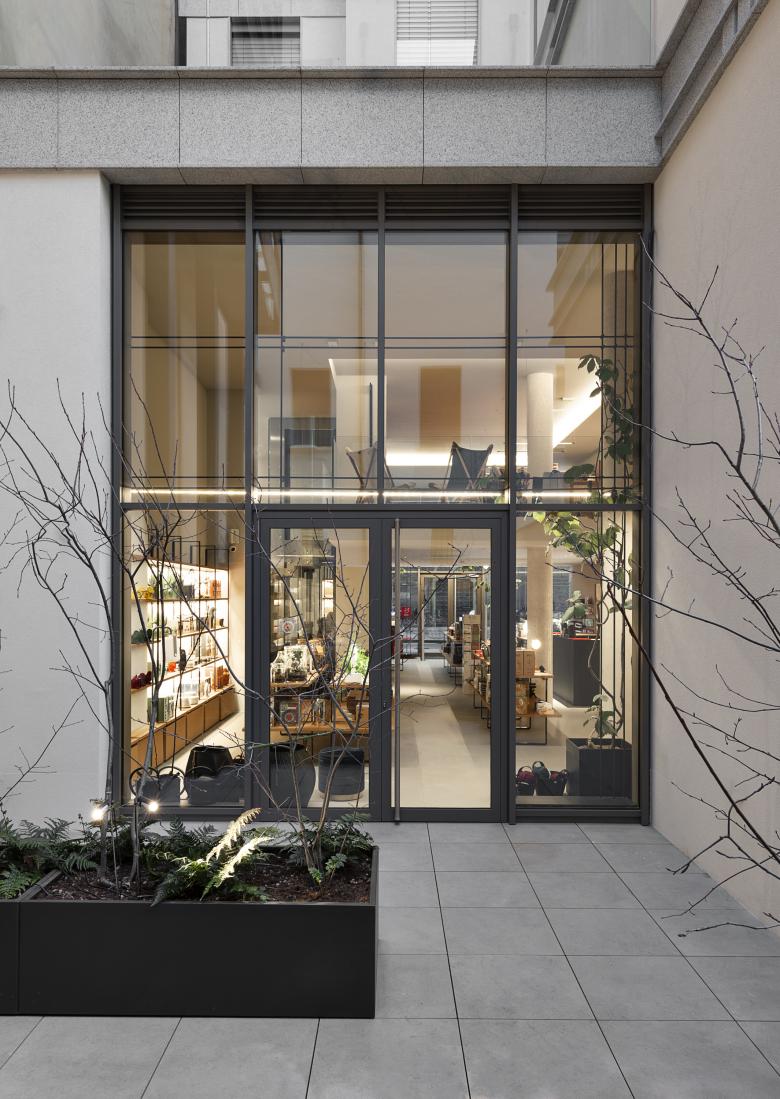
Inside the store we enjoy the view of the Santissima Incoronata Church on Corso Garibaldi and, on the other side, of the courtyard organized as a small garden.
The latter, besides being an exposition area for exterior furniture and objects, becomes an intimate place of decompression which recalls the historical memory of the secret gardens inside the buildings of Milan. Within the project, the design of this green space acquires importance on its own and it works in a relationship of complementarity with the interior space, in a domestic dimension.
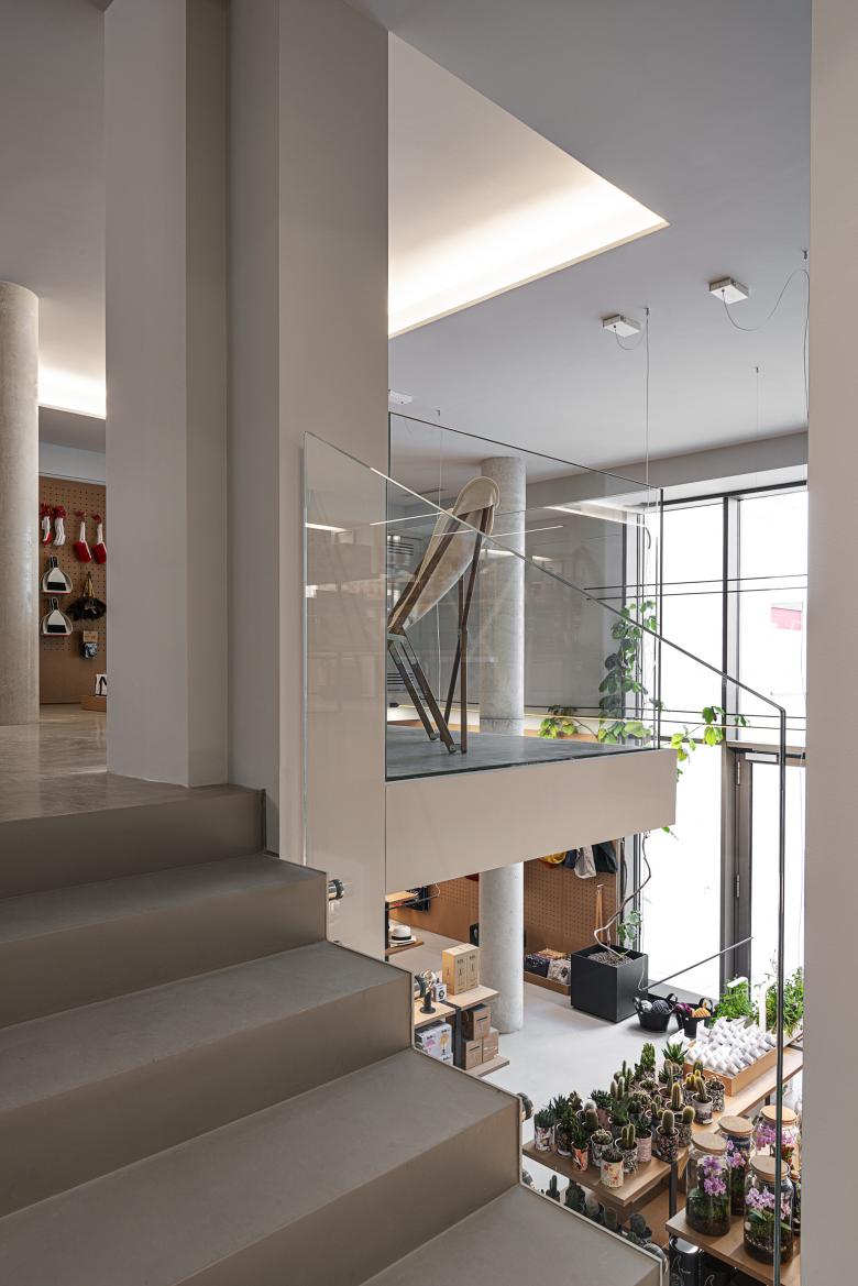
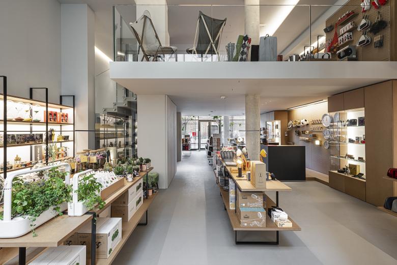
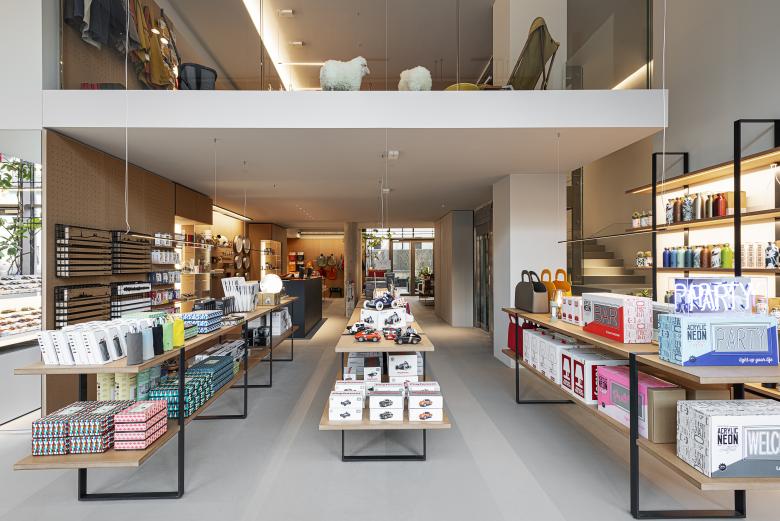
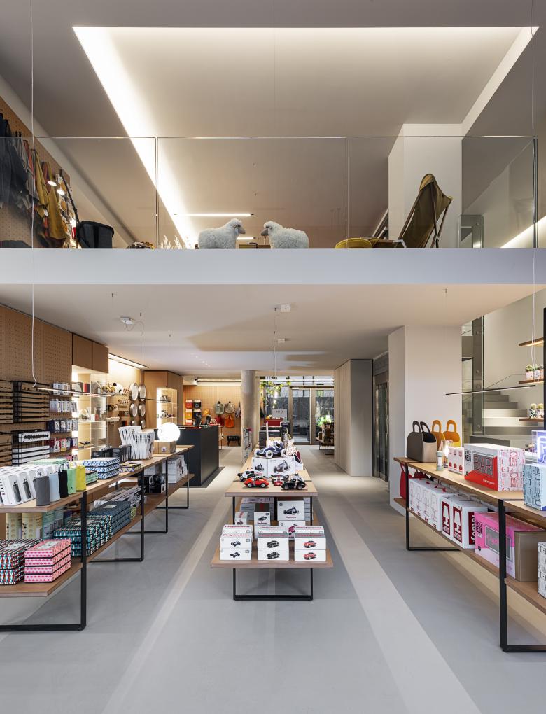
The interior space is organized on two levels connected by a comfortable stair and a one lift. The main floor is located at street level while the upper floor covers only a portion of the total area, allowing room for an open double height space and for a dynamic horizontal and vertical visual contamination of the life which takes place inside the store.
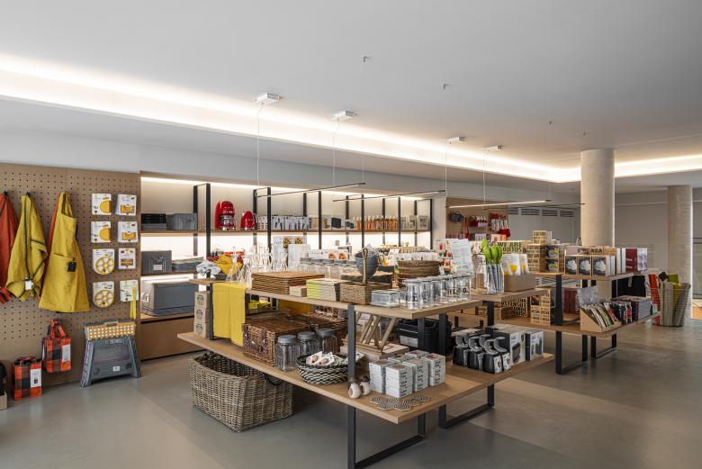
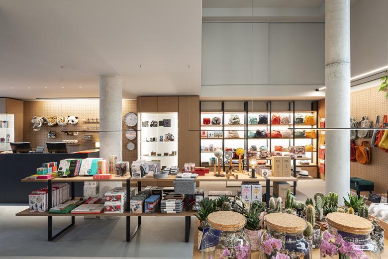
The floor plan for the disposal of the table tops follows a simple and clear layout organized on three parallel axes, perpendicularly to the entrance. The aim is to ensure the maximum exhibition surface without compromising the fluidity of the flow of people. On the perimeter walls panels and shelves alternate.
The project of the store takes form following the “Moronigomma philosophy” … The exposed object must be the protagonist. The space is designed according to it…
This has become the basic principle of the concept that resumes and evolves the choices already made in the Moronigomma shop designed and created in 2018 on the same street, at No. 2.
The use of a single color isolates the interior volume: floor, walls and ceiling.
The light-grey resin floor is a neutral surface suitable for welcoming the multiplicity of colors and shapes of the exposed products selected from all around the world.
A natural MDF is used for the horizontal and vertical exhibition panels with the same thickness. The choice of a practical material, deliberately left rough, recalls the image of a cardboard packaging or a gift box.
The raw iron is used as a supporting element for the MDF panels, as an identification material of the cash counter and of different furnishing elements. In the design of the project, its thickness is always 1cm.
- Any
- 2020
- Estat del projecte
- Construït
