Biennale Architettura 2012, Extra
World-Architects.com is in Venice for the 13th International Architecture Biennale, directed by English architect David Chipperfield and titled "Common Ground."
The third and last installment of our Venice Biennalecoverage focuses on contributions to the 13th International Architecture Exhibition -- directed by David Chipperfield and titled Common Ground -- housed in the Central Pavilion at the Giardini. It is important to point out that Chipperfield appointed about 60 curators, who in turn could invite more contributors as they saw fit. So many of the installations in the International Exhibition are an assemblage of numerous voices, which makes sense given that Chipperfield was looking for the "common ground" shared by architects, as well as that shared by architects with the public.
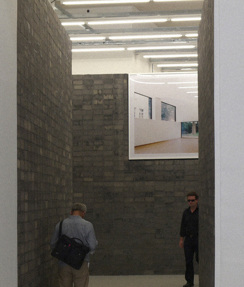
As mentioned near the end of the previous installment, Italy's pavilion at the Giardini is now used as the Central Pavilion for the International Exhibition, meaning the installations are direct responses to Director David Chipperfield's Common Ground theme. The large building, relative to the surrounding pavilions at the Giardini, is on axis with the main entrance to the grounds. This axis continues through the building's columned entrance and into Kuehn Malvezzi's grey-brick room displaying photos by Candida Höfer and Armin Linke. Like the entrance to the Arsenale, Malvezzi shifts the axis, making access to the rest of the Central Pavilion exhibitions more intimate. The grey brick is a very tactile intervention that is almost wet in its variations.
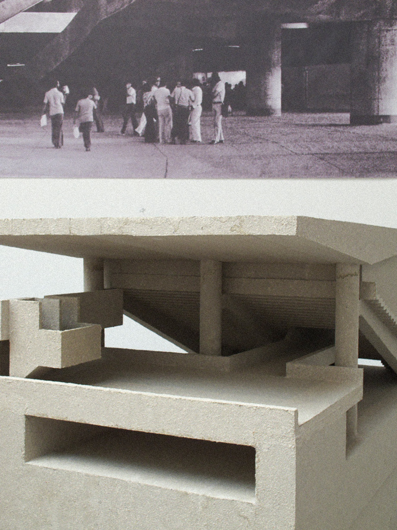
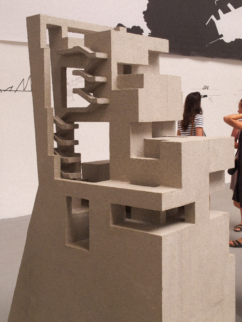
After passing through the grey-brick walls near the entry, the scale opens up in a room devoted to Grafton Architects and Paulo Mendes da Rocha. Grafton received a Silver Lion award at the Biennale for their installation, which follows their inspiration for a commission they received for a new university in Lima, Peru. Grafton, who are from Ireland, found inspiration in Brazilian architect Paulo Mendes da Rocha's architecture, specifically the Serra Dourada Stadium. Models, drawings, and photos fill the large space, but it is the first that gains the most attention, given their size and the way the inscribe the space with a circle. Grafton humbly wears their inspiration on their sleeve, and illustrates how architects can learn about a place through investigations of form in contemporary architecture. In a globalized context, it is great to see an openness to learning from within over an imposition via outside forces.
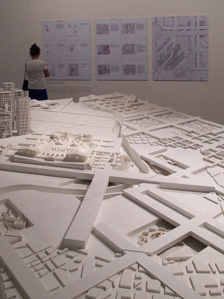
Still on the Central Pavilion's main axis is The Piranesi Variations, curated by Peter Eisenman. The theory-minded architect invited Belgian architects Dogma, students from Yale School of Architecture, and Jeffrey Kipnis, who in turn worked with students from Ohio State University Knowltoon School of Architecture, to "revisit, examine, and reimagine Piranesi's 1762 folio collection of etchings, Campo Marzio dell'antica Roma." Like the Grafton/Mendes da Rocha installation, models are the focus here, occupying the middle of the space near related drawings on the walls. Not surprisingly, Eisenman's contribution, "A Field of Diagrams," is immediately recognizable as Eisenman, a layering of various grids at different sizes and angles on top of each other. Even topping off the gridscape are buildings that look like unrealized designs by the architect.
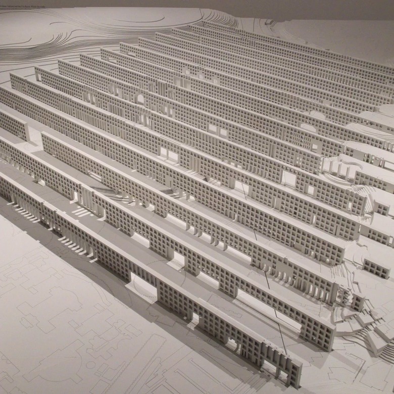
Dogma's "A Field of Walls" is Eisenman's antithesis; it "reconsiders the power relations" of Piranesi's etchings through a parallel series of wall-like buildings. It is brutal and imposing in its repetition and its dominance over the landscape. Neverthless, there is something appealing in Dogma's reading of Piranesi and the diagram they created, as if the parallel walls -- something that could never be willed into existence -- have a clarity that invites pondering what they might mean.
In Toshiko Mori's installation, the New York City-based architect aligns her buildings with those of five master architects: Frank Lloyd Wright, Paul Rudolph, Marcel Breuer, Mies van der Rohe, and Philip Johnson. This may seem presumptuous at first, but Mori has actually designed a visitor center for a Frank Lloyd Wright house in Buffalo, New York, and renovated and added to a house in Connecticut by Marcel Breuer. Through large-scale models in the Central Pavilion, Mori investigates the relationship between form and the architectural detail. Each wall section is "presented as an intellectual and literal totem," though their whitewashed treatment denies the materiality of their realities.
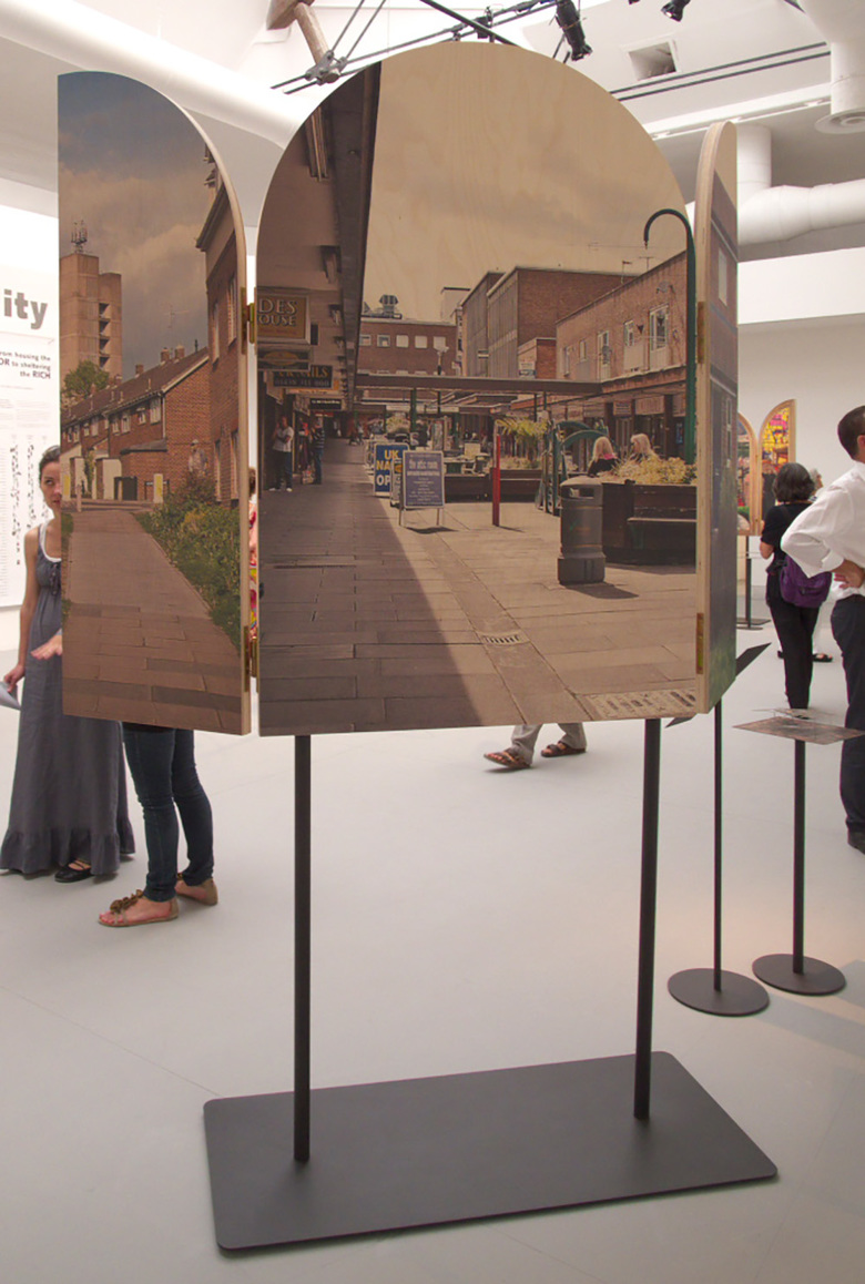
"The Banality of Good" is the contribution from Dutch group Crimson Architectural Historians. Their usual mix of looking at design, research, analysis, and science throught he lens of history is centered on six cities planned and built in the second half of the 20th century. Each city is presented through a freestanding triptych -- one side is the dream and the other side is the reality. They want to raise the issue of the obvious disconnect between what is sold and what is created, but they also want to involve architects in the creation of new cities. Accompanying stats on the wall, such as the shift of architects' contributions in terms of typology over the years, are related, and make visitors realize what architects are actually responsible for today.
A small room devoted to artists Peter Fischli and David Weiss plays a loop of their photos of more than 800 airports they assembled since the 1980s. These "non places," as Marc Augé defined them, "can be read as an autonomous and contemporary civilization," as the Biennale literature describes. Yet the photos are also personal mementos of travels, somthing that links the artists to globetrotting architects like Rem Koolhaas, who has graphed the time he spends in airplanes. If this is Common Ground, then it is among the "protagonists," as Chipperfield calls them, not all architects.
Alejandro Aravena/Elemental's installation presents two projects in Chile (post-earthquake Constitución and the desert city Calama) that are referred to under the moniker "The Magnet and the Bomb." The architects liken their role to diffusing ticking time bombs, within approximately 100 days for each project. Tackling social and economic inequality, the projects exhibit Elemental's inventive and popular approaches to working with communities through architecture. Their display is a mix of carved-wood models, photos, and video that is a pleasure to take in.
In a room next to Elemental's mix of the tactile and the ephemeral is Icelandic artist Olafur Eliasson's equal mix of both. In an oddly shaped, darkened room sits a fan that appears to be spinning light. It is actually spinning two "Little Suns," which are solar lamps that Eliasson has designed as an affordable, sustainable means of lighting for places in Africa. A photo hardly does the effect of the spinning lights justice, and likewise the fan hardly conveys the admirable impact of designing the distributing lights to people who may not have ready access to traditional lighting.
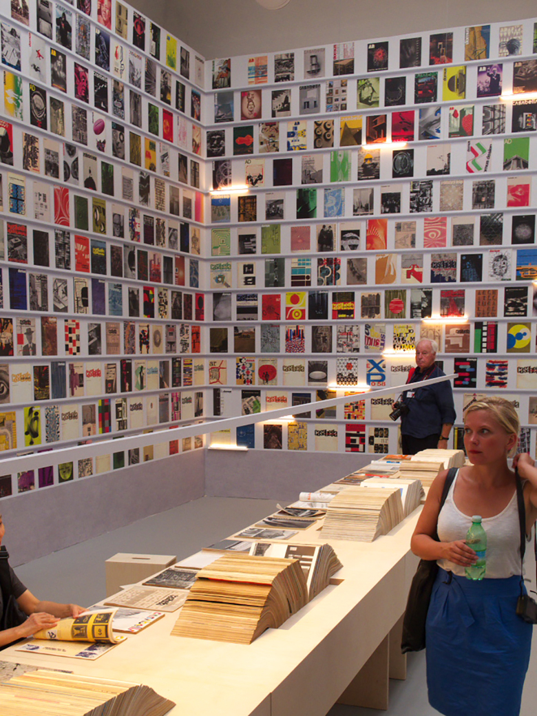
Appropriately located next to the Biennale Library is Steve Parnell's look at four architecture magazines: Architectural Review, Architectural Design, Domus, and Casabella. Some are "bound" into the wood table for looking at, but the majority cover the walls (more accurately a trompe l’oeil does), their colorful covers overwhelming the space. Parnell's compliation of magazines -- accompanied by a large, thorough, complex, and a bit mind-boggling illustrated timeline covering one wall -- examines the way these and other magazines helped define architectural culture. It's a room that one can stay in for a very, very long time.
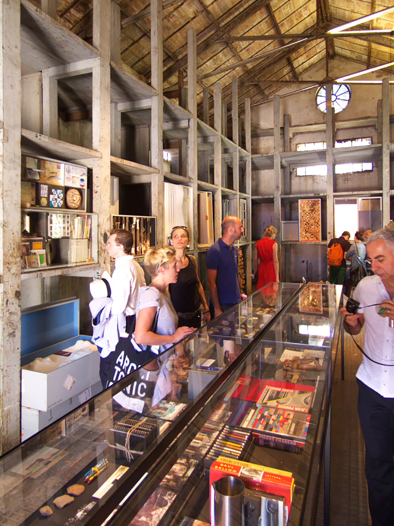
Another room that is crammed to the gills is the Wunderkammer, curated by Tod Williams and Billie Tsien, and located near the end of the Arsenale, well beyond the walls of the Central Pavilion. Williams and Tsien asked 36 fellow architects -- many of them big names like Steven Holl Juhani Pallasmaa, Marlon Blackwell, and Shigeru Ban -- to send a box with "objects of inspiration." These are placed on shelves and under glass cases in the small space. They resemble the boxes of artist Joseph Cornell, in that they are carefully crafted but also very personal; each box gives a peek into the person who crafted it. The Common Ground among these architects may not overlap, but it's interesting to see everything outside of architecture that influences these architects. Ultimately lived experience binds architects to each other and to everybody else, something that comes across in the Wunderkammer and elsewhere at the Venice Biennale.
Articles relacionats
-
AlMusalla at the Islamic Arts Biennale 2025
EAST Architecture Studio | 03.02.2025 -
