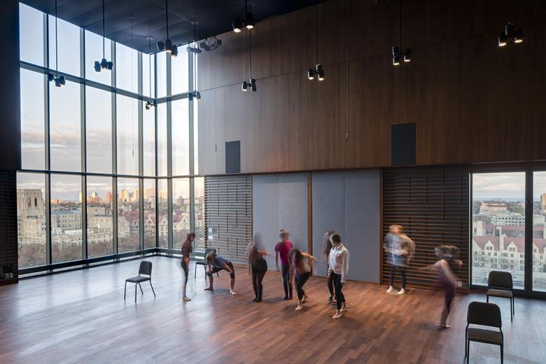
Reva and David Logan Center for the Arts
Reva and David Logan Center for the Arts
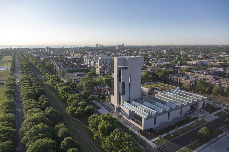
The Midway Plaisance—a one-mile-long green space laid out by Frederick Law Olmsted and Calvert Vaux in the 1890s—splits the University of Chicago's Hyde Park campus into the neo-Gothic spires and quadrangles to the north and the predominantly modern buildings to the south. Much of the university's recent expansion focuses on filling in its blocks south of the Midway; with educational buildings, residence halls, parking facilities, a seminary, and even a chiller plant (featured previously). Perhaps the most important project in this one-block-wide zone is the Logan Center for the Arts, designed by Tod Williams Billie Tsien Architects and completed last year. Williams and Tsien answered some questions about the project.
What were the circumstances of receiving the commission for this project?
The Logan Center is the result of years of hard work and collaboration that kicked off in 2006 with an international invited design competition. The other finalists included Thom Mayne’s firm Morphosis of Santa Monica, Daniel Libeskind of New York, Hans Hollein of Vienna, and Fumihiko Maki and Associates of Tokyo. We were asked to develop models, drawings and renderings and to present them to the selection committee in interviews.
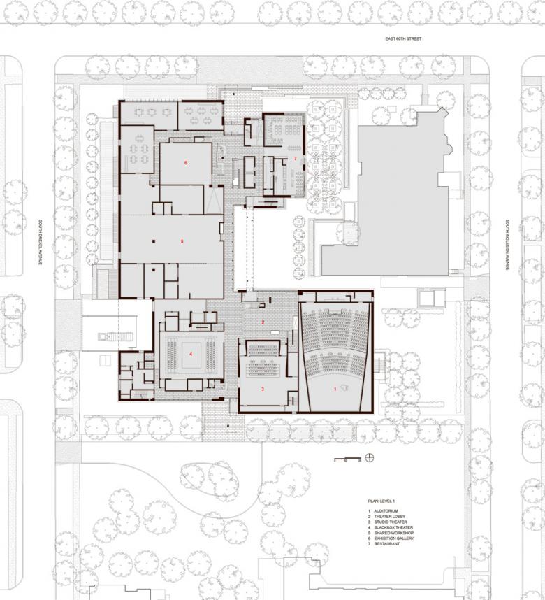
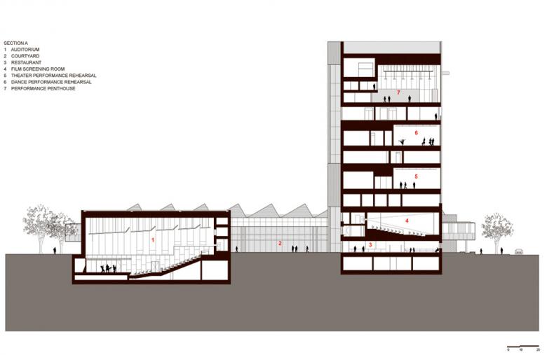
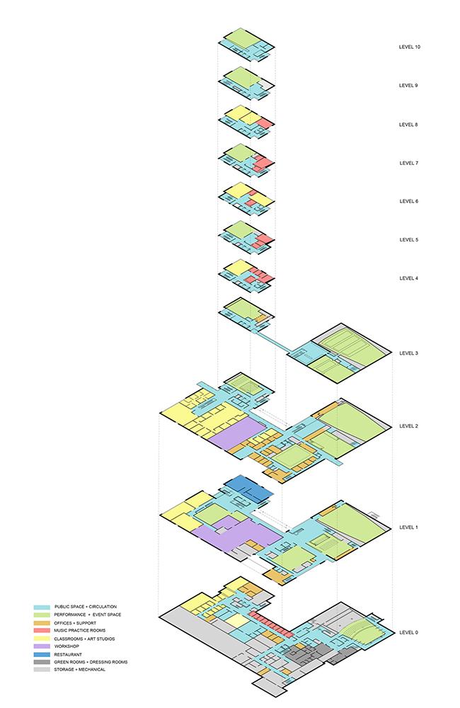
We had envisioned a 12-story tower connected to a horizontal building housing three professionally-equipped theaters and arts studios under saw-toothed skylights. All the entries were estimated to establish that they were on budget. While each submission passed, as you can imagine, they were wildly different. After the design review, costing phase and architect interviews, the selection committee evaluated previous built work along with former client interviews. We were selected as architects in June 2007.
Are there any new/upcoming projects in your office that this building's design and construction has influenced?
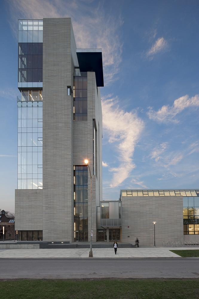
This is the tallest building we have done and although it is by no means a skyscraper it does make us think of the nature of tall buildings today, which is generally a glass curtain wall. In our own buildings we are looking for solidity and mass. So this was an attempt to make a tall building with solidity and mass. Windows are placed based on internal use and logic rather than from the ideas or images related to the exterior. We are working on an Embassy project in Mexico City where we may have a tall building and the thinking on Logan will influence it.
How would you describe the architecture of Illinois and how does the building relate to it?
The State of Illinois and in particular the City of Chicago has a reputation for some of the finest architecture in the United States, if not the world. We also wished to relate to the best architecture of the University of Chicago Campus, both the historic center and that south of the Midway. Our concept, that of a tower and a field, addressed what we felt were the characteristics of the city with its towers, and the campus with its gothic spires, and to the state with the horizontal beauty of its prairie lands. To work in such a place in the shadow of more than a century of our greatest architects is a great challenge and great opportunity.
The program of a mixing bowl of the arts was a new one, thus there were few precedents. We were well aware of the quality of buildings in both the state and the city, so we knew our building needed to be rigorously conceived and built. In terms of materials, while steel is perhaps best known in the region we chose concrete and masonry because it too has a history in the region and the campus. Additionally we felt we could do our best work with materials with which we were most familiar. So we wanted our building to feel worthy to stand among the great work that has come before but not to compete with these buildings. Our work needed to relate but have its own power and voice, its own integrity.
Email interview conducted by John Hill.
Can you describe your design process for the building?
After winning the competition, we engaged in a phase of schematic design, adjusting the conceptual design to fit the University’s specific needs and to meet the budgetary goals. Several schematic solutions were tested to optimize the complexity of housing four departments in one building. We frequently met with department heads and engaged the broader University community to ensure that our building would not only meet the needs of the faculty and students, but would also become an integrated part of the campus vision of openness and interaction, and an arts center for the surrounding community.
How does the completed building compare to the project as designed? Were there any dramatic changes between the two and/or lessons learned during construction?
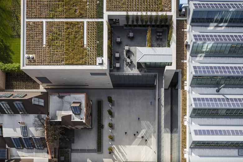
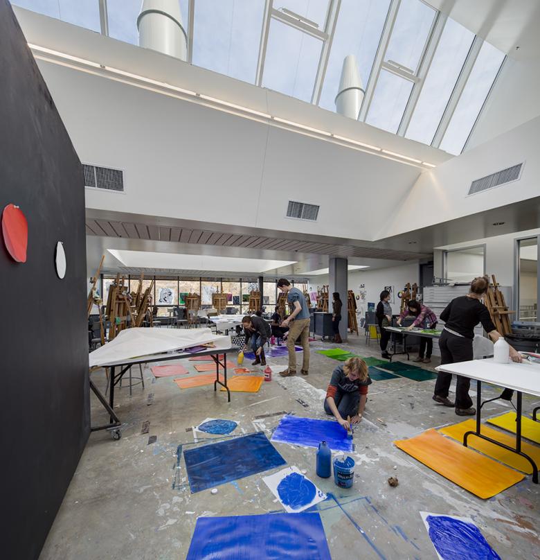
As the project moved forward, the design evolved, but ultimately the concept didn’t change. This was based on a tower and a field. At the interview we showed an image of a silo sitting in a field to reflect the sense of the prairies of the Midwest. Another image was that of the Chicago skyline (the birthplace of the American skyscraper). So the building was designed as a tower and a large low "field" building. The tower became simpler than the competition entry which had a cantilever at the top. The low building lost a lot of the glass curtain wall which really didn't work for studio and gallery spaces. Instead we have solid walls and the natural lighting is achieved by continuous north facing skylights that have PVC panels on their south side.
Because the campus is primarily built in a neo-gothic limestone style we decided to switch from the dark green stone shown in our competition entry to a limestone. However we wanted the limestone to be different from the Indiana limestone which is very consistent in its texture and color. So we found a limestone from Missouri which had previously only been used for paving and terraces. It was much more varied in color ranging from a mottled pink to warm oranges and yellows. This was cut into "super" bricks 4" x 4" x 4' and set with raked joints to emphasize the sense of horizontality and weight. Of course, we thought about Frank Lloyd Wright's Robie House which is on the University of Chicago campus.
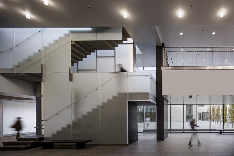
So there were both simplifications of form and material changes that happened as the design progressed. But our concept throughout was to create a tower of the arts with different disciplines of the visual and performing arts in a vertical building connected by stairs that were beautiful, varied, and fun to use. We wanted to replicate a situation similar to Carnegie Hall where we have lived and worked surrounded by studios of musicians, dance teachers, photographers, artists and architects.
Reva and David Logan Center for the Arts
2012
Chicago, Illinois
Client
University of Chicago
Architect
New York, NY
Design Principals
Tod Williams and Billie Tsien
Project Manager
Felix Ade
Project Architect
Johnny Cho
Project Team
Brian Abell, Annika Bowker, Aaron Fox, Forrest Frazier, Aaron Korntreger, Archana Kushe, Aurelie Paradiso, Azadeh Rashidi, Evan Ripley, Philip Ryan
Associate Architect
Holabird & Root
Structural Engineer
Severud Associates
MEP/FP Engineer
Ambrosino, DePinto & Schmieder
Landscape Architect
Hargreaves Associates
Lighting Designer
Renfro Design Group
Construction Manager
Turner Construction
Acoustic & Audiovisual
Kirkegaard Associates
Theater Design
Schuler Shook
LEED Consultant
Steven Winter Associates
Façade Consultant
Axis Group
Elevator Consultant
Van Deusen & Associates
Film Projection Consultant
Full Aperture Systems
Civil Engineer
David Mason Associates
Standing Seam Roofing
Rheinzink
Lighting
Studio 1thousand (fluorescent lamps)
Interior Tiles
Heath Ceramics
Interior Felt Walls
Tod Williams Billie Tsien Architects (design); Liora Manné (custom production)
Exterior Cladding
Earthworks (dolomitic limestone)
Site Area
4 acres
Building Area
184,000 sf
Photographs
Tom Rossiter
Drawings
Tod Williams Billie Tsien Architects
